Kate Gorringe
Creative Director
ABOUT
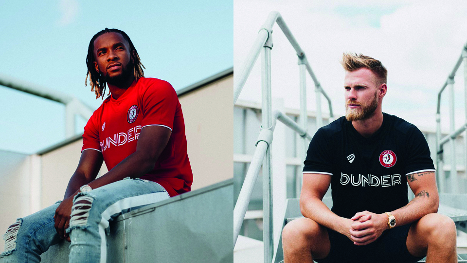
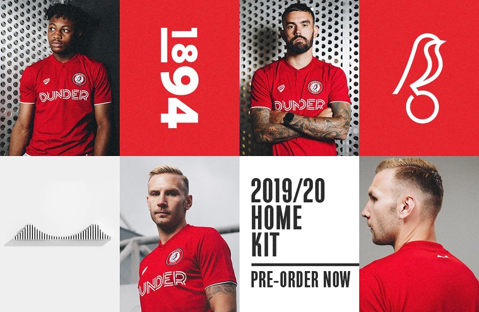
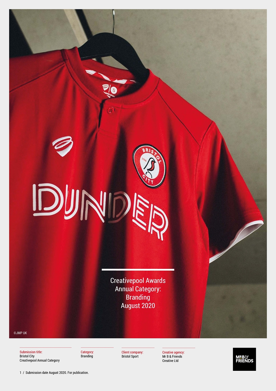
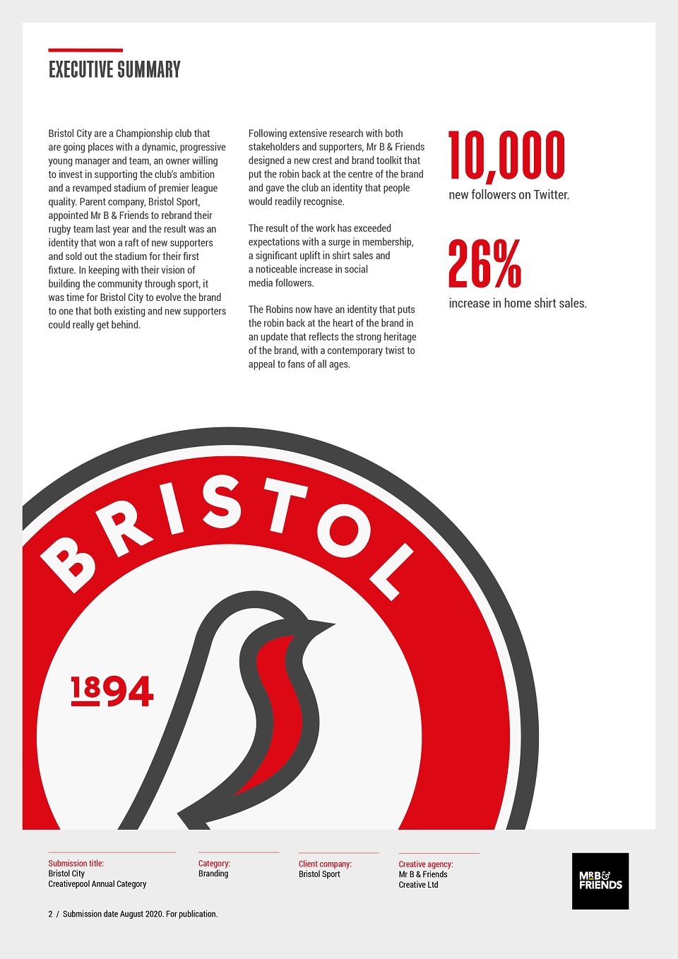
Bristol City are a Championship club that are going places with a dynamic, progressive young manager and team, an owner willing to invest in supporting the club’s ambition and a revamped stadium of premier league quality. Parent company, Bristol Sport, appointed Mr B & Friends to rebrand their rugby team last year and the result was an identity that won a raft of new supporters and sold out the stadium for their first fixture. In keeping with their vision of building the community through sport, it was time for Bristol City to evolve the brand to one that both existing and new supporters could really get behind.
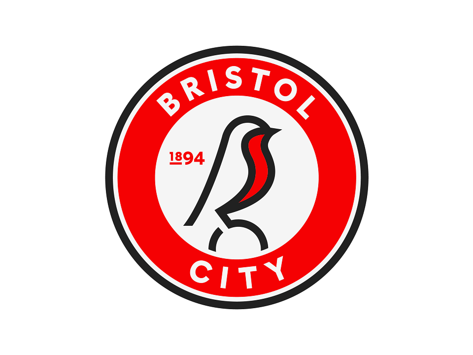
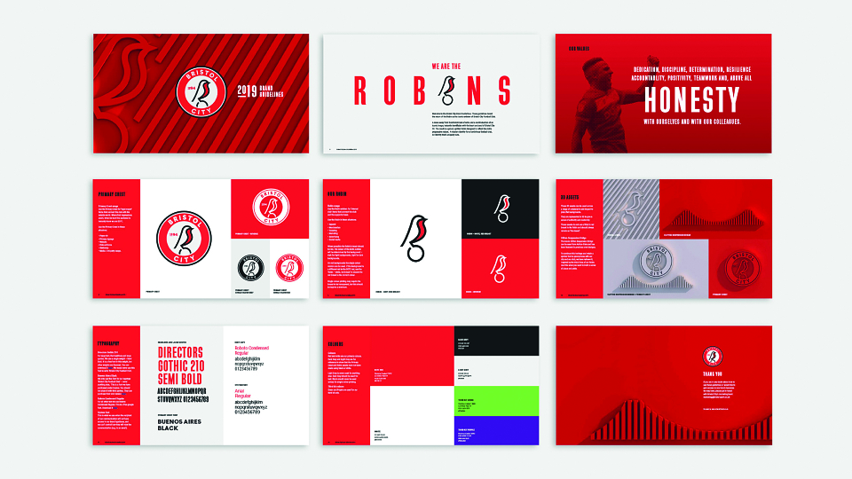
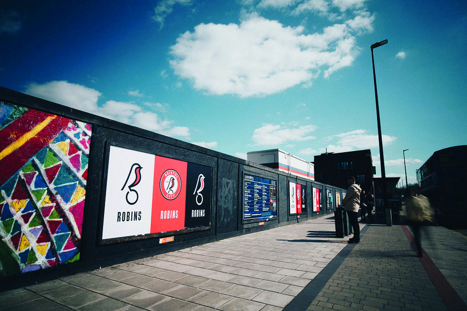
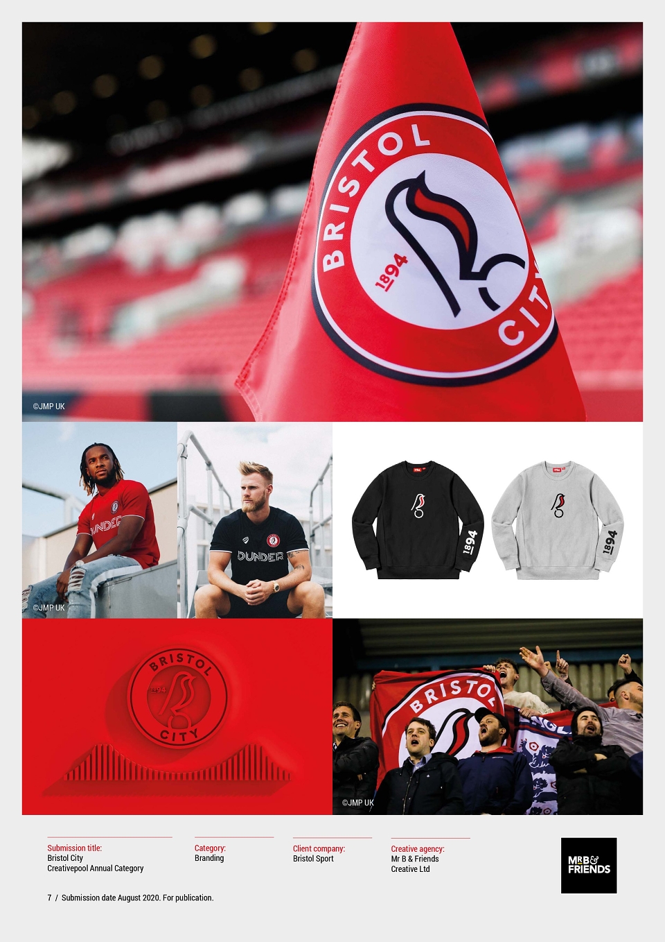
Following extensive research with both stakeholders and supporters, Mr B & Friends designed a new crest and brand toolkit that put the robin back at the centre of the brand and gave the club an identity that people would readily recognise.
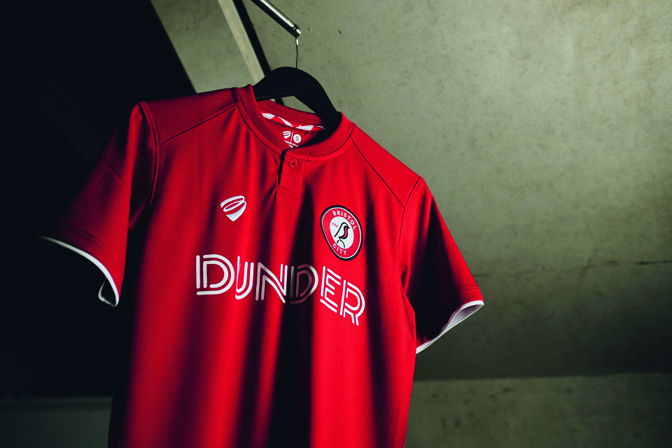
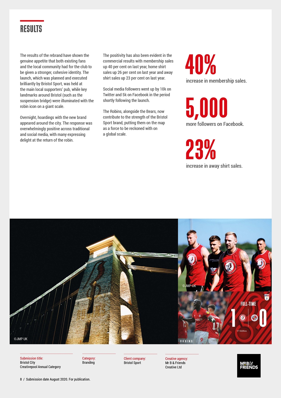
The result of the work has exceeded expectations with a surge in membership, a significant uplift in shirt sales and a noticeable increase in social media followers.
The Robins now have an identity that puts the robin back at the heart of the brand in an update that reflects the strong heritage of the brand, with a contemporary twist to appeal to fans of all ages.
MADEIT CREDITS
-

Bristol SportClient
-
Adam PartridgeBrand strategy -
James DingleGroup Client Partner -
Louise LepicAnimation -
Rosie BridsonDesigner -
Sara FoleyDesigner -
Tom RickussBrand strategy -

Neil LenihanArtwork -

Mr B & Friends Creative Ltd -

Matthew LloydPhotographer -

Kate GorringeCD & Art Direction -

Kieran HawesDesigner -
Harriet WhitehorneCopywriter -
Jen NevilleSenior Account Manager