Kamila Schneider
Design Coordinator
ABOUT
Ecoplan is an accounting firm located in the region of Eunápolis / BA - Brazil, is a well consolidated company that has been operating in the market for nearly 50 years. This ECoPlan name is an initial three-word join. Eunápolis, Accounting and Planning.
The company needs a new visual identity that transmits the personalities: Conservative, serious and reliable.
Even if there is enough time, the client wants the visual identity to have a modernist tone.
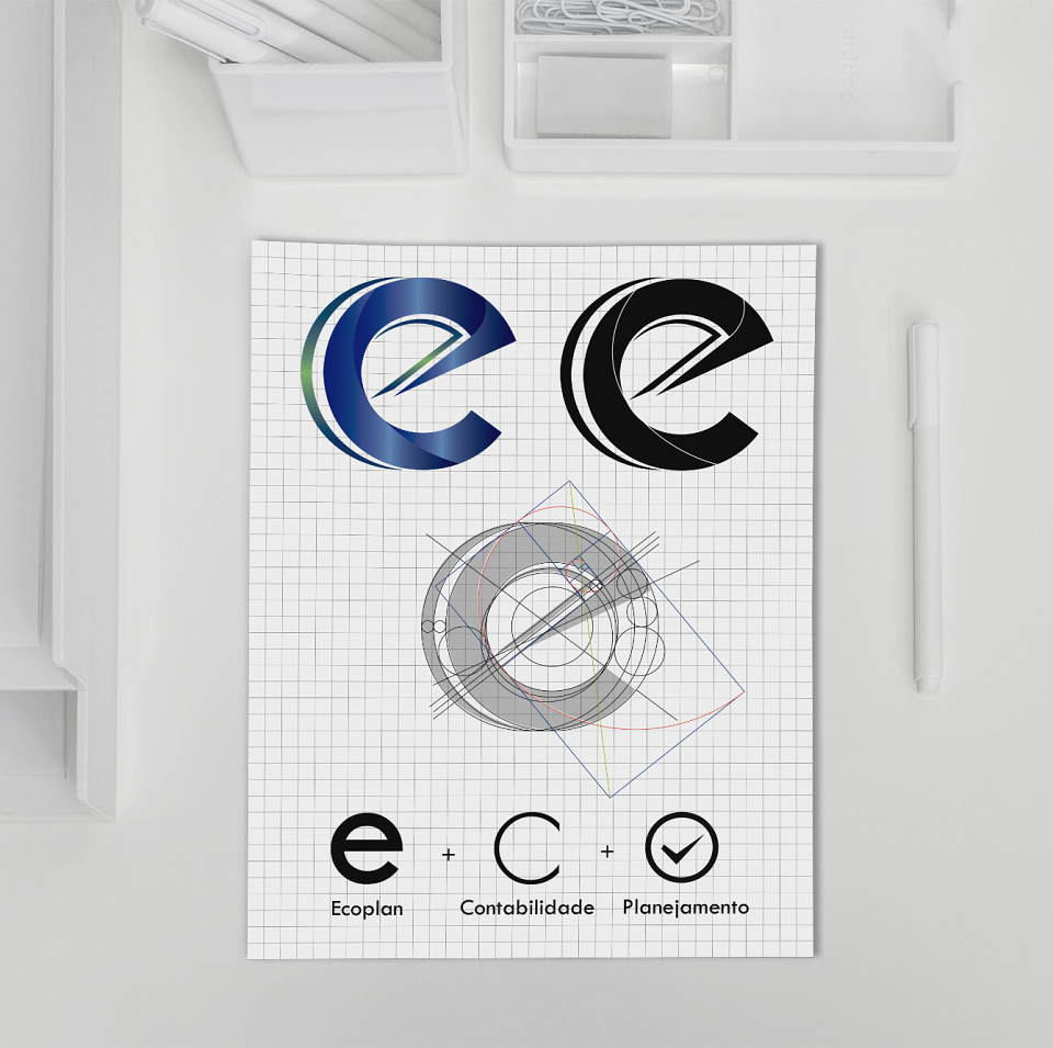
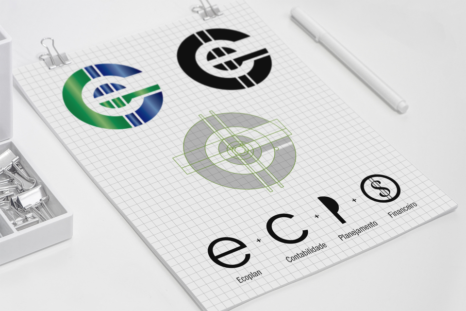
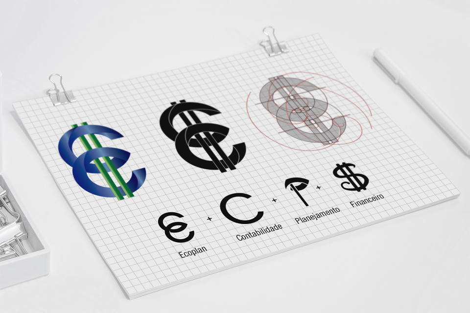
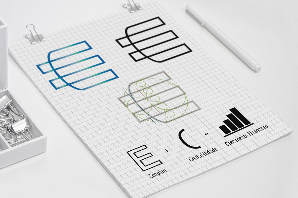
In addition, the company prefers to emphasize the initial letter of the name E.
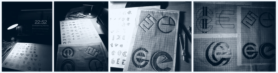
The first step to feed my creativity, was to get a big paper, a pencil, eraser, rulers, and a school compass, sit in front of a computer screen, search for images in google and type in several words such as finance , investments, money, accounting, planning, trust, etc.
With these inspirations, I was drawing several sketches and relating to the letter E. Then I chose some and I was eliminating until I got the choice of 4.
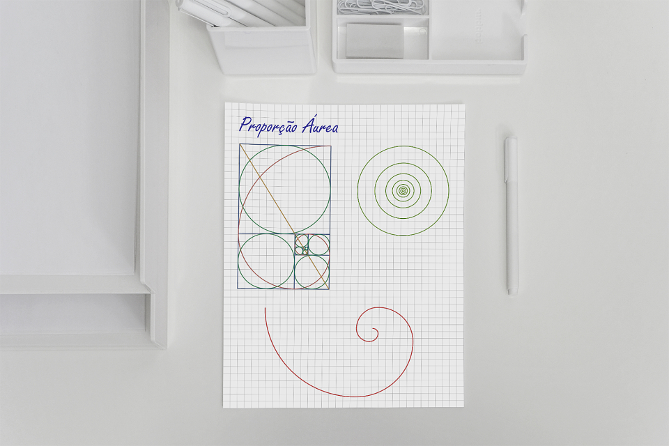
When I vectored the images, I tried to work with the Fibonacci measurements and many grids.
The Golden Ratio is a form of measurement. It is commonly found in nature. When used in design, it results in organic and natural, aesthetically pleasing looking visual compositions.
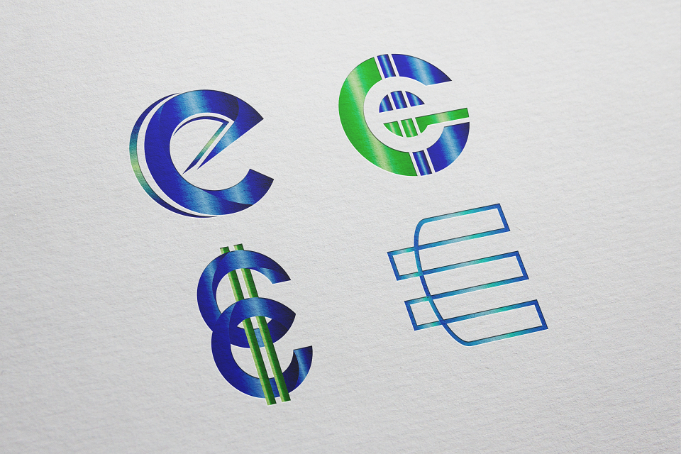
One concept, 4 ideas, 4 different logos. All 4 logos were produced for the accounting firm Ecoplan. All 4 with blue colors (representing trust) and green (representing wealth). All companies with the same concepts of the same line (E) + Accounting and Planning (which are also part of the company name). All were given in the measures of the Golden Ratio (art, a mathematical theory that is linked to beauty and perfection). Note: The work has not yet been approved by the customer.
I am waiting for the client with the approval of one of the logos to continue the project.