Just Design
Stellenbosch
ABOUT
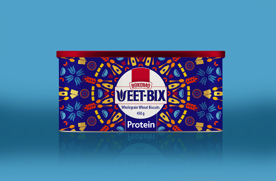
Weet-Bix limited edition tins
The Design Challenge:
Heritage brand, Weet-Bix has had very little change to its packaging over the years. The brand team felt it had an opportunity to disrupt the cereal category, by creating a talkworthy pack.
Just Design Cape Town, was tasked to develop a Limited Edition tin concept that has impact on shelf while at the same time, doubling up as a container to keep the cereal fresher for longer.
Design Inspiration:
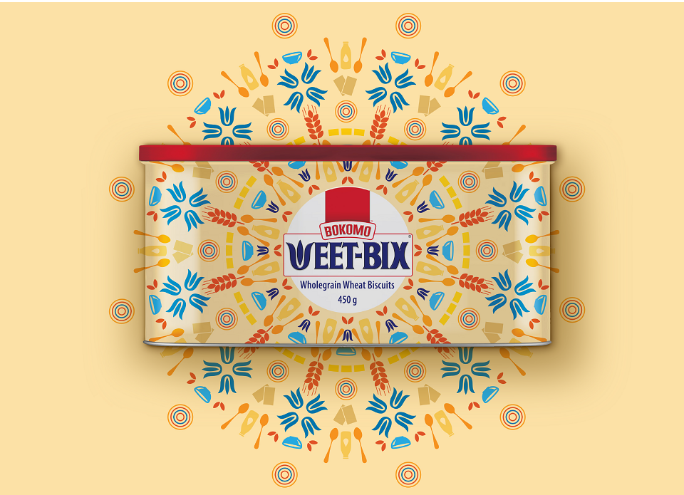
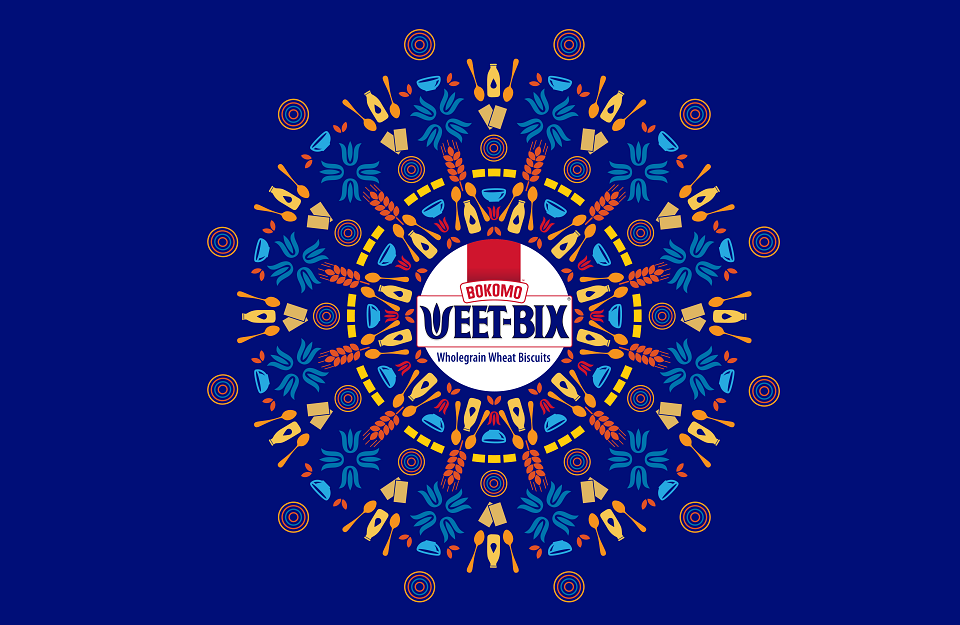
We took inspiration from breakfast rituals and visual iconography: spoons, bowls, milk, cereal, and combined that with Weet-Bix elements such as their iconic W, the iconic rectangular cereal shape and weat iconography.
Design Solution:
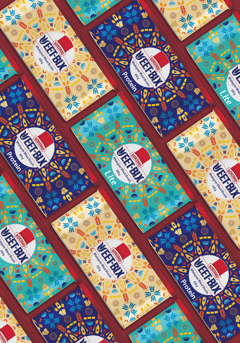
All the elements were arranged in a round mandala design with Weet-Bix branding at the centre of the mandala. We choose contrasting colours and combined these with the Weet-Bix blue and red brand colours.
This resulted in beautiful dynamic pattern designs.
MADEIT CREDITS
-

Just DesignCreative Director