Just Design
Stellenbosch
ABOUT
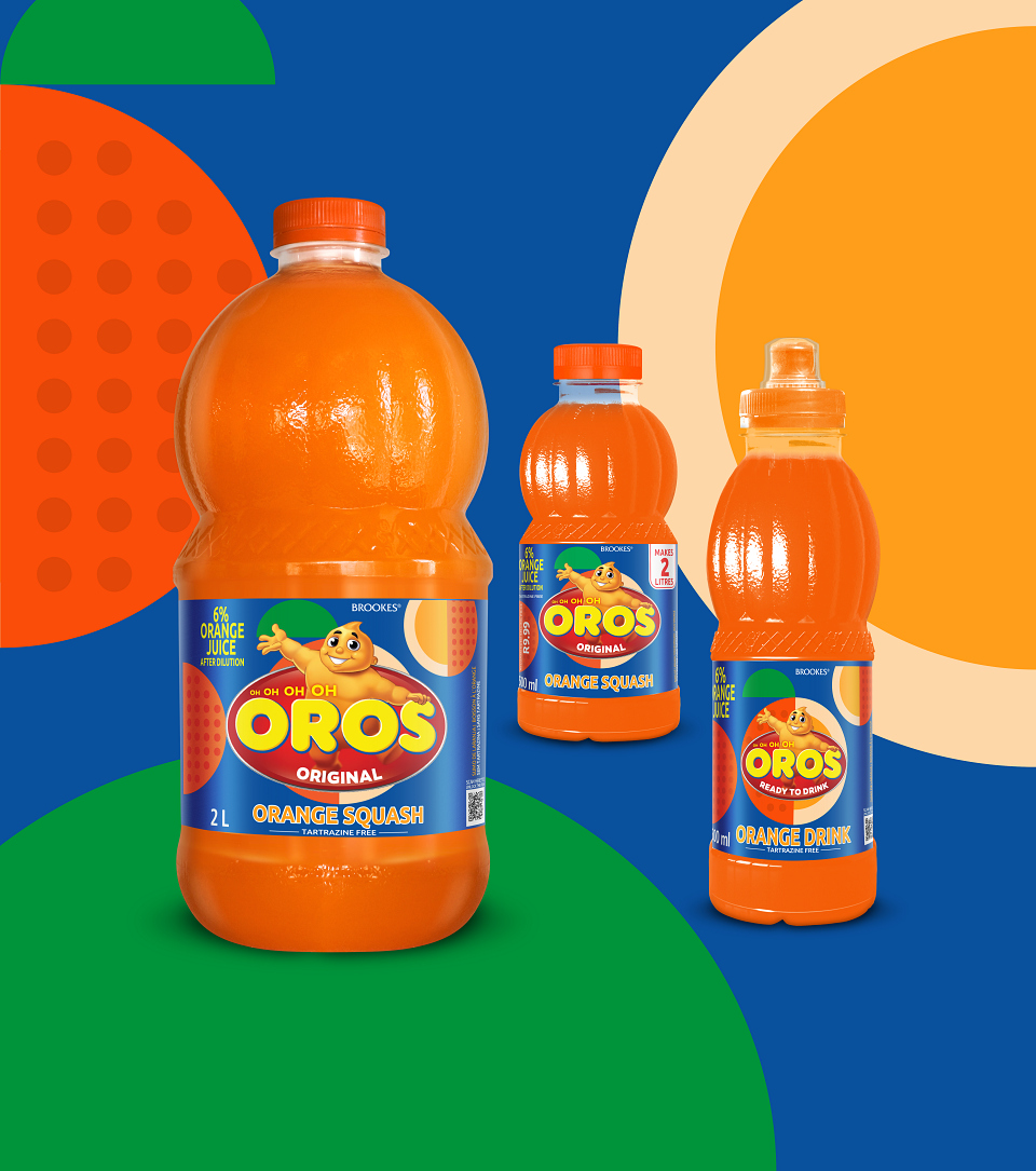
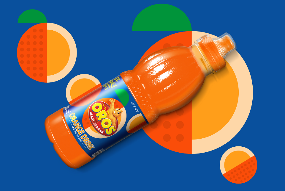
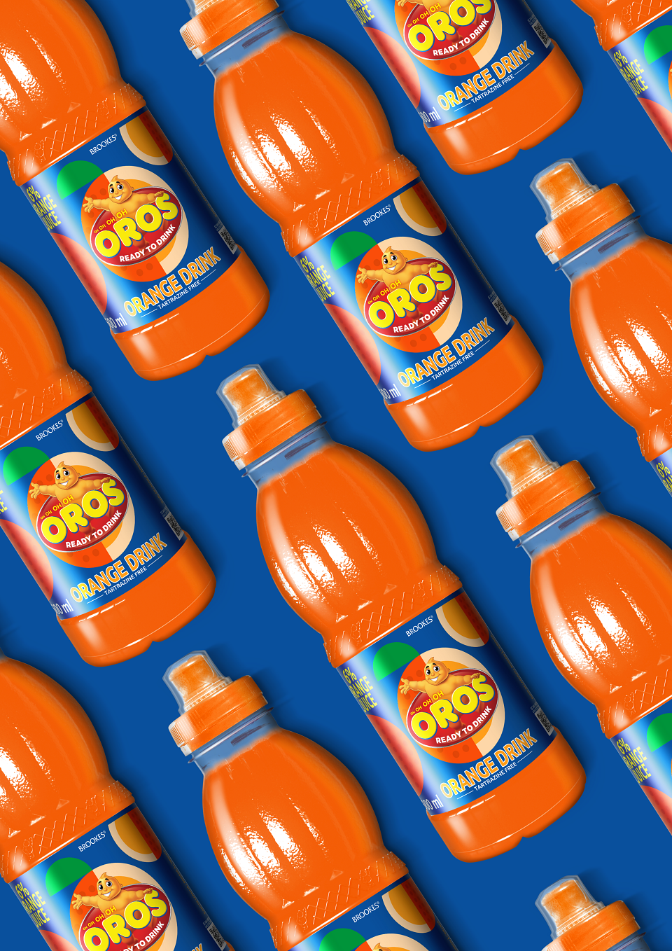
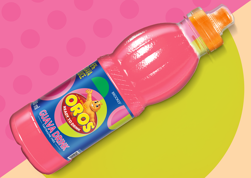
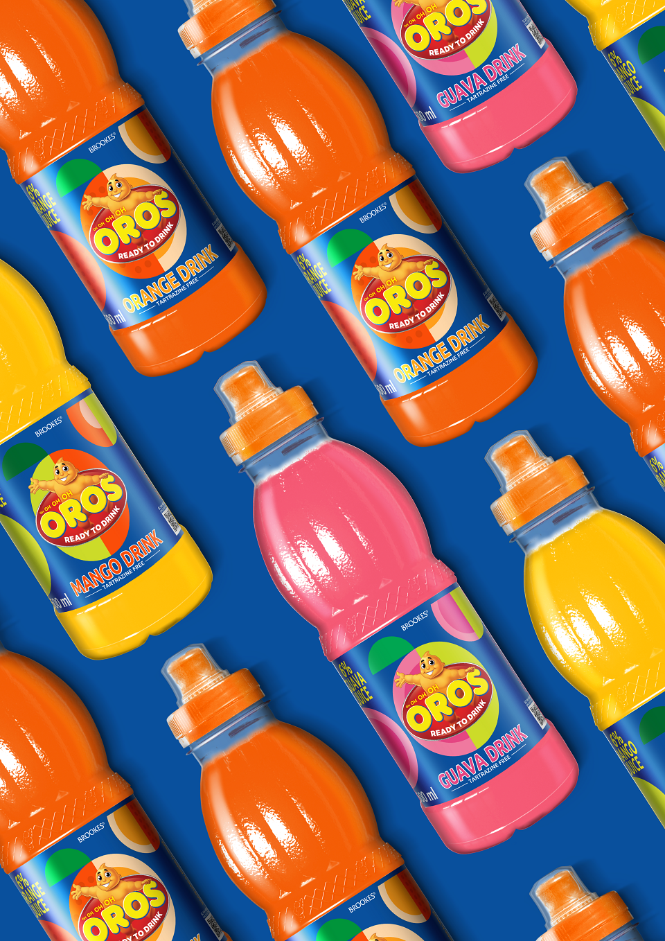
OROS UPGRADEOros is a heritage squash brand in South Africa. It has been a very familiar brand in most households for many decades and as a result, any design upgrade needs to be mindful of the entrenched brand assets and equity. That being said, all heritage brands need to evolve with the times and changing consumer mindsets. The key driver for this upgrade came out of the need to increase the brand’s street cred through their ready-to-drink offering, allowing Oros to appeal to a teenage / young adult audience. This type of audience craves ‘newness’ and excitement, and the traditional brand elements really needed to be pushed in order to drive that appeal and shift brand perception from kids / families to something a little ‘cooler’.The resulting execution uses abstract pattern-like ‘fruit’ to reinforce the flavour cues. Each variant demonstrates a unique pattern, in bright colours, and contrasted on a dark navy background. Oros feels rejuvenated and on-trend and certainly a step away from its traditional kid-like perception.
MADEIT CREDITS
-

Just DesignCreative Director