Just Design
Stellenbosch
ABOUT
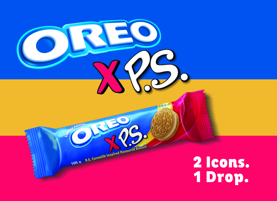
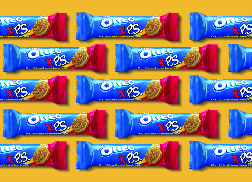
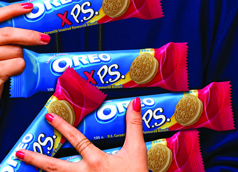
Two iconic brands. One bold new flavour.Oreo x PS Limited EditionTHE BRIEFBring together two iconic brands in a limited-edition collaboration that celebrates the playful personality of Oreo and the distinctive identity of P.S. The objective was to create bold, exciting packaging that introduces the P.S. Caramilk-inspired flavour while building on the familiarity and recognition of both brands.The CHALLENGEThe challenge was to balance two strong brand identities without compromising either. The design needed to feel unmistakably Oreo while giving P.S. a meaningful presence, creating a fresh, distinctive look that would stand apart from the core range and capture attention on shelf.THE INSPIRATIONInspired by the distinctive visual assets of both brands, we brought together Oreo's iconic blue with the vibrant pink and yellow of P.S. The contrast of colour, playful typography and flowing graphic elements created an opportunity to express the energy of the collaboration while celebrating the indulgent Caramilk-inspired flavour.THE SOLUTIONA bold, energetic packaging design that brings both brands together in a distinctive visual expression. Vibrant colour blocking, a dynamic ribbon device and an indulgent Oreo biscuit create movement, personality and appetite appeal. The result is a playful limited-edition concept designed to stand out on shelf while remaining true to both brands.
MADEIT CREDITS
-

Just DesignCreative Director