Jordan Pearman
Senior Visual Designer
ABOUT
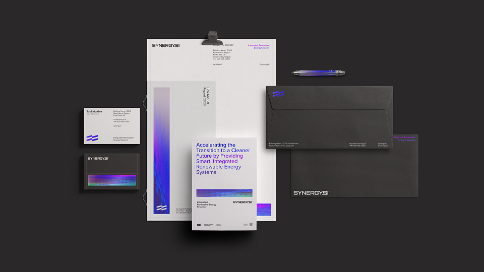
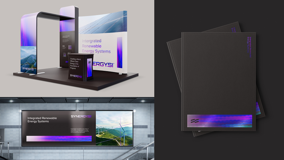
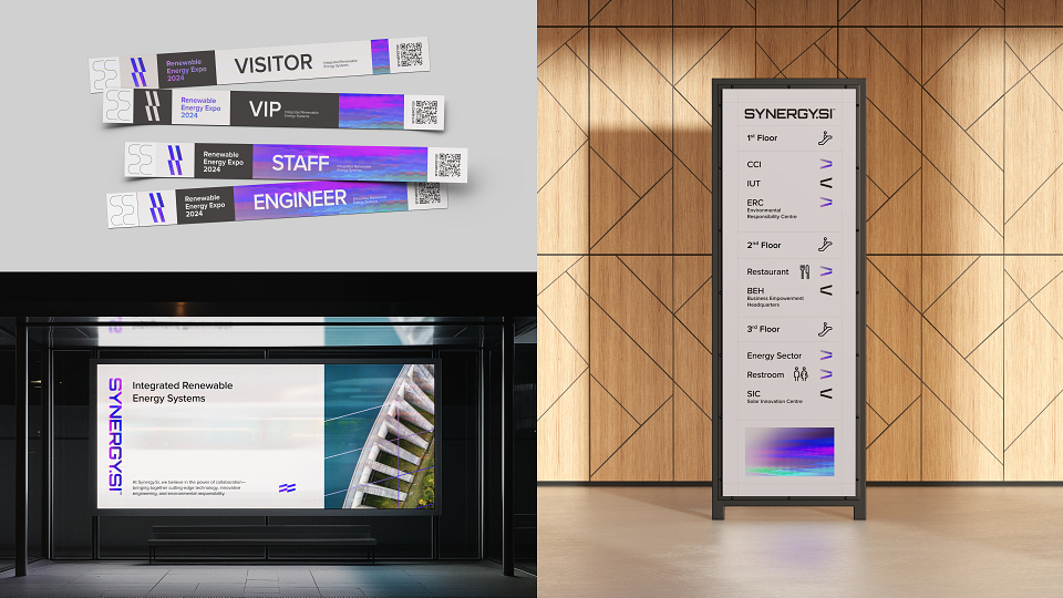
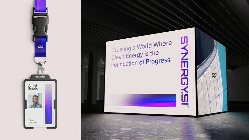
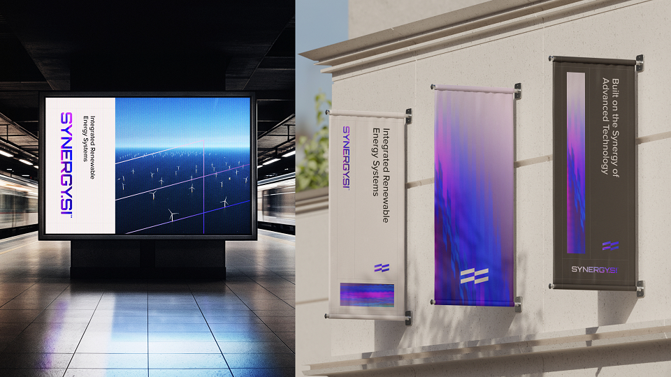
When Synergy Systems (SSi), the central voice of Norway’s renewable energy networks, sought to modernise its brand, they partnered with COSMOS™ to craft an identity as forward-thinking and dynamic as the sector it represents. The goal: create a world where clean energy is the Foundation of Progress
Our creative approach was anchored in the concept of ‘sustained motion’, highlighting a vital pillar of energy: momentum. This theme guides a visual strategy—focusing on renewable origins like wind and solar, and the infrastructure that channels power, such as wires and grids.
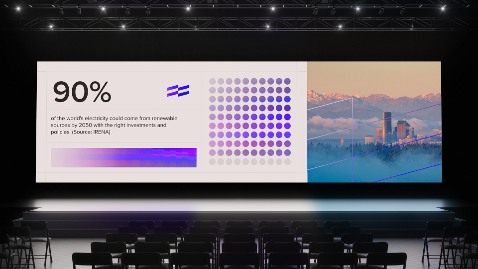
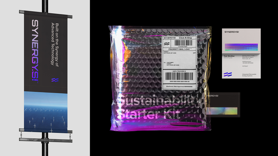
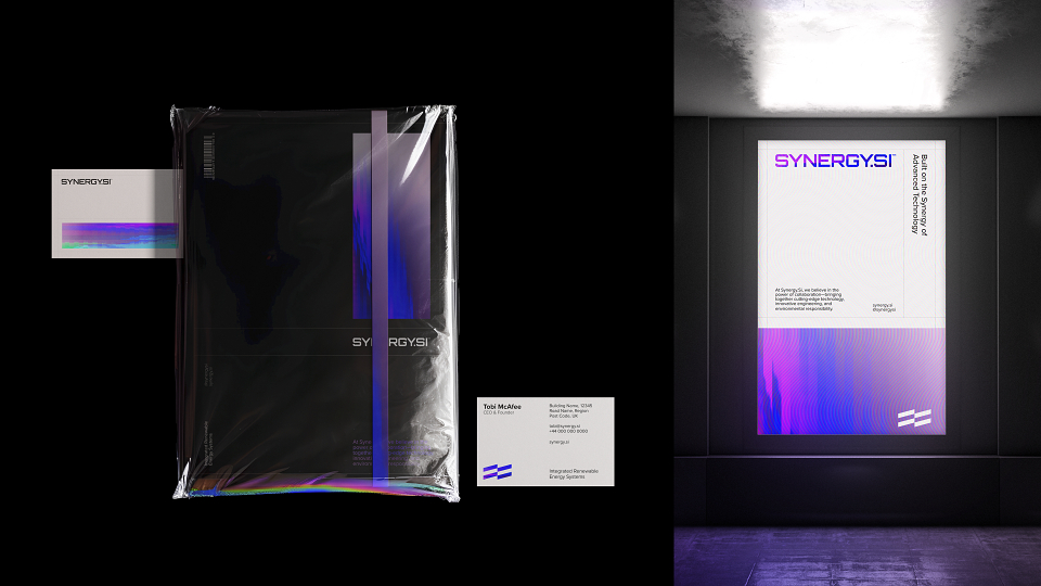
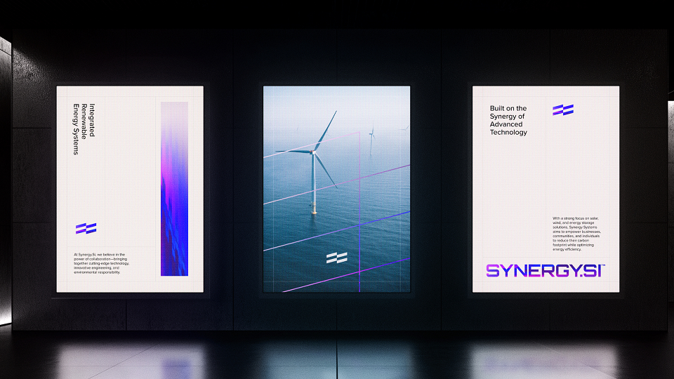
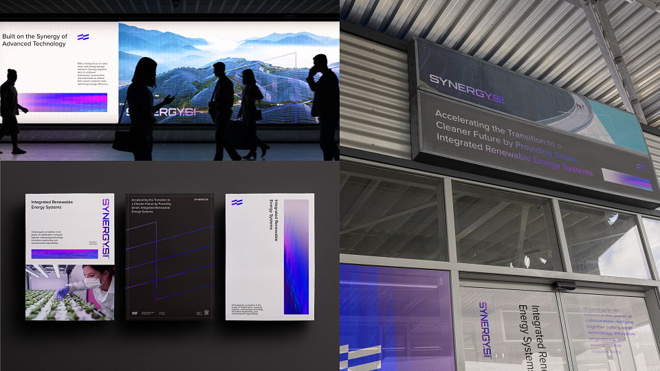
At the core of the identity is a 3:1 grid system, offering a clean, scalable framework adaptable across formats. This grid also informs a key design feature: procedurally generated patterns, developed through custom tools using displacement maps. These can be static or animated, allowing for rich, motion-driven visuals without added complexity.
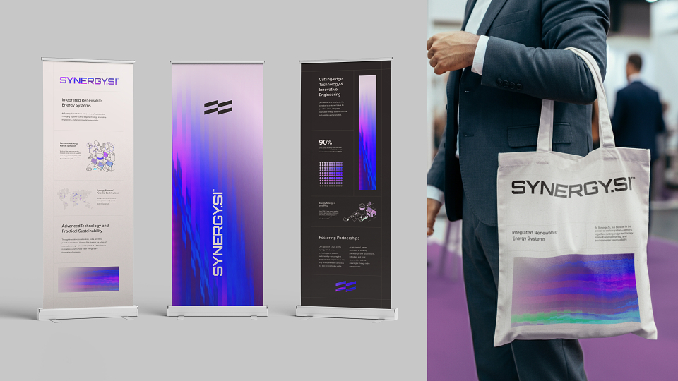
Intersecting lines from the grid inspired a flexible motif that infuses the system with depth and movement, while a bold colour palette, led by deep purples, magentas, electric greens, and cyans, echoes the dramatic, natural beauty of Norway.
Typography reinforces this balance between energy and structure. We paired Orbitron, a geometric sans with strong personality, with Proxima Nova, whose technical clarity adds precision. Together, they support an identity that avoids tired tech tropes, delivering instead a clean, scalable system ready to grow with SSi.
The result is a brand identity built not just for now, but for the future—clear, flexible, and always in motion.
MADEIT CREDITS
-

Synergy Systems EnergyClient
-

Jordan PearmanCreative Art Director -
VNSH Creative HouseCreative Agency -

David PreeceArt Director