Jonathan Crouch
Senior Creative
ABOUT
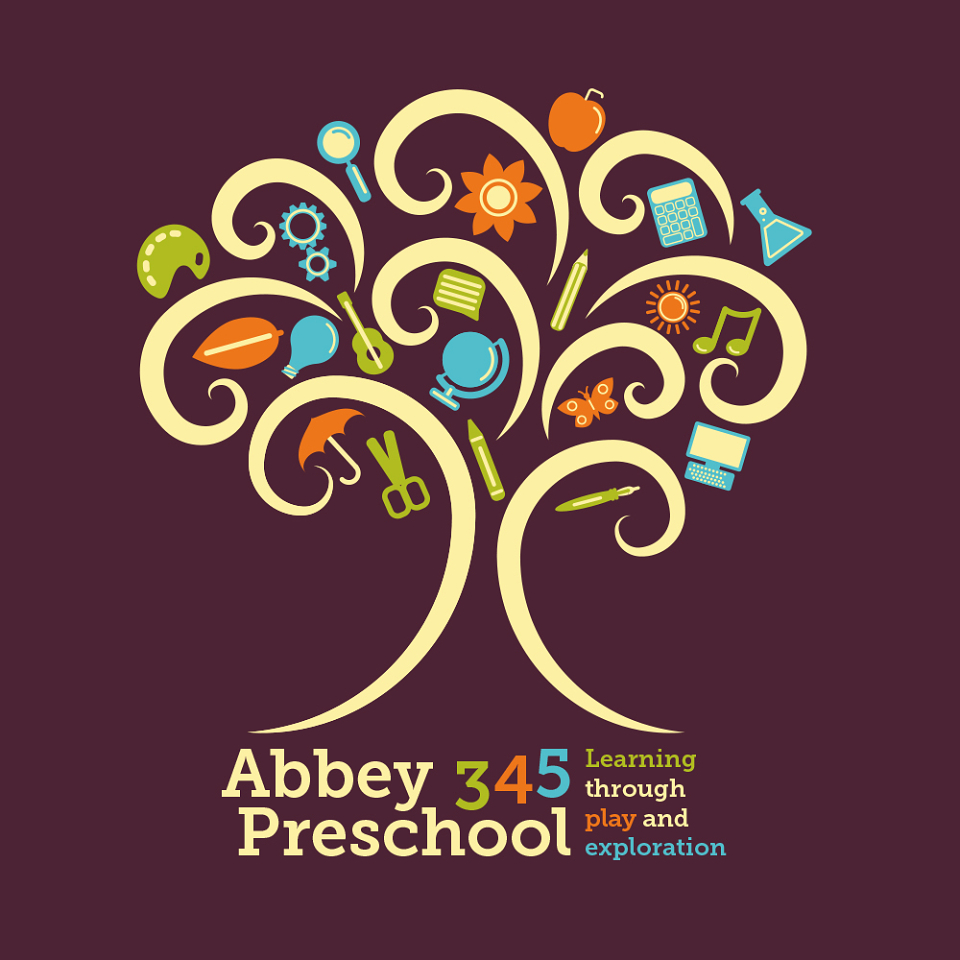
After a new rival preschool set up in Crowland, 345 Preschool felt that it needed to update its branding. The old branding was based on lurid primary colours, along with excessive use of Comic Sans - a font choice based upon its legibility with children.
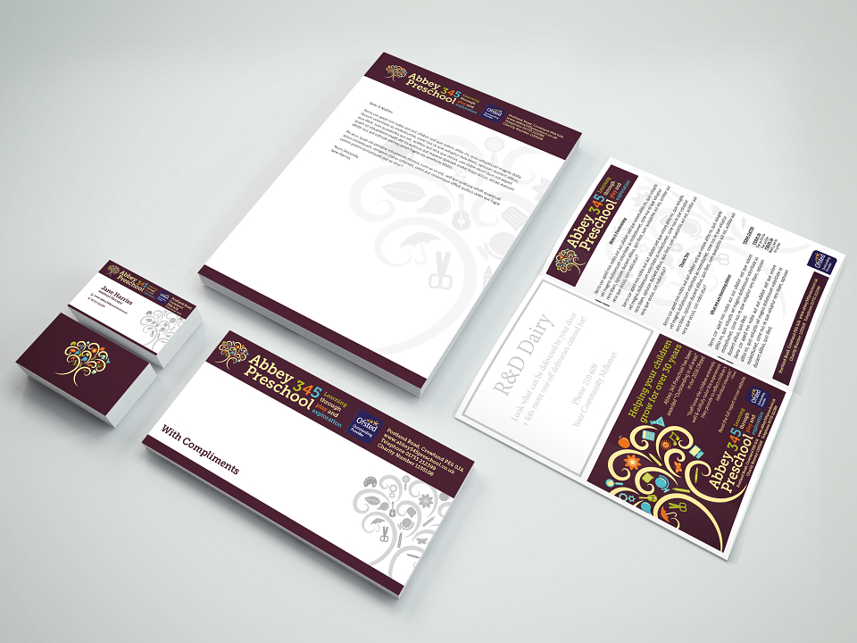
The new branding still featured bright colours, but was targeted at the parents, who ultimately would be making decisions to sign their children up. Moving away from balloons, the 345 Preschool's new logo primarily features a tree, with a variety of icons representing the things that a child can learn in the preschool.