Jo
Photographer, Data Entry
ABOUT
Samples of logos
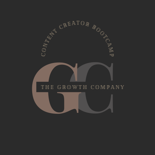
The Growth Company and its bootcamp about Content Creation.
The idea for the first logo I found in professional businesses related to marketing and sales, helps to convey sense of authority, power and competence with formality needed for adult education sector.
Two, common designs I used to all logos were centered initials and name of the company. Comparing to the rest of the logos, first one benefited from arched subheadings. The whole typography is in the correct line and letter spacing provide clear, balanced composition.
The second logo was more artistic in its core, using a brush typography added painterly effect to the whole composition. Alongside with a chromatic font overall logo looks like a street art, with warm blue giving summer vibes. The opposite sides of two subheadings keep attention on the content of the logo, keep informing about the content of the program the logo is advertising, with no clutter design.
In the third example I focused on bold and contrasting blue and dark blue composition. Apart from centered initials, the name of the business is emphasized by additionally juxtaposed font. To balanced the whole composition a second subheading is done by almost indistinguishably between each other colors, to tone down the composition.
MADEIT CREDITS
-

JoPhotographer, Data Entry