Jones Knowles Ritchie
London
ABOUT
Jura 1984 Vintage
The brief
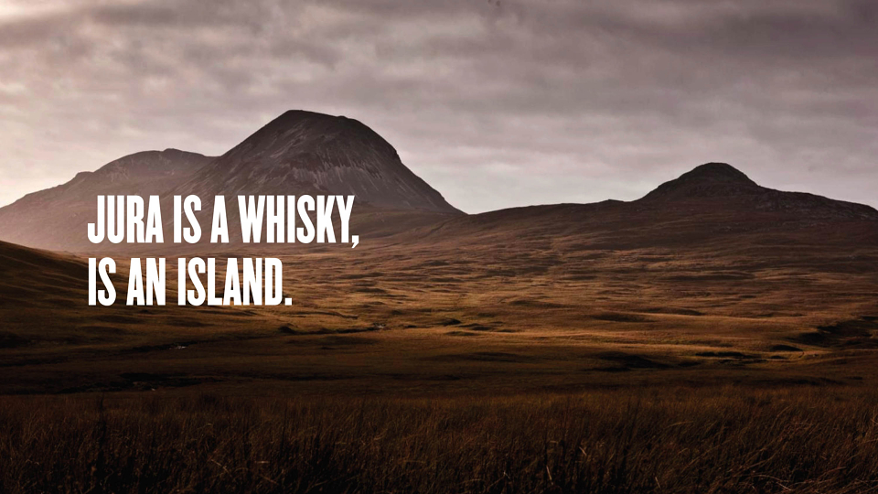
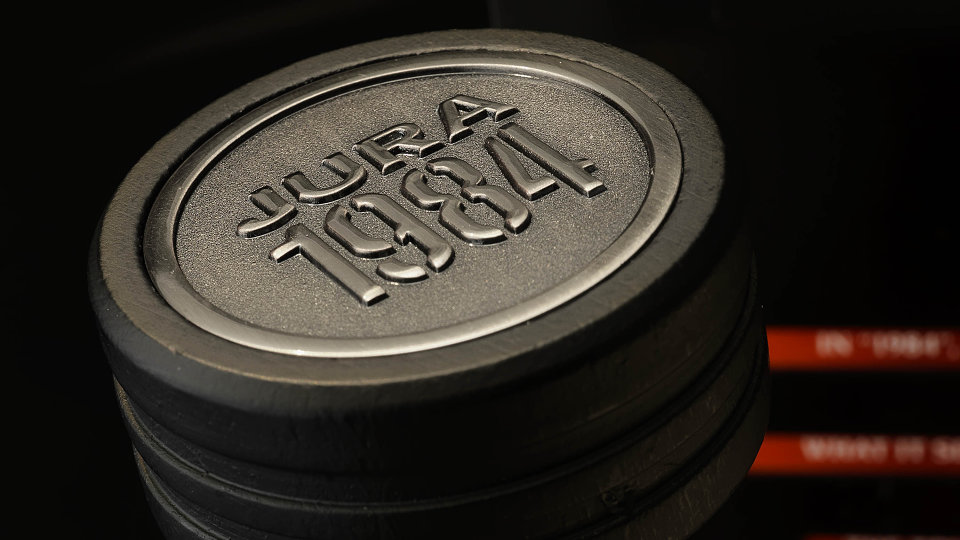
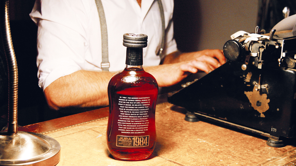
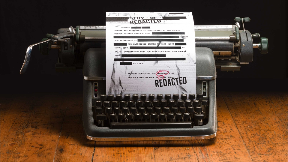
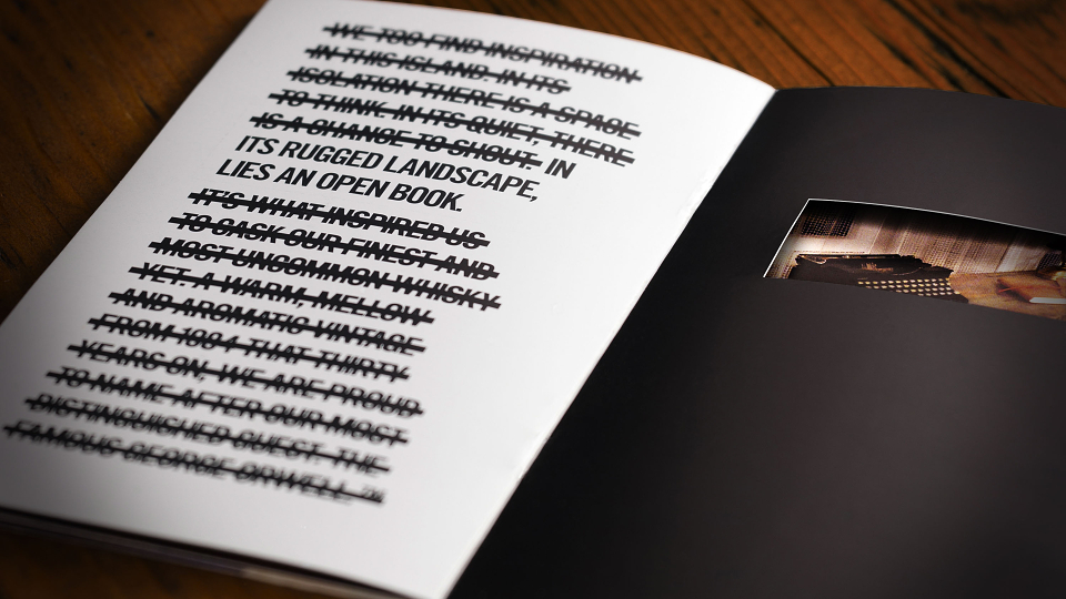
The remote island of Jura has a claim to fame beyond its famous distillery: George Orwell wrote his modern classic ‘1984’ during a stay there. Our client wanted to celebrate the link between the island and its most famous visitor by launching a limited release whisky that would ‘break the rules’ of the category. They asked us to design the packaging and brand world for a rare 30 year old malt casked in 1984 for release in 2014. Just 1,984 bottles went on sale.
The creative idea
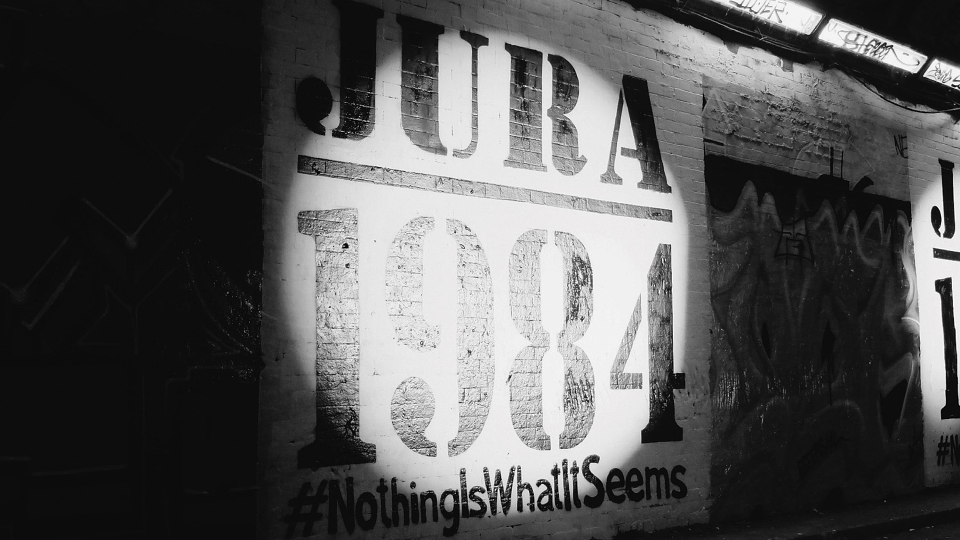
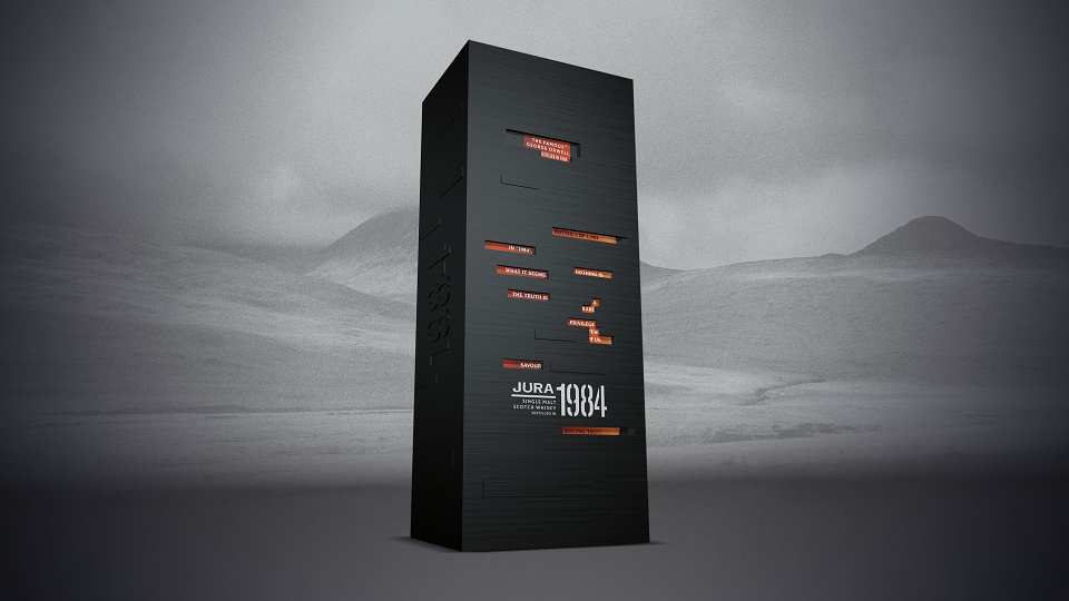
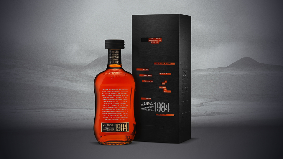
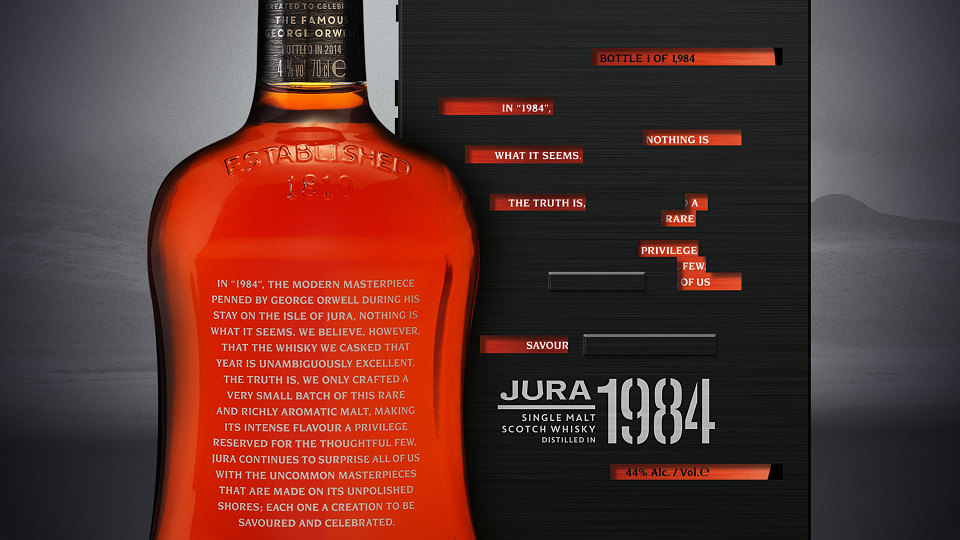
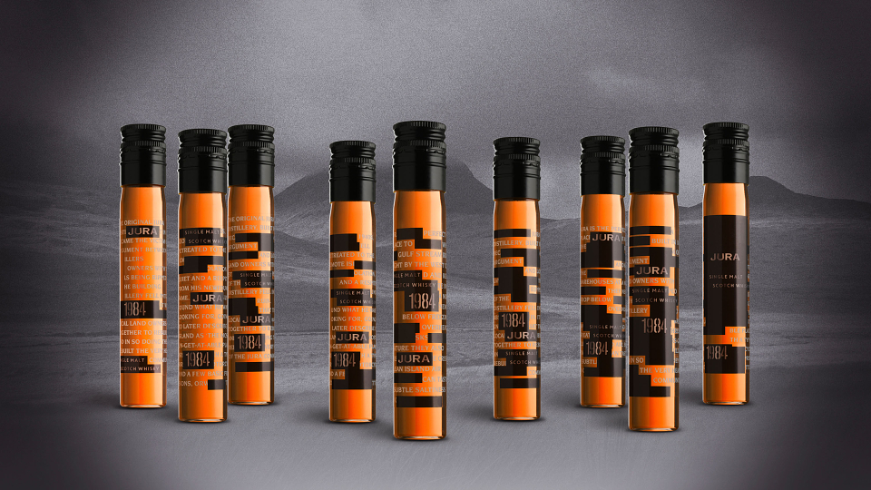
The themes of censorship, menace and mistrust were our creative inspiration, allowing us to reject traditional whisky category cues in favour of something much more haunting. The idea of censorship is expressed through the visual motif of redacted text played out across media packs, website and printed collateral. On the primary packaging, the idea is achieved by die-cutting the outer box to ‘censor’ the words on the bottle within. Once the secondary packaging is removed, the full copy on the bottle text is revealed. The result was two texts with very different meanings - the outer dark and menacing, the inner bottle text hopeful and poetic. Using this idea across all branded platforms enabled us to reinforce the idea of hidden meanings and dualities through the design. ‘Nothing is what it seems’ is an idea that inspired the campaign through the line.
Design for growth
“jkr’s imaginative interpretation of the brief has created something truly different in the premium malts category.” Jura Brand Team
MADEIT CREDITS
-

Jura 1984 VintageClient
-

Jones Knowles Ritchie -

Matt ParkesGlobal Marketing Director -

Sean ThomasCreative Director -

Brett StablerDesign Director
Annual 2015 WinnerJura 1984 VintagePackaging
Project featured: on 6th February 2015
Contributor:
Invite
x3
Jones Knowles Ritchie has been a Contributor since 25th November 2015.