

Jones Knowles Ritchie – The Diana Award
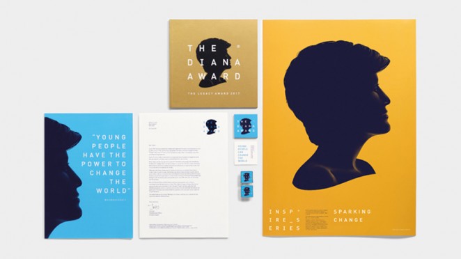
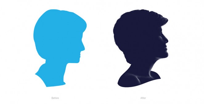
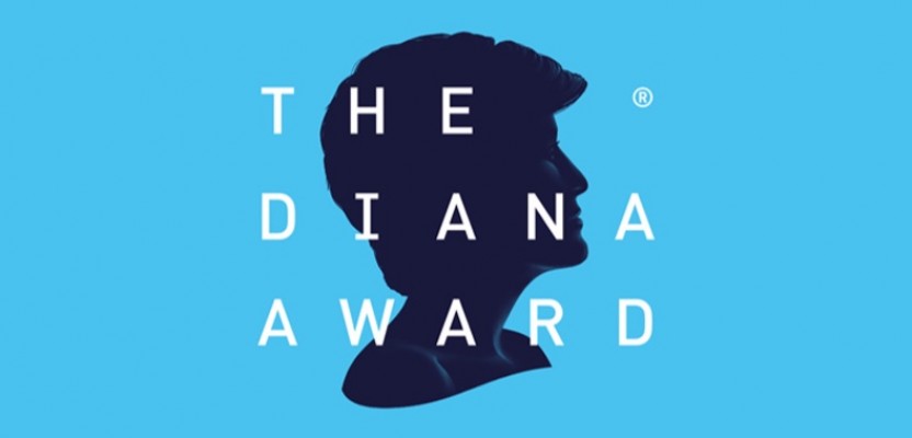
Jones Knowles Ritchie (JKR) has rebranded The Diana Award, the youth charity set up in memory of the Princess of Wales. The Diana Award was established in 1999 following the death of Princess Diana and recognises young people who demonstrate kindness, compassion and a desire to help others, and the charity also runs anti-bullying and mentoring programmes. To coincide with the 20th anniversary of Diana’s death, JKR was commissioned to create a new visual identity for the charity. JKR’s new identity for the charity is based around the concept that young people have the power to change the world, and aims to appeal to the charity’s wide audience, including sponsors and young people. The branding, which has now rolled out across all touch-points, features a new logo and a more unified look for all of the charity’s different initiatives, such as its Inspire Series. An updated logo replaces the previous, two-dimensional silhouette of Diana’s head for a darker blue, three-dimensional version that shows the Princess’ shoulders and has her head tilted slightly upwards. The consultancy has also redesigned The Diana Award trophy, which was unveiled for the first time at the inaugural Leacy Award ceremony earlier this year in May.
Smith & Milton – Chartered Insurance Institute
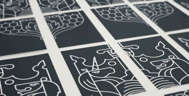
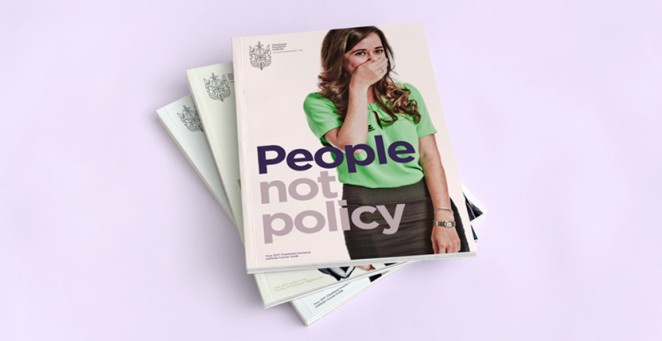
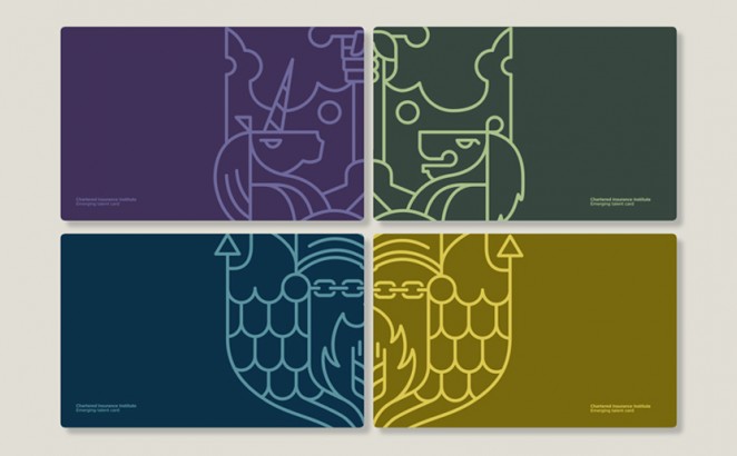
Smith & Milton has rebranded the Chartered Insurance Institute, which looks to modernise the organisation’s crest. The Chartered Insurance Institute (CII) is a professional body for the insurance and financial sectors, which looks to increase members’ technical and business skills and promote “public trust” and “integrity” in the industries, according to the company. It has over 125,000 members from 150 countries, including those from insurance disciplines such as claims, broking, underwriting, sales, life and pensions, mortgage advice and financial advice. The new logo features a redrawn, line-drawn coat of arms on the left, and the company name and slogan set in a sans-serif typeface on the right. The crest and typeface are set in either white or grey, enabling the branding to sit across a variety of coloured and photographic backgrounds. It is part of a refreshed visual identity, including a block-based system used online and on print materials that separates out the crest into quarters, and a colour palette of greys and pastels, accompanied by a secondary palette of brighter colours. The new line-drawn crest aims to be a “contemporary interpretation” of the company’s original heraldic mark, retaining the crest’s symbolism but also representing the CII as a “relevant and modern organisation.” The crest has many elements to it, including a shield denoting a salamander surrounded by a flame, an anchor shape and a wheatsheaf, a hand grasping a sword by the blade, a chain, a lion and a unicorn. The new visual identity has rolled out across the website, social media and print and marketing materials.
ASHA – The League Against Cruel Sports
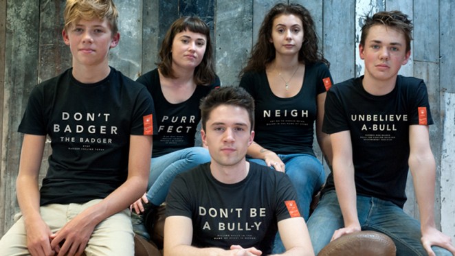
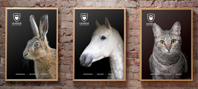
Studio ASHA has created the branding for animal rights charity The League Against Cruel Sports, which looks to humanise and empower animals rather than portray them as “weak and helpless.” The League Against Cruel Sports was founded in 1924, and looks to protect animals such as foxes, stags, otters and hares from hunting, and dogs from fighting. The charity helped to bring about the Hunting Act 2004, which banned hunting with hounds in England and Wales, but is still fighting to prevent illegal hunting. ArthurSteenHorneAdamson (ASHA) has created a new visual identity for the charity, which looks to inspire people to “change their behaviour towards animals” rather than focus on animals as “tortured victims.” The new branding is flat and monochrome, and features a heart-shaped paw print within a shield, with the charity name set in an all-caps, sans-serif typeface underneath the symbol. ASHA also came up with a new strapline for the charity (“defending persecuted animals”) which sits alongside the logo in some instances, and three categories to encapsulate the charity’s work – investigate, educate and protect. By humanising the animals, the new identity aims to make people “consider the inhumanity” of torturing these creatures. The studio has also developed copy for use across merchandise and print communications, which uses puns and onomatopoeic animal sounds to further push the human aspect, set in bold, white type against a black background. The branding has rolled out online, across print advertising materials, merchandise and in-house communications.
Vladan Pavlović – Republic of Serbia
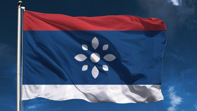
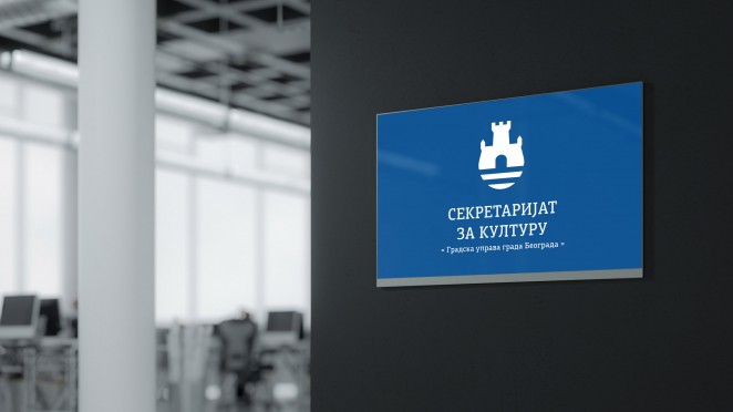
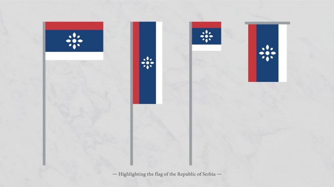
Graphic designer Vladan Pavlović has proposed a new identiy for the Republic of Serbia that presents the Balkan country as one of “peace, democracy and tolerance.” The local designer's concept visual identity for Serbia includes a flag and crest that adopt the symbol of the rosette instead of the traditional coat of arms, which dates from 1882 and was last tweaked in 2010. Pavlović wanted to explore how a new visual identity could change the perception people have of Serbia, both at home and abroad. To contrast some of the country's recent violent history, Pavlović chose to focus his visual identity on the rosette, which he describes as a symbol of unity, peace and stability – and one that has a long tradition in the region's architecture, painting, clothing and decoration. This replaces the traditional coat of arms, which currently combines the Serbian cross, fleur-de-lis and symbols of the country's former monarchy, such as the double-headed eagle. Pavlović includes the eight-petaled rosette in the centre of his flag design, which keeps Serbia's current tricolour, but expands the middle band of blue. Pavlović claims his proposed banner abides by the five principles of good flag design as outlined by the North American Vexillological Association, which advises that the pattern should be so simple that a child can draw it from memory. Using the same rosette symbol and blue colour, Pavlović has also imagined the country a new coat of arms, emblem and stamp.
Young & Laramore – The Indianapolis Museum of Art (Newfields)
When the Indianapolis Museum of Art (IMA) refocused its mission to emphasise “impacting lives through exceptional experiences with art and nature,” it hired Young & Laramore to re-evaluate their overall brand strategy and help it determine how to best reflect and communicate this new mission to the museum’s core audience, as well as a broader audience that typically doesn’t visit art museums. After studying the IMA’s segmentation analysis and performing its own Consumer Immersion with museum aficionados and broader audience members, Y&L recommended giving the name, Newfields, to the IMA’s 152-acre campus. In addition to the brand strategy and name, Y&L crafted Newfields’ identity system and even the core tenets of a visitor’s experience. Newfields, a Place for Nature and the Arts, will serve as a community destination offering dynamic, relevant and social experiences with both art and nature. The logo (a sculptural, dimensional N) is designed to showcase the wide range of experiences offered at Newfields. This logo serves as a prism through which to view these experiences, which will promote connection and movement throughout campus, encourage active participation and integrate food and drink. Newfields will officially debut in early October with a new website.