Jessie Stephenson
Graphic Designer
ABOUT
MobileLife+ is a company at the forefront of the mobile device management industry. Their goal is to provide end-to-end visibility and control over a device's life cycle, allowing their clients to focus on the big picture. Their services are tailored to each client, as they take the time to understand their unique requirements and embed themselves within their culture.
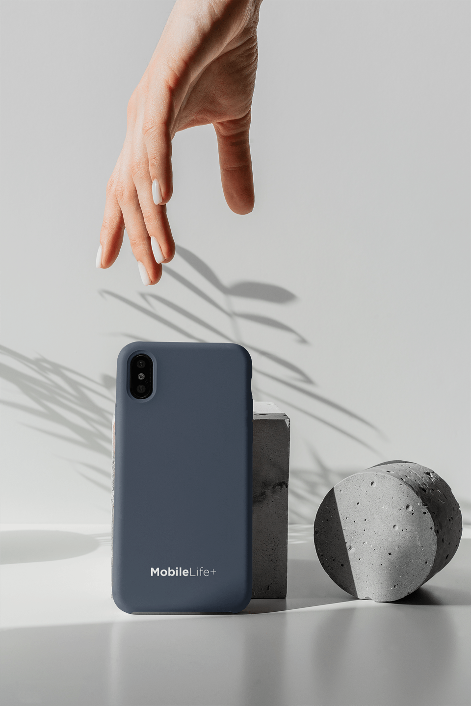
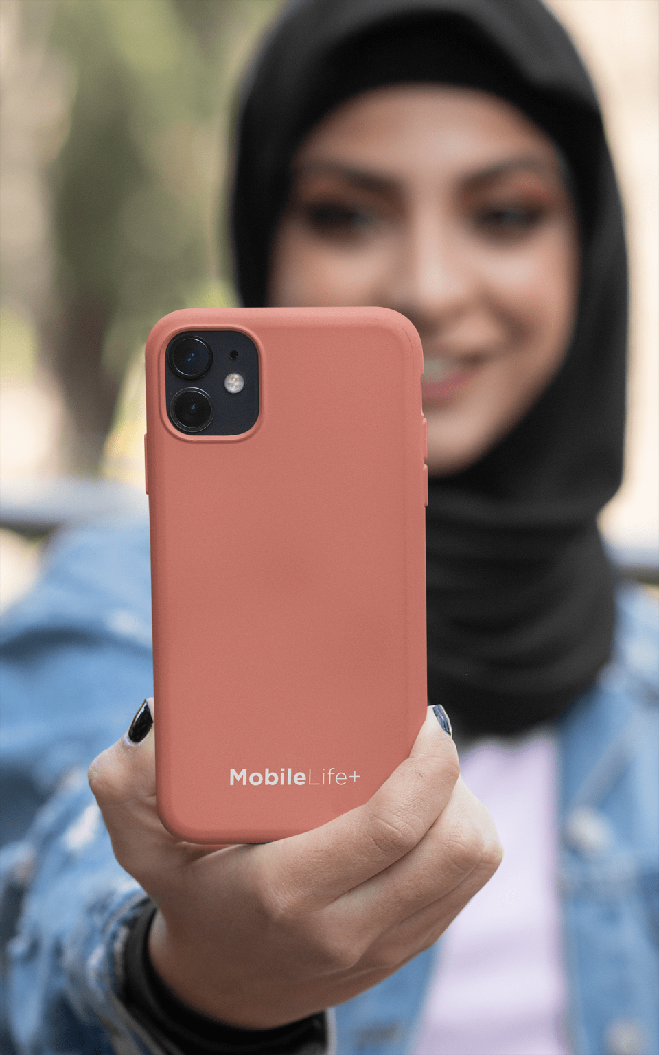
For this reason, MobileLife+ needed a brand identity that would reflect their bespoke approach to mobile device management. I was brought in to develop a visual identity that spoke to the company's strategy of personalisation and control.
I began by researching the markets and understand the industry's needs for both development and sustainability. The final result was a brand identity that perfectly reflects MobileLife+'s commitment to helping users find a more personalised and customised experience, while also maintaining control over their mobile device's life cycle. The new identity is a perfect balance between creativity and functionality.
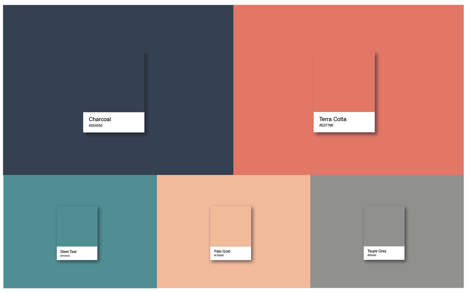
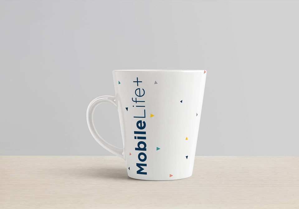
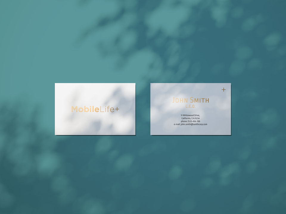
The identity is accompanied by a vibrant colour system that refines the brand’s signature Charcoal, enhances it for digital contexts and introduces new colours. The core colour system has been expanded to include Terra Cotta, Steel Teal, Pale Gold and a Grey.