Jerome Williamson
Founder
ABOUT
Overview
Twin Alibi is a dynamic cover band specialising in high-energy performances for pubs, bars, and special events. This project involved creating a retro-futuristic 1980s-inspired brand identity, including logo design, promotional materials, and merchandise that captures the duo’s aesthetic.
Project Scope
- Logo & Visual Identity
- Posters & Social Media Graphics
- Merchandise (T-shirts, stickers, beer coasters)
- Event Promotions
Challenge
Develop a bold, nostalgic, and eye-catching brand that:
- Appeals to bar-goers and event planners
- Channels 1980s synth-pop nostalgia (think neon, grids, and retro-futurism)
- Works across both digital and print (from Instagram to beer coasters)
Design Process & Concept
Brand Identity
Colour Palette
- Black & White – Timeless contrast for high-impact visibility
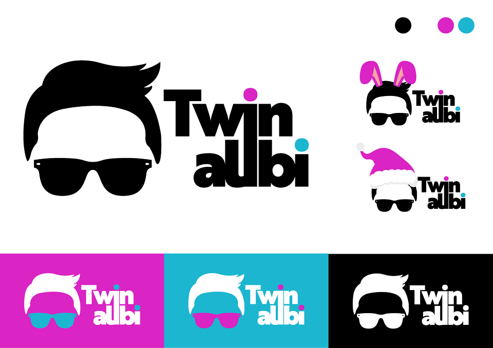
- Cyan (#00FFFF) & Magenta (#FF00FF) – Classic 80s neon vibes
Typography
- Brother 1816 – A geometric sans-serif with a retro-futuristic edge
- Creative Influence:
- Synthwave aesthetics (gradients, grids, glows)
Logo Design
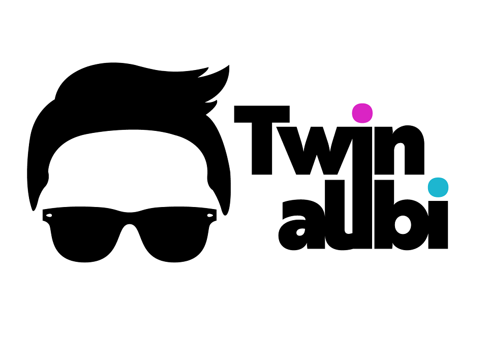
- Wordmark: Band name ‘Twin Alibi’ stacked with ‘i’ in both Twin and Alibi connected as one.
- Icon: Man’s head with only the hair and shades displayed
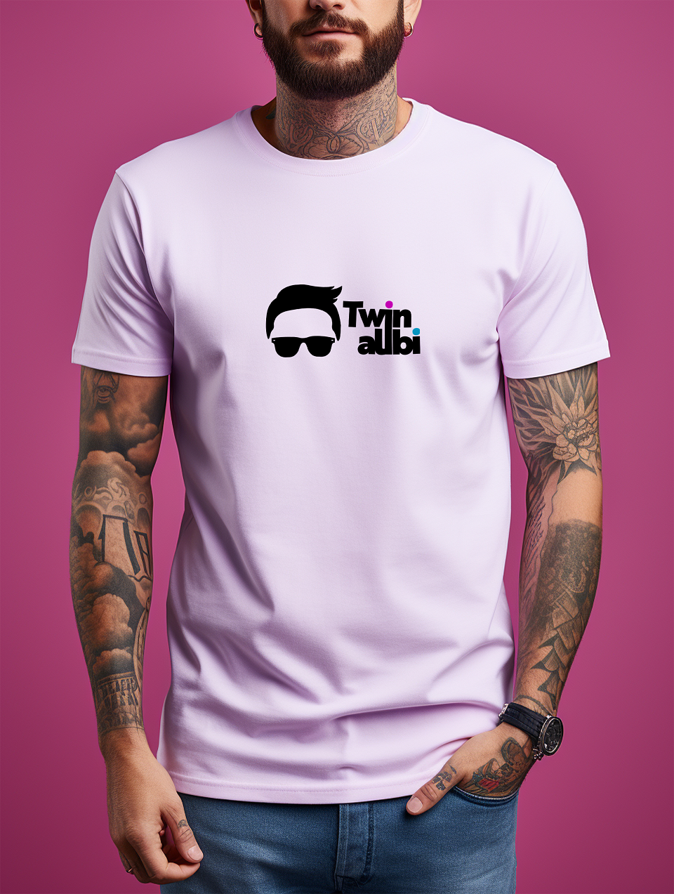
- Variations: Simplified black/white version for merch as well as full colour versions
Promotional Materials
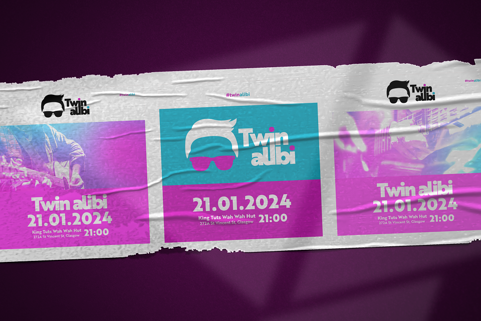
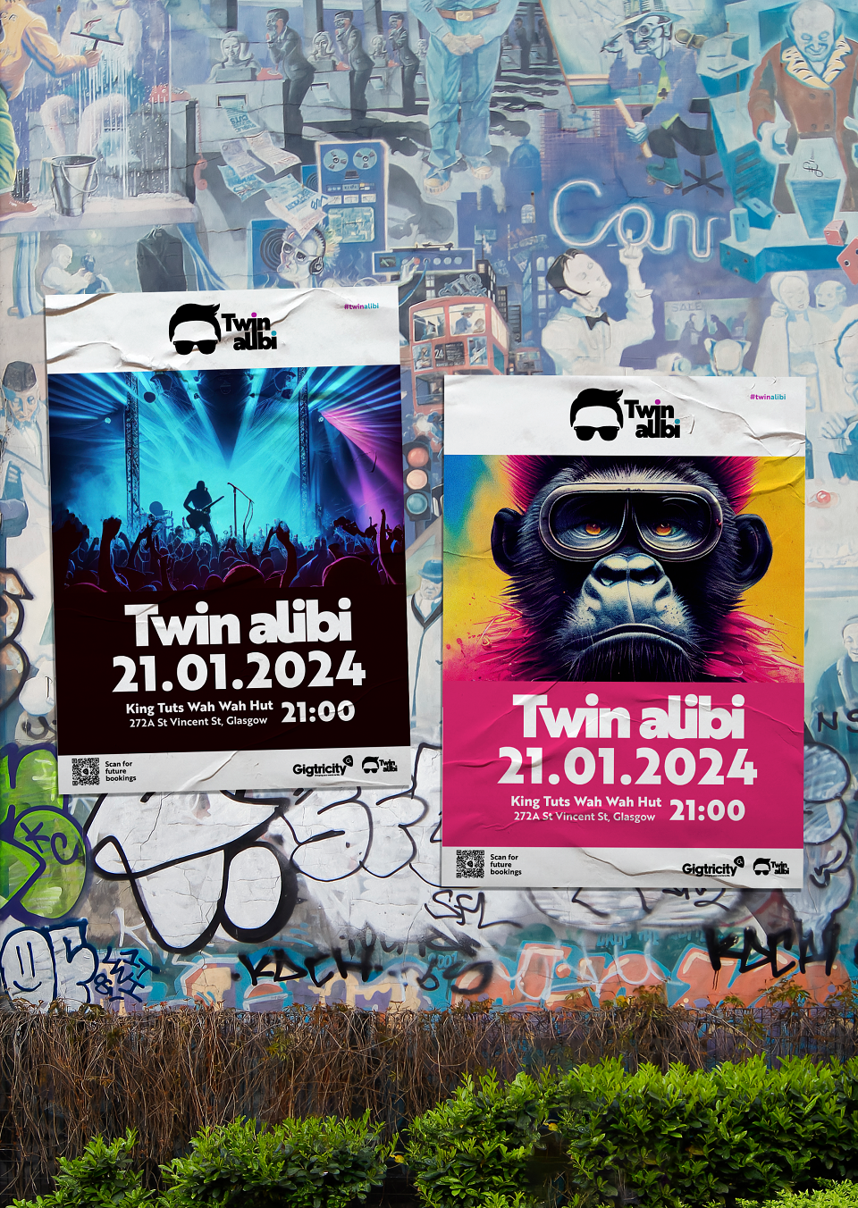
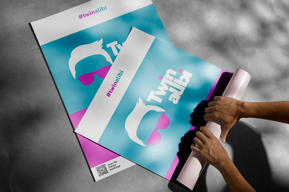
Posters & Social Media Graphics
- Grid layouts with bold typography and Duotone Imagery
- Retro screen-printed look
- Icon: Man’s head with only the hair and shades displayed, also had variations for Easter, Christmas, etc.
Beer Coasters
- ‘Twin Alibi’ Wordmark
- ‘Twin Alibi’ Icon
Merchandise
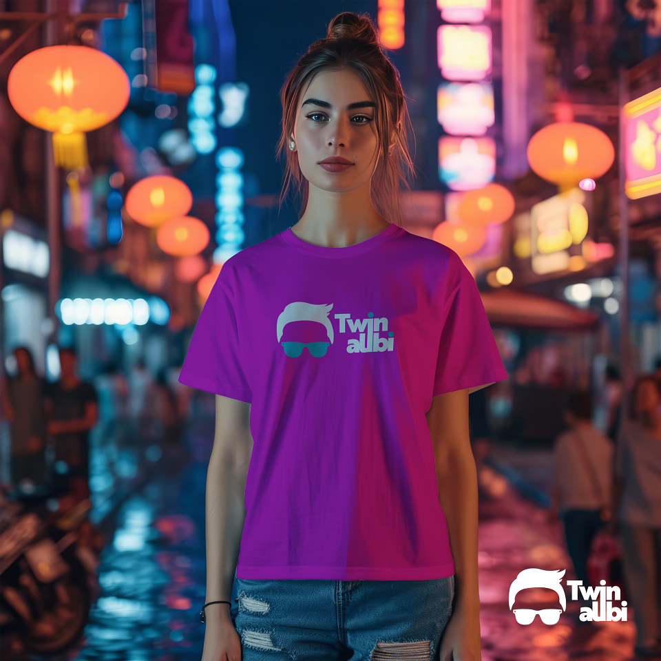
- T-Shirts: Word mark and icon, on white, black or purple t-shirts.
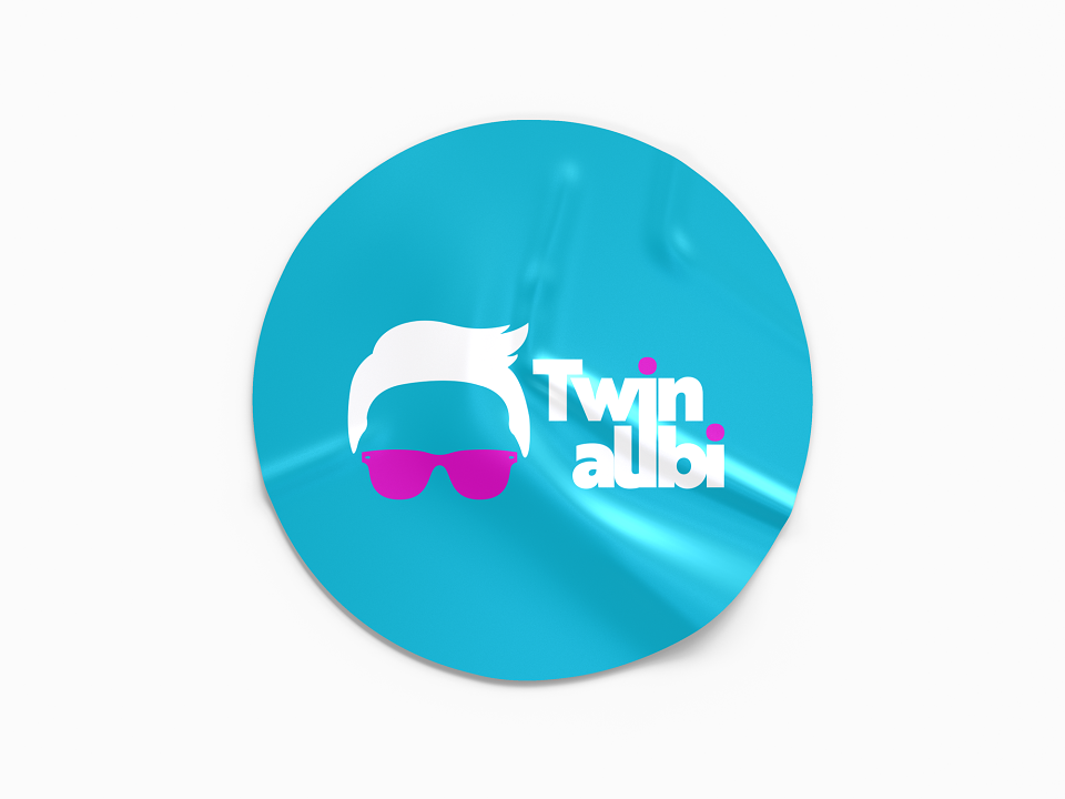
- Stickers: Die-cut with word mark and icon
- Gig Flyers are styled similarly to the posters with QR Code.