Jena Kitley
Freelance product and Graphic designer
ABOUT
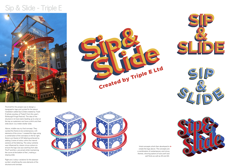
The brief for this project was to design a typographic logo and symbol for the above installation called Sip & Slide created by Triple E (photo courtesy of Triple E from this year’s Edinburgh Fringe Festival). The idea of the structure is to have stairs leading up to a bar at the top so customers can have a drink and then slide down via a helter-skelter slide.
They wanted the theme to be contemporary with elements of the circus. The final concept creates an illusion of 3D lettering achieved by adding 2 tones of colour within the internal sections of the lettering. The colour scheme was in influenced by classic circus colours to ensure the logo was eye catching from afar. The P and the L are joined whilst maintaining the curve at the bottom of the L making a sloping slide.