Jan
Creative Director
ABOUT
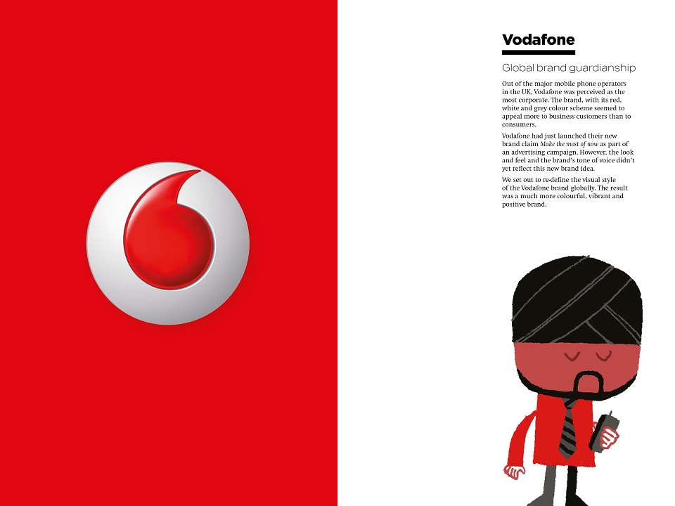
Out of the major mobile phone operators in the UK, Vodafone was perceived as the most corporate. The brand, with its red, white and grey colour scheme seemed to appeal more to business customers than to consumers.
Vodafone had just launched their new brand claim Make the most of now as part of an advertising campaign. However, the look and feel and the brand’s tone of voice didn’t yet reflect this new brand idea.
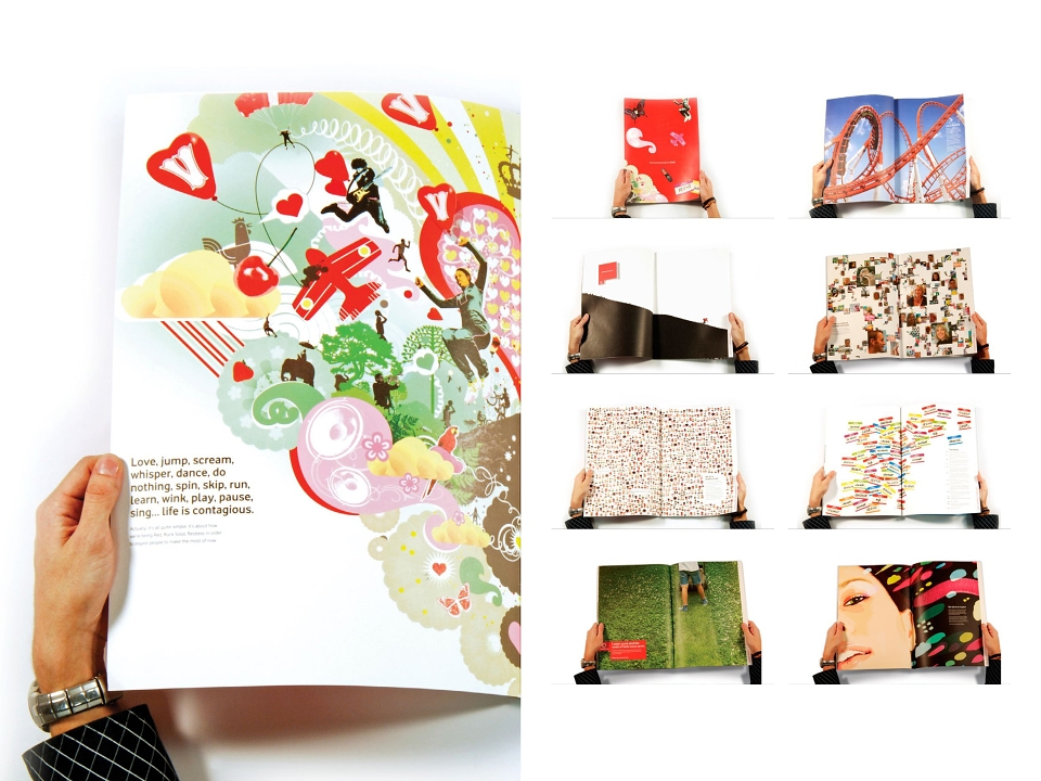
We set out to re-define the visual style of the Vodafone brand globally. The result was a much more colourful, vibrant and positive brand.
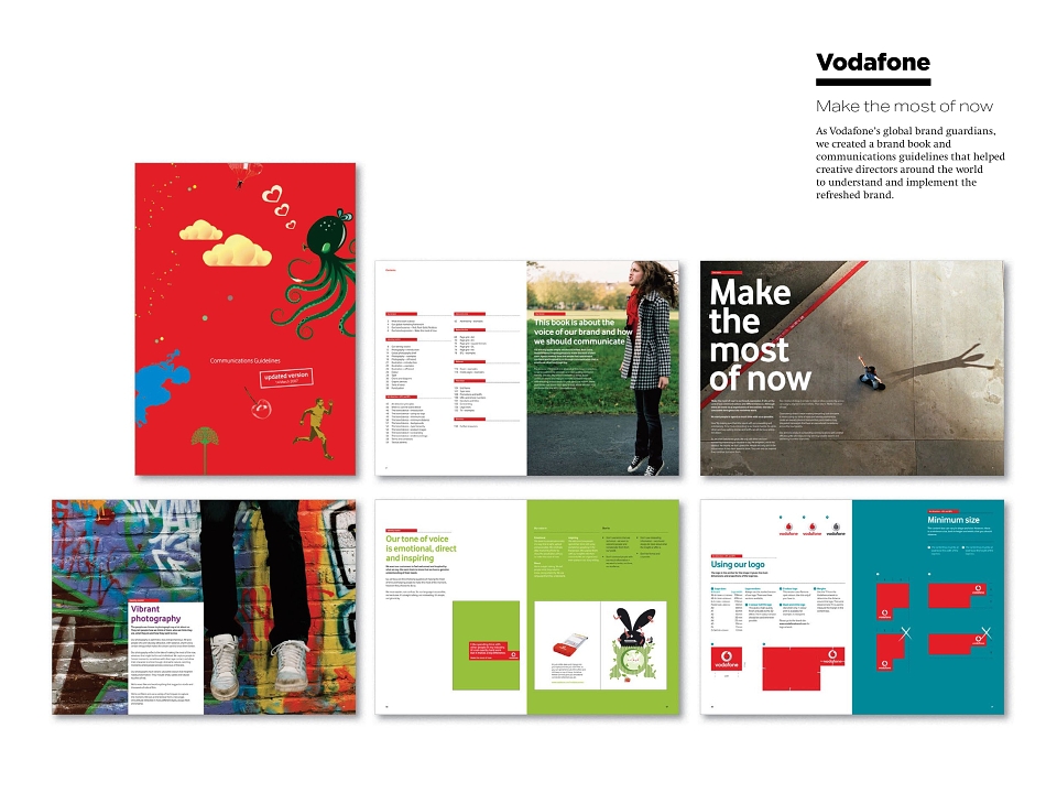
As Vodafone’s global brand guardians, we created a brand book and communications guidelines that helped creative directors around the world to understand and implement the refreshed brand.