Jane Barges
Junior Designer
ABOUT
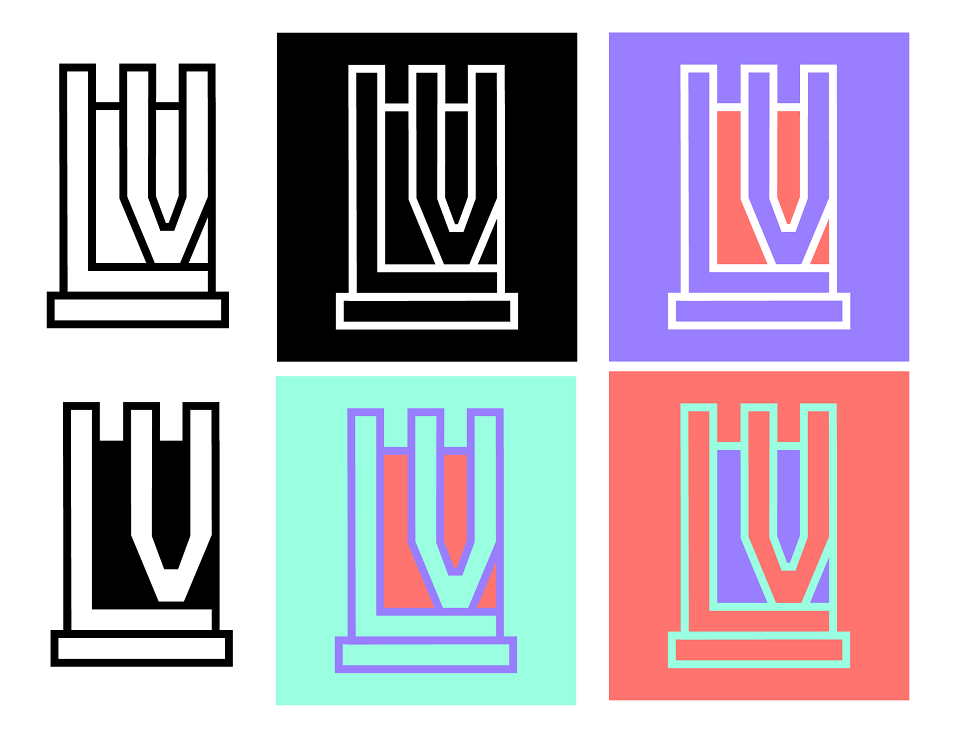
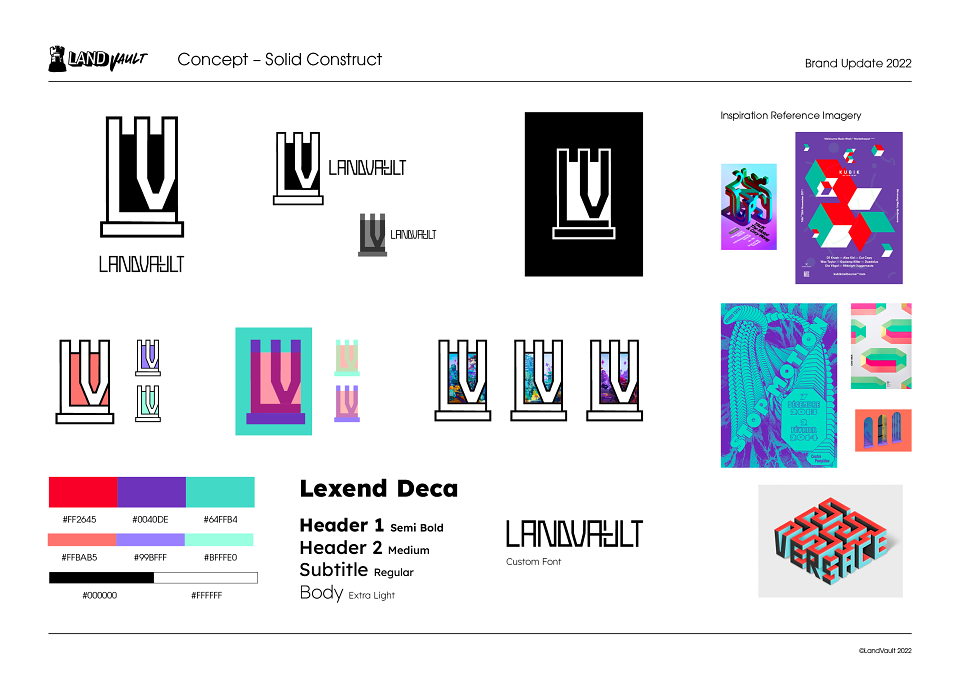
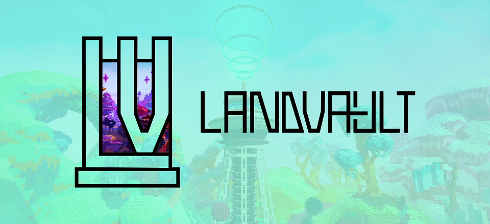
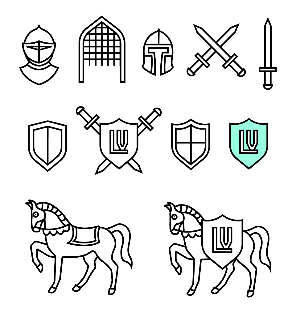
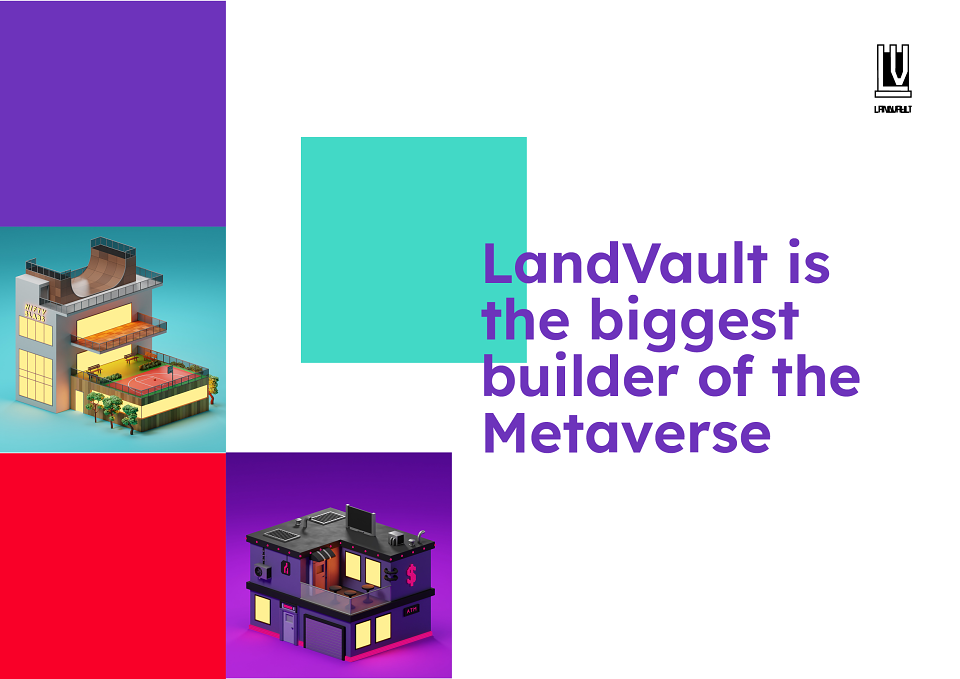
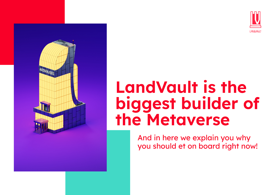
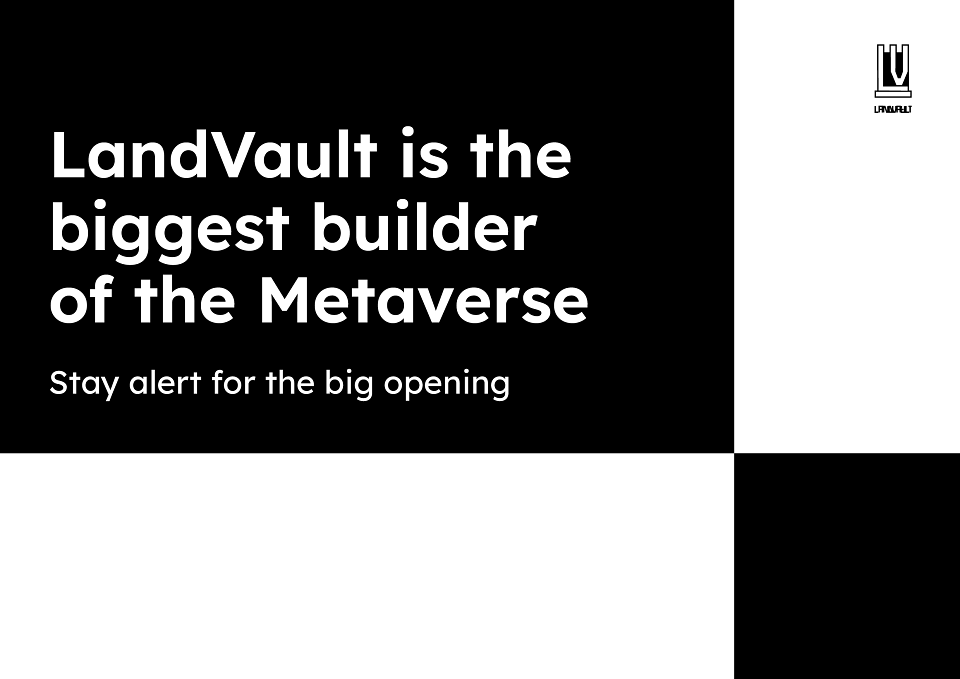
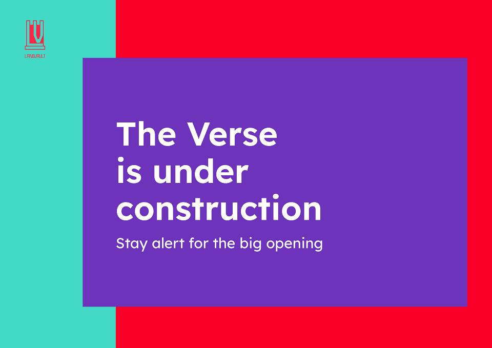
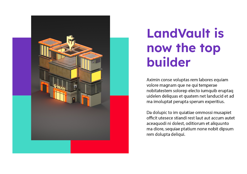
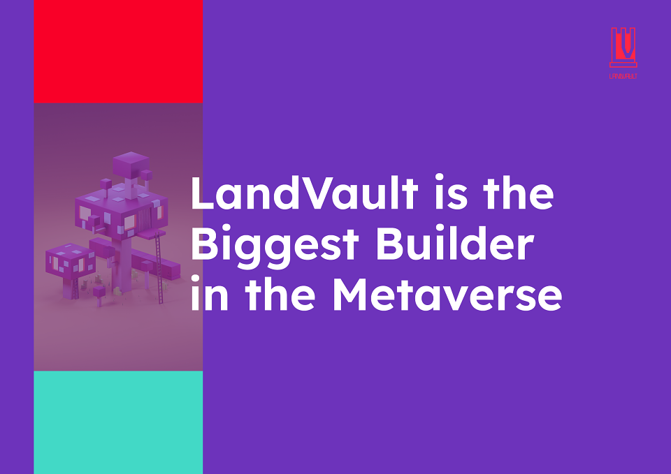
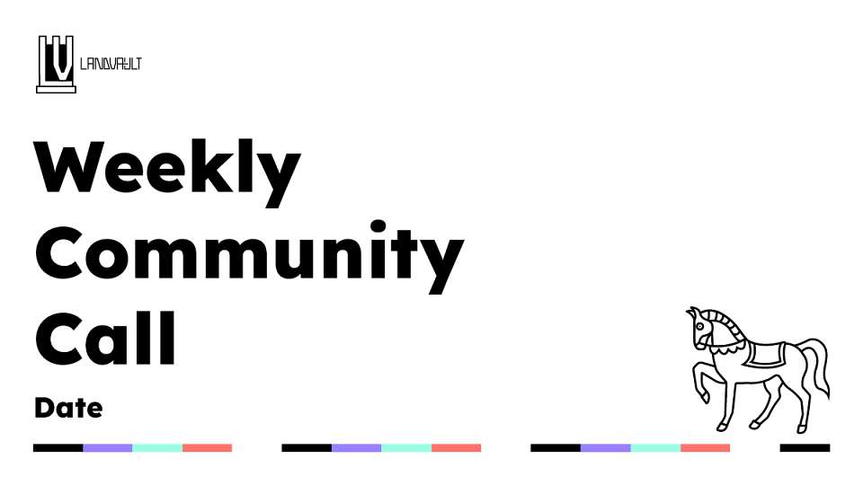
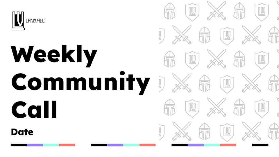
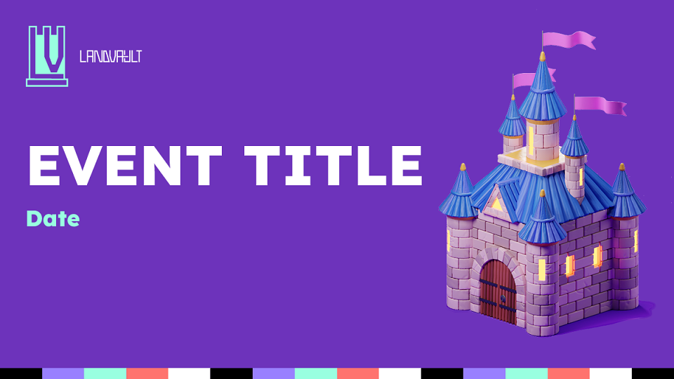
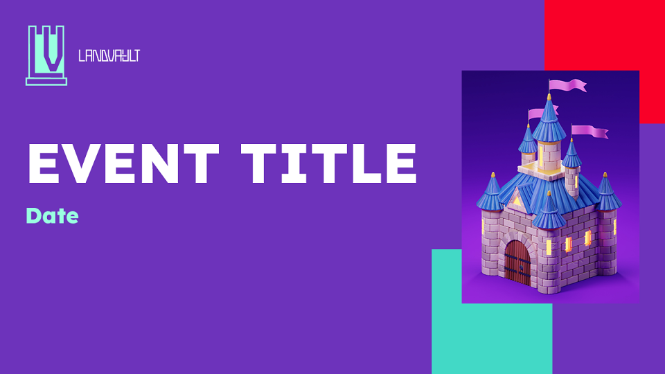
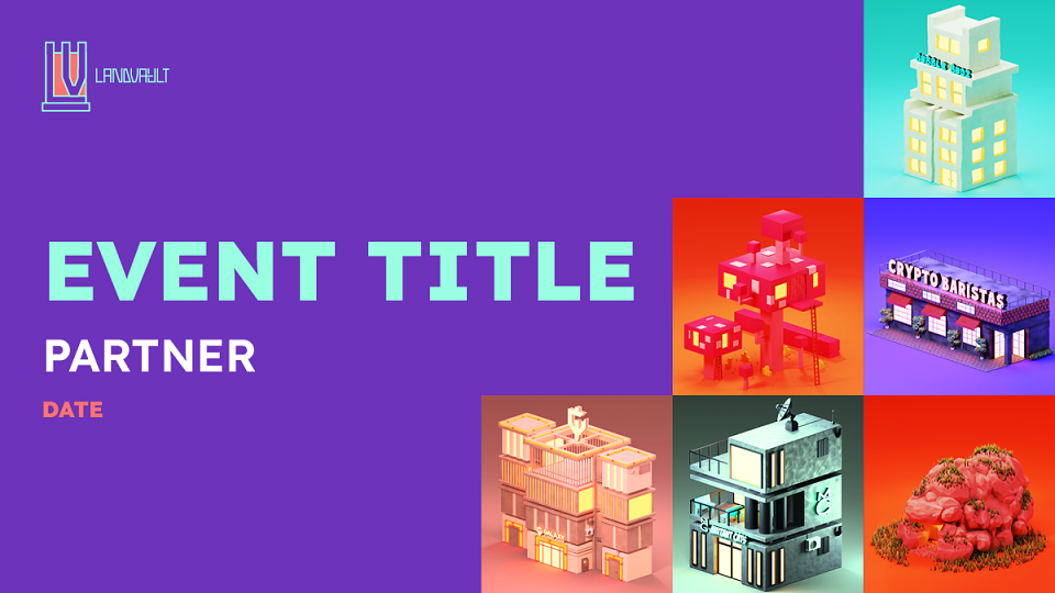
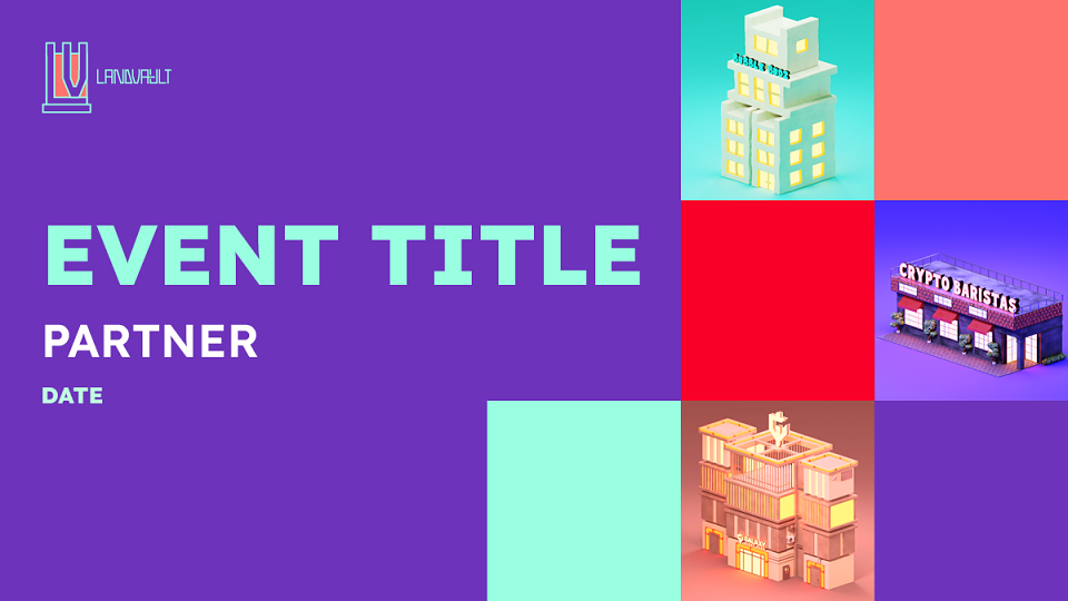
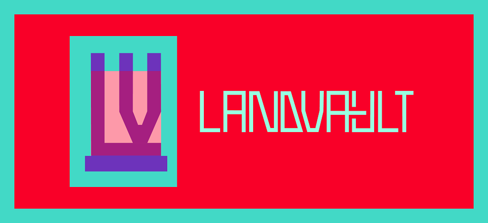
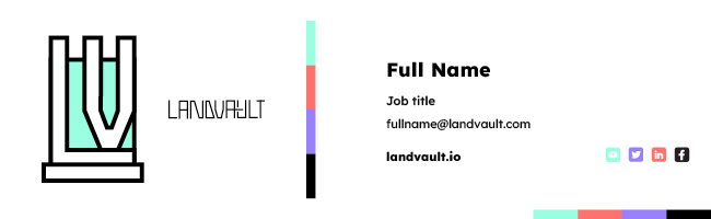
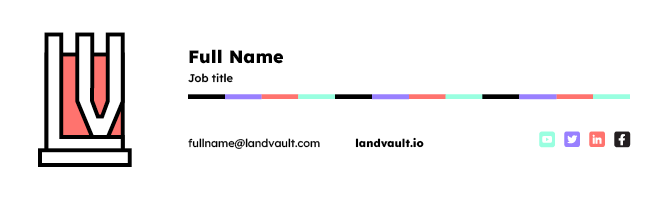
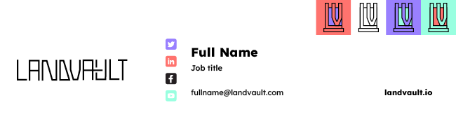
Set by my creative director, I worked on this rebranding exercise during my time at LandVault as a graphic designer. The aim of the project was to not only build on my branding skills but also find a fun, clean alternative to the existing branding, that was still synonymous with the brand identity. Using the imagery of the rook as the basis for my brand concept, I played around with creating a playful, medieval yet modern visual universe. This included a fresh colour palette that alluded to creativity and the web3 space, combined with clean line icons relating to castles and rooks. I used lettering in the logo to make a more recognisable icon that was simple yet effective and flexible. These images include slide deck layouts, social post templates, email signature templates, icon selection and server profile pictures.
MADEIT CREDITS
-

Jane BargesGraphic Designer