James
Graphic Design, illustrator
ABOUT
Characteristics of Identity
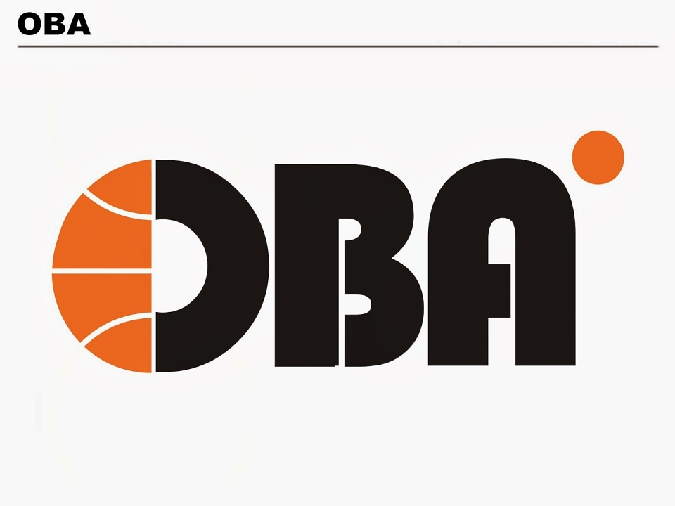
Unlike other projects in my past where information about the organization or business was a big part of the concept process, however the design work came from the lack of information gave to me the chance to play with idea of the design that usually I wouldn't do. The design concept came use of spaces that can be found ether on the sports field or those found on a ball.
All thought this design is for a oragaztion for sport and mainly for the use of basketball the design has retro felling to and reminds me of PAN AM travel and some close to the design of Saul Bass.
• Under 16’s and their parents
• Sport fans
• Basketball
• General public / Events
• Education (teachers, schools and colleges and universities)
Strengths of Identity
Unlike other identity in area of sport it doesn't heavy alley itself with the identity of sport, by doing this is helps it stands on its own and being soft on the eyes.
Weakness of Identity
They are few weakness to this design, start of with being mainly linked with sport of basketball and not being linked with sports, but you could argue that that is strength I see it as part of the weakness. The other weakness is not using colour. Although logo design mainly based in black and white, when it comes to this design the black and white design is a strong message but the use of colour gives that little bit of kick.