James Flint
Designer
ABOUT
WMH&I rebrands London’s biggest education business partnership charity to continue its purpose as a flagbearer for a more diverse workforce in the city.
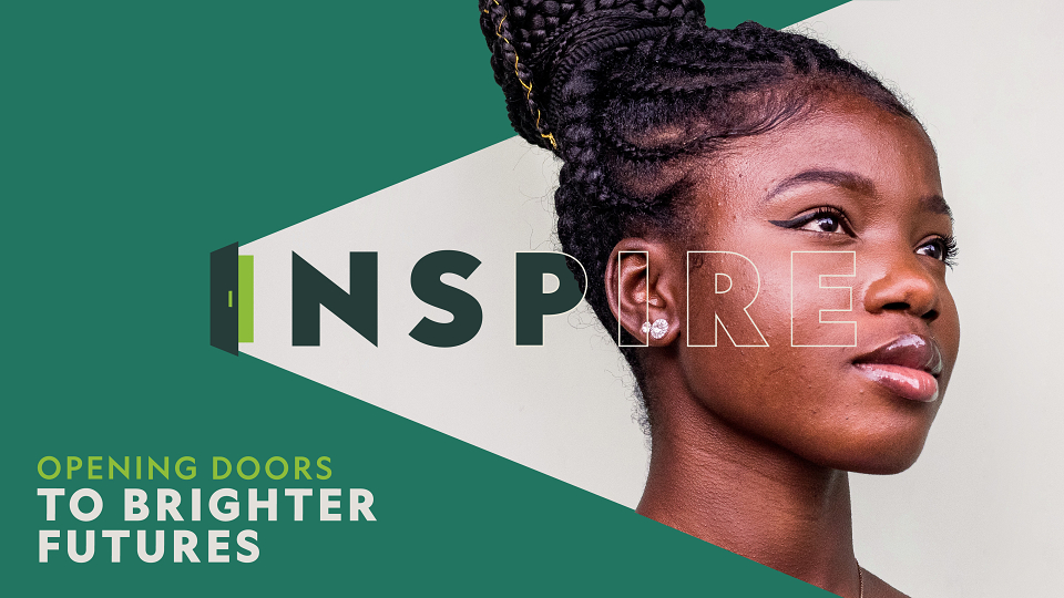
INSPIRE is a London-based Education Business Partnership (EBP). The charity works with schools to provide Work Experience, Work Related Learning and Careers Education. By linking the worlds of business and education, INSPIRE opens doors of work opportunities to young people across the capital.
Since 2004, INSPIRE has been on a mission to break down the barriers that hinder social mobility. They want to make aspirations achievable for all young people, regardless of class, gender, race or ability. That’s why INSPIRE makes the connections to business more accessible to young people, whilst also changing the perceptions in business, which currently might stop hiring people from more diverse talent pools.
INSPIRE works in the London boroughs of Hackney, Islington, Camden and Westminster. Earlier in 2022, it decided to merge with another London EBP called 15 Billion, who cover Newham, Redbridge and Barking & Dagenham. This merger provides the opportunity to touch the lives and careers of many more young people across the capital and beyond, whilst also providing crucial data to local authorities.
WMH&I wanted to reinforce INSPIRE’s position as a flagbearer for a more diverse workforce across London. After the merger, the organisation decided to keep the INSPIRE, as the stronger and more established charity. However, from an organisational point of view, the two charities merged equally. WMH&I had to therefore create an identity that the entire organisation could relate to.
Although the new identity needs to appeal to young people, INSPIRE’s main audience is those who want to inspire and inform young aspirations. Therefore, in creating this identity, WMH&I had to appeal to multiple audience groups.
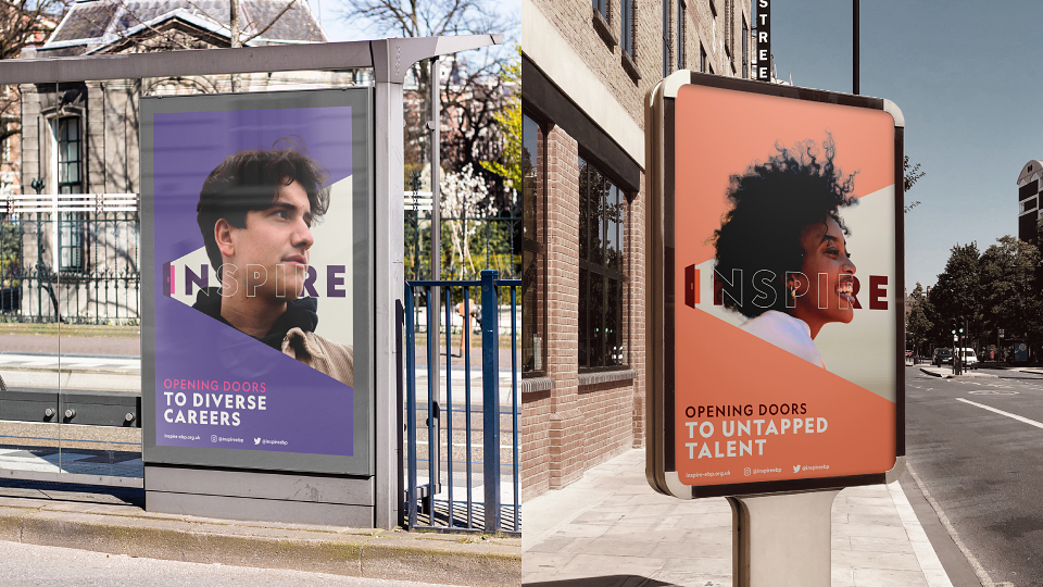
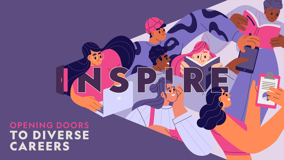
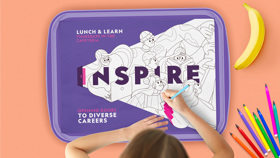
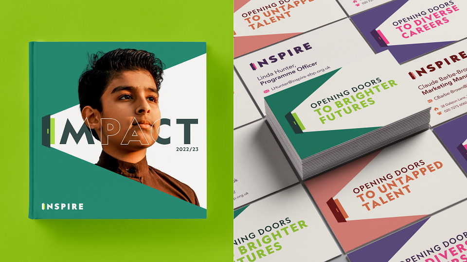
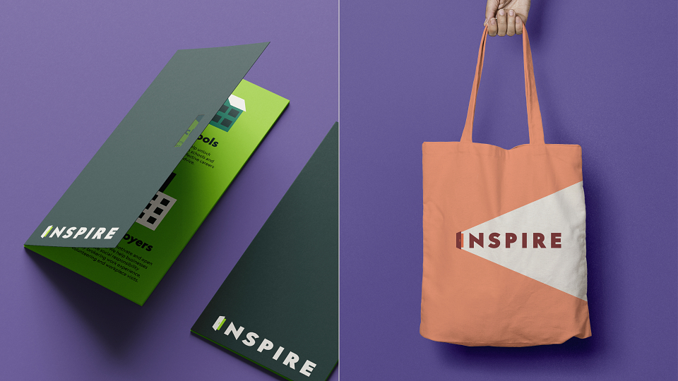
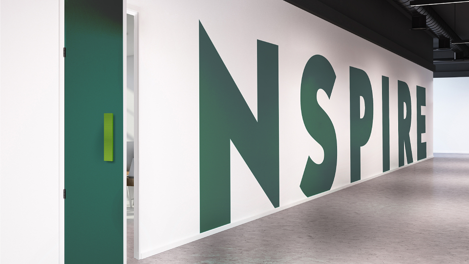
The design of the INSPIRE identity is a visual metaphor for the charity’s role in opening doors of opportunity for young people. The ‘I’ doubles as an open door with an optimistic beam of light. It forms the basis of the brand system, holding photography, illustration and typography - all of which follow the direction of light, creating a sense of optimism and positivity. The door monogram is peppered throughout the identity and is used outside the logo in illustration and icons. The tone of voice adds further personality, playfully using messaging around open doors and opportunities.
INSPIRE's rebrand ranges from key visual assets used across posters, web and moving image, also including a comprehensive kit of parts including PowerPoint, Word and Canva templates that enables the charity to engage in partnerships with employers and schools.
MADEIT CREDITS
-

InspireClient
-
Dan ColemanGraphic Designer -
Phoebe PriestleyGraphic Designer -
West One ArtsTypographer -

WMH&I -

Wybe MagermansGrowth & Development Director -

Mark NicholsCreative Director -
James FlintDesigner -

James FlintDesign Director