Jake Roycroft
Not Employed
ABOUT
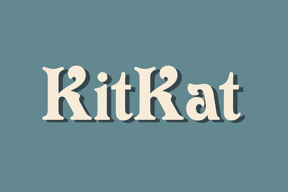
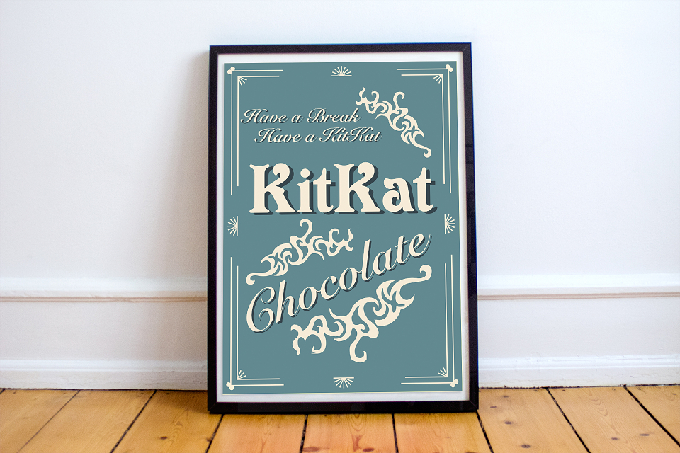
This was one of my favourite projects for typography during University; this involved picking a new brand and making it look Victorian using colours and typography. I decided to use Kitkat because I thought it would be interesting to see what the brand would look like with different colours and typography; compared to the bright red and sans serif font it currently uses. Although old chocolate posters like Cadbury were useful for research, I found that old canal boats had a nicer style; they had rich colours, the names were painted by hand, and they had lots of decoration. I really like my poster because the two different fonts work well and contrast with each other; “Kitkat” stands out against the other text because it’s bolder, the colours work well together and contrast with each other, and it looks Victorian. I did try screen printing this poster to create a more hand-made Victorian look, but I wasn’t happy with the results; this was because I had to mix the colours myself using CMYK inks, and the colours looked nothing like the posters here.