Jake Roycroft
Not Employed
ABOUT
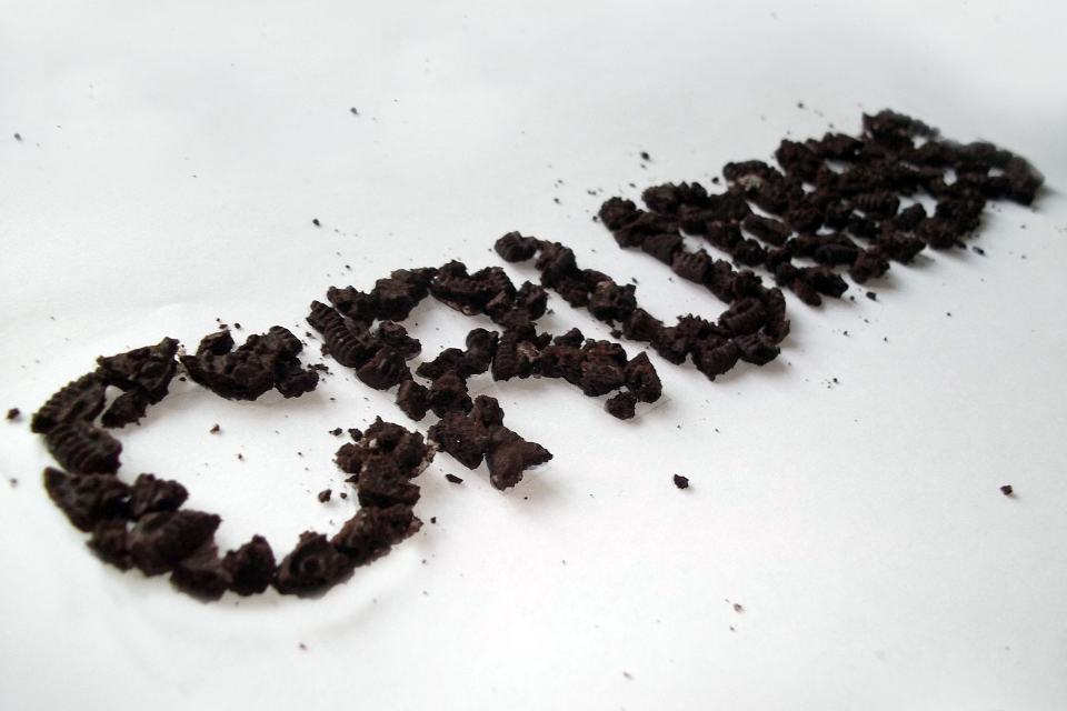
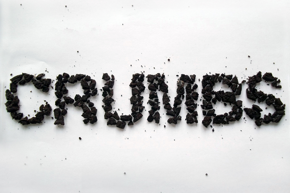
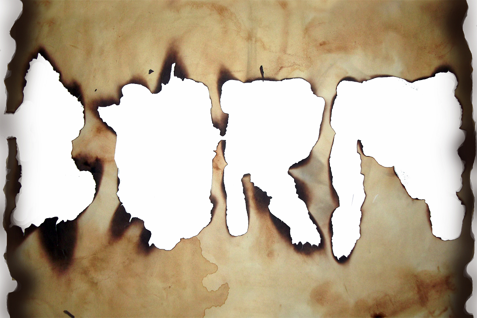
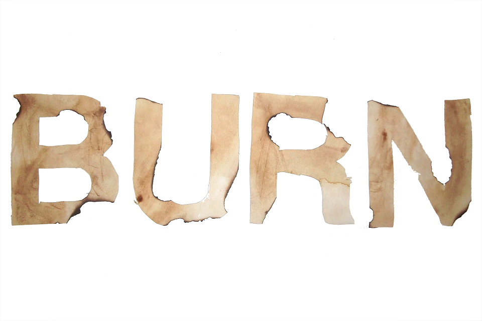
Part of the typography module required me to create experimental typography; the weirder it was the better it was. I made the first one by printing off the outline for the word “crumbs” but making sure it was a faint outline, then I crushed a few oreo biscuits into small crumbs, and then carefully arranged the crumbs inside the outline. I used Helvetica Neue because I wanted a neutral typeface; the word and crumbs had to stand out the most. I really like this because it looks clean and crisp contrasting against the background, it is a unique type style, and I got to eat it after it was photographed. The second experimental typography was created by writing the word “Burn” in outlines using a pencil; I then burnt away the outlines by using a match. I like this type because it is very rough so it suits the word well. I didn’t really get to pick a typeface because I couldn’t control what the fire burnt away; the middle of the “U” was burnt away because of this. The third one was similar but I cut out the letters first and burnt the edges instead, I also used Helvetica for this one.