Jake Roycroft
Not Employed
ABOUT
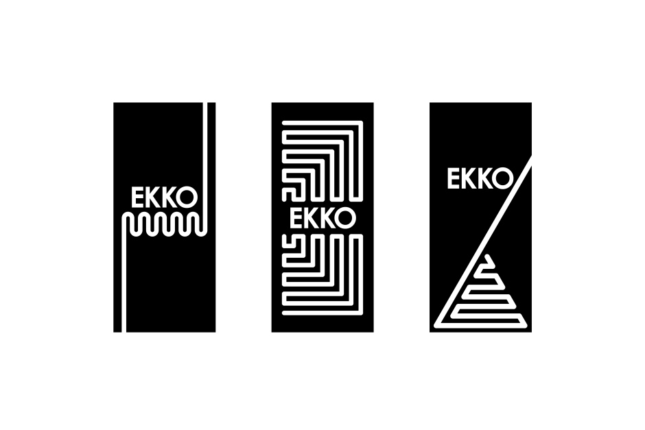
During the holidays I had the great opportunity to do a week of work experience at Uniform; a graphic design agency in Liverpool. Whilst I was there I helped on various jobs and live briefs with other designers, one job involved me creating a brand mark for a new concept that they were working on, Uniform were experimenting with conductive ink to create “Digital paper;” this ink could be touched and the pulse in the finger would activate something. The logo had to fit on a small 30mm wide box, so the logo had to be quite bold so it could still work on a small scale. The lines used on the logos were influenced by sound waves, the Arctic Monkeys logo, electricity currents, and connected lines. After creating a large list of names for the concept, Eko was selected to represent how the touch of the finger echoed out to activate something, and then it was altered to Ekko because people pronounced it better. I really like the logo because it is very simple and contemporary, it is bold and eye catching, it looks very sophisticated, and it suits the concept well.