Jack Perrett
Designer
ABOUT
THE CHALLENGE
Typhoo presented Mad River with a tough challenge. Herbal teas and infusions have become predictable, fixed and – in some cases – a little fusty. We were asked to create a new brand for new drinkers. How could we reinvigorate herbal infusions to introduce Gen Z into the category? How could we cause genuine reappraisal amongst the mainstream brands that have become too middle aged and predictable? Most critically, how could we disrupt the category, building positivity, rather than just standing out for being rebellious?
THE APPROACH
Both the Mad River and Typhoo teams have long experience in herbal infusions. With both sides questioning the orthodoxies in what has become a predictable category in capturing flavour descriptors and vague, functional benefits?
We weren’t afraid of radicalism. Adamant that our messaging would be free of bull and the design should stand apart from any other, we ran an audit of the blends and claims of the players in market. We learned the truth about efficacy in herbal infusions and what plants, seeds and botanicals actually do – from an accredited, scientific view – for human biology.
We also analysed consumer behaviour in retail and grocery multiples, and food service and wanted to present a brand that people discover through packaging. Consistent in the market is a generous use of colour, lots of tessellated patterns, gentle illustrations of plants and plenty of geometrical design. The overall impression speaks of - and to - middle-aged ladies in comfortable teashops, safe and unadventurous.
Reviewing efficacy, we asked obvious questions. What does each ingredient in a herbal mix actually deliver? Why should anyone believe the claims about well-being? Does the stuff really do what it says on the label? We were determined that any mood and moment enhancing effects would have a basis in fact. We were helped by the commitment of the Typhoo team, drawing upon 140 years of scientific wisdom and a matchless knowledge of flavour profiles. We all reached the same two conclusions: 1) we needed to be more, not less, scientific in our approach and 2) rather than present ourselves with po-faced pseudo-science, we should be less serious and reverential. ‘Keep it real’ was the mantra on both counts.
THE SOLUTION
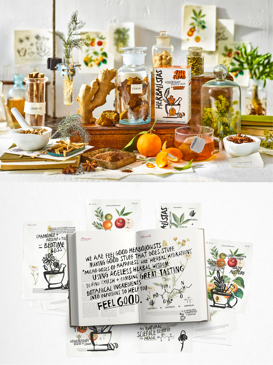
In response, The Herbalistas was born as a description of the expertise behind the brand. It became our name, encapsulating a shared attitude amongst the people who ‘get it’. It was an ownable play on ‘barista’ which speaks of an expertise worn lightly.
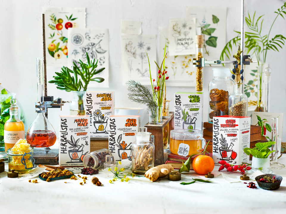
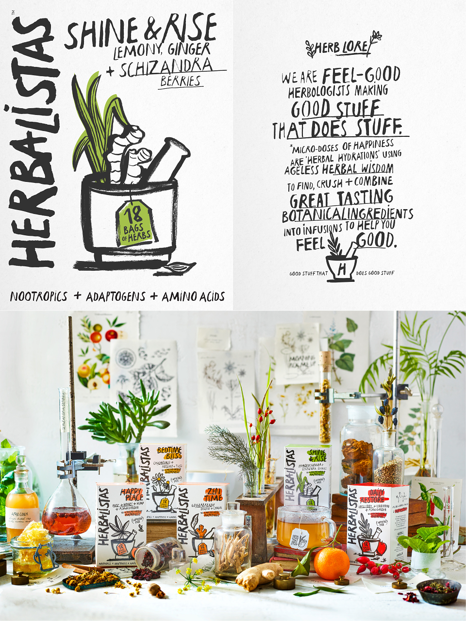
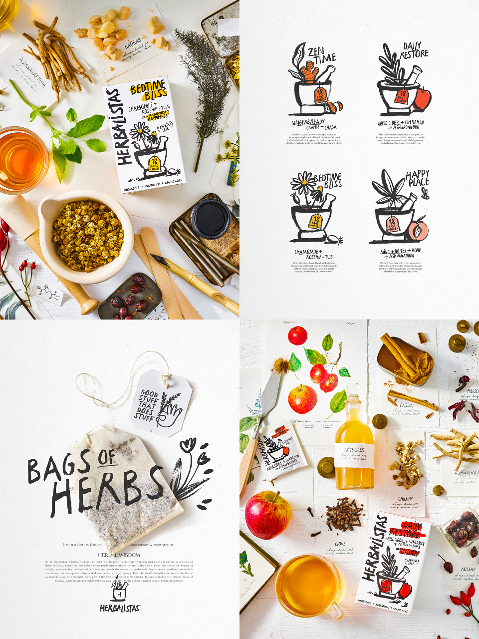
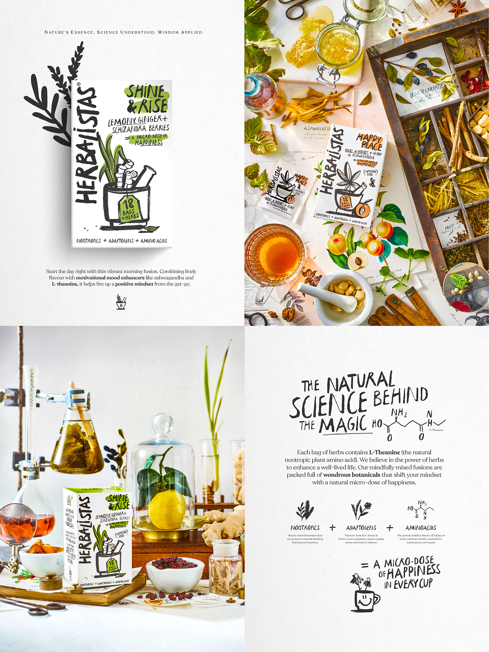
The product range has five flavours, delivering particular functionality which we named Zen Time, Bedtime Bliss, Daily Restore, Happy Place and Shine & Rise. The benefits sing out. We introduced new, simple language using the factual term ‘bags of herbs’ rather than tea bags and any new terminology – ‘adaptogens’, for example – was explained with ringing clarity.
It isn’t about herbal tea as a religious experience, but one that delivers what it says, when it says, with refreshing irreverence, summarised by the Herb Lore we created on pack:
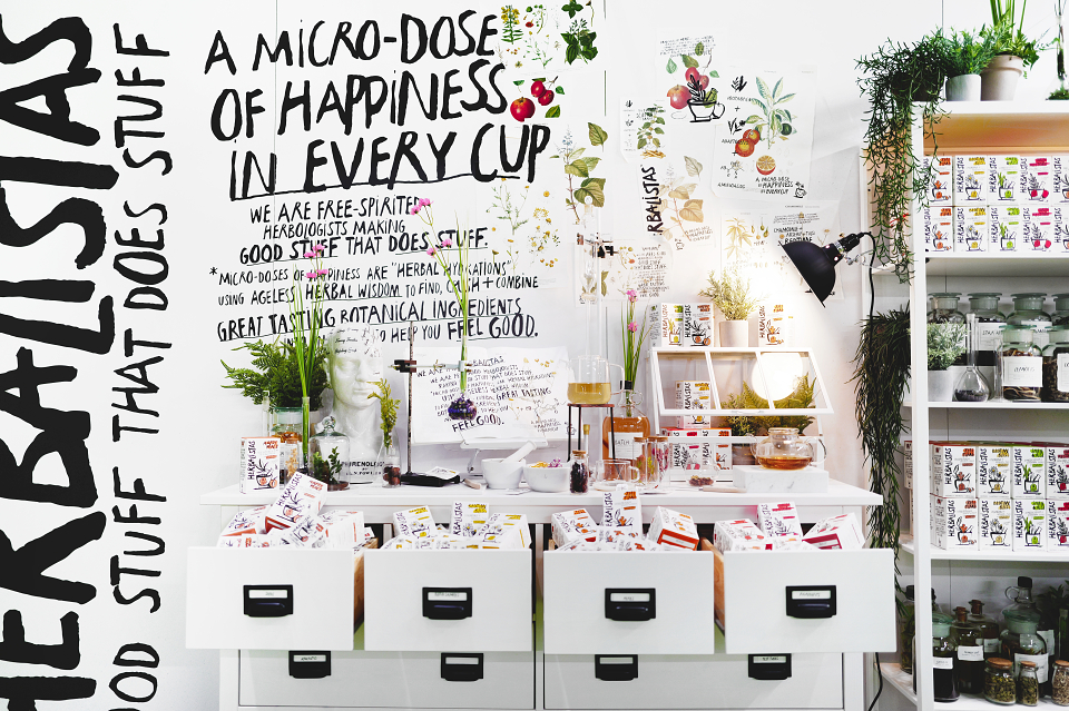
“We are feelgood herbologists making good stuff that does stuff. Micro doses of happiness are herbal hydrations, using ageless herbal wisdom to find, crush and combine great tasting botanical ingredients into infusions to help you feel good.”
Building a bespoke typeface for the identity itself and key messaging was deliberately random to replicate the herbologists own hand, marking each product at time of creation.
The hand-drawn, black and white illustrations are more rebellious Basquiat than teashop Emma Bridgewater. The use of a simple white pack with limited colour flashes aids navigation for the consumer by clearly defining it from other brands on shelf whilst also clearly delineating between each product. We combined both to de-face traditional botany imagery of old, whilst retaining the herbal wisdom and infusing with a contemporary styling, we now communicate with the fresh approach of the Herbalista. To reinforce the science behind the magic we utilised the simple visual language of mathematical symbols and scientific organic structure diagrams.
THE RESULTS
Consumer reaction has been overwhelmingly positive. Verbatim quotes include: “Just the right amount of colour.” “Gives me vibes of positive and healthy.” “The packaging is cool.” “Definitely different”. “Looks minimalist, modern and calming.”
The Herbalistas is available to purchase online, it is listed on Amazon from 28th March and Ocado shortly afterwards. Further take-up in grocery retail is anticipated from the end of April.
The Herbalistas brings renewed energy to infusions with an immediate appeal. The packs make botanically exciting teas accessible and speak directly to a generation which defers to straight talkers who know what ‘relatable’ means. The Herbalistas packaging heralds a cuppa that defiantly ‘ups’ the game.
CLIENT TESTIMONIAL
"Mad River have been a pleasure to work with and the creative outputs have been consistently exceptional. The team have worked with us from concept through to launch and have done an amazing job of crafting an exciting, innovative and beautiful brand that we think has genuine stand out in an otherwise crowded market. The team really understood the brief and worked with us to create something we are all really proud of. This was also reflected through the work on the website and brought to life at trade show NOPE. Herbalistas' debut to the trade at NOPE had an incredible reception - we were overwhelmed by the positive response, which is a testament to the creative genius of the Mad River team. Thanks to the team at Mad River for the time, energy and creativity - I look forward to working with them again on future projects. "
Rosie Churchill - Brand and Marketing Manager, Typhoo
MADEIT CREDITS
-

Mike BrehmeClient -

Rosie ChurchillClient
-

Mad River -

Will AwdryCopywriter and Writing Coach -

Jack PerrettDesigner -
Simon GaterCreative Director -

Jessie DenyerDesigner