Isaac
Graphic Designer & Illustrator
ABOUT
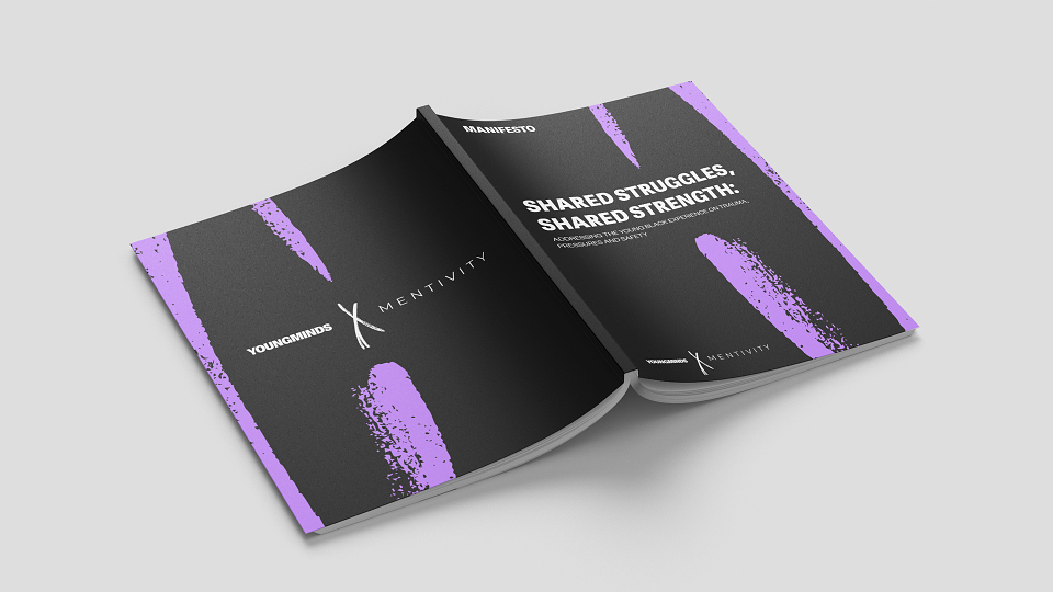
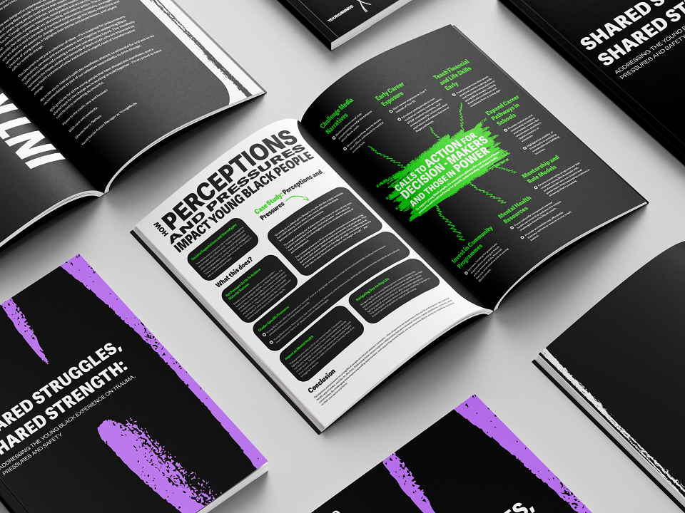
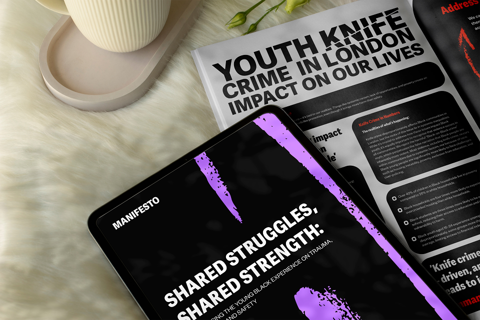
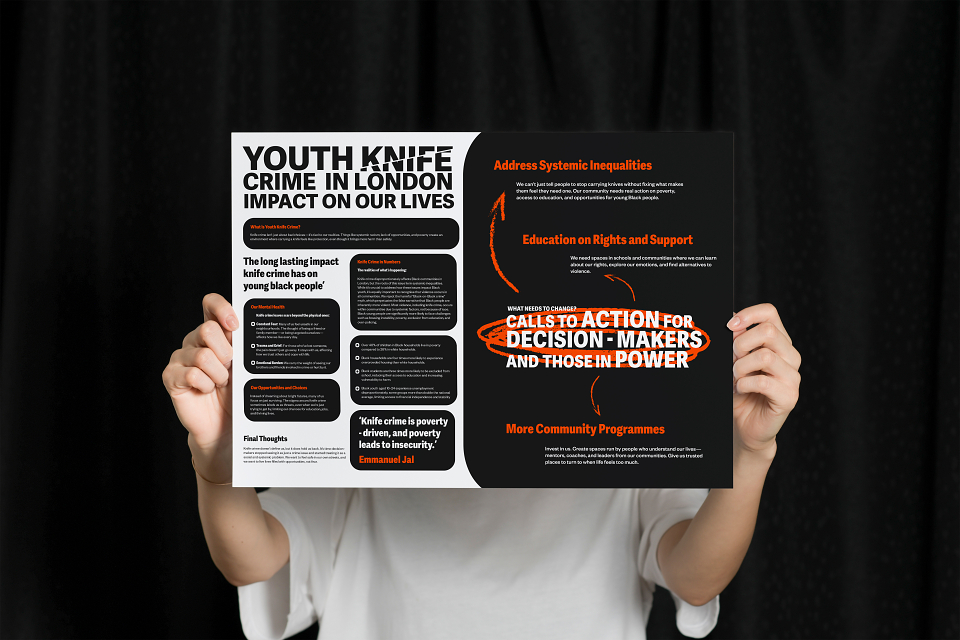
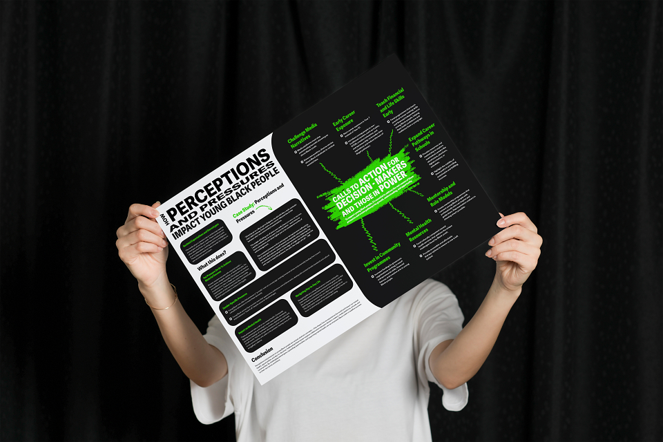
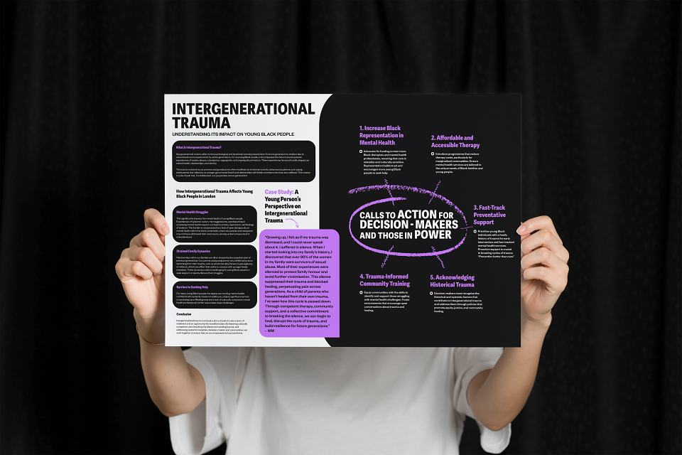
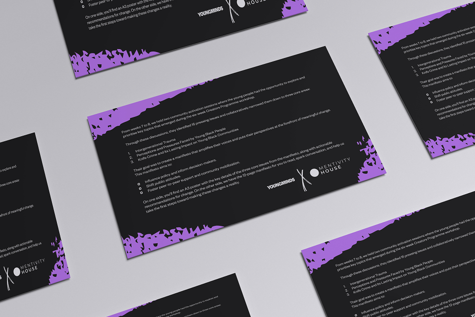
Both organisations wanted a creative way to present the work produced by young people during the workshop and to showcase their discoveries in an exhibition-style event. After several conversations, we decided to bring the content together in the form of a manifesto. From this, a couple of pages were repurposed into A3 posters, designed as creative statement pieces and paired with an explainer card that described the context behind them.
The aim was for the manifesto and posters to feel striking and impactful at first glance, minimal yet high-contrast, grabbing attention while carrying a youthful, personal touch. This was important because the content was curated directly by young people, and the design needed to reflect their voice.
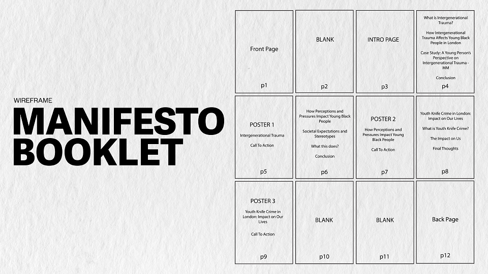
Before moving into visuals, I began by creating a wireframe to carefully arrange and organise the content across each page. From an aesthetic perspective, it was essential that the branding of both organisations came through clearly in the final design. To achieve this, I used the brand colours from YoungMinds’s new rebrand while incorporating Mentivity’s typefaces, fusing both identities into one cohesive system.
To bring a sense of texture and authenticity, I layered in brush stroke elements, echoing the raw, expressive quality of youth-led creativity. For the poster titles, I wanted the typography itself to carry meaning. For example, in a poster addressing knife crime, I applied a slashed/split effect to the type to symbolically reinforce the message.