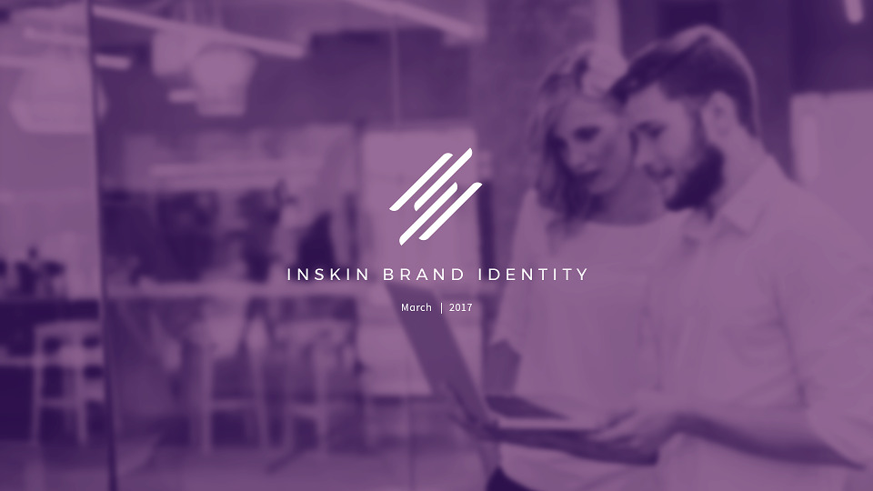
Inskin
London
ABOUT
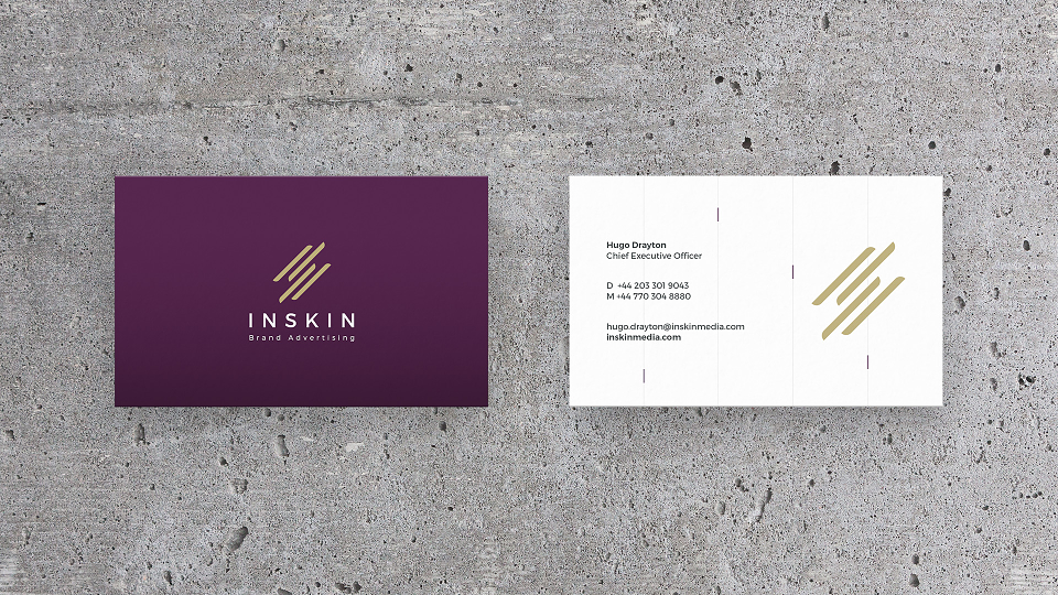
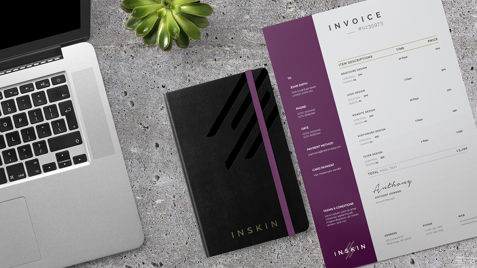
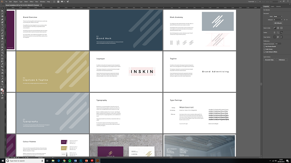
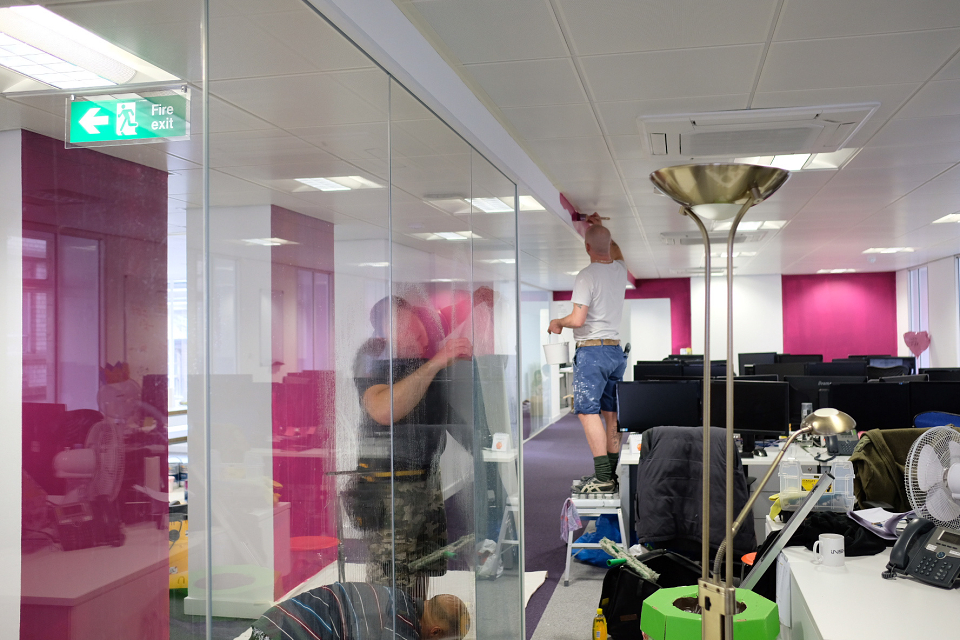
Over the last eight years, Inskin had grown from a small startup to an established global company. The business was keen to re-envision their visual identity to better reflect their maturity and professional approach to advertising. The existing logo's typeface suffered legibility issues at certain sizes and was felt to convey a 'futuristic' style that lent too heavily towards the technology side of the business.
Goals:
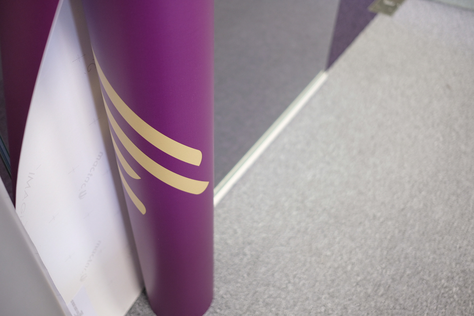
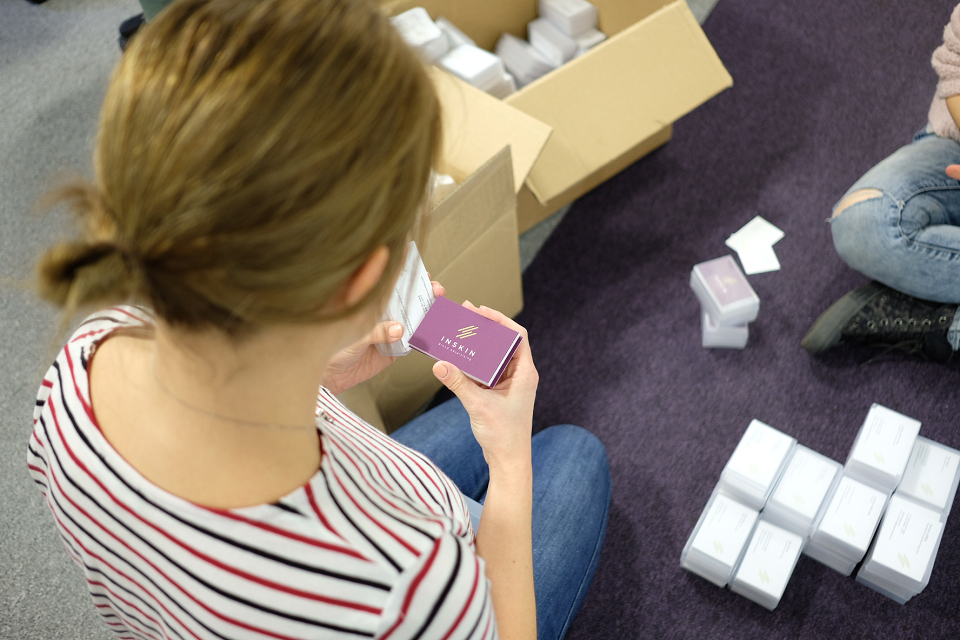
- Introduce a simple but identifiable symbol
- Explore new typography to better represent the brand
- Better support for smaller sizes / lower resolutions
- Refine the colour palette moving away from 'bold' startup colours