Incorporate Design
Chessington
ABOUT
Summary
OBN was one of the first not-for-profit life sciences membership organisations. They develop new services and events in response to member needs and market opportunity. However, this had led to their brand being undermined by inconsistent and uncoordinated presentation.
Problem
In the face of increasing competition, OBN set us the challenge of bringing order and clarity to their offer. They had two ambitions: first, that their audience would better understand the benefits of OBN membership; and second, that the creation and launch of new services and events could be made quicker and easier by a robust branding framework.
Approach
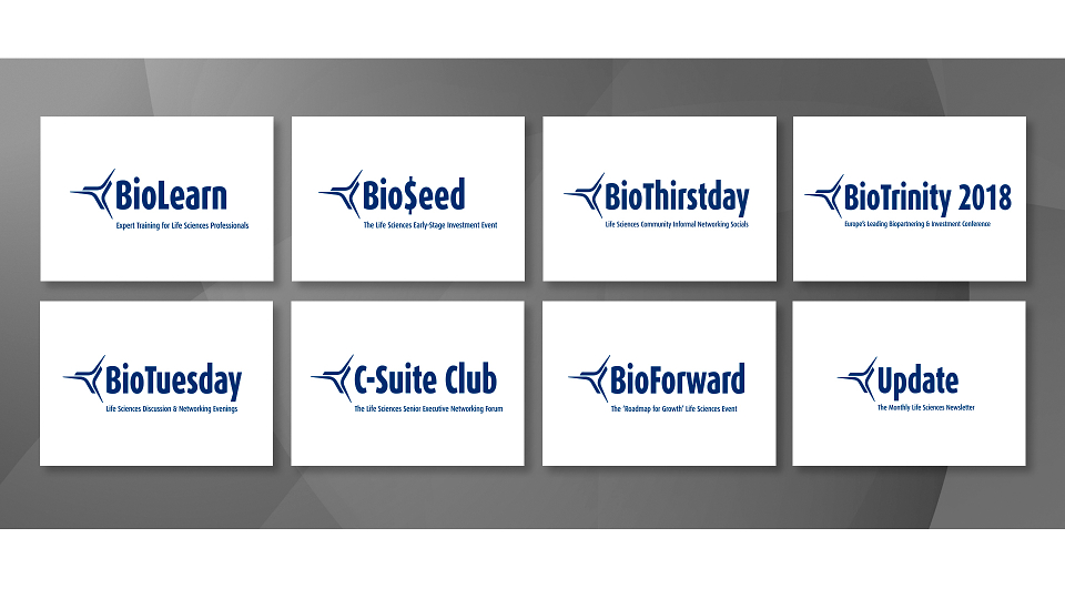
Looking from the outside in – We bring a dispassionate and expert point of view. It allows us to develop a brand architecture that makes sense from the audiences’ perspective – rather than just reflecting an often-convoluted internal or legal structure.
Plain speaking – Life sciences is awash with acronyms and jargon. With such an array of services and events on offer we thought it would be useful if each product or service explained itself in a straightforward manner – clarity enables and encourages choice.
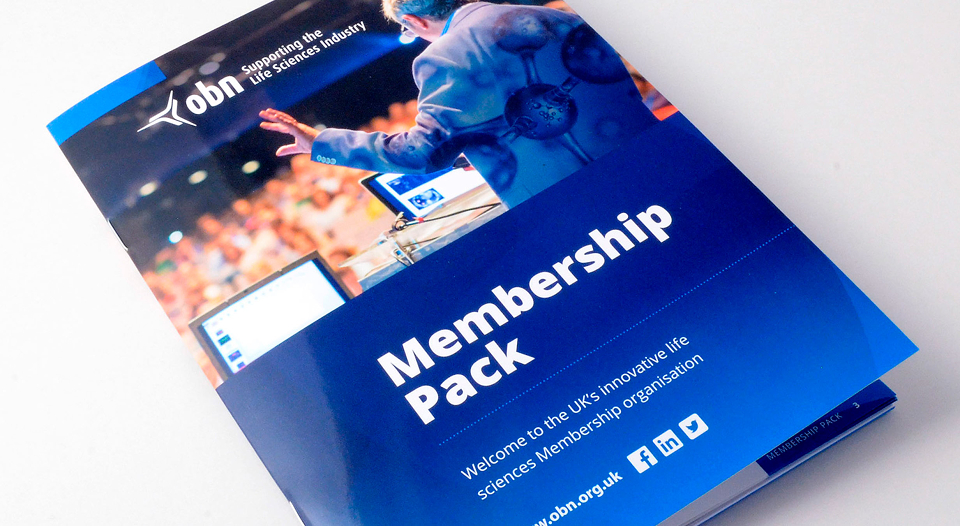
Images with brand DNA – Combination is at the heart of OBN activity: science and technology; people; finance – bringing them together makes interesting things happen. This is reflected in a ‘double-exposure’ effect for headline imagery.
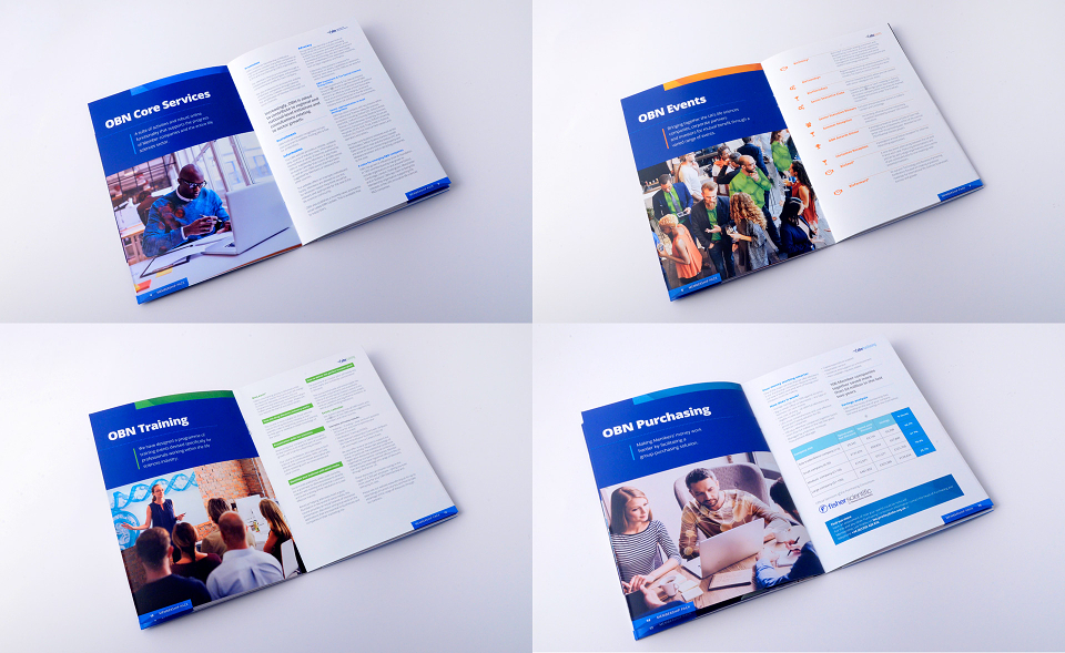
Information hierarchy – The quest for clarity is also expressed in the way typography is used to expedite understanding. We use layout, scale and weight used to guide the reader – simple, quick, unequivocal.
Result
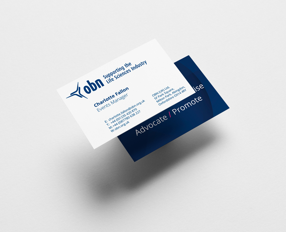
Updating collateral – With all of the elements in place, we are now rolling out the newly clarified OBN brand architecture and visual identity across all applications: from office signage to stationery; membership literature to event marketing.