IMP (Implementation Management Partners)
Edinburgh
ABOUT
INDUSTRY CONTEXT AND CHALLENGES
Post-spinoff from SAIC in 2013, Leidos — a leader in technology, engineering, and science solutions — experienced significant growth. Despite strategic acquisitions and expanding client relationships, the company’s brand awareness remained overshadowed by competitors in the government sector. Leidos’ existing visual system was outdated and cumbersome, failing to reflect the quality or distinctiveness of their offerings, and unable to provide a means for integrating new subsidiaries. In pursuit of a brand identity that would resonate across all stakeholders and support future growth, the Leidos board initiated a comprehensive rebranding effort.
Leidos presented us with a definitive goal — to streamline and rejuvenate their brand in anticipation of a global advertising push. We were tasked with forging a unified, compelling identity to mirror its extensive range of services and diverse audiences. Together, we pinpointed critical areas for refinement within the visual identity, including inconsistent graphics, a lackluster color palette, and a disorganized type hierarchy. The rebranding ambition extended beyond aesthetics and implementation to crafting a brand architecture that would facilitate the integration of subsidiaries and prepare the comms team for a successful launch and improved workflow going forward.
STRATEGY
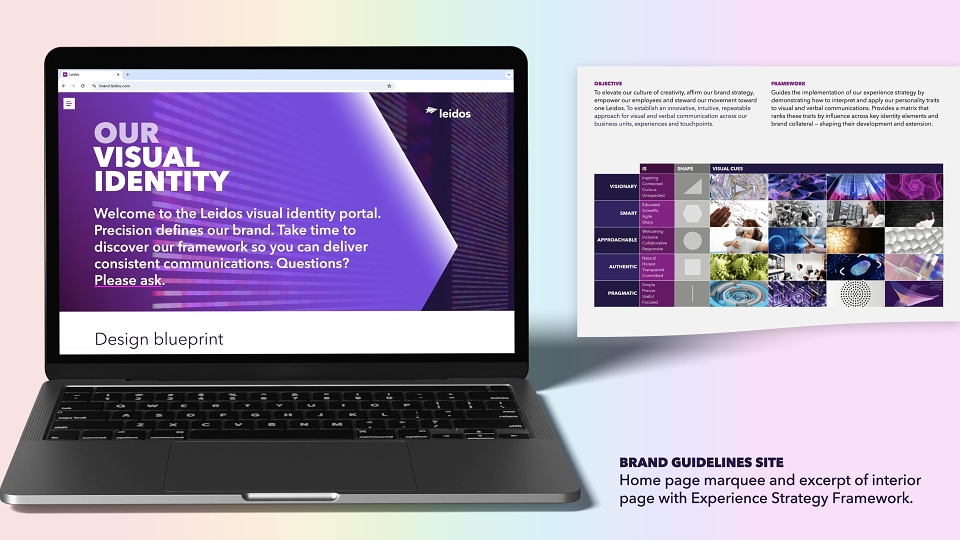
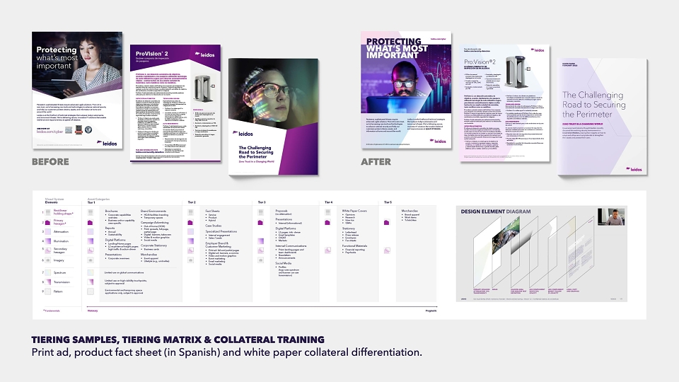
Our research revealed Leidos’ deep commitment to its employees, community involvement, and addressing complex global challenges in multiple markets. To set a course for decision-making around communications, we began with an experience strategy framework that mapped each brand attribute to shapes, functions, moods and materials. Since there was no existing playbook for brand unification, we established a brand architecture with subsidiary treatments and structure, and collaborated on a plan for acquisition migration. To initiate a collateral hierarchy, our tiering strategy organized touchpoints along a spectrum from visionary to pragmatic—Leidos’ core brand personality traits. Each tier indicates the visual components for use, easing asset selection and reinforcing collateral distinction among tiers. Lastly, a collection of key templates and a brand immersion training series ensured the communications team’s success in adopting the new identity.
CREATIVITY AND INNOVATION
Observing a kaleidoscope—the optical device from which “Leidos” is derived—we witness an unexpected harmony of form and color. But the resulting imagery isn’t random. Its perpetual renaissance comes from the precise arrangement of mirrors, objects, and light. With every turn, there’s a new surprise, and that essence is what guided the Leidos identity refresh. Our concept, “Mechanics of Wonder,” was the basis for a visual language that juxtaposes structure and spectacle.
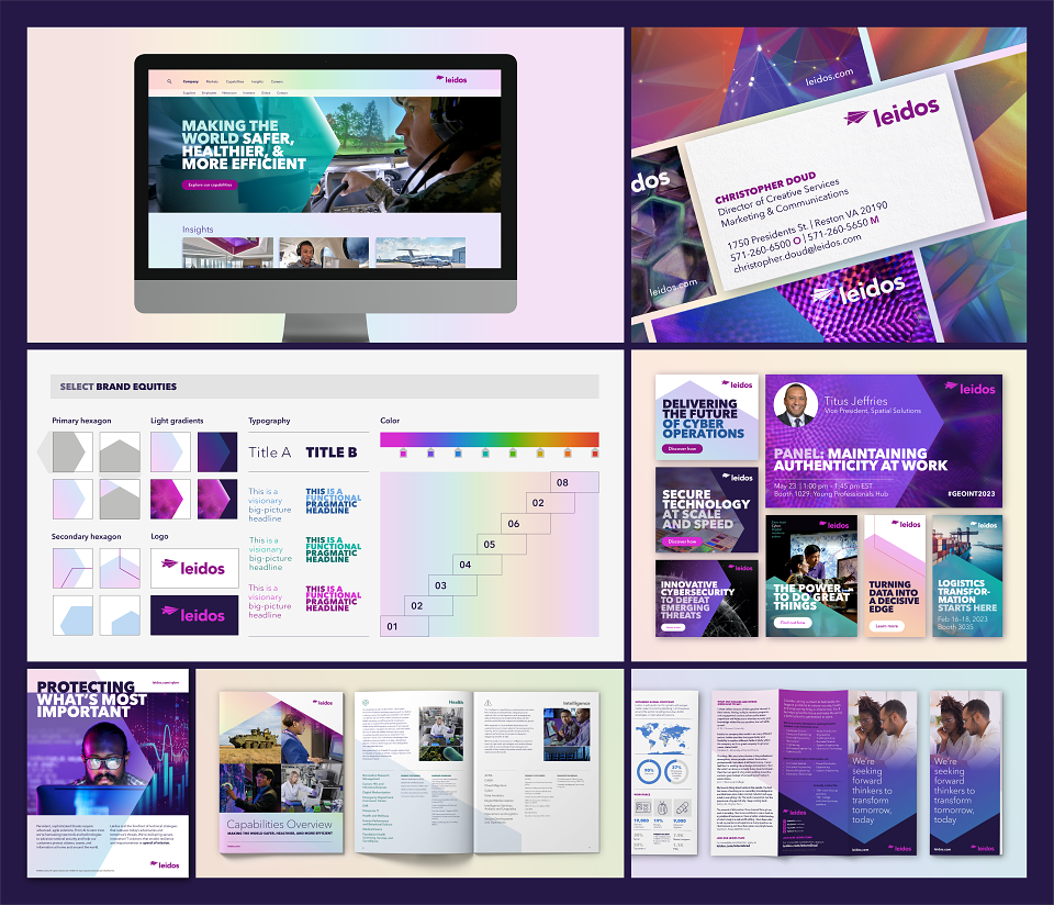
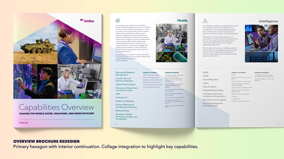
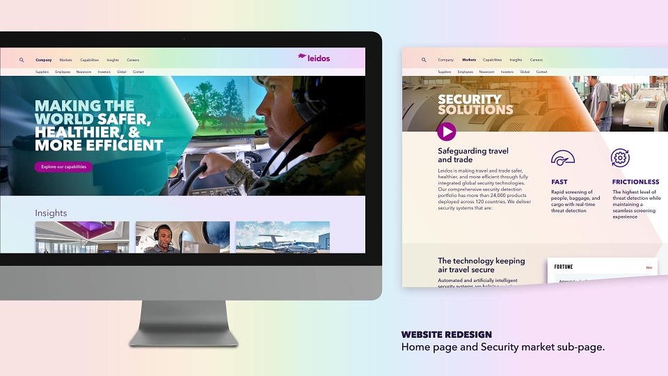
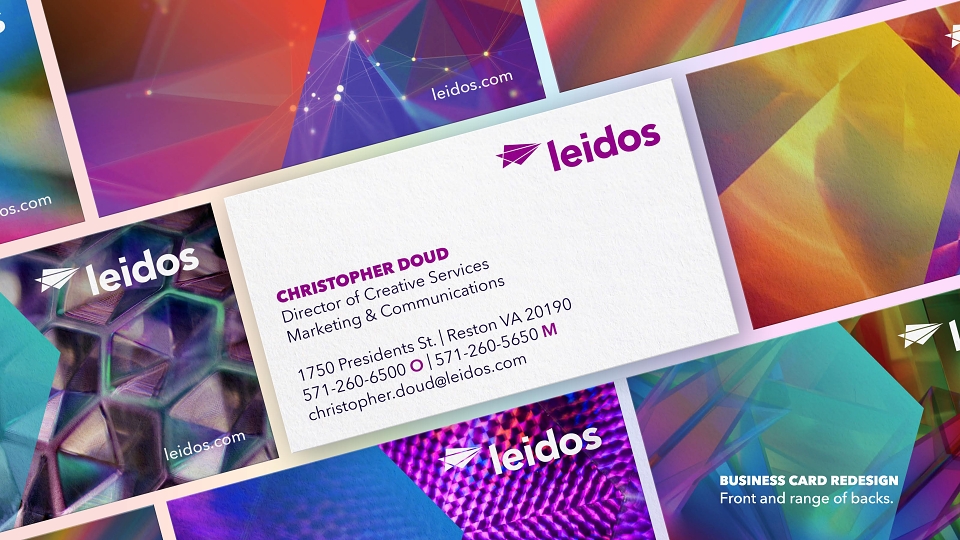
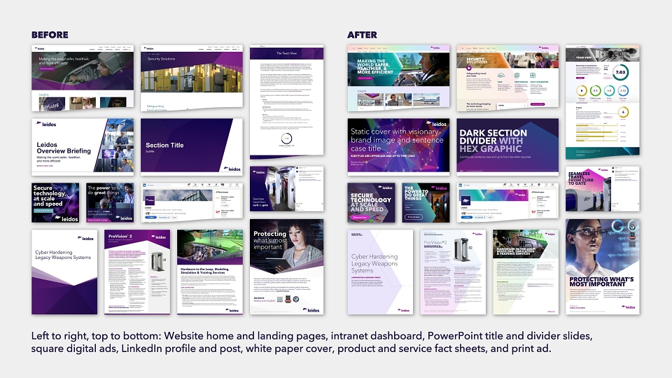
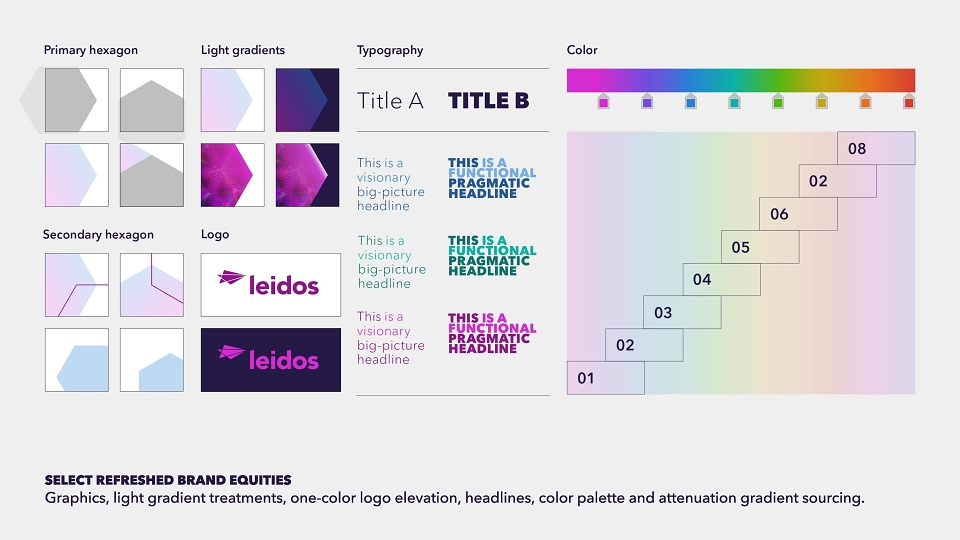
To re-align the brand’s visual identity with this concept, we dove into kaleidoscope research, drawing inspiration from the properties of light, precise mirror arrangements, and diversity of form. Our findings led to a color palette overhaul, capturing the full visible spectrum to brighten the system and captivate viewers. We crafted subtle gradients to emulate the dance of light on surfaces—enhancing engagement and synergy with imagery while conveying Leidos’ unparalleled capabilities in the B2G space. Through deliberate cropping, orientation and positioning, the hexagon—commonly found in mirror setups—became a vessel for layouts and messaging, reflecting and revealing narrative-enriching content. Maintaining the original typefaces and logo by request, we found ways to improve their roles. We refined the typographic hierarchy, collaborating with Monotype for a bespoke type kit, and elevated a single-color logo to a pivotal light source and anchor for other layout elements.
RESULTS
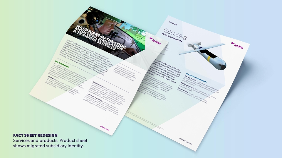
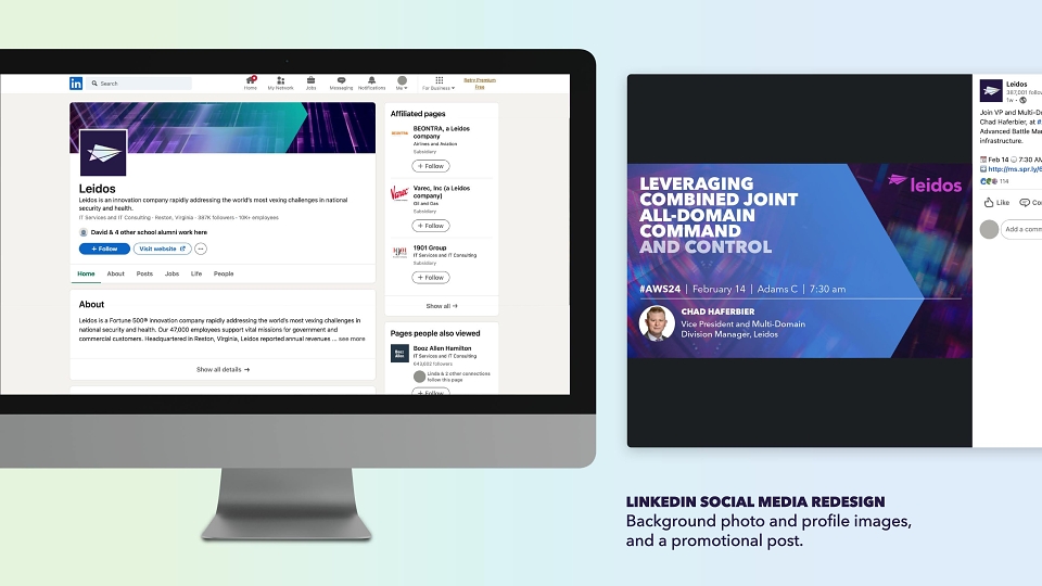
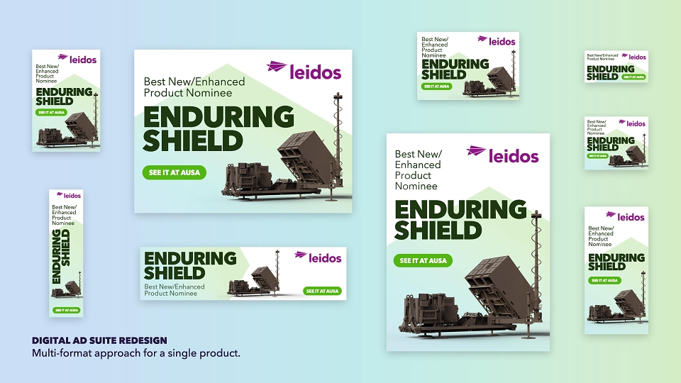
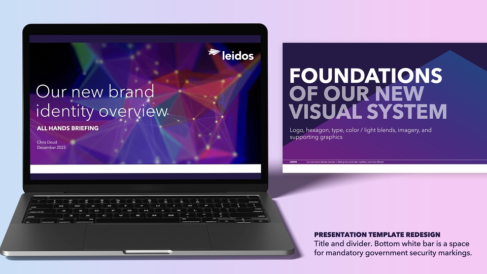
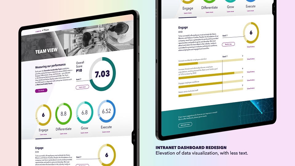
With a lean budget, we revitalized Leidos’ communications across all touchpoints, produced guidelines and assets, provided templates for Adobe and Microsoft apps, trained the comms team in the new system, assisted in launch implementation, and established and operated a help desk to support communicators as they migrated and designed year one collateral. Our work ensured that every interaction would align with Leidos’ personality traits and kaleidoscopic offerings.
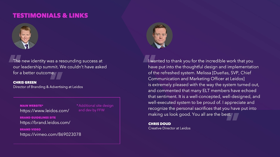
Since the Leidos brand refresh, stock prices climbed by approximately 25%, signaling strong market confidence. Endorsed wholeheartedly by the new CEO, the refresh garnered unanimous leadership support, facilitating a seamless and expedited integration of formerly separate entities under a unified brand. The communications team has benefitted from the system's user-friendliness, quickly and efficiently producing a wide range of collateral under the guidance of our comprehensive brand help desk and quarterly reporting to
facilitate an ongoing governance model.
Highlighting the brand’s momentum, Leidos secured a $700 million NSA contract in December 2023. As we await industry benchmarking, the brand refresh is at the heart of a global advertising campaign launching this year, aimed at enhancing government sector favorability, with outcomes to be assessed over the next year. This initiative is expected to further solidify Leidos’ reputation for innovation and leadership in their markets.