Cora
Freelance Graphic Designer
ABOUT
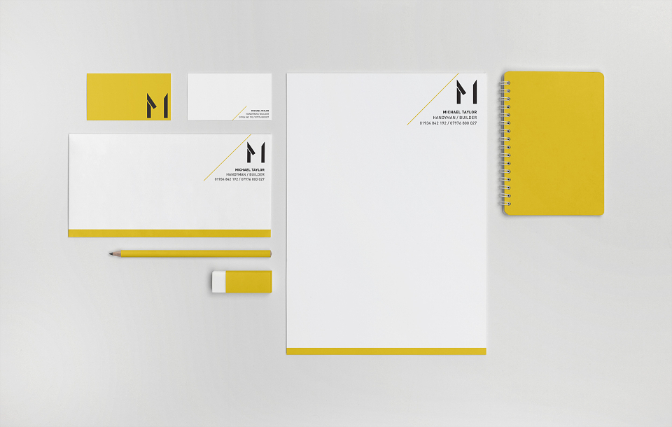
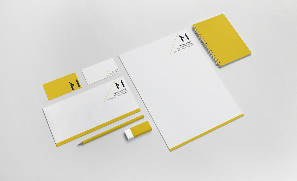
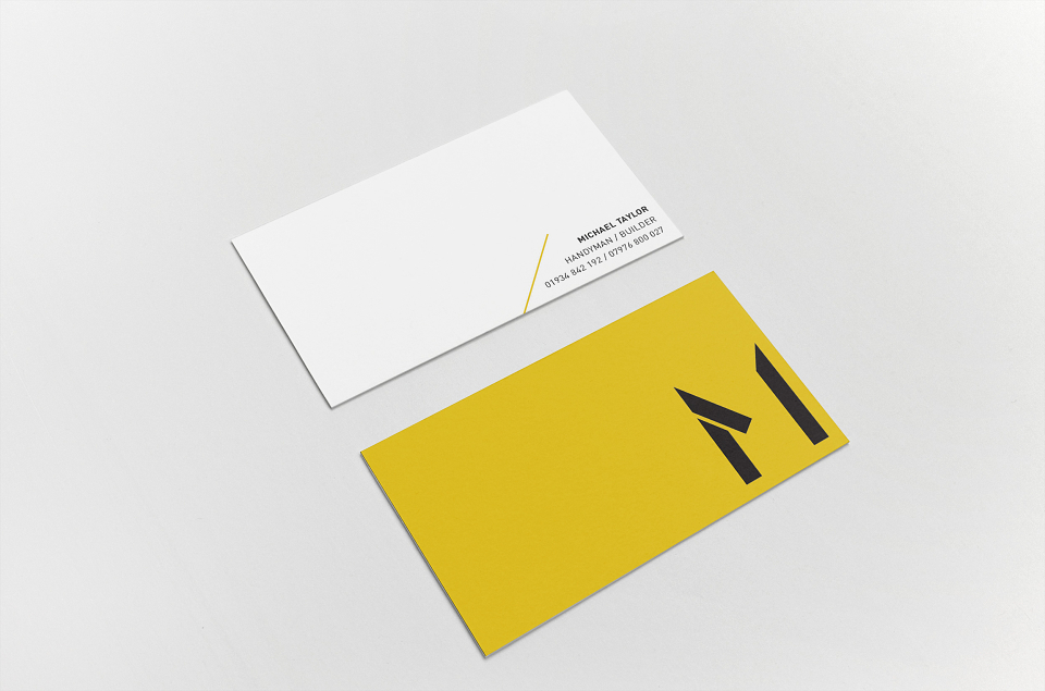
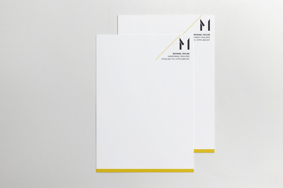
As a one-man band builder/handyman, Michael wanted to generate more business and to bring his corporate identity up to date. The existing logo and corporate identity was modernised to try to portray the precision and perfection of his completed work. The main logo to an uppercase, monumental M, made up of three building blocks as a nod to the industry. It's iconic geometric design is a clear indication to the quality of Michael's work. The refined logo makes Michael Taylor current and appeals to a wider, younger audience and is memorable.