Library
Brighton
ABOUT
Our client, Motion Nutrition, a UK organic sports nutrition brand, spotted an opportunity to move beyond their traditional male, gym audience into a broader female, lifestyle performance market. They created a suite of new products for their hero protein powder range and asked us to develop an identity rebrand and packaging redesign to relaunch brand and product.
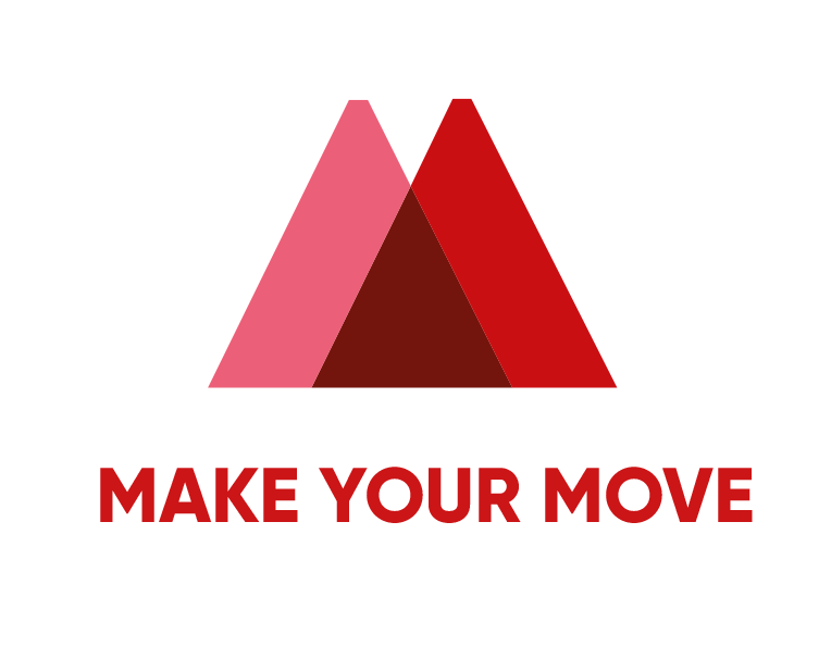
Following an extensive research phase into audience, retail and competition, our design process started with the development of the new logo - an iconic image that could harness the energy and ethos of the ‘Motion’ brand and the new tagline we developed - ‘Make Your Move’.
Concept
The iconic ‘M’ monogram in the logo has been carefully designed to reflect important aspects of the brand: a mountain range that expresses a love of organic, natural products and an active, outdoors lifestyle. The smaller inset triangle symbolises a pathway or start of a journey inviting the consumer into the brand to explore the product and consider where their next adventure might take them.
The font ‘Gilroy’ is used in three different weights to create a simple, modern identity which complements the angular, clean lines of the design and communicates the unfussy and pure nature of the product. The flexibility of the design allows the ‘badge mark’ M to be used standalone, locked up with ‘nutrition’ below or as part of the full logo.
Execution
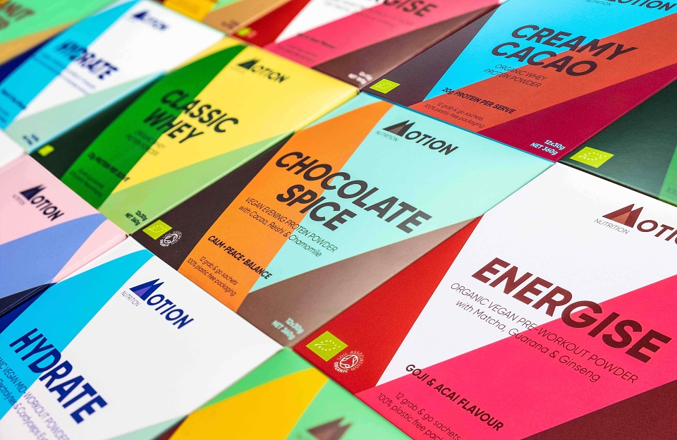
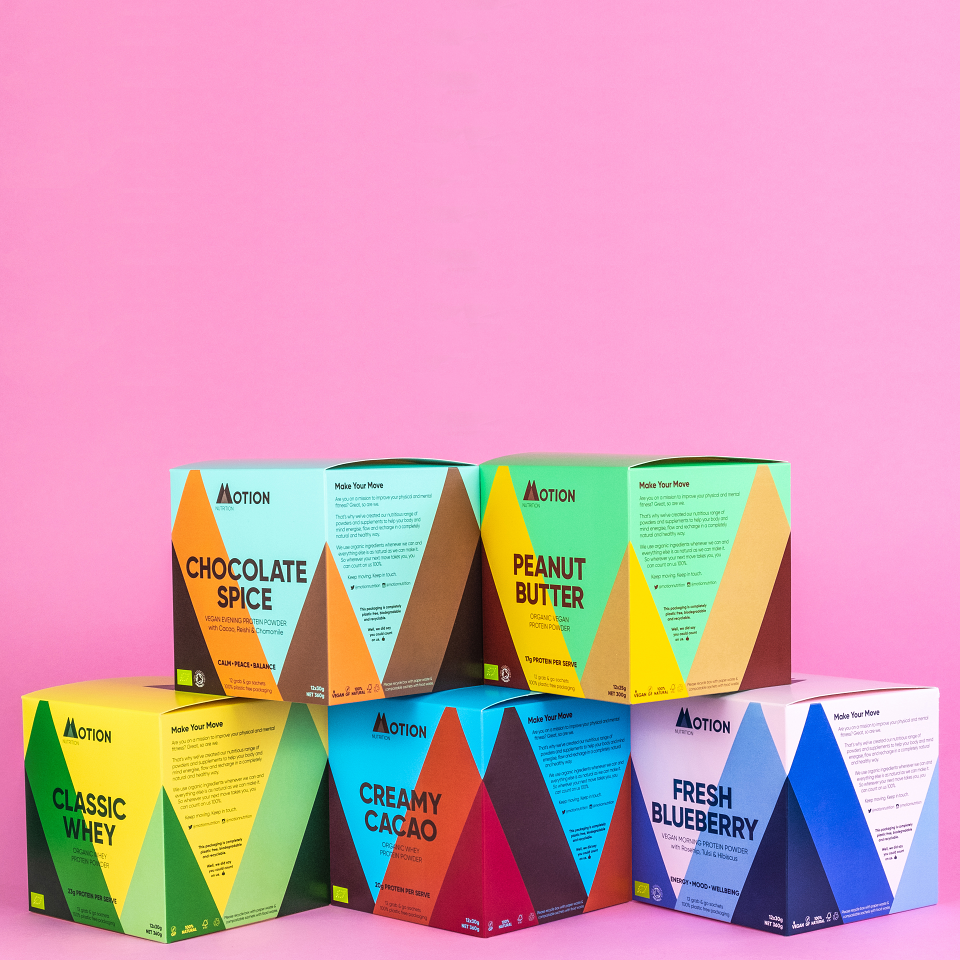
The next step was to apply the new identity to the flagship range of 8 protein powders. By breaking down the lines and shapes of the ‘M’ we explored simple, bold, triangular patterns to create an ‘ascent’ and ‘descent’ pattern. This allowed us to create subtle matches between the usage styles of the powders - pre-workout, post workout, wake up, unwind - and the packaging design.
An unconventional boxed format was chosen because most protein powders come in plastic pouches or tubs which do not stack and are not recyclable. The box shape combined with our geometric designs allowed us to create an uninterrupted wraparound design, allowing boxes to stack horizontally and vertically, showcasing the family of products perfectly and reinforcing the brand identity with full height Motion ‘Ms’ across the boxes. This works visually even if the boxes aren’t front-face on, creating an uninterrupted scene from all angles.
We chose vibrant and contrasting colours designed to redefine the category, bring energy and support flavour cues. Each SKU has an individual palette of three main complementary but contrasting colours to reflect the tone of voice: energetic, adventurous and motivating.
The flat pack box packaging was sourced from sustainably sourced cardboard with a matt finish and bio-degradeable inks to ensure complete recyclability. Inside the box, the protein powder is contained in individual, un-branded fully compostable sachets emphasising the pure nature of the product. This 100% recyclability is a significant innovation in the category and in retail.
Result
The result is an eye-catching brand and product range with strong audience appeal and unrivalled shelf stand-out among competitors. Now available to buy online and shortly to arrive in Holland & Barrett.