Hanan
Graphic Designer
ABOUT
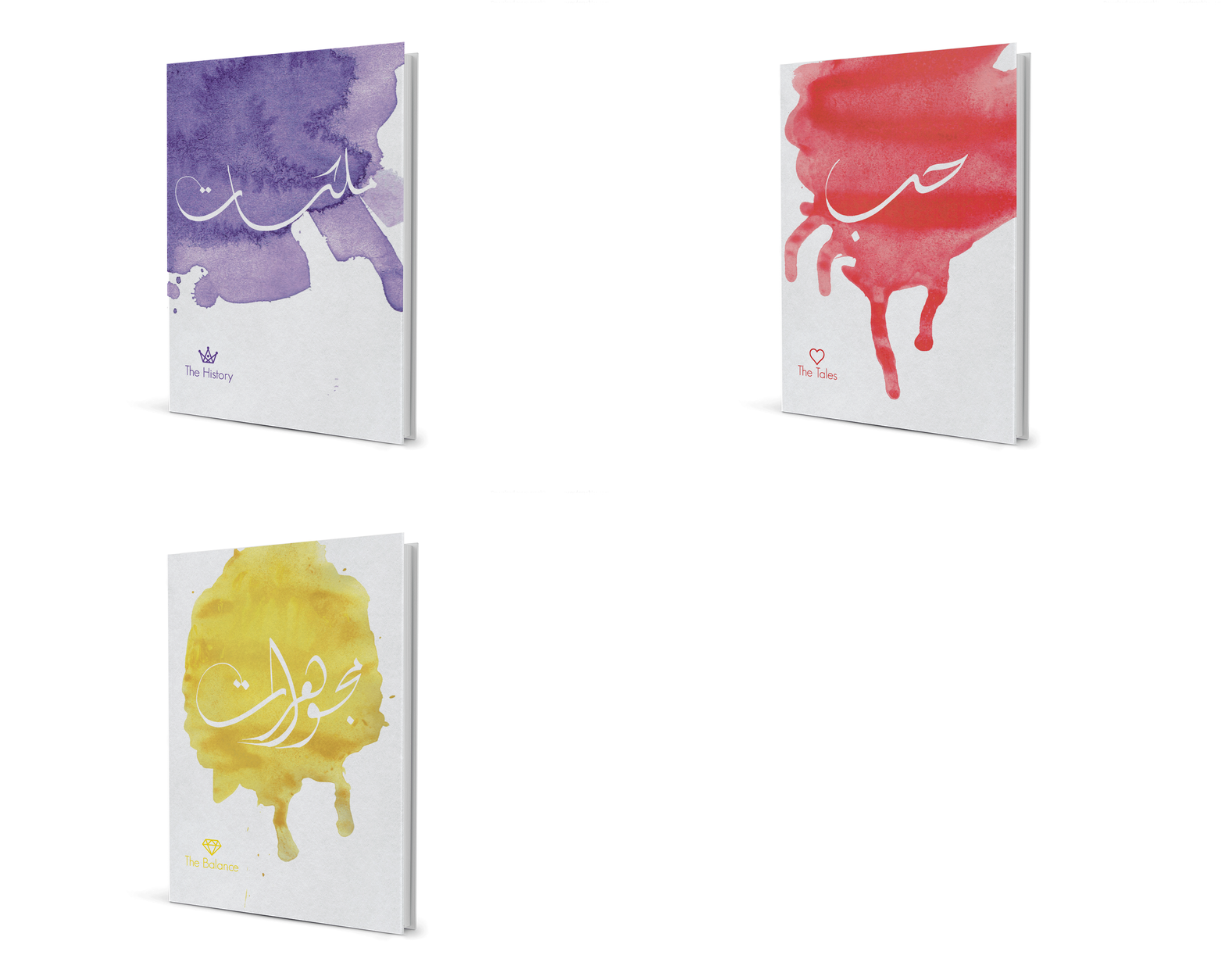
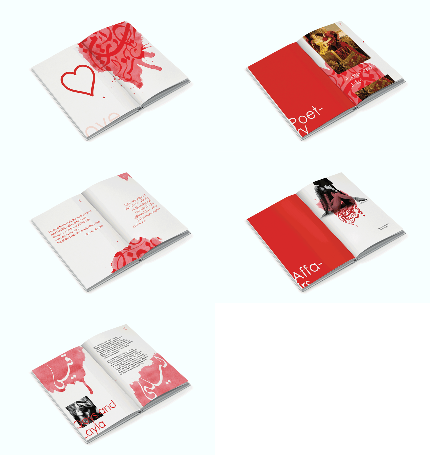
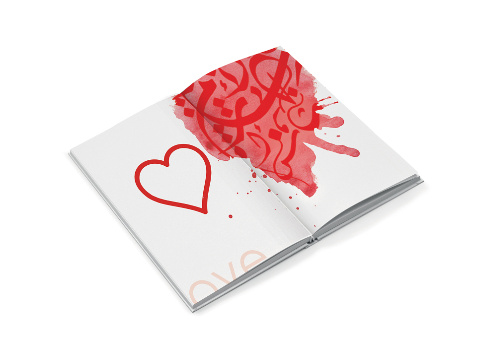
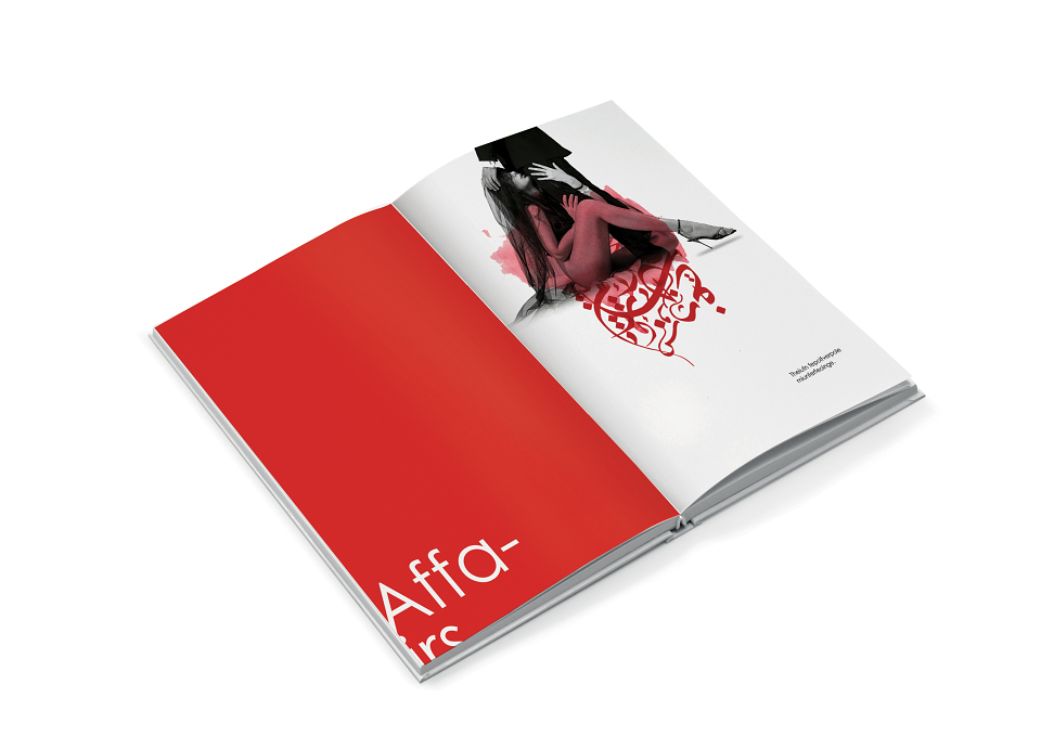
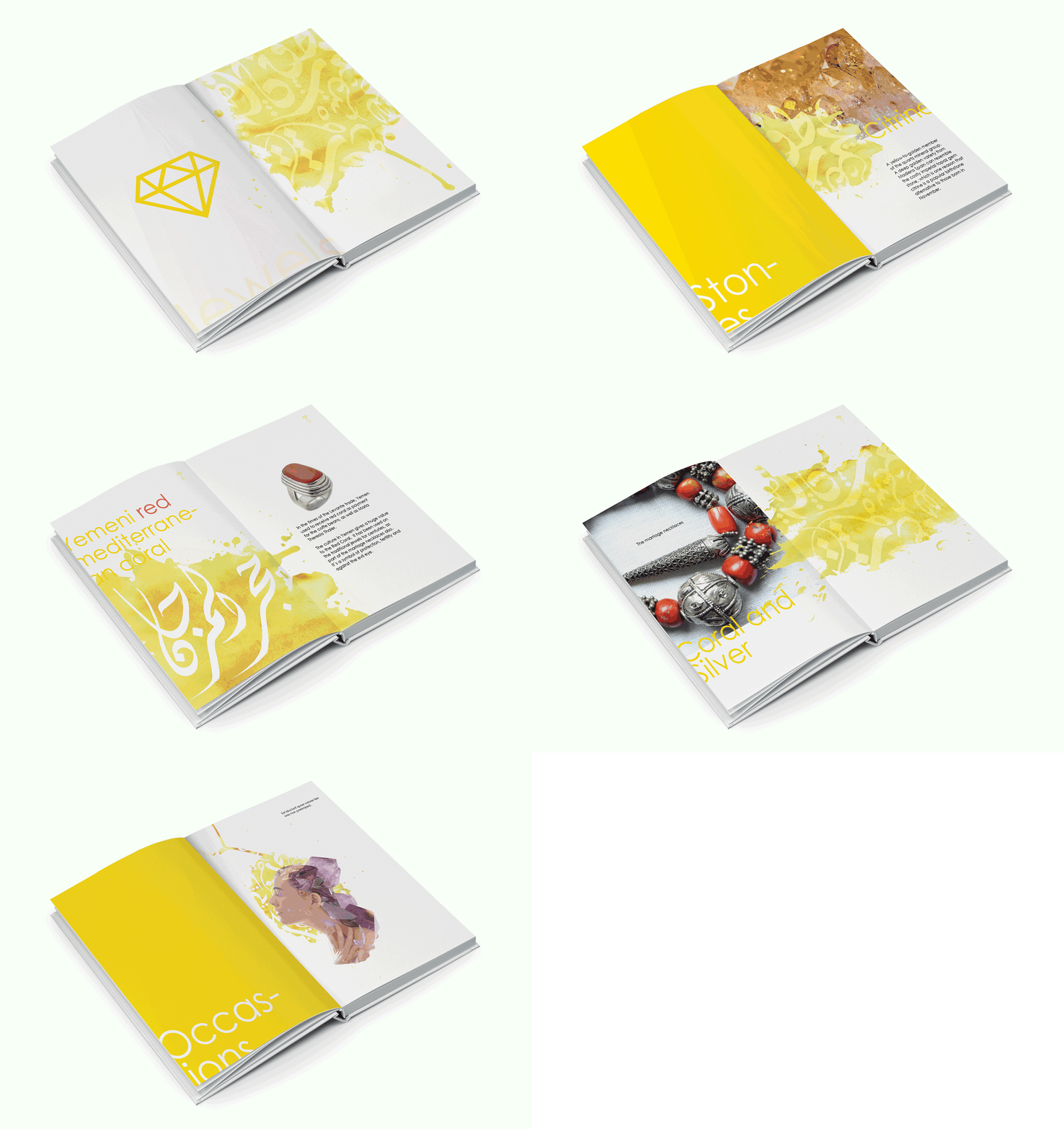
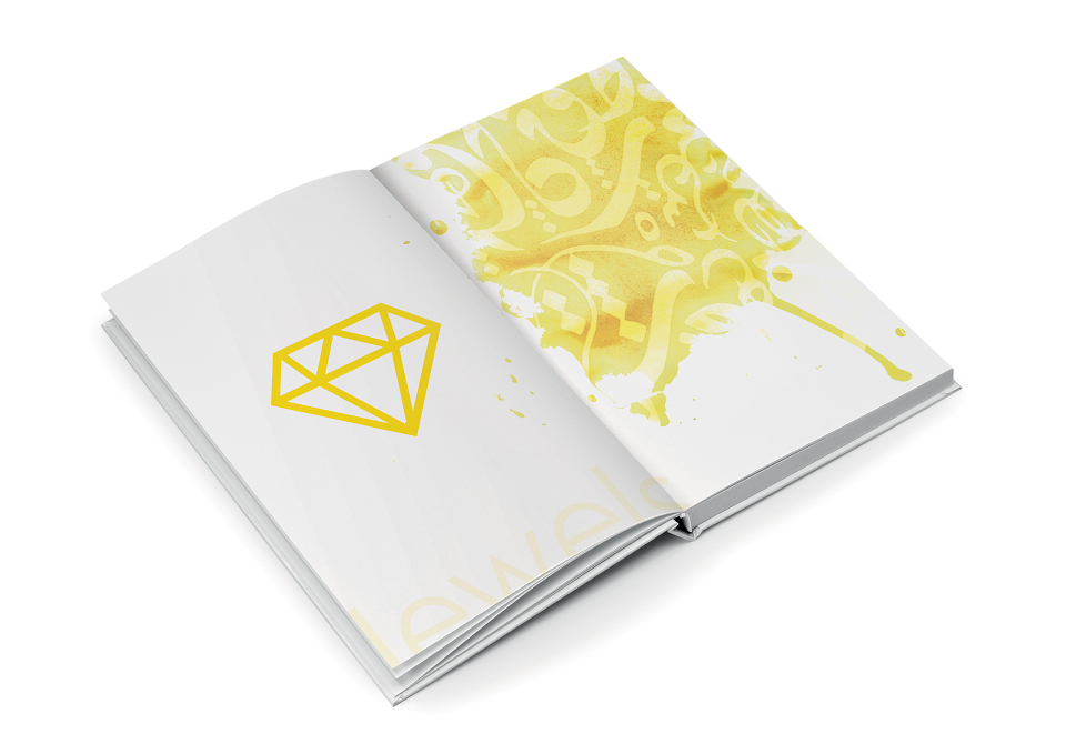
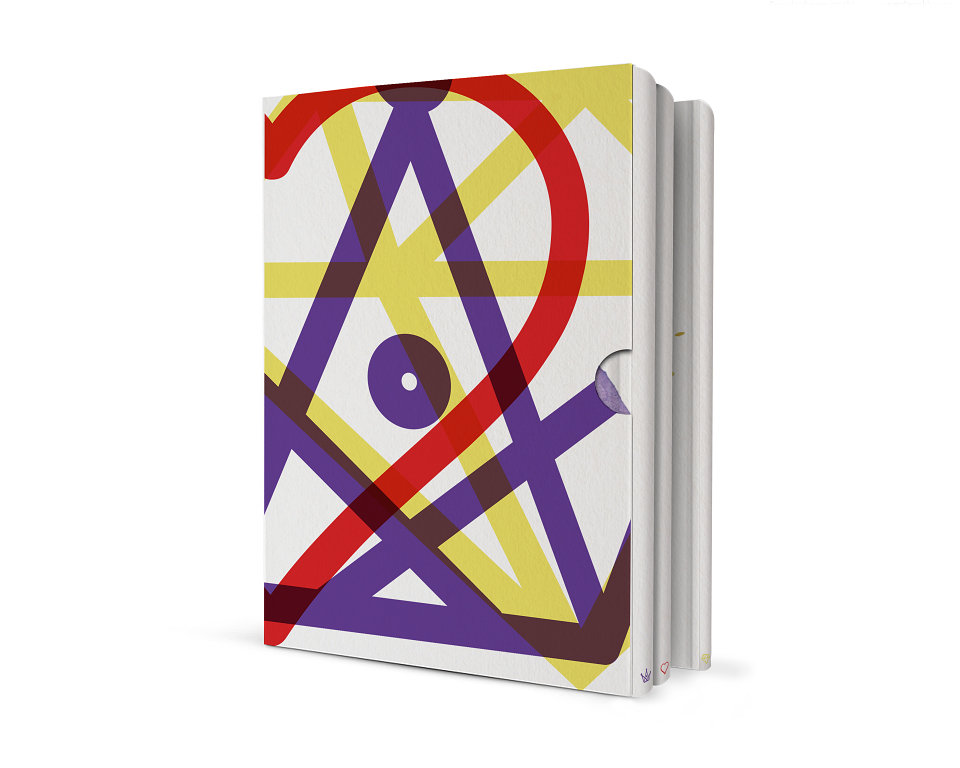
A set of publication together makes the title Queens Love Jewels. However, each book has different content that are not related to one another. The concept of each book is to contrast between the Eastern and the Western culture, with its content and design. Queens contrasts between historical Eastern and Western queens once ruled and influenced nations. Love contrasts between Eastern and Western romance. And Jewels contrasts between impact of jewellery and precious stones on both cultures.
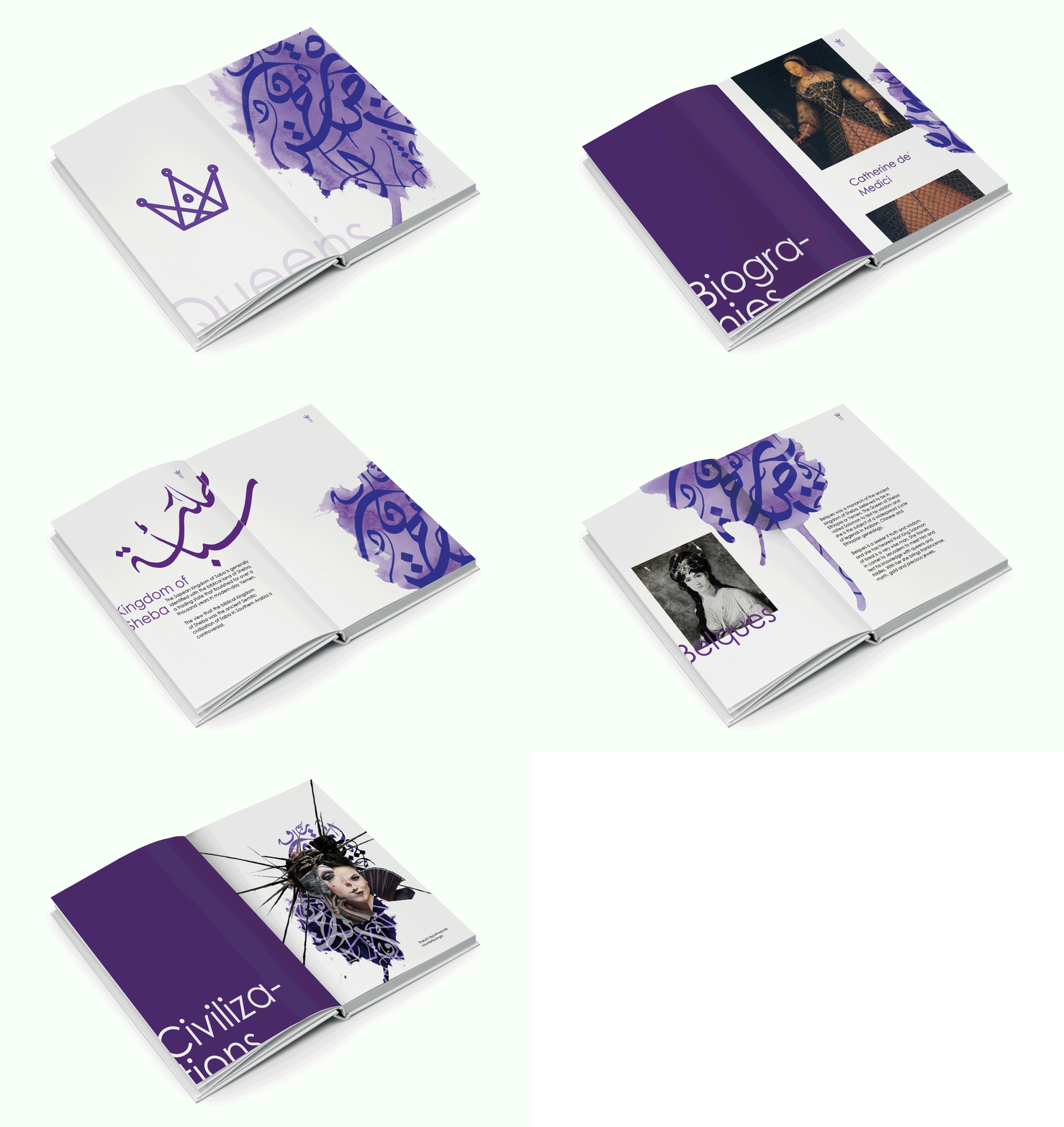
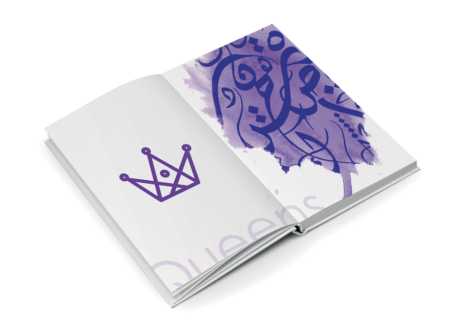
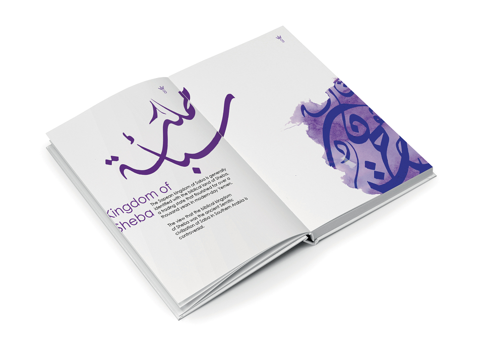
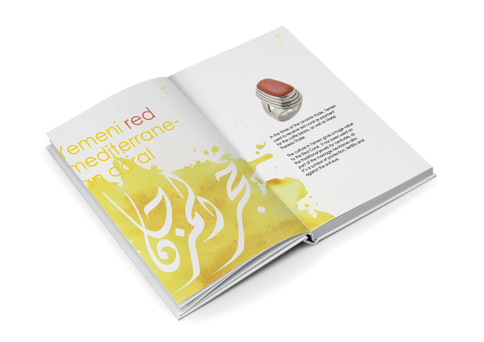
The set doesn’t only contrast between cultures with its content, but also with its layout design. I have chosen to have Arabic calligraphy as a main theme, choosing a lose script in contrast with the stiff san serif headlines, copy texts and symbols. Also having a lot of negative space around the images and copy texts, and especially around the Arabic script. To have this space around the scripts made the layout contemporary, therefore, it is also in a way a contrast between vintage and modern.
Traditionally, Arabic Calligraphy is handwritten using ink. Substituting watercolour behind the scripts is another highlight to the contrast between cultural differentiations.
Visit my blog for the full story, and for a chance to get Queens Love Jewels printed on any product of your choice.
MADEIT CREDITS
-

HananGraphic Designer