Giada Tamborrino
Branding & Sustainable Packaging Designer
ABOUT
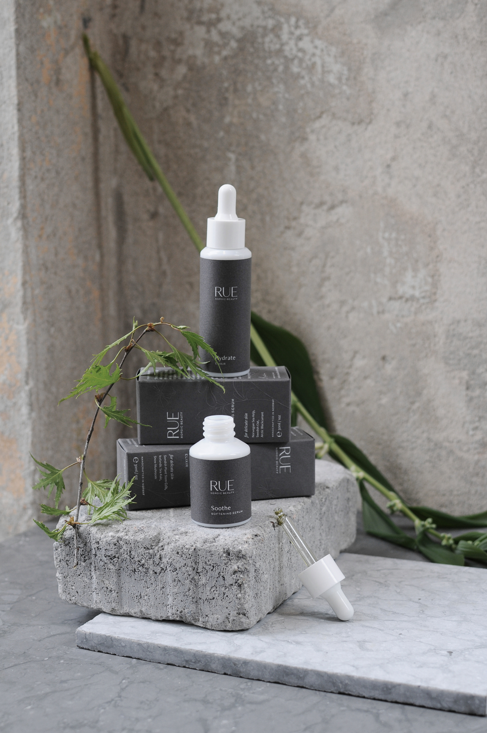
Brand Identity, Packaging & Website Design for Norwegian brand RUE - Nordic Beauty. RUE combines the purity of Scandinavia through all the elements of the senses, embracing nature through pure, plant-based skincare. The botanical potions are formulated with Nordic ingredients that are local to Oslo and created for the woman who understands that now is the time for her to begin her ritual to graceful ageing.
RUE captures nature in a modern, minimal, yet sustainable force that stimulates the eye from first glance. We wanted to reflect that into the branding elements, through the use of modern, powerful typography, and a Nordic Sea-inspired colour palette. To soften the aesthetics and add a delicate touch, we introduced a custom hand-drawn rue plant (Ruta graveolens)* which will be embossed on the packaging and applied through printed and digital collateral pieces.
To enhance the journey by touching textured fibers on each package, we selected a dark-grey uncoated paper with a wired texture.
Sustainability is a key element, so the paper used for the packaging and labels is fully recyclable and biodegradable, as well as FSC and ECF certified. It is also Heavy Metal Free, and the bleaching process avoids the use of harmful chlorine. To make the labels oil and water proof, we applied a plant-based coating.
Photography by:
SORGENFRI
Marte Gjone
Giada Tamborrino Studio
MADEIT CREDITS
-

Giada TamborrinoBranding Designer, Packaging Designer