Grace Leaney
Graphic Designer & Illustrator
ABOUT
Scotland is famed for its whisky. As far back as the fourth century, monks introduced these fertile lands to the art of distilling. By the 15th century, they had turned this rain-soaked barley drink into “uisge beatha” or “aqua vitae” “water of life” or “whisky”, first produced by the Friars of Fife.
Since then, whisky has enjoyed a cosy, wintry reputation. The kind that invites you to light a log fire, pull up a wing-backed chair, and enjoy a smoky whisky on the rocks over a broadsheet paper.
But how do we take the best of this heritage, history, and reputation and redefine whisky for a new audience, and a new world? How do we make it a drink as at home on a dusty cottage bookshelf as behind a cocktail bar? How do we bring it up to date and make it relevant for a new generation?
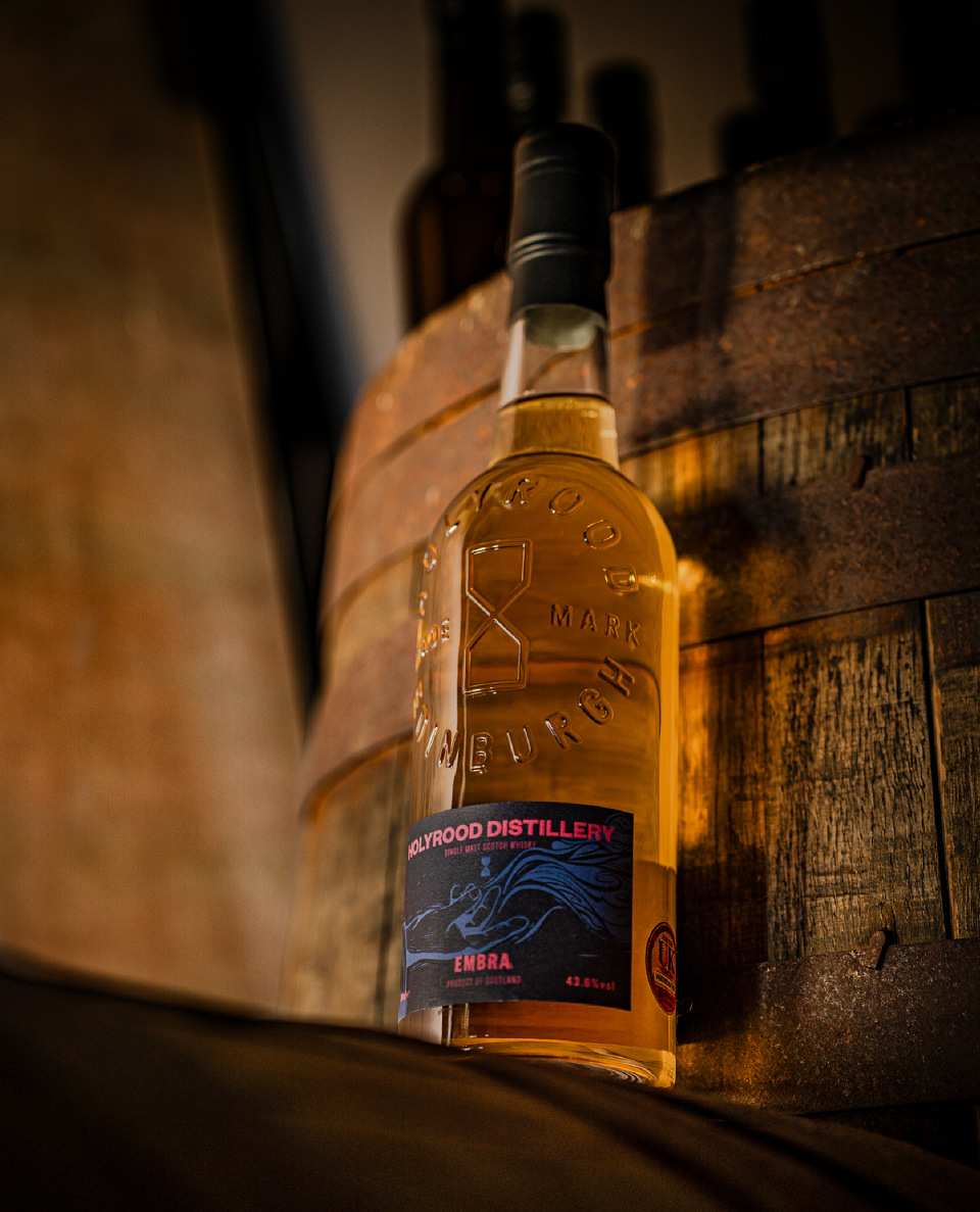
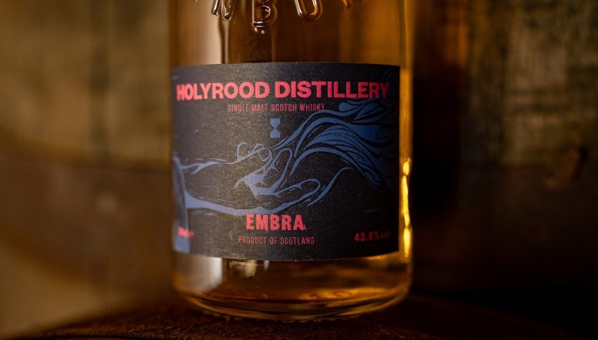
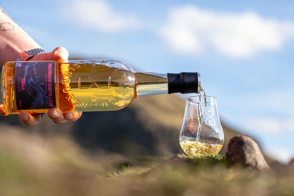
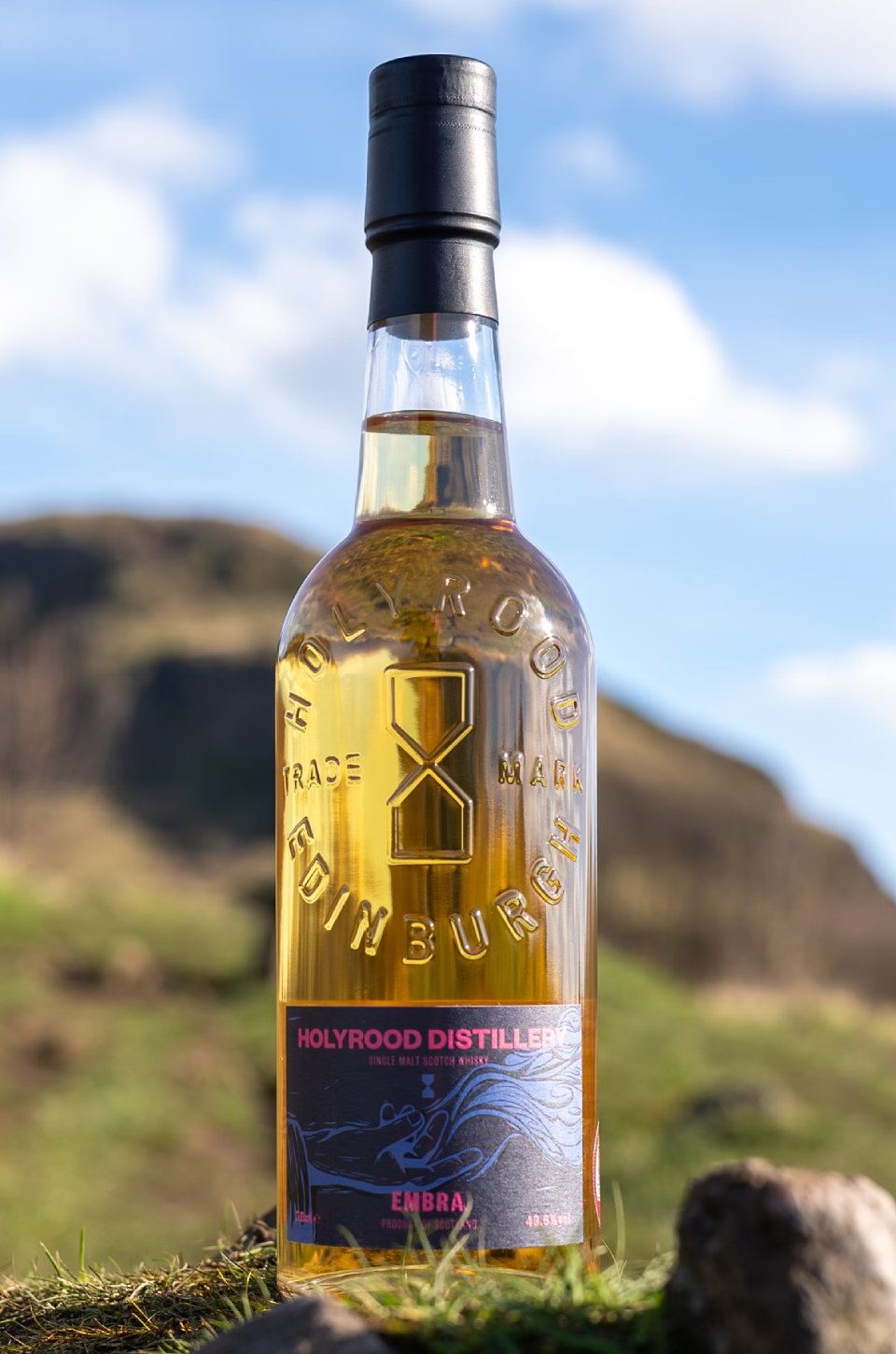
That’s where Holyrood Distillery comes in. This young and experimental distillery has an innovative approach to brewing, creating exciting, complex, and flavourful whisky at any age. This project, to design the bottle for their second flagship release, needed something that was as modern and vibrant as it was historic and respectful of heritage. As its first peated whisky release, we also needed something smokin’.
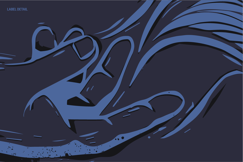
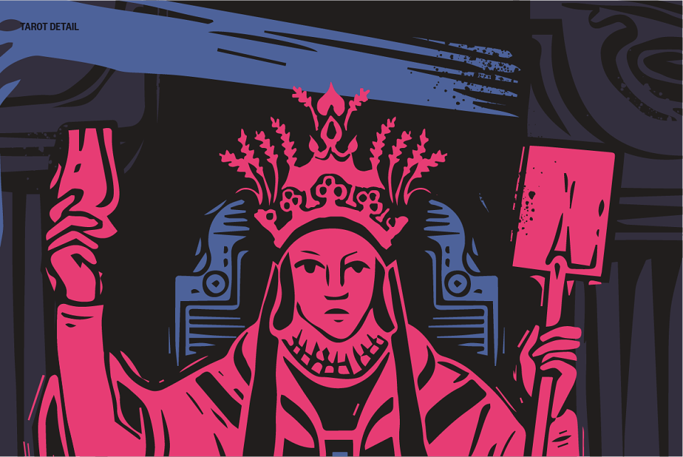
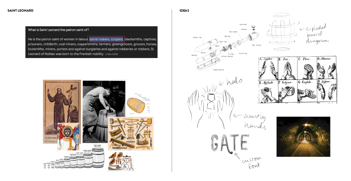
So, inspired by Holyrood Distillery’s location, nestled at the foot of Arthur’s Seat on St. Leonard’s Lane, we came up with the idea of honouring St Leonard; the patron saint of barrel makers and coopers. In our concept, St Leonard is rendered into a fictitious, saint-like figure called "The Distiller,". We brought him to life through a modern take on medieval style imagery and added smoke to the design to reflect the liquid’s flavour profile. Drawing inspiration from the bold branding strategies often seen in modern beer breweries, we embraced vivid colours and blended textures, marrying tradition with contemporary aesthetics.
To put St Leonard The Distiller in an appropriate historical context, we used medieval-style woodcut illustrations, digitally drawn using ProCreate and Illustrator to mimic the charm of hand-printed artwork.
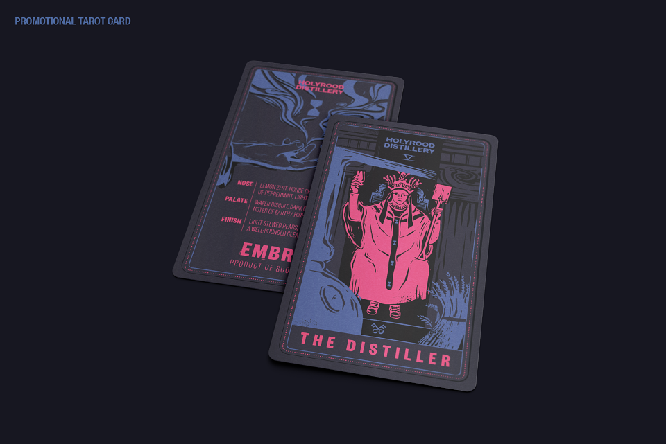
We chose textured paper with embossed and debossed areas in the print finish to give a tactile, relief print feel. The deliberate imperfections make the label feel authentic, small-batch, and hand stamped.
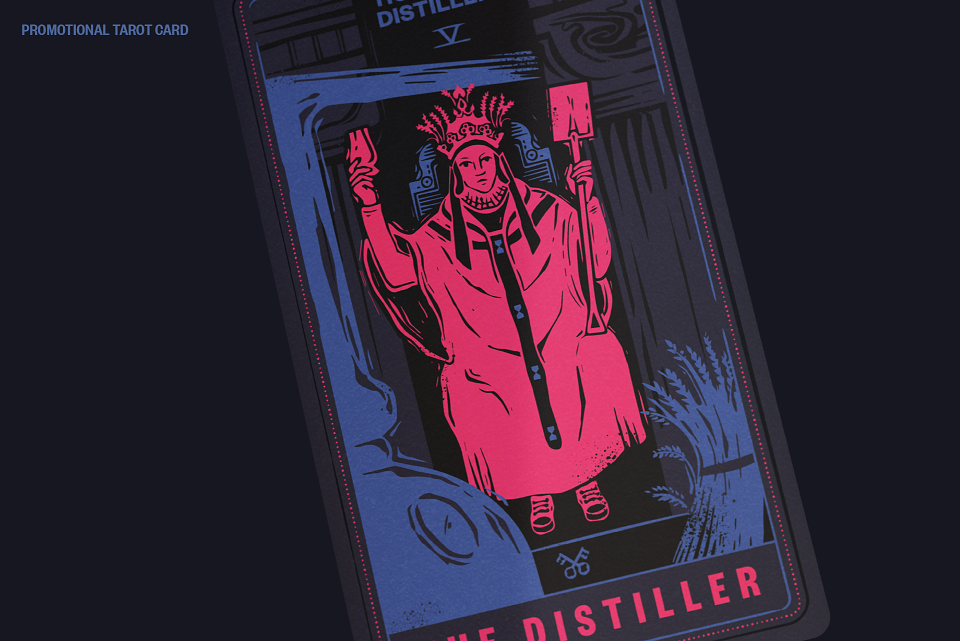
For a playful touch, we added in a double-sided tarot card to display the tasting notes of the whisky. On these we used the traditional tarot symbolism of the Hierophant card to bring the character of The Distiller to life. He's seen with a spade, crown of grain, Glencairn glass, whisky still, and of course, a pair of Converse trainers to bring him right up to the 21st century. The perfect embodiment of Holyrood Distillery.
The whisky's release has been well received and exceeded expectations. Our bold and distinctive branding has not only carved a space alongside beer breweries but has also captivated consumers looking for a drinking experience that combines hip with history. Slàinte to that.
MADEIT CREDITS


Annual 2024 BronzeEmbra Whisky for Holyrood DistilleryIllustration
Annual 2024 People's ChoiceEmbra Whisky for Holyrood DistilleryIllustration
Project featured: on 19th June 2024
Contributor:
Invite
x2
Grace Leaney has been a Contributor since 25th November 2015.