Grace Dawson
Account Director
ABOUT
Background
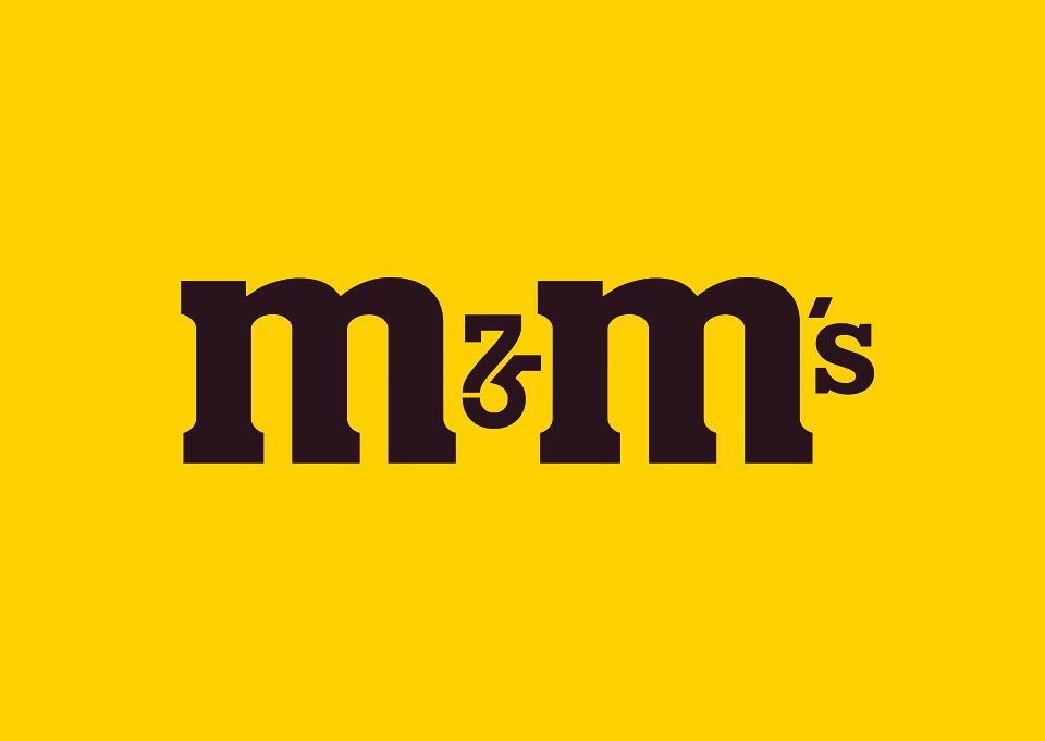
Since 1941, M&M’s has been adored by chocolate lovers around the world. The brand wanted an ownable logo to use during the year long celebration of its 75th anniversary.
Creative Idea
The idea was simple, transform the M&M’s ampersand into a discoverable “75" typographic symbol. Many brands add new visual elements and clichés to their brand mark during an anniversary. Our goal was to use the brand’s existing iconic equities rather than muddy the symbol with balloons and birthday cakes. Our belief was that a simple and iconic symbol integrated into the brand mark would allow for a flexible system that would last all year long.
Creative Execution
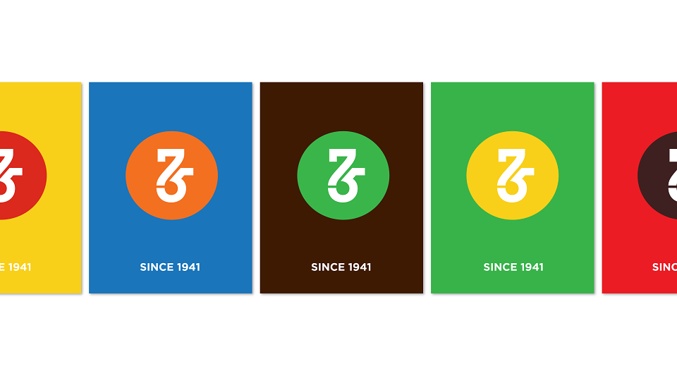
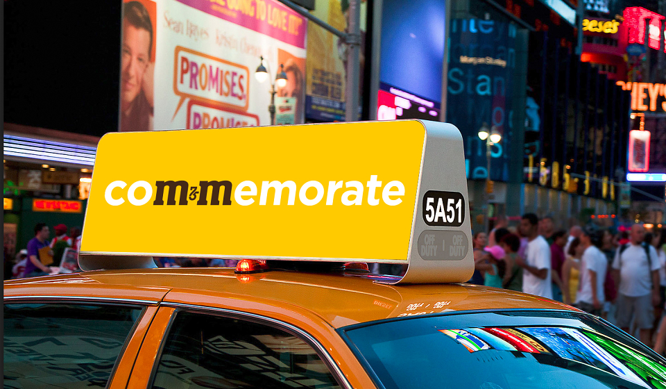
In order to create a powerful symbol, the layers of keylines and shadows within the M&M’s logo were removed. The characters were redrawn to ensure appropriate contrast and the visual feel of the ampersand was matched with the 75 ligature. The brand was encouraged to use the logo as a flexible toolkit, including the word mark, the 75 ligature and the 75 within the lentil.
Results
The brand has begun to use the logo within numerous 75th anniversary touch-points, including social media channels, television end-frames, NASCAR sponsorships and events.
MADEIT CREDITS
-

Mars Inc.Client
-

Jones Knowles Ritchie -

Amy MawMarketing Manager -

Tosh HallCreative Director -

Matt ParkesGlobal Marketing Director -
Grace DawsonAccount Director