GMA Creative Firm
Lisbon
ABOUT
Concept
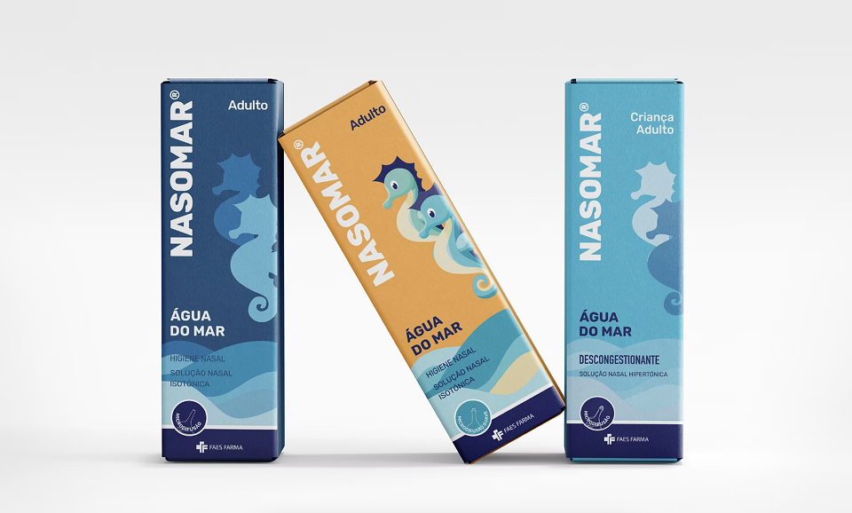
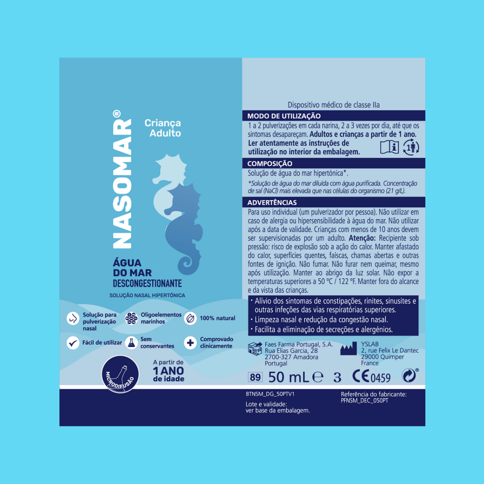
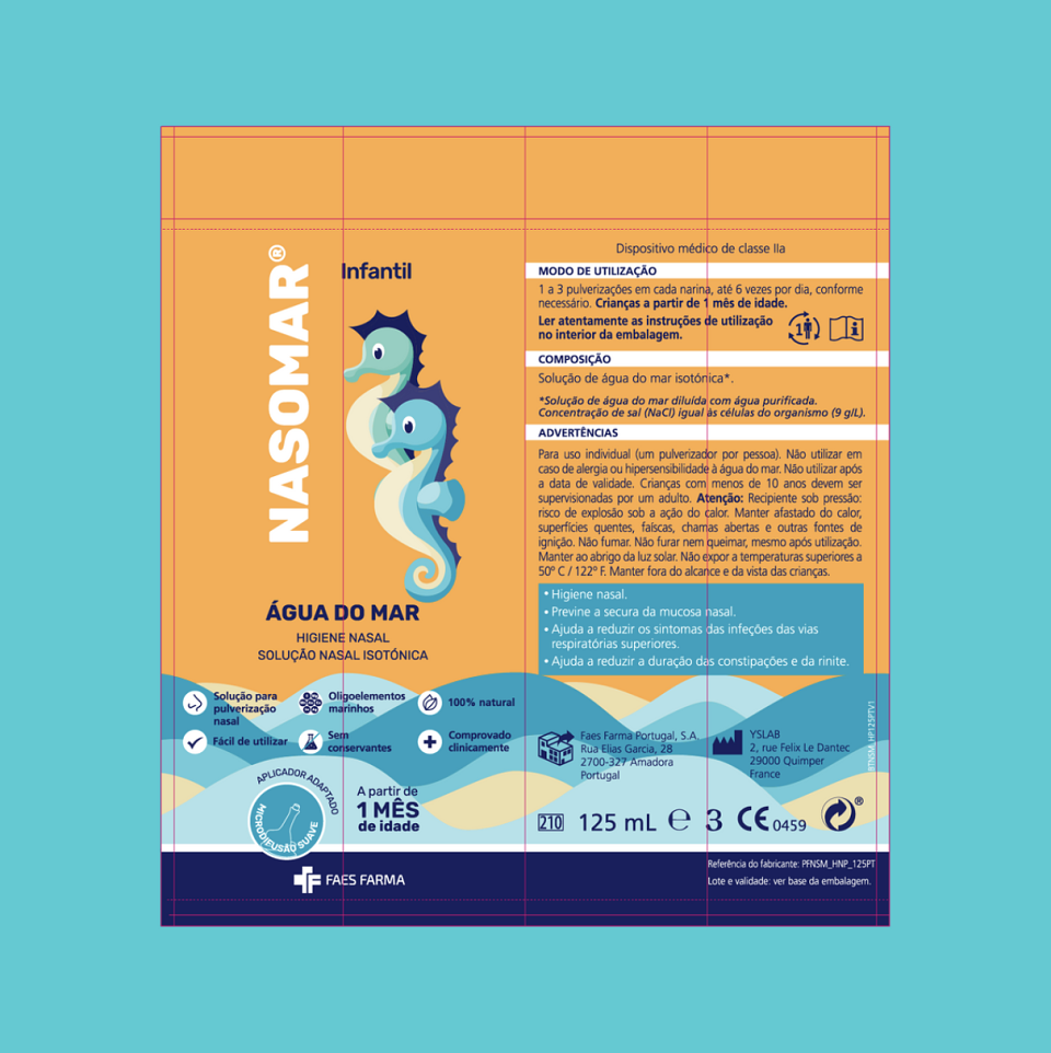
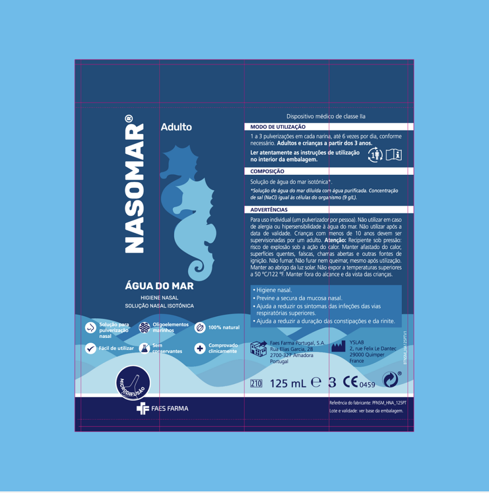
With over 25 years on the market, Nasomar sought to modernize its logo and packaging while retaining a connection to its familiar image. The redesign focused on enhancing readability and brand identity consistency. The seahorse symbol, known from Nasomar Infant, was reimagined as the “Nasomarinho,” giving the brand a unique personality: calm, charismatic, and friendly. The wave motif, already part of the brand’s visual universe, was extended into continuous waves across the packaging, creating a cohesive and recognizable design.
Execution
The project updated the brand’s graphic design and logo while introducing refreshed packaging for the three product lines: Adult, Infant, and Infant & Adult. The design stood out with its clean, modern visuals, emphasizing familiarity while differentiating Nasomar from competitors.
Results
The new logo and packaging successfully modernized Nasomar’s image while maintaining its connection to existing consumers. The updated designs established a cohesive visual identity that increased shelf appeal and strengthened Nasomar’s position in the market.