Georgina Mallett
Graphic Designer
ABOUT
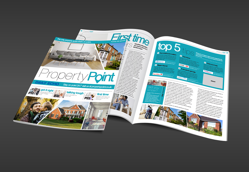
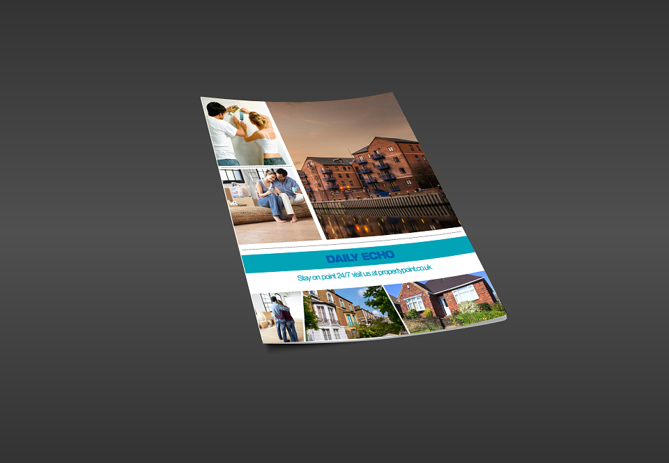
This was an in-house Newquest project, which focused on relaunching their UK based property magazine, with a whole new name, colour scheme, style, look and content, in order to promote sales.
I had full creative reign with this project - they wanted nothing to be similar to what’s been produced before and wanted everything to be fresh, modern and up to date.
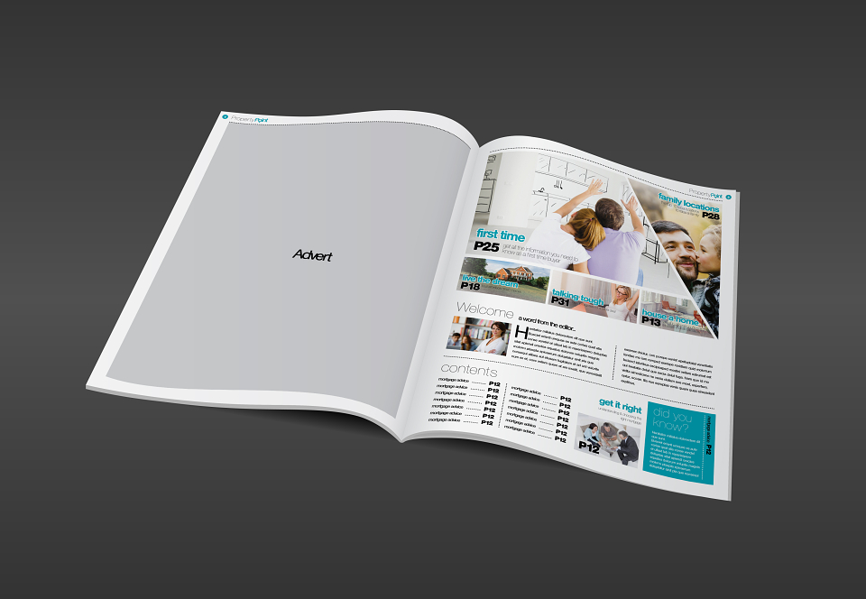
Their magazine before was quite dated and gave off more a newspaper style. The colours and imagery were drab and purely showed exteriors of houses. Whilst the entire supplement had no editorial or lifestyle content at all - purely advertisement and listings!
I decided to scrap all of that, as searches take place online now.
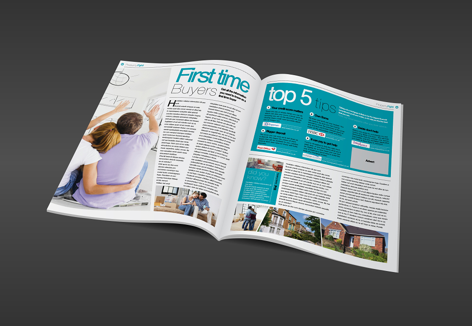
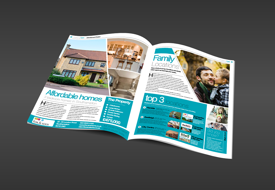
In order for people to read property supplements - it’s more about the lifestyle and up-to date guides, information surrounding the market.
So I created a lifestyle magazine, with articles that concern the entire property ladder, guides and helpful tips people want to keep and imagery that reflects the personal side people can connect with. There is clever, subtle advertising space and it becomes helpful and intuitive, rather than unwanted and in your face.
The entire style is clean and edgy, modern and appealing.
The client was pleased with the campaign.