Georgina Graham
Head of Design
ABOUT
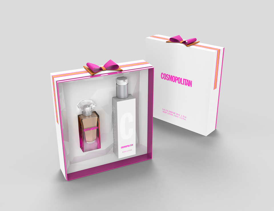
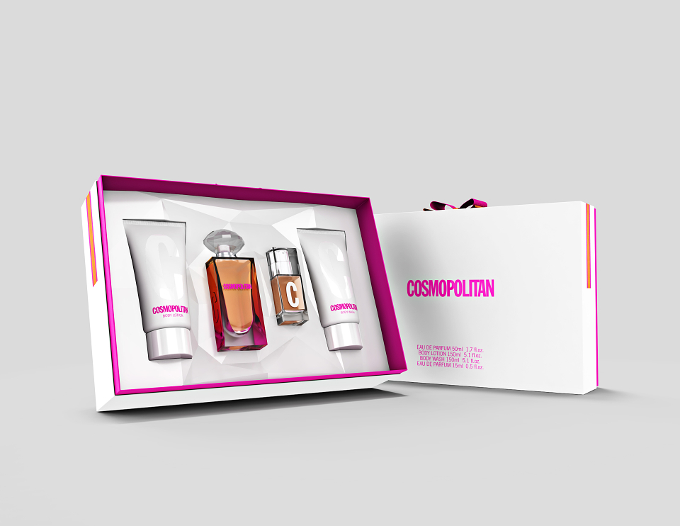
This was Cosmopolitan the magazine's first foray into fragrance and we won the licence to design & develop for them.
Our brief was it must be Fun, Fearless & Feminine
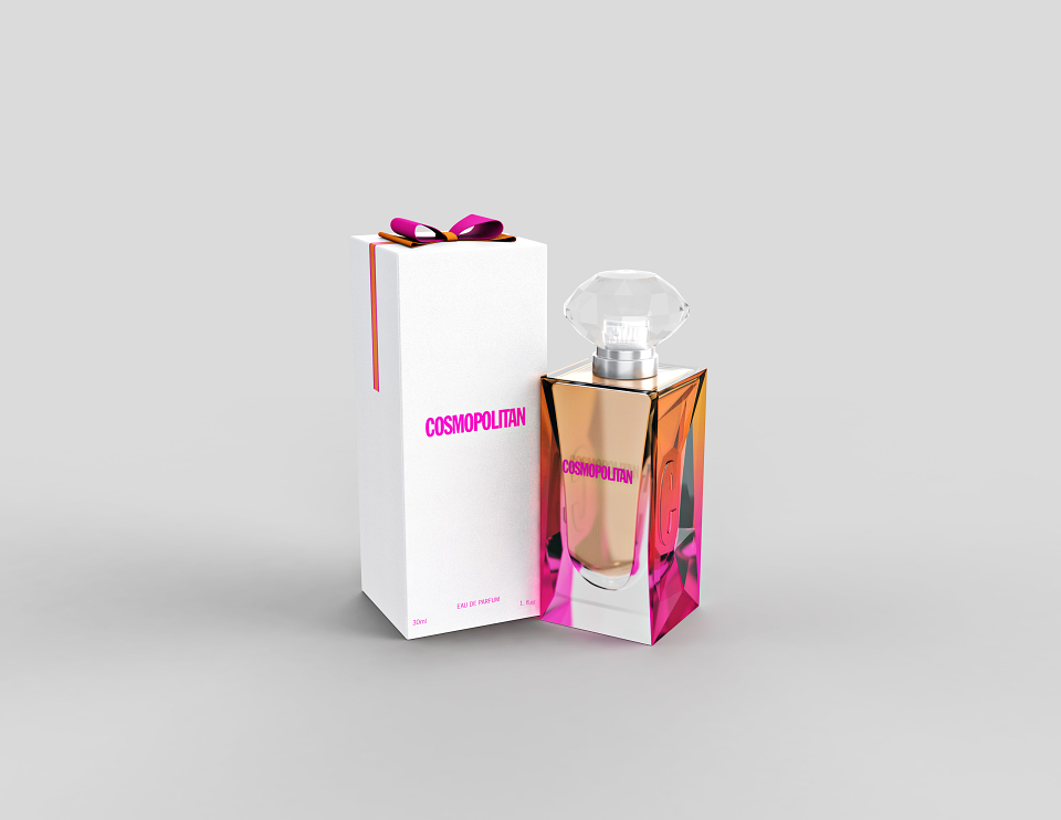
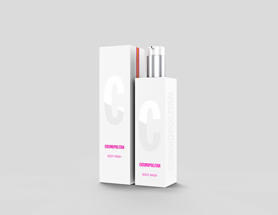
The bottle had to look crushed in the sides with a C embossing as though the C had forced it's way into the sides of the bottle.
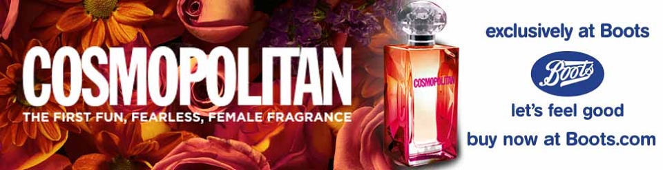
I came up with the idea that the crushed effect should be a facet design like a diamond to represent the fearless strength of women -
The vignette pink to orange was to represent the fun and was Cosmo's key colours for that season.
The Feminine was the fragrance which I developed with the fragrance house as I have a background in Perfumery.
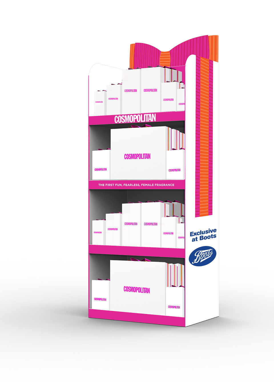
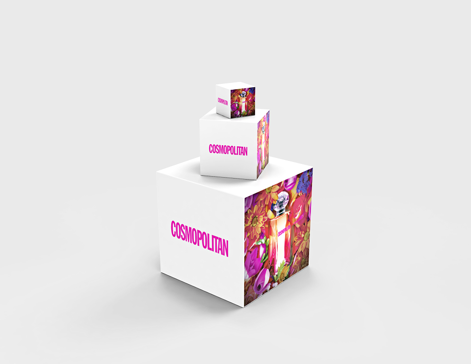
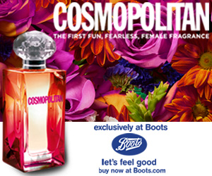
I also designed the POS & Marketing materials including roll ups, stands & web banners to go with this.
Launched in Boots in 2015.