George Apetrei
UI / UX Designer
ABOUT
J&B Campaign Launch Website
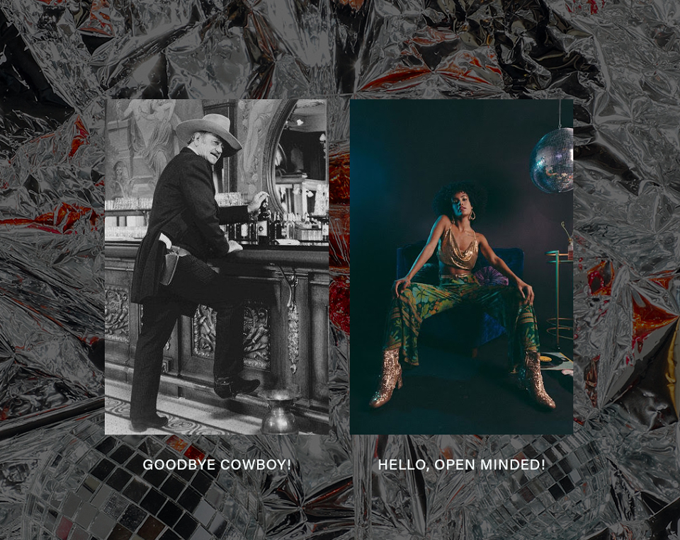
Back in 2020 J&B Global decided to change their traditional approach and came with a new creative platform, expanding their target and (finally) including a more diverse audience, including women in their agenda.
As a digital art director and UX/UI Designer I was fully in charge with their online presence, research, documentation, wireframing and prototyping, working closely with a copywriter and a tech team.
The Scope
We met the J&B Romania team and their expectations and scope of work were quite straight forward: a new website and additional assets for their sales force and bartenders.
Brand & Market Research
Back at our office we started researching the brand evolution in Romania, their editorial affairs, how it is perceived by public and by bartenders.We found out that they had different phases and, at one point supported a series of clubbing events (including a blog).Meanwhile, their overall presence shrank and, on the other hand the bartenders didn’t use much of their drink on their cocktails.
Solutions
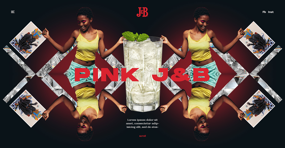
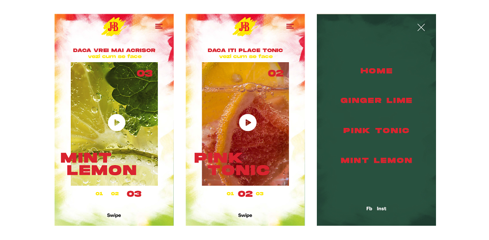
After a few rounds of short brainstorms we came out with a couple of ideas and presented them to our creative director.In order to shot both sides at the same time (the inclusive / diverse audience and the new ways of mixing the drink), we illustrated three character types (the bold & flirtatious, shy & fashionable and suspicious & mysterious).Each one had a correspondent drink based on the personality (J&B Tonic - bold, J&B Ginger Beer and Lime - mysterious). As a result we had a key visual for each one.
Structure, wireframing, interactions and the interface
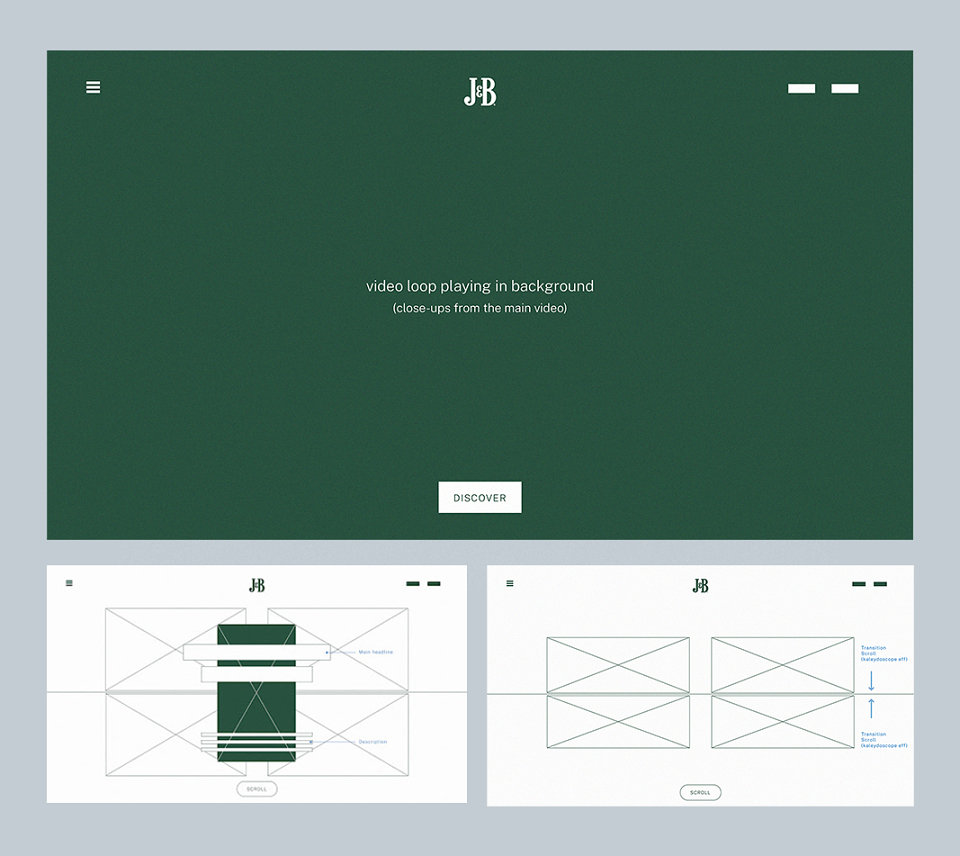
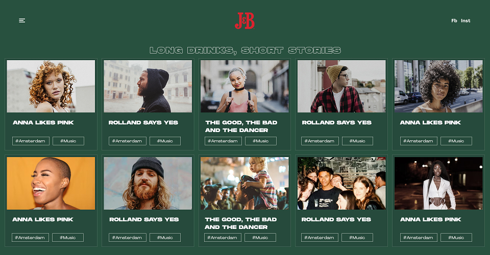
After we had a concept, I returned to develop the experience and fill the gaps for the website.Firstly, I validate with our strategist what information they need to communicate. We simplified their structure, kept their corporate and company page as simple and effective as possible.In the second round I defined the pages, their content and flow: Home Page (as a showcase / summary with specific links), the Feature product / Cocktail aka Character type page, Menu for extended options, Contact, About and so on. As a bonus, I added a blog, called Long Drinks, Short Stories.
UI Design
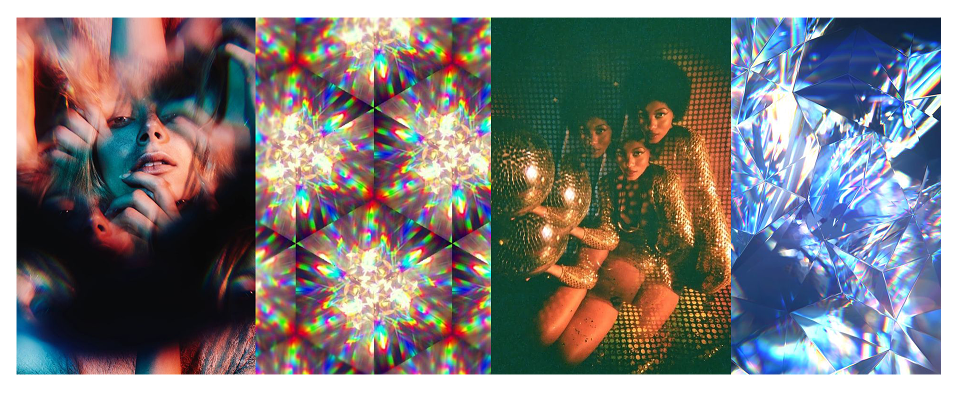
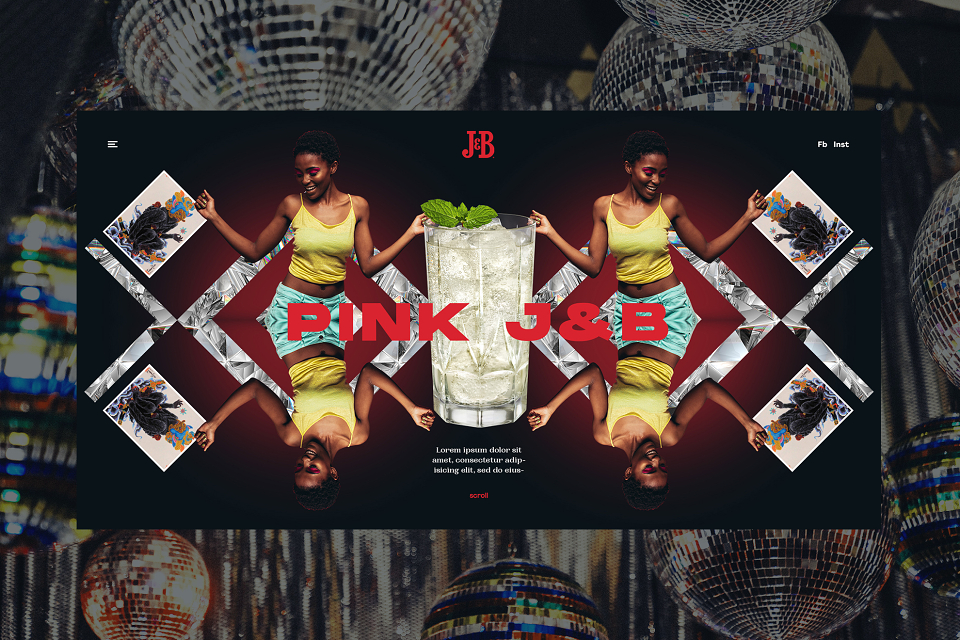
As described earlier, each product illustrates a personality. To make it feel more “alive”, and place them in an “environment”, I was looking for an interaction that gives a sense of space and works well on symmetric layouts.
And the result:
To maximize the "Kaleidoscopic" effect, we use a parallax at the center of the page / viewport and "cut" the symmetric layout while scrolling. This also worked excellent as a transition effect from a visual to another.
Long Drinks, Short Stories
We included also an editorial component, a series of short videos of tourists visiting for the first time Bucharest and sharing their impressions about city's nightlife. Short, funny, spontaneous and unexpectedly juicy.
While the general consumers have the website to inform and get updated with the brand’s news, the promoters used a microsite to advertise the featured drinks to the bartenders (along other duties they already had at their partner locations).
Thank you!
MADEIT CREDITS
-

George ApetreiUI / UX Designer