George Apetrei
UI / UX Designer
ABOUT
AV Store - Ecommerce Experience
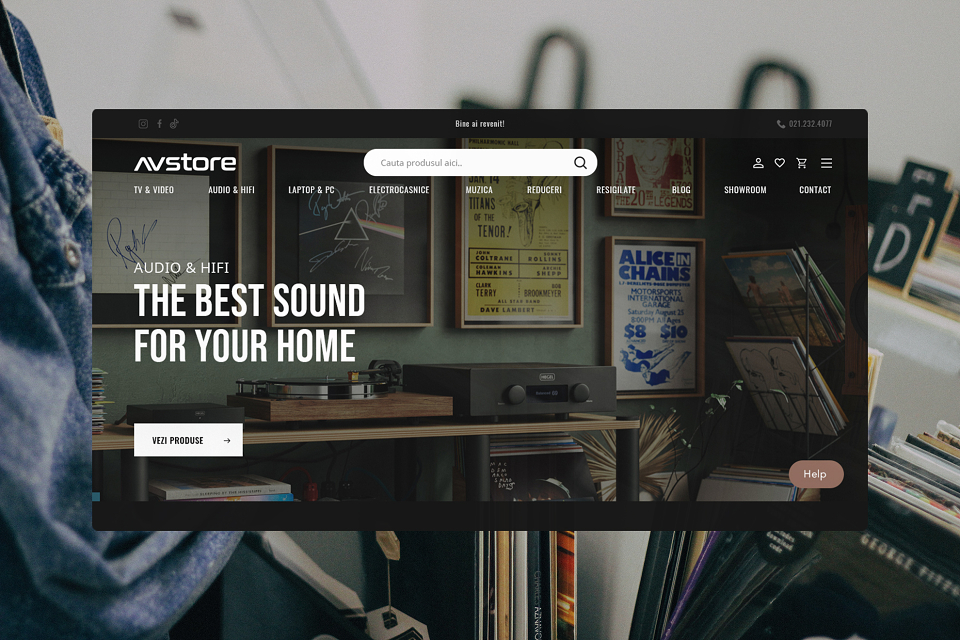
AV Store is one of the best hi-fi retailers from Romania, their portfolio showcasing some of the most iconic brands, a truly gold mine for audiophiles of any level. Despite that, the brand didn’t benefit from a facelift in a while and the website had some certain issues to be addressed from a UX perspective.My role, as a UX and UI Designer was to identify the main problems, propose new features, create and validate additional user scenarios and flows and design a new interface that matches the brand positioning.
First issues to be addressed
At the very beginning some User Experience issues were taken into account, before diving deeper into the project. Some of them included:• Overwhelming hierarchy and structure;• Difficult navigation between related products;• Busy and outdated user interface;• Missing key features as: online support, a smarter search, guest user shopping.
User research and conclusions
The first stage was to collect all the information from the client, their customer support department, and acknowledge the technical limitations of the custom CMS they built. Once we got all the information onboard, we were ready to conduct a series of interviews to get to know their audience better. As we already knew, there is a strong revival and increase of interest in analog formats, hi-fi equipment and accessories.What we wanted to know was how many distinct categories are from the entry level to the experienced audiophile and create different scenarios and personas for each of them. We learned about their tech set-ups, how often they update their sound systems, how much they are willing to spend, what are their favorite online blogs and websites they get the information from.
Once we overlapped the results, we got four main categories:A. The Master AudiophileKnows exactly what piece of equipment needs and why. Experienced with multiple audio formats, already changed a couple of products and brands. They easily could explain why the product x complements the amplifier y and z speakers.B. The Feelie (aka not so technical)What they know is that they need equipment to play their records, but they can easily get lost between options. Once they get the guidance, they are able to understand the product ranges but not the technical specs. They want the best quality, but also appreciate the extra connectivity options and products’ design.C. The Up to Date Connoisseur If the Master Audiophile knows a certain territory, The Up to Date Connoisseur tends to get informed about lots of gadgets, apps and accessories. They like to know and get the newer products, compare and debate on their specs and compatibilities. They are digital oriented and like to have the best interconnected solutions.D. The Audiophile on a budget They love music but aren’t willing to spend a lot of money on sophisticated and premium/expensive equipment (not thousands but hundreds of euros on a piece of gear). With a focus on more compact solutions, they get the best from their budget and, thankfully there are options for everyone.
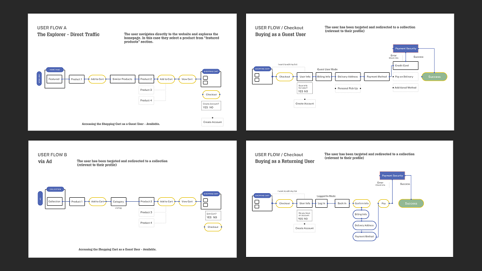
With the profiles already established, the next stage was to define clear user journeys, adding several features and compiling the information in a fluid and modular structure. Some of the functionalities are: shareable wish lists, a hi-fi configurator and a strong editorial component.
Wireframing, prototyping and the interface
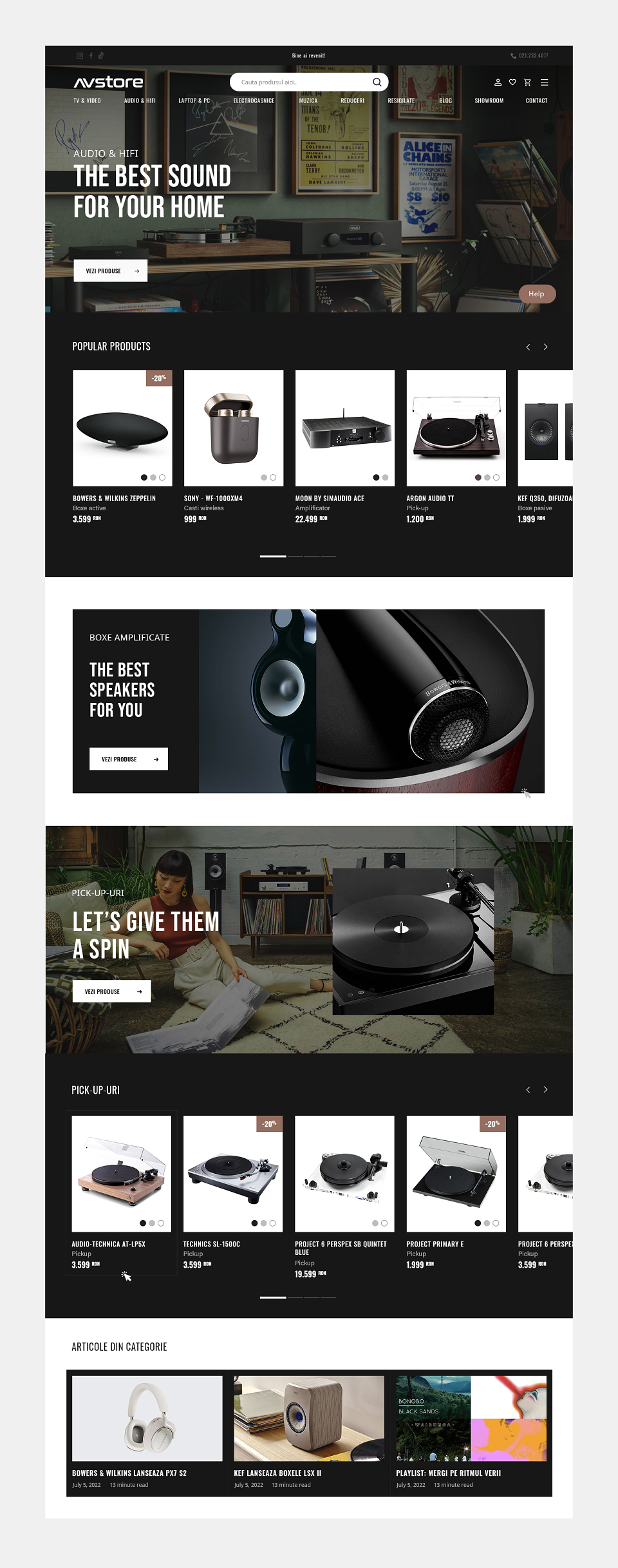
As the website itself is quite complex and requires high flexibility, we agreed to define and design the sections that will finally build the home page, category and landing pages. Modular, flexible with a better focus on products, information hierarchy and imagery.
Now, let’s get back to the music
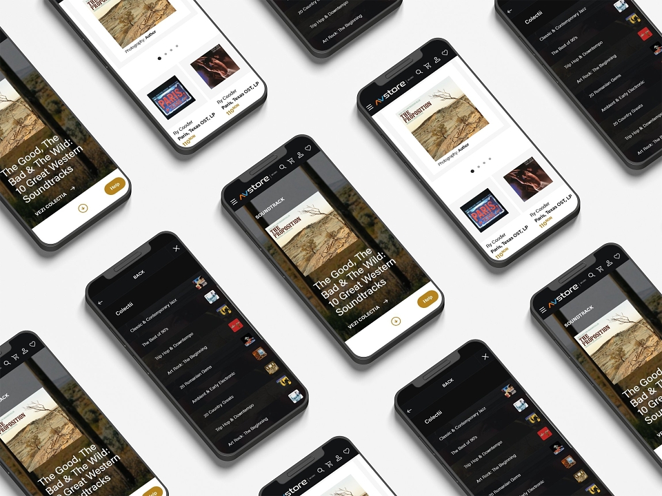
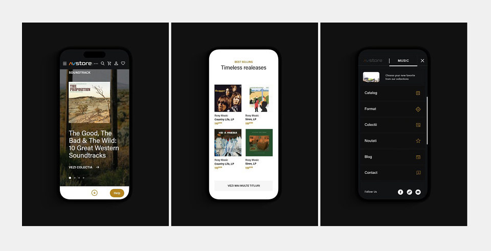
Besides the strong hi-fi equipment, AV Store also sells music records. And yes, it makes perfect sense. What felt a bit overwhelming and counterintuitive was that all the products were treated the same (record players, speakers, amplifiers and records), with the same product listing, filters and product pages. In this case it didn’t work at all, this category having a lot of particularities, less technical, more subjective (despite the formal classifications or filters).
This was also a good opportunity to establish what are the product categories that need different approaches and why a modular CMS serves best different scenarios and opportunities (promotional campaigns, branded landing pages and so on).
The client also agreed that for this particular case a visual differentiation from the main website (a light theme) would be beneficial.
Essential features made easy
Basic as it is, the search itself could add a plus of practicality. As the users like to dive into music collections, to discover artists or releases, some links to collections or artists’ based listings feels intuitive.
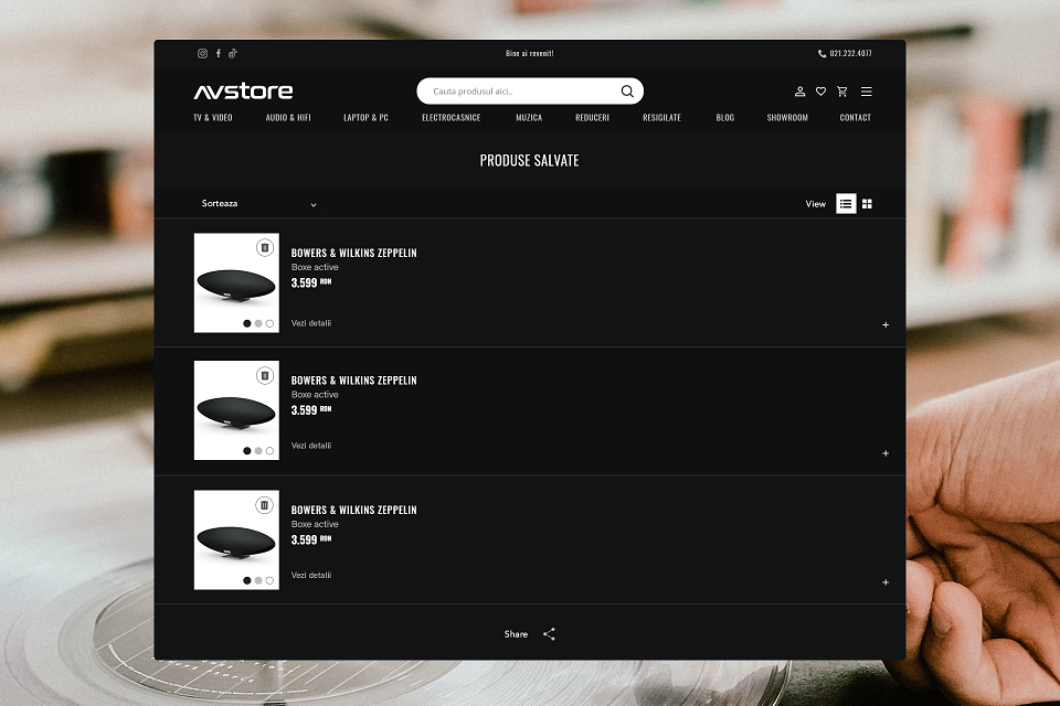
A shareable wish list is another simple yet efficient way of transforming a solitary experience into a conversation. It also helps when users are looking to buy presents without messing it up. For the client it also means recurrence and an organic way of promoting the right product to the right user.
Collection, the curated list
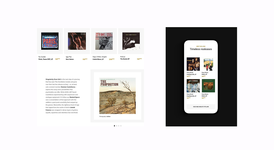
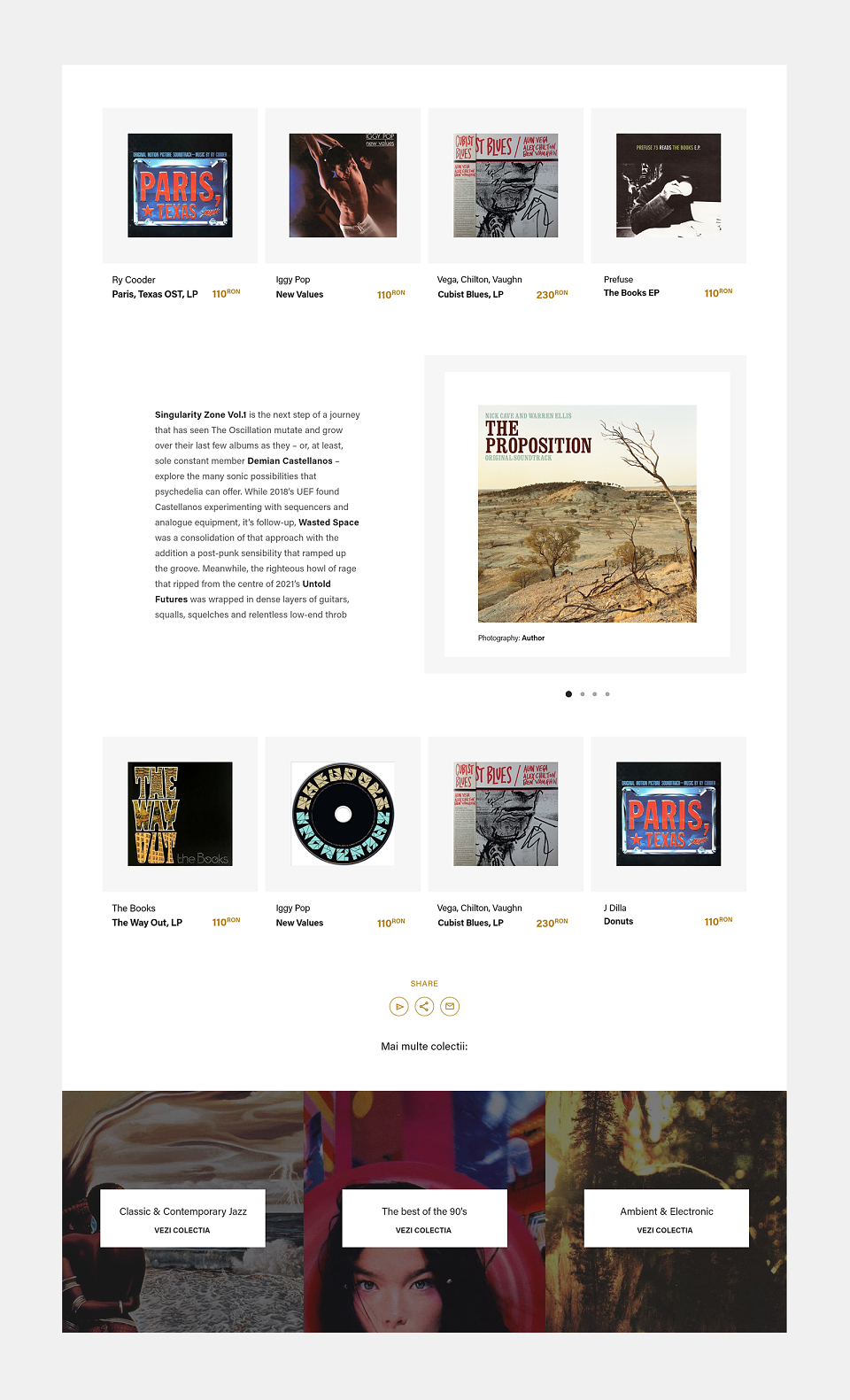
The editorial component, in this case the curated list of recommendations is a really enjoyable way of discovering new artists or releases. It allows you to present very different genres/styles without looking inconsistent, has a personal touch, and makes you want to connect to the curator / selector.
Once everything has been established I was ready to document the interactions and place all the UI components in a Design System.
Thank You!
MADEIT CREDITS
-

George ApetreiUI / UX Designer