GarryVeda Design Bureau
Dnipro
ABOUT
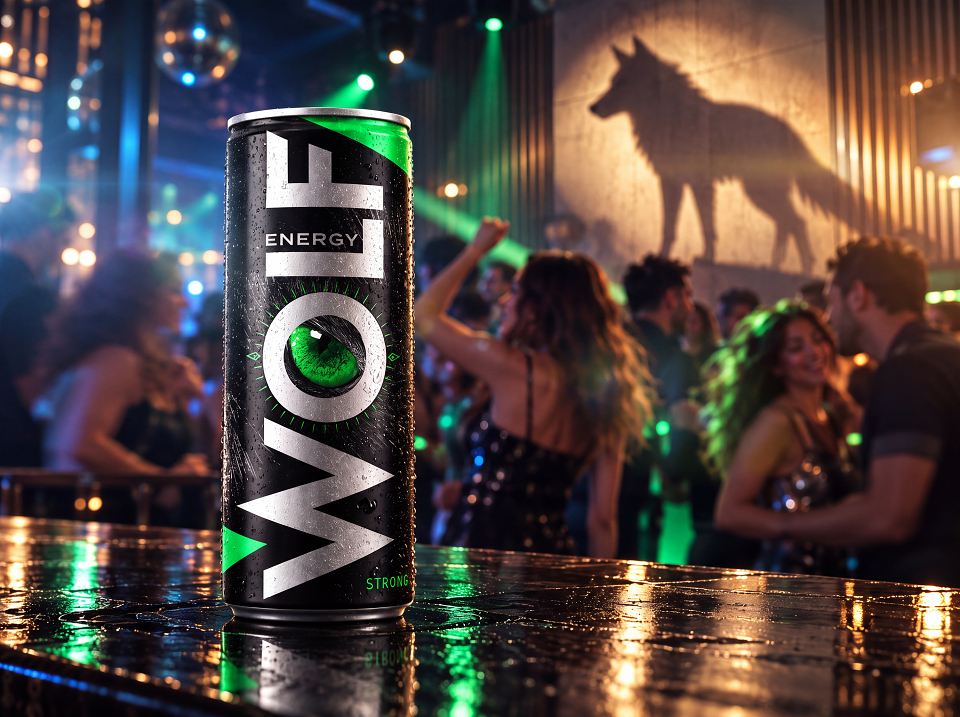
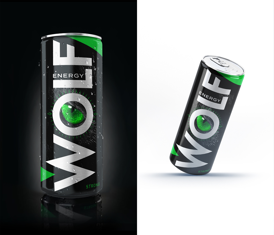
WOLF ENERGY: Rethinking the Visual Language of Energy Drinks
The project started with a simple question: what can an energy drink look like without relying on the flames, lightning, aggressive animals, and other visual clichés that dominate the category?
Energy drinks are one of the most visually aggressive categories in consumer packaging. Flames, lightning, wild animals, speed graphics, and exaggerated claims have become so common that many products begin to look interchangeable.
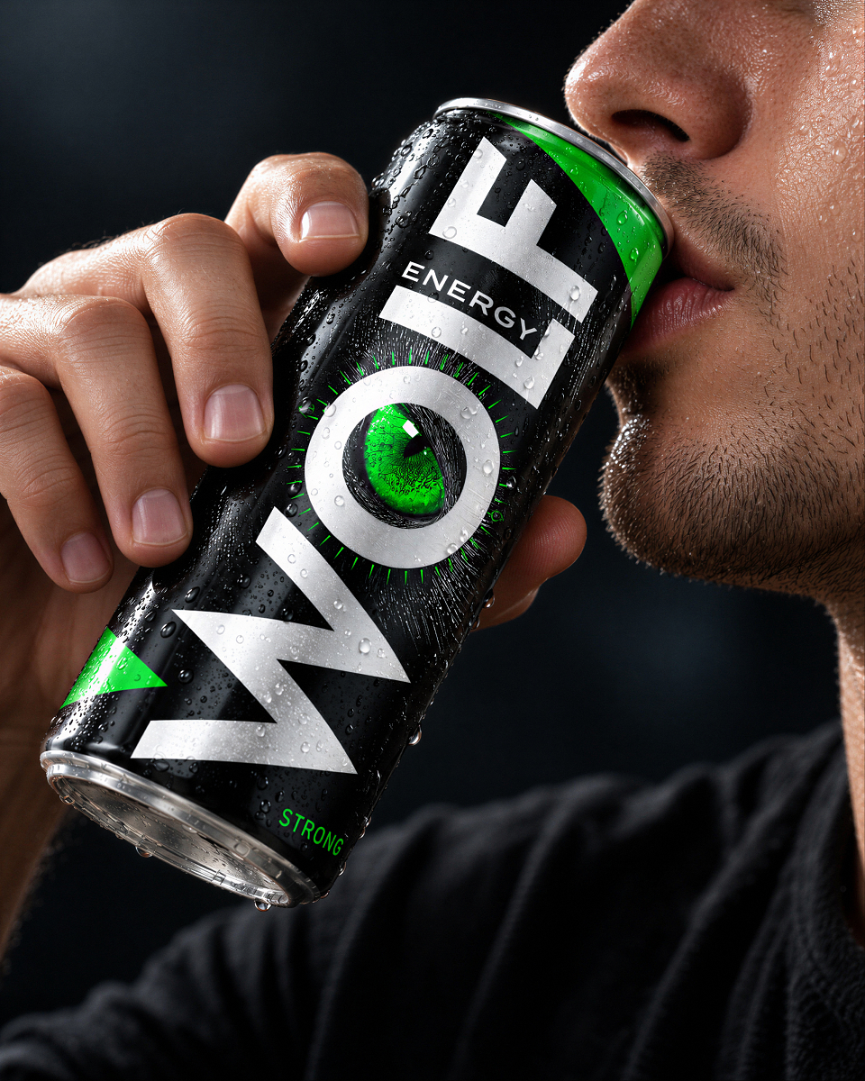
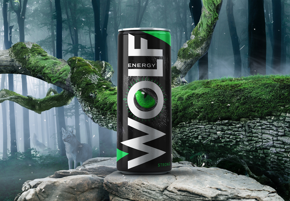
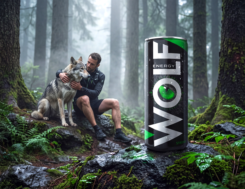
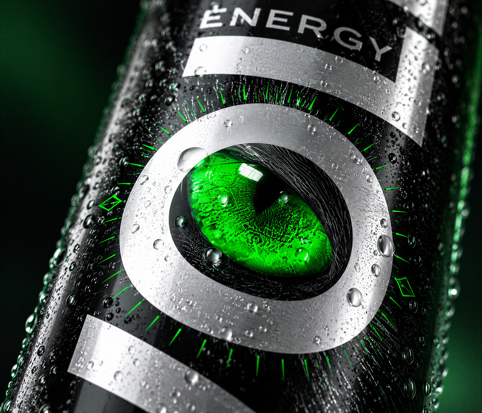
WOLF ENERGY was developed as an exploration of a different approach. Instead of adding more visual noise, the concept reduces the design to a small number of highly recognizable elements and lets scale, contrast, and composition create the impact.
For us, the project illustrates a simple principle: great packaging doesn't always need more visual elements to attract attention. Sometimes, it needs fewer, stronger ones.