GarryVeda Design Bureau
Dnipro
ABOUT
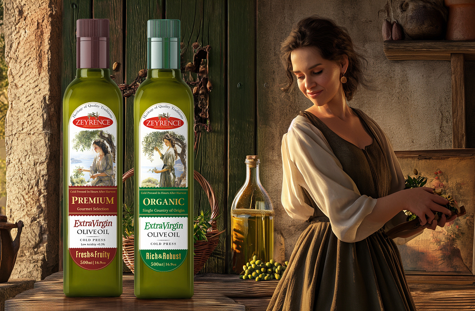
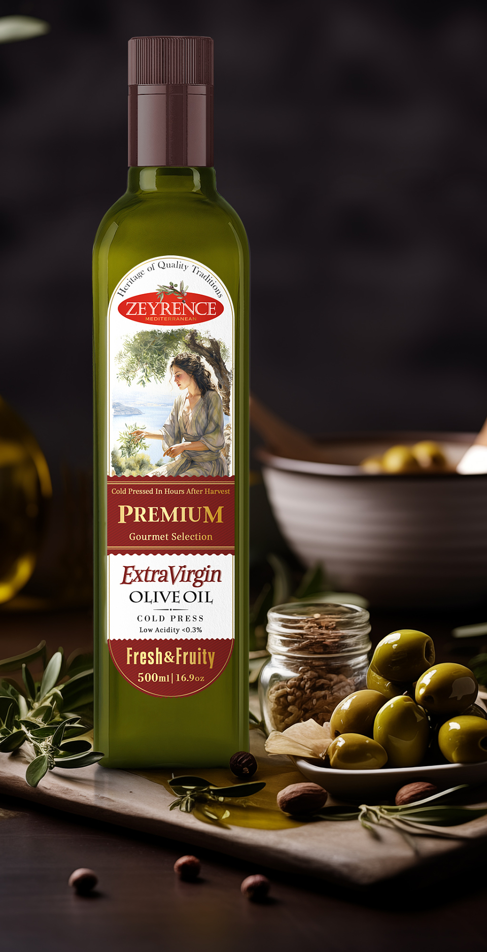
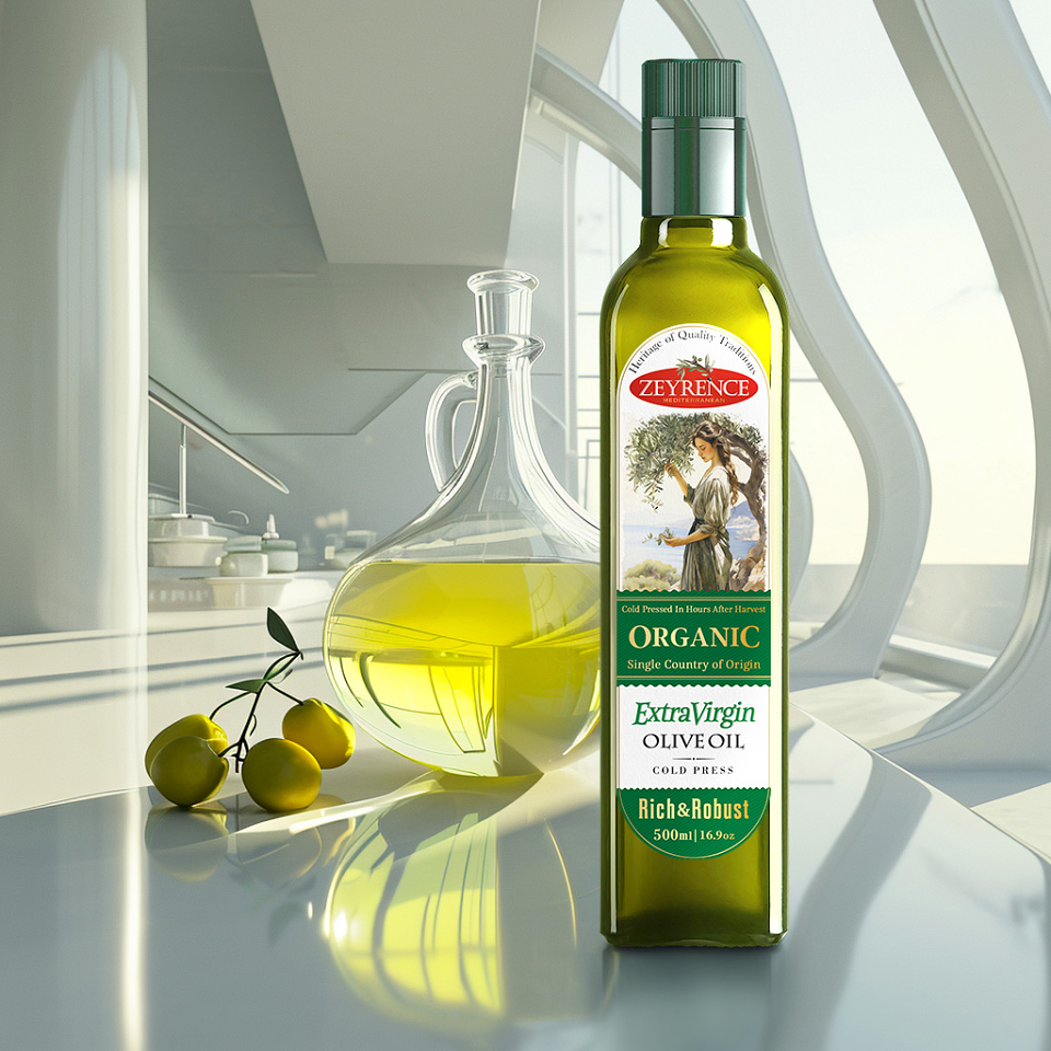
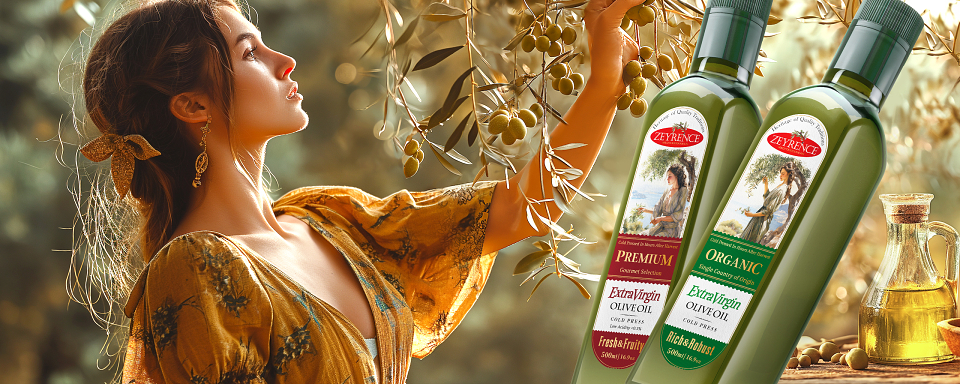
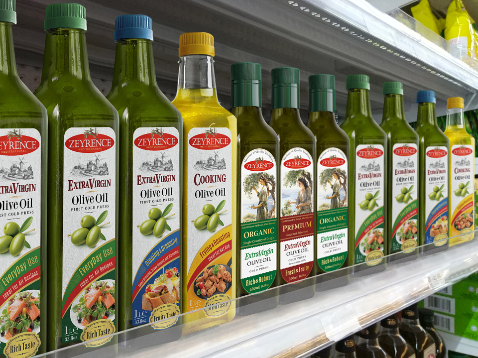
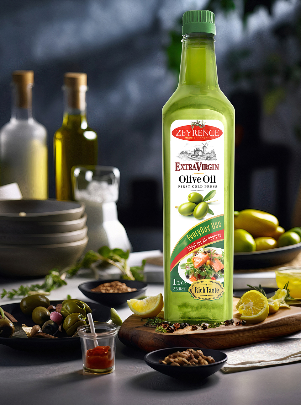
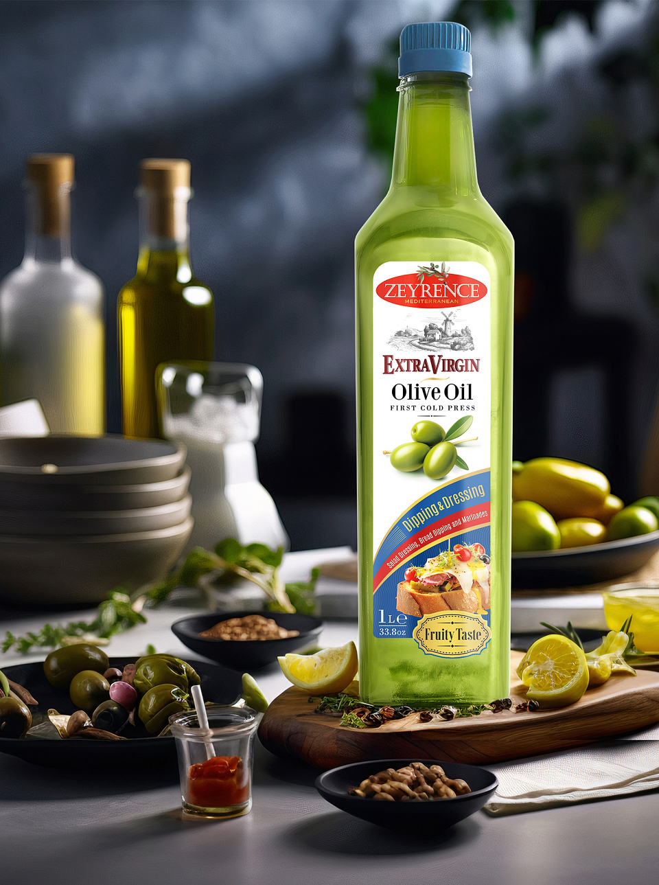
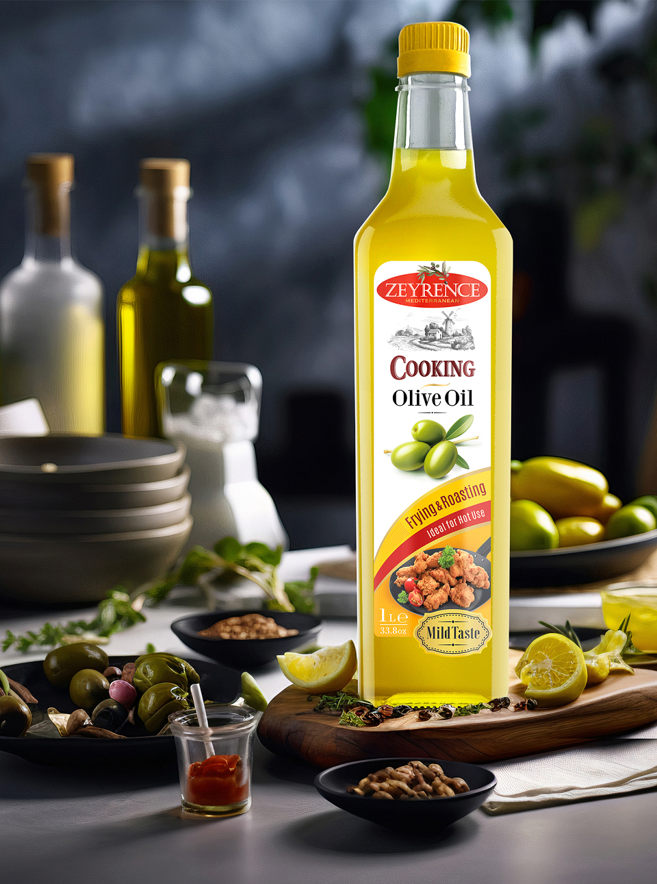
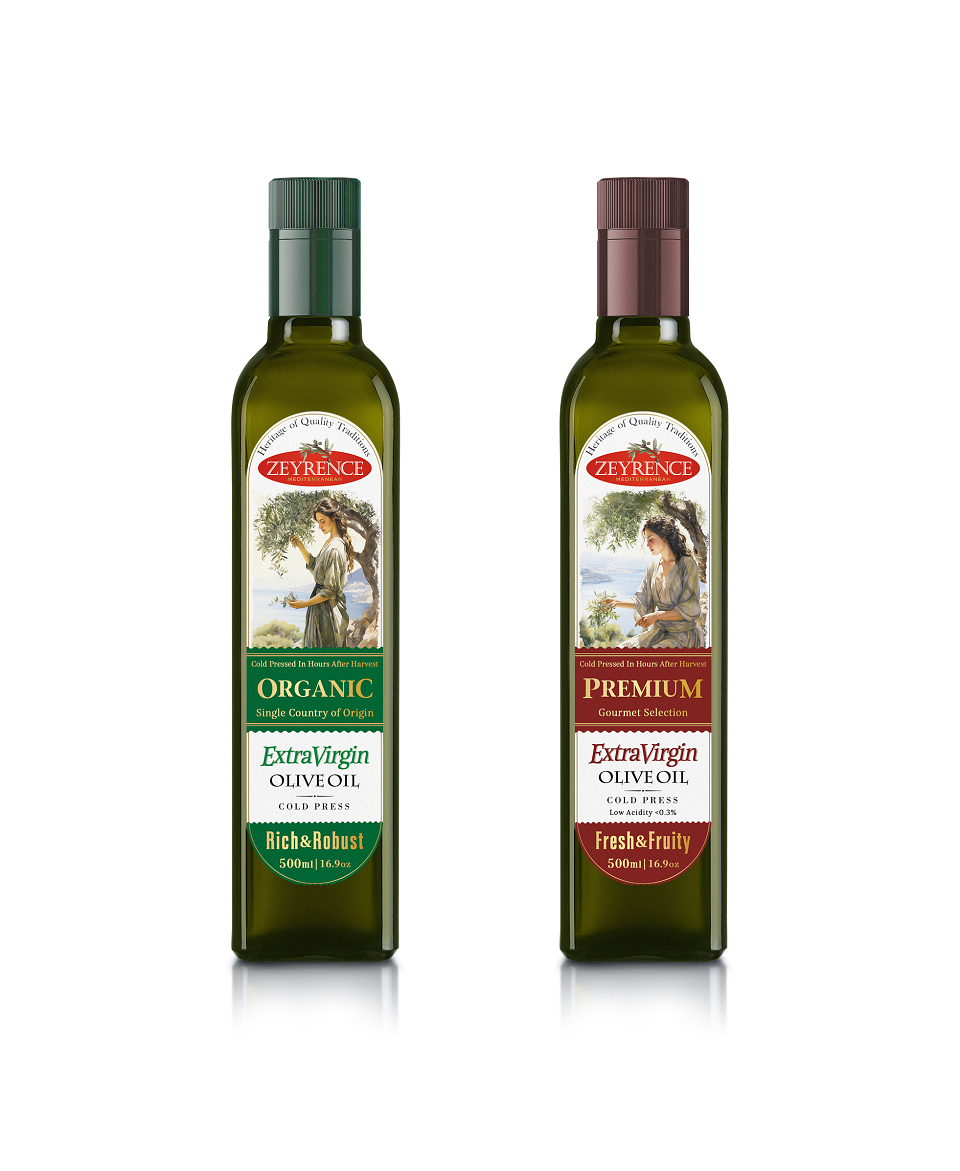
Zeyrence Extra Virgin Olive Oil is a packaging design system developed for a premium Mediterranean olive oil range, including Premium and Organic variants.
The main challenge was to communicate authenticity, quality, and traditional craftsmanship in a category where many products rely on similar Mediterranean visual codes. The design needed to feel familiar enough to signal genuine olive oil while remaining distinctive and premium on the shelf.
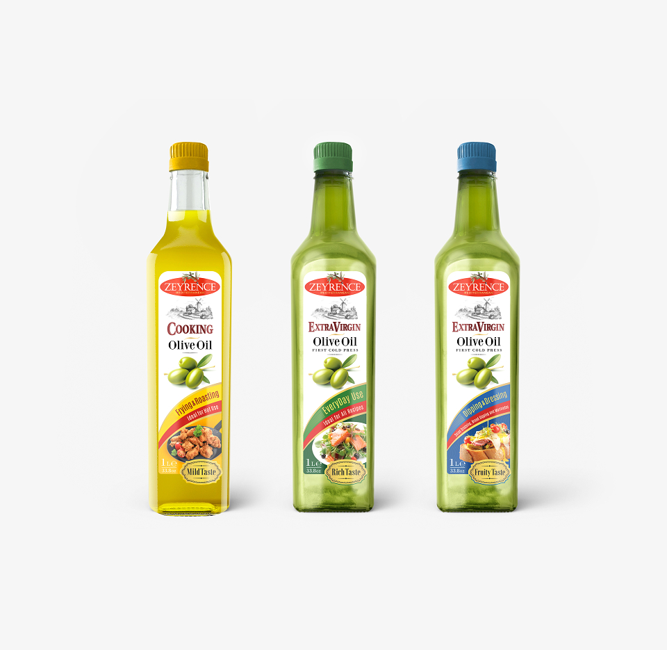
We developed a visual system built around elegant classical illustration, a strong central brand mark, clear product hierarchy, and differentiated color coding for each variant. Burgundy tones reinforce the richer gourmet character of the Premium line, while green creates a more natural and organic expression for the Organic product.
Key product messages such as cold pressing, low acidity, origin, and flavor profile were organized clearly without overwhelming the front label.
GarryVeda Design Bureau developed the packaging concept, visual language, SKU differentiation, label composition, and final production-ready artwork.
The resulting system gives Zeyrence a cohesive premium identity while making the individual variants easy to distinguish and preserving a strong sense of Mediterranean authenticity.