GarryVeda Design Bureau
Dnipro
ABOUT
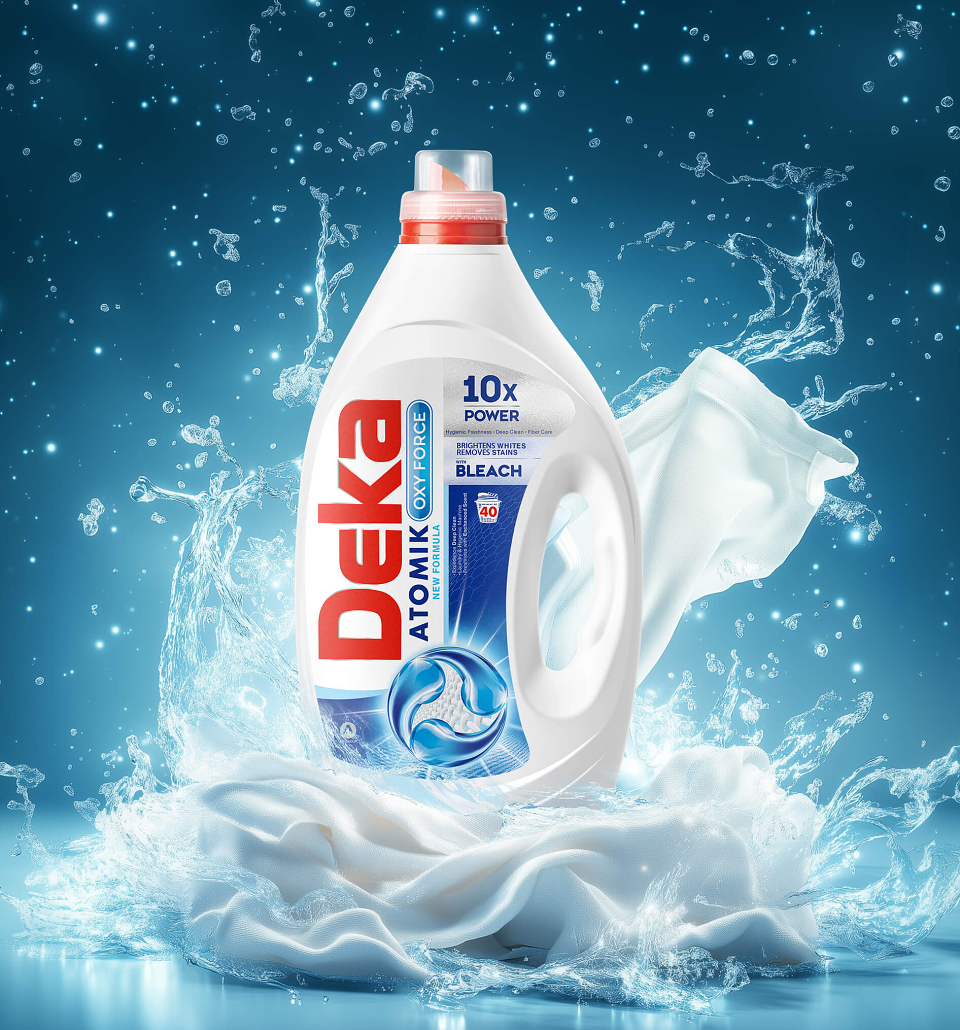
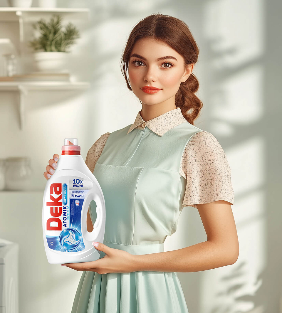
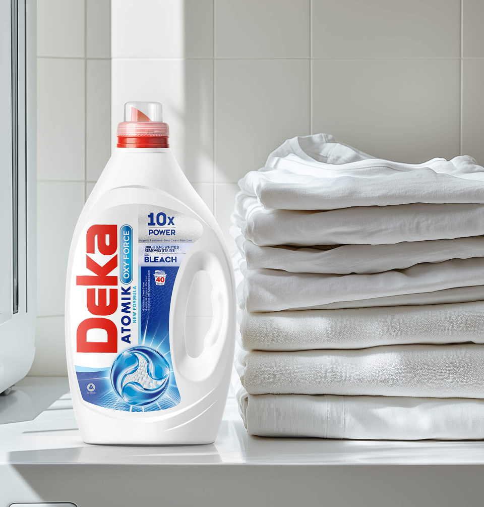
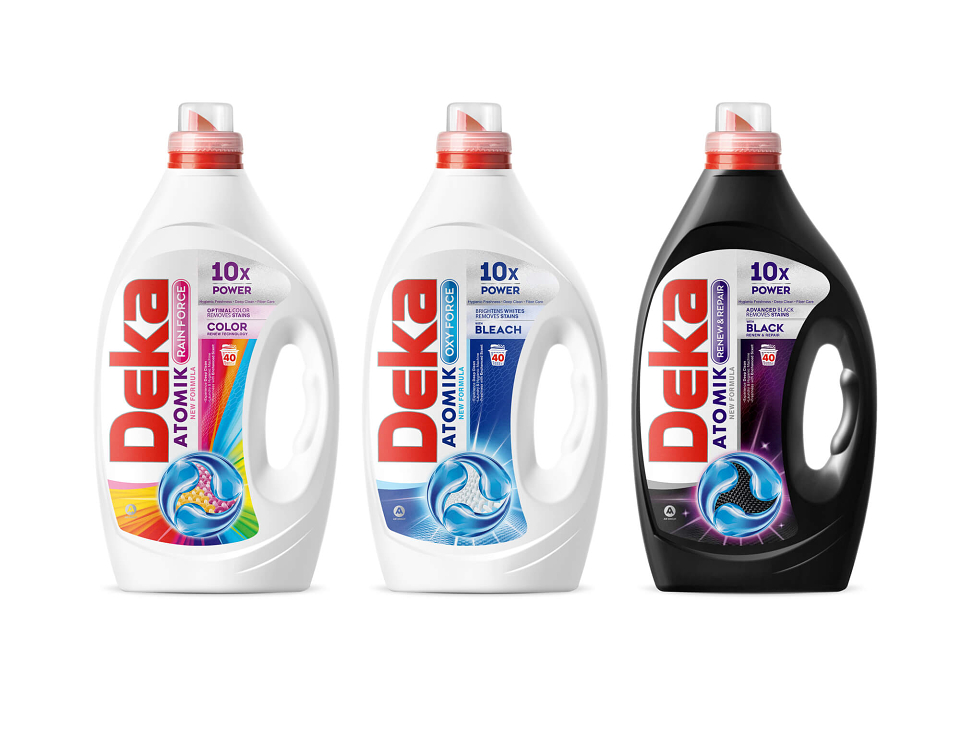
DEKA Atomik is a packaging design system developed for a concentrated liquid laundry detergent range with dedicated formulas for Colors, Whites, and Blacks.
The laundry detergent market is highly competitive, with many products relying on similar claims, colors, and visual codes. The key challenge was to give DEKA Atomik a strong and immediately recognizable shelf presence while clearly differentiating each formula within one unified product family.
We created a bold visual system based on a strong vertical brand block, dynamic technical graphics, high-contrast typography, and distinctive color coding for each variant. Color uses an energetic multicolor treatment, Oxy Force relies on clean blue tones associated with freshness and whiteness, while Black receives a darker and more premium visual character.
The information hierarchy was carefully structured to communicate multiple performance benefits clearly without making the packaging feel overloaded.
GarryVeda Design Bureau developed the packaging concept, SKU differentiation system, graphic language, information hierarchy, and final production-ready artwork for the complete range.
The resulting system gives DEKA Atomik a cohesive, scalable identity with strong shelf recognition and clear product differentiation across the full detergent family.