Gareth
Design Director
ABOUT
BRIEF
Speedway of Nations is a rebrand of ‘Speedway world cup’, a newly formed World Championship event. 15 nations compete head to head in a high octane week for the ultimate title of World Champions.
The objective was to create a logo identity to captivate current and new audiences alike. The logo would need to symbolise the nature of the sport and be a mark fans could recognise.
SOLUTION
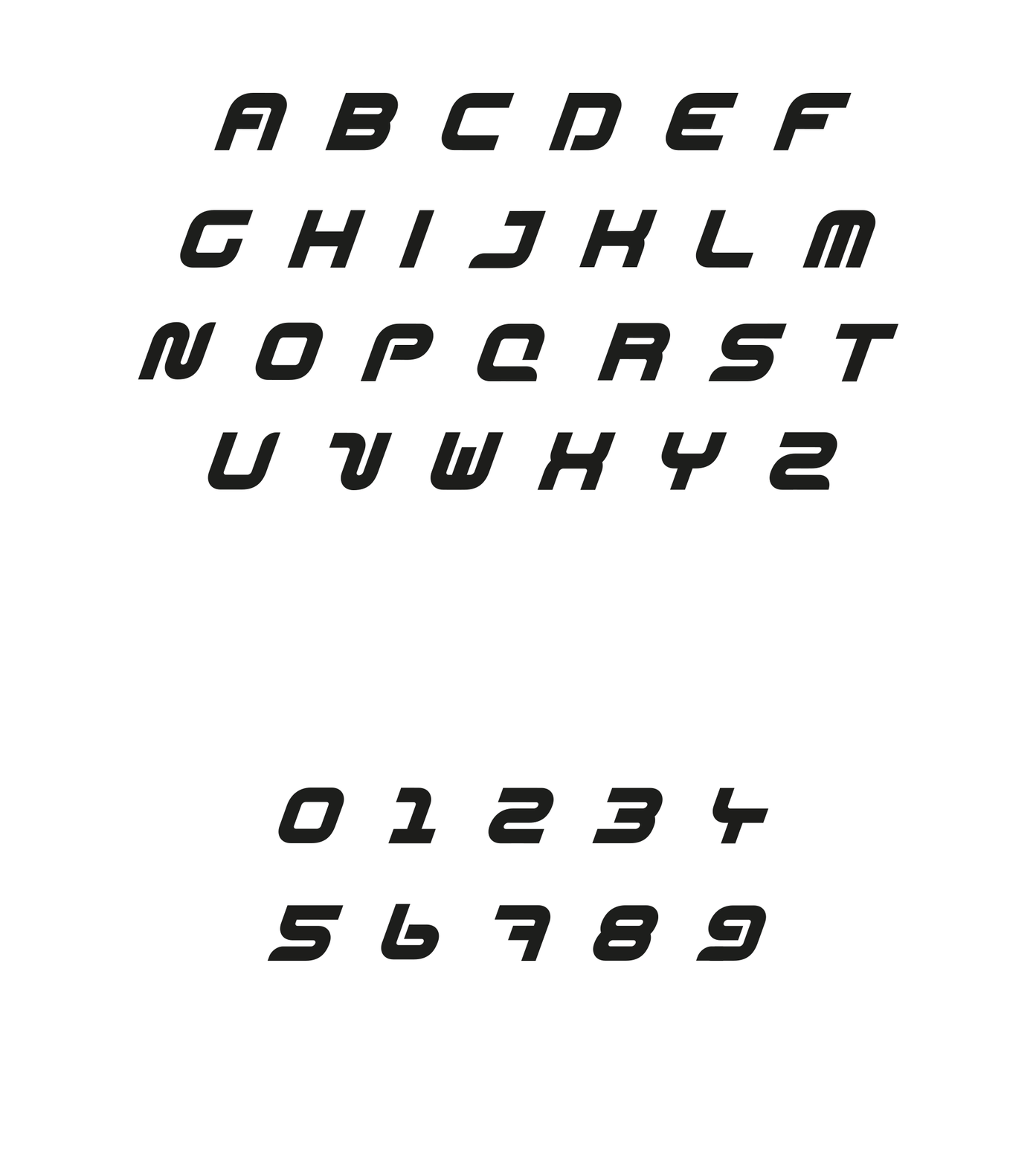
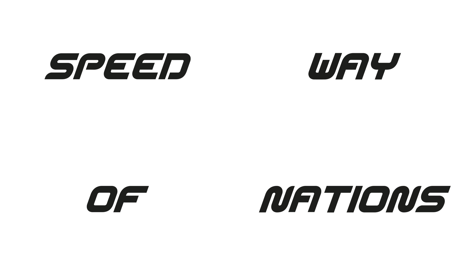
A fluid line. The lettermark logo symbolises the fluid motion, direction and momentum of the speedway race which orients around an oval track.
Unique to the Speedway of Nations race is the unity of two team drivers per race. This unit of two is also reflected in the lettermark.
RESULT
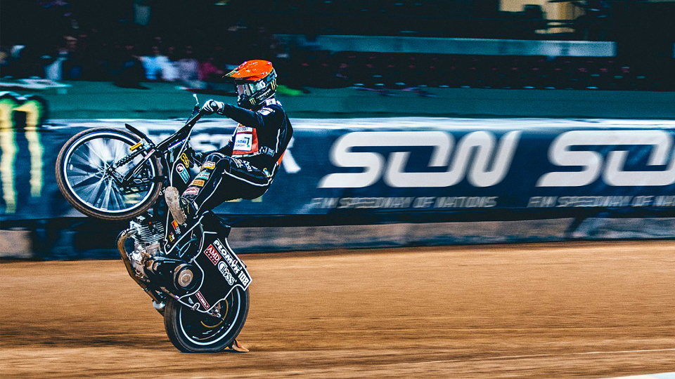
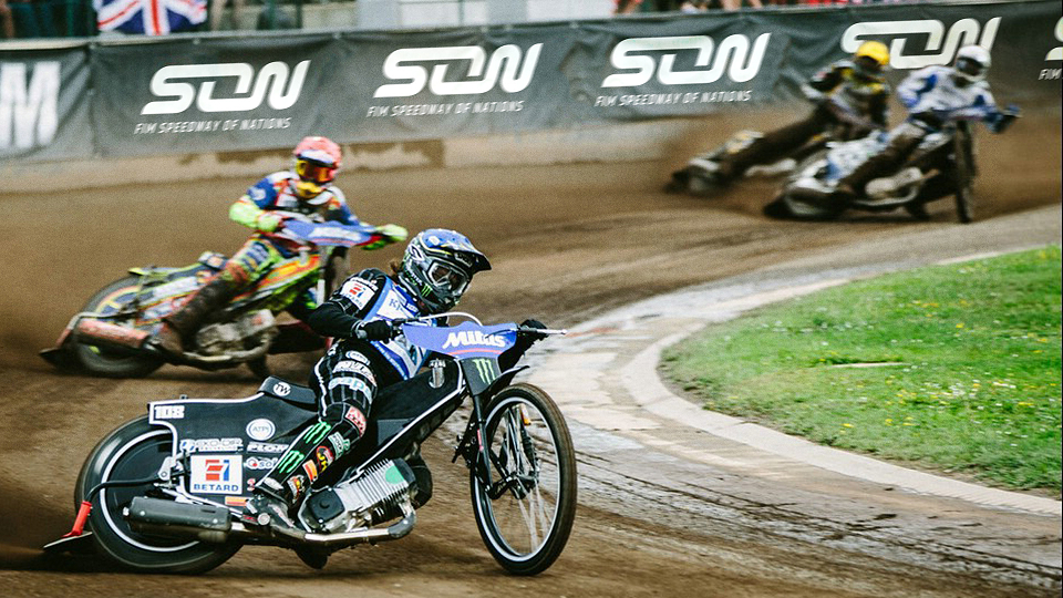
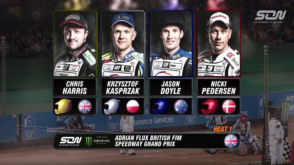
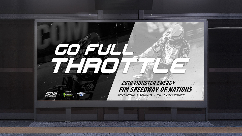
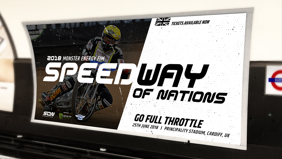
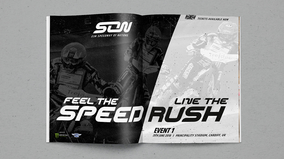
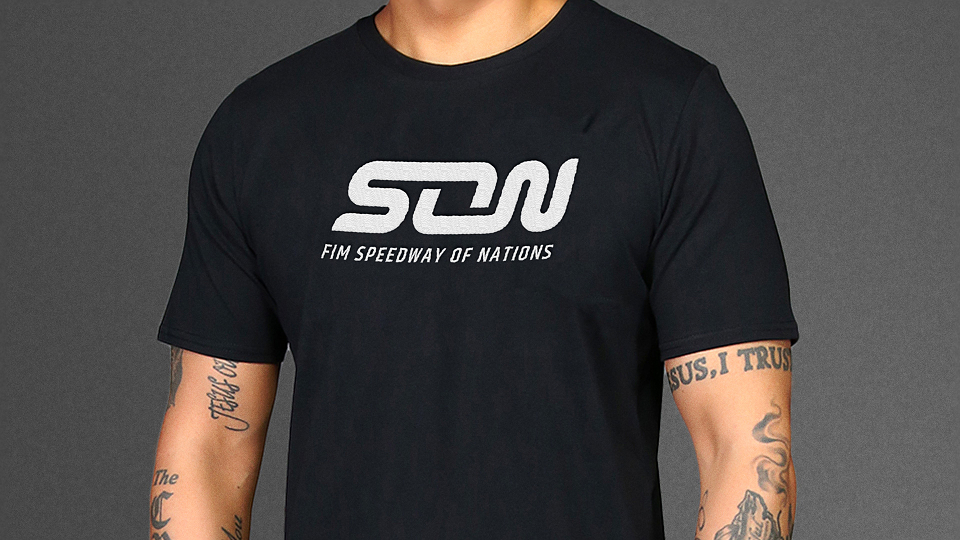
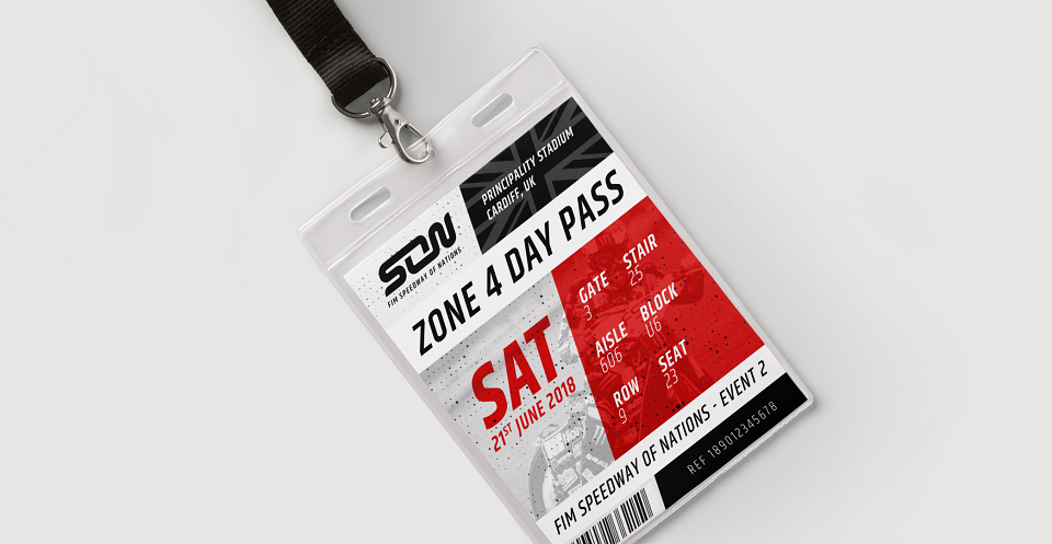
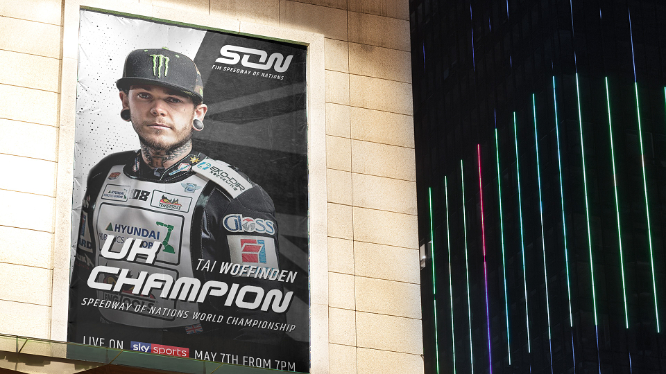
The new face of the Speedway World championship, used across all platforms both in the arena and TV, online and on merchandise.
A fresh and modern aesthetic that celebrates what makes Speedway of Nations truly unique and exciting by reflecting the unity of the fanbase, the unity of the team and the sport as a whole.
MADEIT CREDITS
-

GarethFreelance Creative / Designer