Fliss Morse
Freelance Designer
ABOUT
The result
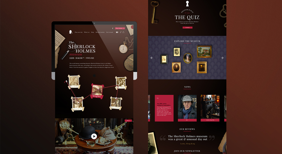
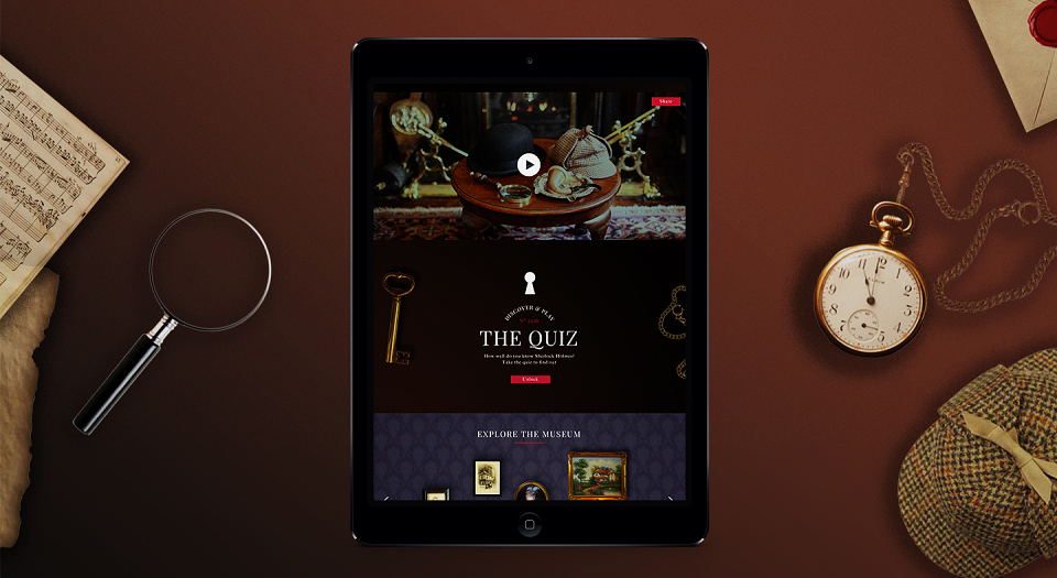
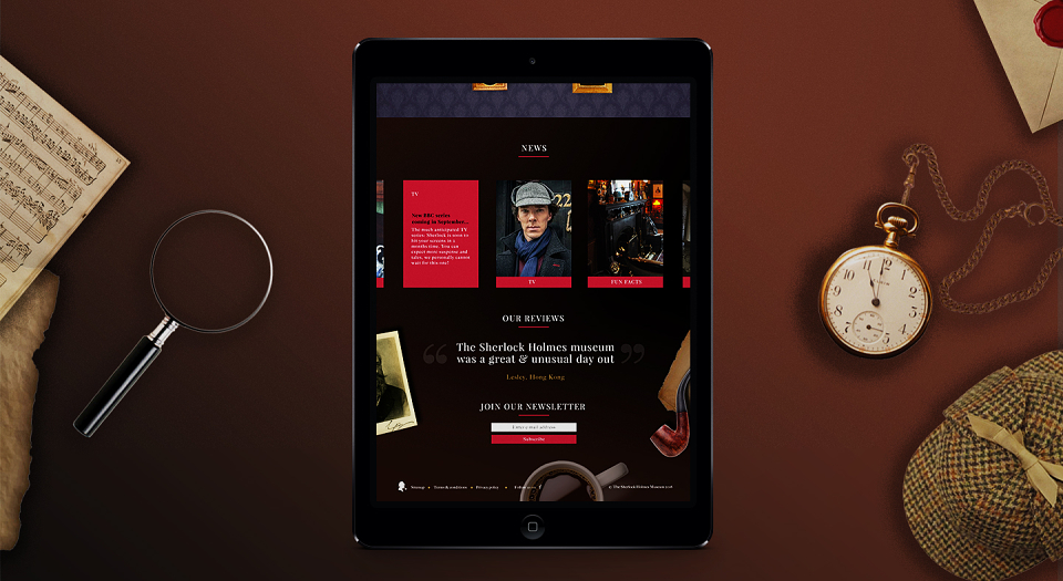
Concept 1
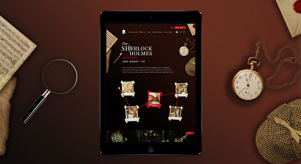
This design is an ode to the museum and the plot of the story itself. By bringing in the elements from Sherlock’s desk, as well as items that could be found in the museum, a more immersive experience is created that feels almost candid.
The user lands on the homepage and as they scroll down they are greeted with a crime board. As they hover over the polaroids on the crime board, they reveal the call to action which link through to more information on tickets, directions, groups. opening times and tour info.This makes the user feel as they are already in the investigative state of mind by the time they come to The Quiz.
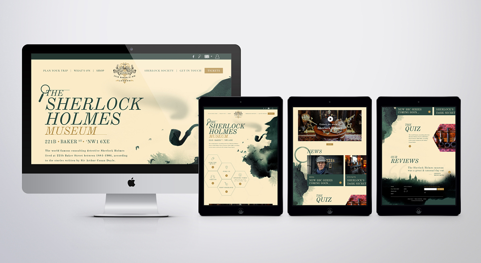
Concept 2
This design is clean, simple but with an air of intrigue and mystery suited to the Sherlock Holmes legacy. Most of the most relevant information is on the homepage, acting as a gateway for the users to navigate through and find out more. The user lands on the homepage with some clear calls to action on the hexagonal buttons directing users to ticket info, directions, opening times and group and tour info.
There will be subtle animation in the background as the ink bleeds slowly as the user scrolls down the webpage, and different ‘nods’ to Sherlock’s identity appear in the background such as the magnifying glass and London skyline.