


Lately, people have been asking me the same question: How do you create a brand? What is the process behind it? Can you do it for next week? Well, the last one used to be more of a requirement than a question.
The thing is, when I explain the way I work to people that are not designers, they look surprised. They don’t know all the work that goes into it and that’s probably why clients tend to underestimate our profession. You can’t imagine how many clients out there are asking designers to create a logo in two days, just because they ignore what it takes to create a solid brand.
I found out that when I guide a client through my process, they begin not only to understand the complexity behind the creative process, but more importantly, they start seeing my work differently. They value it more, a lot more.
First, what is branding?
I’m going to make it easy and quote Marty Neumeier, author of The Brand Gap:
Branding is a person’s gut feeling about a product, service or company. Is not what a company or designer says it is, branding is what people say it is.
As designers we can’t control what people say about our client, but we can influence them. We have to find out what is unique about our client and the values they can offer to the customer, in order to communicate it consistently through different touchpoints such as logo, tone & voice, visual language, website and so on…
Back to my process. It consists of 4 steps:
- Discovery phase
- Defining the brand
- Designing the logo
- Creating the styleguide
1. Discovery phase
The goal of this first step is to end up with a bunch of keywords that will help me to define the brand later on.
 I had a list of questions that I used to find out more about the client’s business and culture, in order to gather all the information I needed. The problem with this document is that it looked boring to the client and not interactive at all. It felt more like homework for them. Now I’m trying to move to a more dynamic approach.
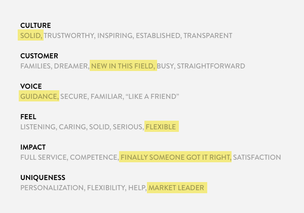
Instead of asking questions that requires long answers (sometimes entire paragraphs), now I look for keywords to describe different aspects of the brand such as Culture, Customer, Voice, Feel, Impact and Uniqueness. I took this framework from The Futur and it’s my favourite so far.
Apart from this exercise, together with the client, I create user personas, love/hate matrixes to make sure which values we have to stick to and which ones we should avoid, as well as visual references and research about the market and its competitors.
With all this information on the table, I extract the most relevant keywords and use them to start defining the brand.
2. Defining the brand
Now that I understand the business and the costumer, I can start looking for the brand essence, which for me is basically a sentence or a concept that summarises the brand’s attributes that I’ve highlighted in the step 1.
The brand essence is going to be part of a moodboard or concept board that I’m going to create in order to start setting a visual language for the brand.
In the moodboard, I include images, typography, colour palette and a basic composition that helps me to support the concept and present it to the client. The goal is to get his/her validation before I move to the next step.
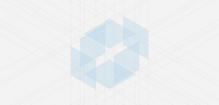
3. Designing the logo
As you can see, I don’t jump straight into designing. This is a mistake many designers make, they get excited about the project and start sketching out whatever comes out of their head.
I also used to do this and the results were a bunch of empty logos, with no meaning nor concept. The main problems came later, when I had to develop the brand further. This became very difficult since there are were values behind to work from.
Understanding and defining the brand not only helps me to do less, but more effective work. It also gives me valuable knowledge that I’m going to use in every element I have to design from now on.
Alright, I’m ready to design. This is probably the most interesting and challenging phase of the process. Now I have to create a nice graphic element from all those pretty words I came up with.
There is a lot of pressure here since I have to prove to the client that I’m worth every cent invested in me. Remember, he/she is hiring you mainly because of the quality of your work. If you have a great process but the results don’t meet the client’s expectations, we have a problem.
The good thing is that I can base my work on the information I have gathered in the discovery phase, the moodboard that was approved by the client, the visual references and of course the brand definition.
First I work on paper. I’m not good at drawing not at all, but sketching on paper is the first step to turning the idea from something intangible in your head to a visual form that I can judge. In other words, this process allows me to quickly find out if an idea could work or if it’s crap.
One thing I would like to point out is that for me sketching never takes only one session. I do breaks between sessions. Sometimes just a few hours, sometimes more. Only when I feel I’ve explored all the possibilities and I have come up with a convincing logo, do I finally sit down in front of the computer.
Now come the part where I digitalise the logo and I go deeper into the concept by looking into typography, colour and working on composition.
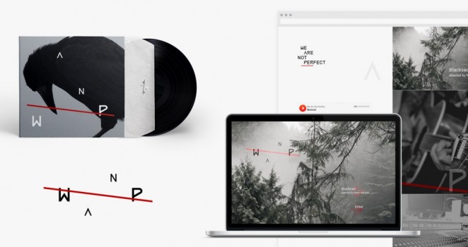
When the logo is done, I create some key applications, starting from business cards to a homepage. Whatever is relevant to the client’s business. These applications are not final designs, actually they are not a client’s requirement. The idea here is to show how the brand might look like in context, by introducing additional elements that are not part of the logo, like messaging, pictures, backgrounds, etc. Here is where I start to see the brand coming to life.
4. Creating the styleguide
Before I begin to develop the brand through some of the touchpoints previously mentioned, I need to set the foundations of the brand. And here is where the styleguide becomes the new focus of the project.
The main goal of the styleguide is to provide other designers, project managers, marketing managers, etc. with a clear set of directions about what the brand stands for and how the brand needs to be seen by the audience.
In this document I give specifications related to the logo, typography, colour palette, pictures, etc. The styleguide means that the logo is officially finished and now it’s time to start working on the missing pieces of the puzzle.
What did I learn from this process?
First of all I learned that I’m maturing as a designer. When I was younger and less experienced, my work was driven more by my instincts rather than a well-defined process. This is a sign of immaturity.
The lack of process in my work and my eagerness to start designing as soon as possible, used to end up in projects where it was really hard to deliver solid work that matched the client’s goals.
Another sign of immaturity is taking everything personal. Every time a client gave me feedback I didn’t want to hear, I took the comment like an attack on my skills as a designer. Instead of trying to get closer to them and try to work better, I built a wall in between us and focused on just getting the work done and out of the way.
Now the client is part of the process from the beginning. We share the ownership of the project, and we work aligned in order to do a good job together.
In addition, breaking down the project allows me to present my work at different stages and getting validation before continuing. This helps me to reduce the risk of working in the wrong direction.
By following this process, I not only deliver good work but I also establish a strong relationship with the client. They want me to keep working together with them and I end up doing what I love: developing brands.