Felix Luna
Graphic Designer
ABOUT
Project OverviewProject GoalThe primary goal was to strategically rebrand Eskimo Hut for a modern 2025 audience, evolving its established Texas-based identity into one capable of national expansion. The objective was to craft a brand identity that not only feels current but also connects more deeply and authentically with contemporary consumers.DebriefAs a designer taking on personal projects like this help broaden creative thinking while executing with the idea of a professional client engagement; I was able to really create a sense real world obstacles that we as designers experience. The general challenge was to completely overhaul a brand with regional recognition but with a dated identity, preparing it for a larger, more diverse national market. This project tackles ideas in not just graphic design, design thinking and creative strategy in whole but looks at a project from a marketing perspective of a company with large goals looking to enhance more than its image but also consumer perception of its brand and products.Deliverables- In-depth Market and Brand Research to identify background, opportunities, and competitive gaps.- Strategic Name Change and a comprehensive Brand Strategy Review.- A new Logo and Visual Identity System.- A Mascot Design to foster nostalgia and relatability with a millennial audience.- Comprehensive Brand Guidelines to ensure consistency.- A full overview of Brand Application, spanning digital, print, advertising, merchandise, and environmental design.
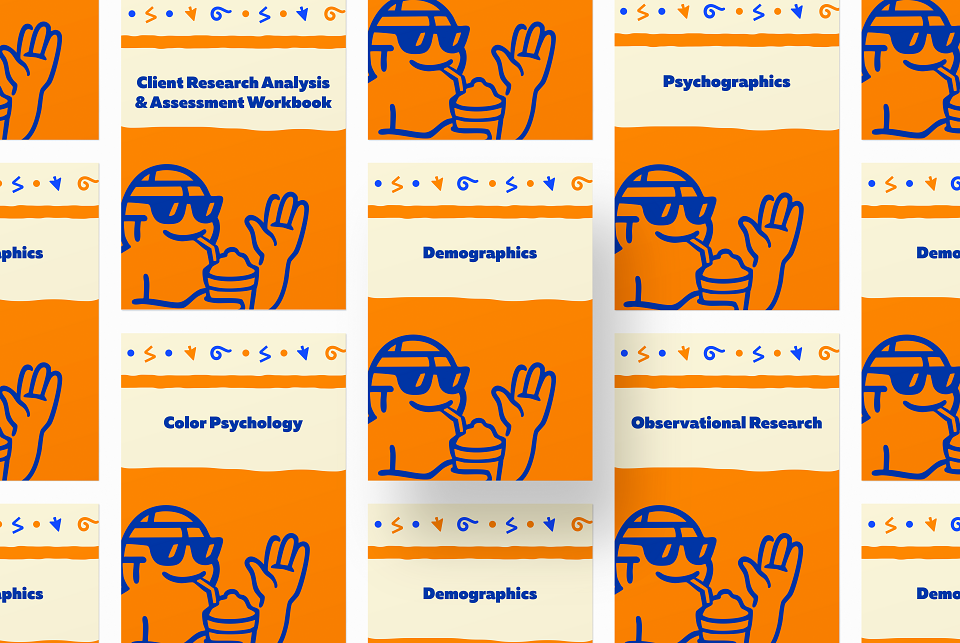
Research & DiscoveryWe initially started this whole project with RESEARCH to understand the brand's current standing and identify clear paths for growth. The methodology included brand analysis, site visits, observational research, and analysis of demographic and psychographic data. The goal was to uncover insights into brand perception, market positioning, and competitive gaps to inform a robust rebranding strategy.
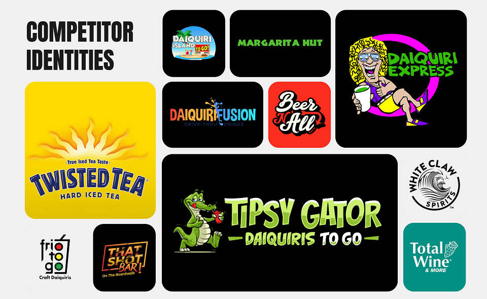
Competitor Analysis
Market Research
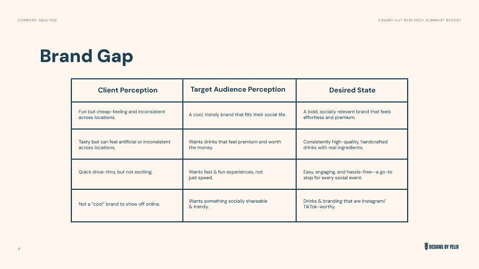
Brand Stagnation and Outdated PerceptionThe brand's logo and visual identity have seen no significant changes since its founding in 1996, leading to brand stagnation. This has resulted in an outdated brand perception that relies on legacy customers but fails to attract younger demographics. The branding is inconsistent across locations, which weakens the overall brand perception.Limited Digital PresenceEskimo Hut has minimal digital marketing efforts a lot of which being push on towards the actual franchisees, which limits its reach in an industry where competitors heavily utilize social media and online ordering. The lack of a loyalty program, app-based promotions, or influencer partnerships further disconnects the brand from modern consumers.Market Growth OpportunitiesThere is significant potential for franchise expansion beyond Texas and Oklahoma, but this requires a modernized identity to attract investors. Opportunities exist to diversify offerings with seasonal flavors, non-alcoholic drinks, and expanded snack options to increase revenue. Implementing mobile ordering, app-based loyalty programs, and delivery partnerships are key avenues for growth.Consumer Trends and PreferencesThe Texas market is a top consumer of alcohol in the U.S. A significant majority of Gen Z and Millennial consumers (74%) prefer frozen cocktails over traditional ones, indicating a strong and relevant market for the core product. Psychographic research shows that younger consumers are actively seeking fun and unique drink options. Consumers value fast and easy purchasing experiences, aligning with the drive-thru model, but also desire consistent quality and taste.
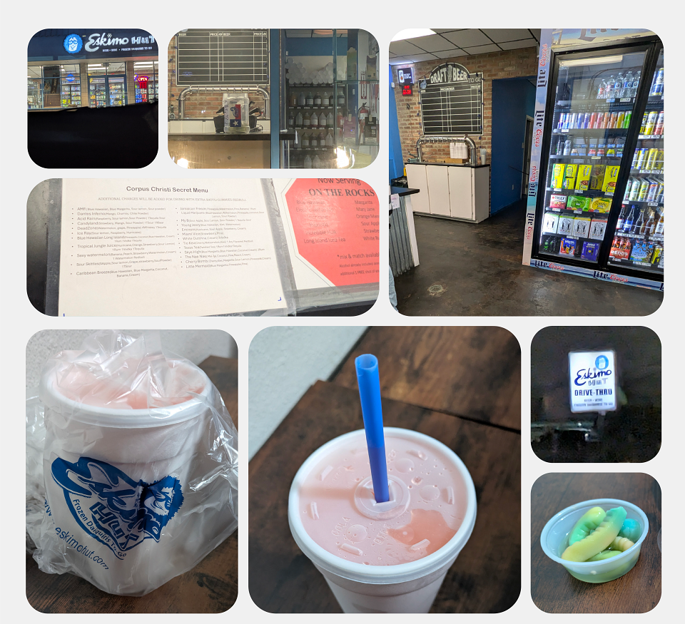
On-Site Observational Research
Audience Analysis
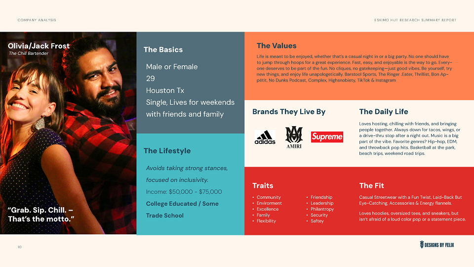
Two key personas
This persona answers the internal question: "What would the brand say or do?"
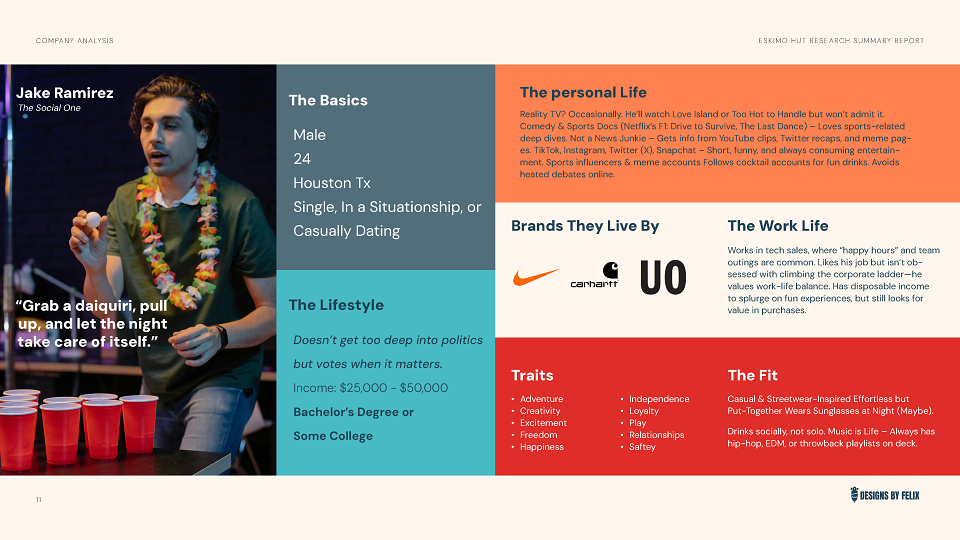
This persona answers the external question: "What will resonate with our customer and fit into their life?"
Analysis & StrategyFollowing the comprehensive research phase, the next step was to take the findings into a clear strategic direction. This phase translated problems and opportunities into a focused plan for the creative execution.
Problem StatementEskimo Hut's brand identity, while established, required modernization to captivate new, younger audiences and support national expansion. The core challenge was to refresh the brand in a way that felt contemporary and culturally sensitive without alienating its existing customer base or losing its unique, fun-loving spirit.
Key Learnings from ResearchStagnation is a RiskThe brand had not evolved since 1996, making it appear dated to a modern audience.The Name is a BarrierThe name "Eskimo Hut" posed significant cultural sensitivity issues that would hinder future growth and investor appeal.Experience is EverythingThe target audience craves a fun, socially-shareable experience, not just a product. The current brand was failing to deliver this.Digital is Non-negotiableA minimal digital footprint meant massive missed opportunities for engagement and sales compared to competitors.
Concept ProposalHonor Eskimo Hut's rich history while crafting a refreshed identity to captivate new audiences. The creative concept is centered on a mission to modernize the brand while celebrating the unique frozen experiences that define it. This approach would balance heritage with innovation, creating a vibrant, authentic, and future-proof brand ready for its next chapter.
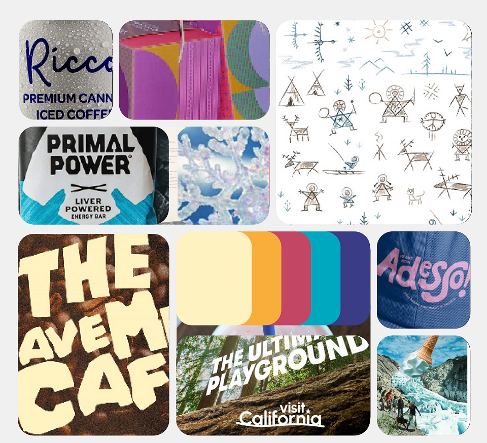
Moodboard / Visual Direction
Typography
The use of Muller Heavy for headings and Muller Regular for body copy establishes a clean, strong, and highly legible foundation. This sans-serif choice conveys professionalism, stability, and modernity, making the brand feel credible and scalable—directly addressing the weaknesses observed in competitors.The choice of Balloon SC D Extra Bold for sub-headings is the key expressive element. This font injects a dose of fun, energy, and unique character into the system. It acts as a visual accent that keeps the brand from feeling too corporate, nodding directly to the "adventurous" and fun-loving spirit of the brand persona.The combination of the straightforward Muller font family with the quirky Balloon font creates a sophisticated duality. It tells the audience that this is a professional, high-quality brand that can be trusted, but one that doesn't take itself too seriously and is still the go-to for a fun and unique experience.
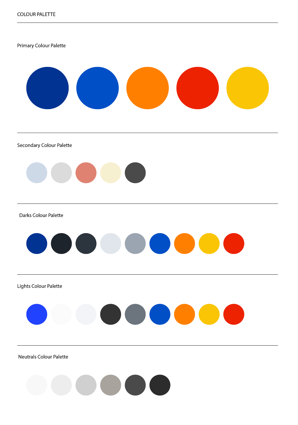
Color Choices
The Primary Color Palette, with its bold blues, orange, red, and yellow, forms the expressive heart of the brand. These colors communicate energy, fun, and adventure. They are attention-grabbing and youthful, directly reflecting the vibrant flavors of the drinks and the social energy of the customer experience. Overall we want to represent the idea of a cold outside and a warm inside similar to use case of a common Igloo.The Secondary and Neutral Palettes provide a crucial counterbalance. The muted tones—like light grays, terracotta, and charcoal—introduce a sense of maturity, quality, and professionalism. This ensures the brand feels credible and premium, setting it apart from competitors who rely solely on bright, oversaturated colors.By combining these distinct palettes, the brand can be both playful and polished. It can use the primary colors for high-impact promotions and packaging to capture attention, while utilizing the secondary and neutral tones for backgrounds and text to maintain a clean, sophisticated, and readable presentation. This adaptability makes the brand feel both fun and trustworthy, perfectly aligning with an audience that values both quality and a unique, trendy experience.
Ideation & Development
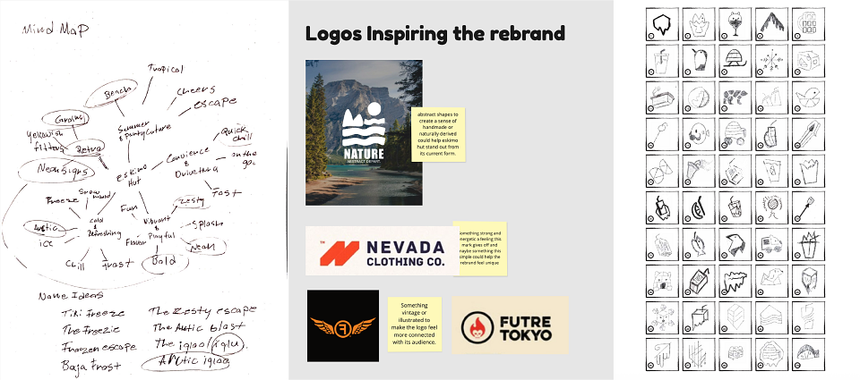
Initial Sketches and Brainstorming Documents
Adventurous, Convenient, and Community.
Naming and Tagline
A critical first step was a name change to address the cultural sensitivity of "Eskimo Hut". Brainstorming led to the name "Arctic Iglu". This name was chosen because "Iglu" pays respectful homage to the Inuit language and evokes a sense of warmth and shelter, while "Arctic" maintains the brand's core "cold" theme. For the tagline, a methodical process was used to move from product descriptions to an emotional promise. The final tagline, "Frozen Daiquiris & More", was selected because it clearly communicates the primary offering while using "More" to encapsulate the convenience store aspect without being restrictive.
Finalizing Concepts to Move Forward with...
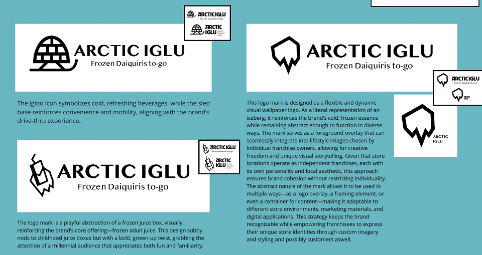
Concept 1: The Igloo & SledThis concept features an igloo icon to symbolize cold, refreshing beverages, while a sled base reinforces the convenience and mobility of the drive-thru experience.Concept 2: The Abstract Juice BoxThis logo mark is a playful abstraction of a frozen juice box, visually reinforcing the brand's core offering of "frozen adult juice". The design intentionally nods to childhood juice boxes to appeal to a millennial audience through fun and familiarity.Concept 3: The Dynamic IcebergThis mark is designed as a flexible "wallpaper logo" that represents an iceberg. Its abstract nature allows it to be seamlessly integrated into diverse lifestyle images chosen by individual franchise owners, empowering them with creative freedom while maintaining brand cohesion.
Logo Font Experimentation
Before finalizing the logotype, a thorough phase of font experimentation was conducted to explore a range of personalities for the "Arctic Iglu" brand. The process involved testing multiple typographic styles, from energetic italics and heavy, playful scripts to more structured and modern block-like and stencil-inspired letterforms. This exploration was crucial for determining the perfect balance between a fun, expressive character and a strong, stable foundation. By visualizing how different fonts impacted the brand's tone, this process ensured the final chosen typography was a deliberate, strategic decision that aligned perfectly with the core brand attributes.
Evaluation
Concept 1 was an obvious choice however it felt too expected and lacked any creative thinking, Concept 2 was one of my favorites however the creative direction here was to play on the ideas of nostalgia with that juicebox feel to give millennials that reminisces of the old days of enjoying one of their juicebox staples however with that idea in mind it also attracts a whole different audience of kids and teens which goes against the company as a whole.Concept 3 is where we are focused with the Iceberg concept it really explores the idea of giving the brand a fluid logo that can be used against any wallpapers but in its current form the logo feels too sharp and simple. the logo needs new exploration in adding softer curves to help balance it out.
Iceberg Exploration
The development of the logo mark was an intensive process driven by a desire for authenticity. To ensure the iceberg icon felt real and grounded, it went through several design sequences and lockup explorations aimed at understanding the natural structure of an iceberg. This led to a wide range of concepts, from literal, realistic illustrations of icy mountain ranges to more geometric and abstract interpretations. This rigorous process of iteration was essential in finding the perfect balance—a mark that captures the powerful essence of an iceberg while still functioning as a clean, modern, and scalable logo for the Arctic Iglu brand.
Concept 4
After reviewing the initial three concepts, a fourth direction was developed to expand the iceberg idea beyond a simple solid structure into something more meaningful for the brand. This new concept, intended as the primary direction for client presentation, focused on creating an organic form that truly embodies the feeling of an "iceberg snowcone". As shown in the explorations, the mark features a soft, rounded top combined with a sharp, geometric base, creating a satisfying visual balance. While this iteration successfully captured the core concept, it was identified as a crucial developmental step that would require further refinement before being finalized.
Visual Experimentation
Before proceeding to refinement, a critical phase of visual experimentation was conducted to test the newly developed organic logo against the brand's intended imagery and style. The goal was to validate if the concept could successfully invoke the desired vibes of "party and style" when placed in a real-world context. Seeing the logo interact with lifestyle photography and text created a definitive "aha" moment in the development of concept four. This practical application confirmed that the direction was not only correct but also highly effective, providing the strategic confidence needed to move forward into the final refinement stage.
Refinement
The final refinement process focused on finding the perfect balance between a handcrafted feel and a clean, geometric structure. During this phase, the heavy strokes outlining the "snowcone" top were removed and replaced with a series of clean, layered lines. As shown in the explorations, this change effectively communicates the stacked, icy layers of a snowcone or igloo while maintaining a modern and sophisticated aesthetic. This final, refined version of the mark was then paired with the primary logotype, creating a polished lockup ready for presentation and application in mockups for the next round of feedback.
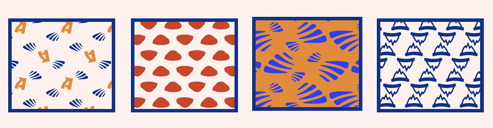
Design Patterns
As an initial starting point for developing brand applications and mockups, a series of unique patterns was created. This exploration was built on the idea of deconstructing the logo to create a visual "DNA" for the brand. By isolating and repeating core elements from the logo's form—its lines, textures, and shapes—a set of fun and energetic patterns was developed that gives life to the overall identity. This initial library of patterns provided a versatile toolkit for testing how the brand's personality could be extended across various customer touchpoints in the upcoming design mockups.
Mock Ups
A visually stunning design system was created, utilizing abstract patterns derived from the logo's "DNA" across a range of mockups, including vehicle wraps, merchandise, and stationery. However, upon critical review, it was determined that while the system was energetic and bold, it was "not hitting the mark" and "felt wrong for the brand". The heavy reliance on abstract patterns created a disconnect from the brand's core identity. This key evaluation prompted a strategic reset, leading the process back to the original moodboard to refocus on the foundational goals: honoring the brand's inspiration with cultural consideration and ensuring a genuine connection with the end users. This led to the development of a more authentic and purposeful set of brand elements, including the sticker and tape systems and a refined icon set, to better strengthen the final identity.
Icon System
The icon system was inspired by distinct sources from the moodboard: the "products, environmental theme, & feelings," represented by icons for drinks and fire, and the natural "Inuit environment," represented by icons for mountains, trees, and snow. It was through this creative experimentation that the initial concept for the brand mascot was born—a cool snowman character ready for a drink.
Stickers & Tape
These new visual assets from the icons were then used to build out the brand's patterns and were selectively applied to the sticker and tape designs based on their visual interest, forming the foundation of a more meaningful identity system.
Revised Mock Ups
Evaluation
Following the creation of a comprehensive set of new mockups, a crucial evaluation of the entire brand identity took place. While the new supporting elements—like the dynamic icon and tape systems—proved highly effective at bringing the brand's personality to life, a strategic gap became apparent. The logo itself, in its current form, felt "too abstract and potentially 'sportsy'," creating a disconnect with the broader, more socially-focused identity system built around it. Recognizing this, the difficult but necessary decision was made to undertake one final stage of logo development. This pivotal step was not about starting over, but about refining the mark to ensure it could fully match the strength and strategic clarity of the entire brand ecosystem, leading to a perfectly cohesive final identity while also strengthening the new brand elements.
The Final Concept
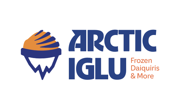
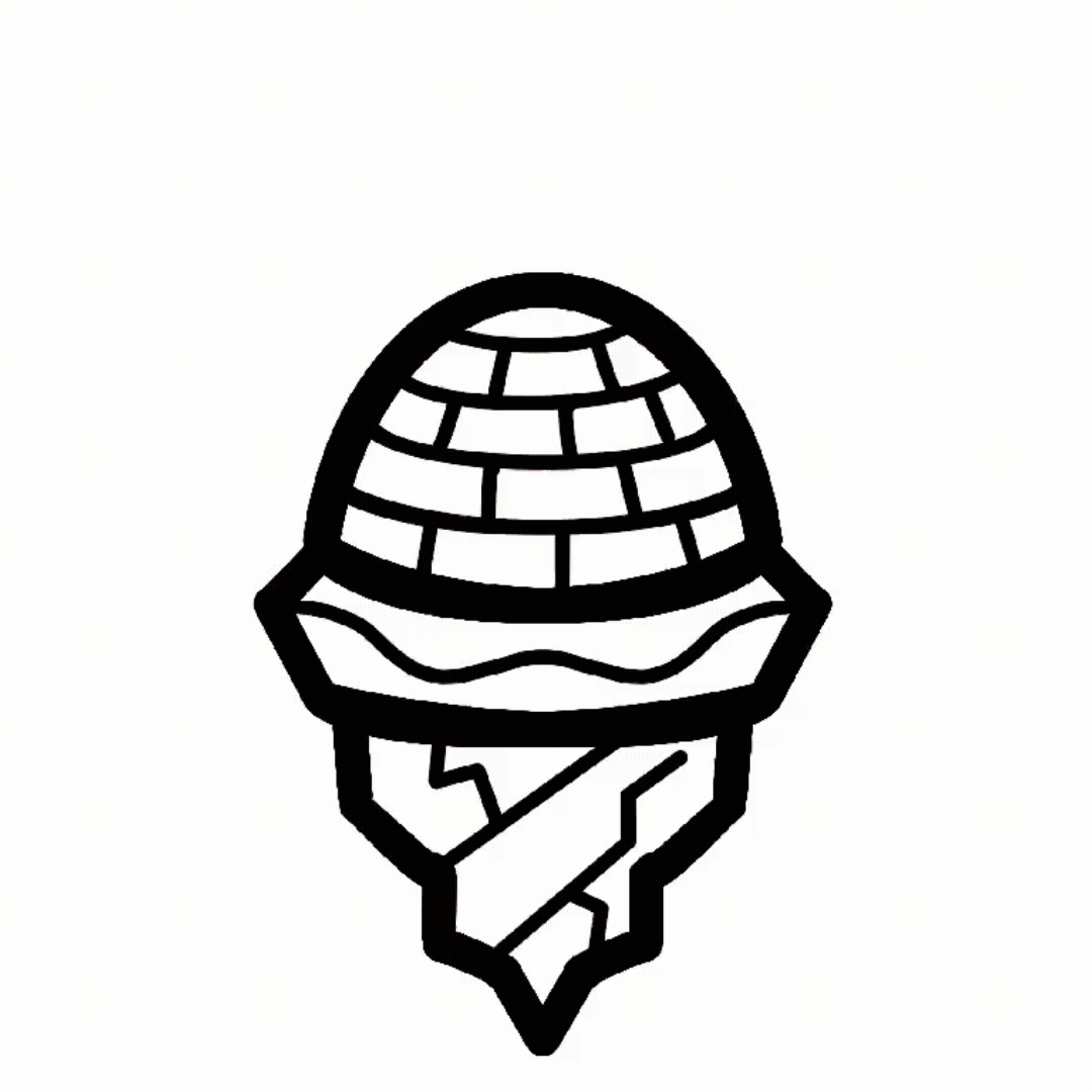
The final logo is a thoughtful fusion of the core brand concepts, meticulously refined to create a scalable and memorable mark. Starting with the concept of a snowcone top and an iceberg base from our previous revision, the design was elevated by integrating a brick-like texture to form an igloo, directly referencing the new brand name. The mark then underwent precise geometric alignment and stroke-weight adjustments to achieve a clean, balanced, and visually solid form.
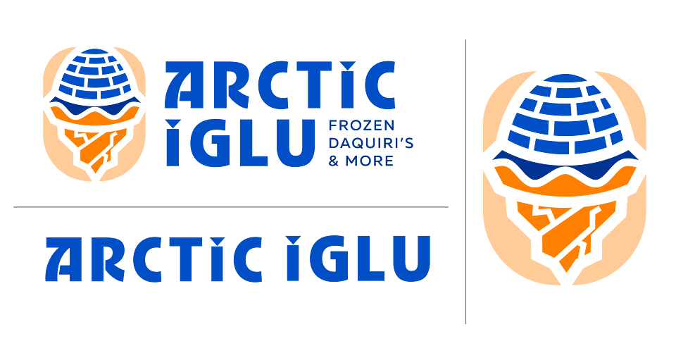
The final logo lockups provide a flexible and cohesive system for the "Arctic Iglu" brand. The primary lockup features the final "iglu-snowcone" icon paired with the bold, modern wordmark and the "Frozen Daiquiri's & More" tagline, creating a full brand signature. The system is supported by a standalone wordmark for versatile application and a standalone icon that serves as a memorable and scalable brand shorthand for social media profiles, packaging details, and other brand touchpoints.
Design Elements
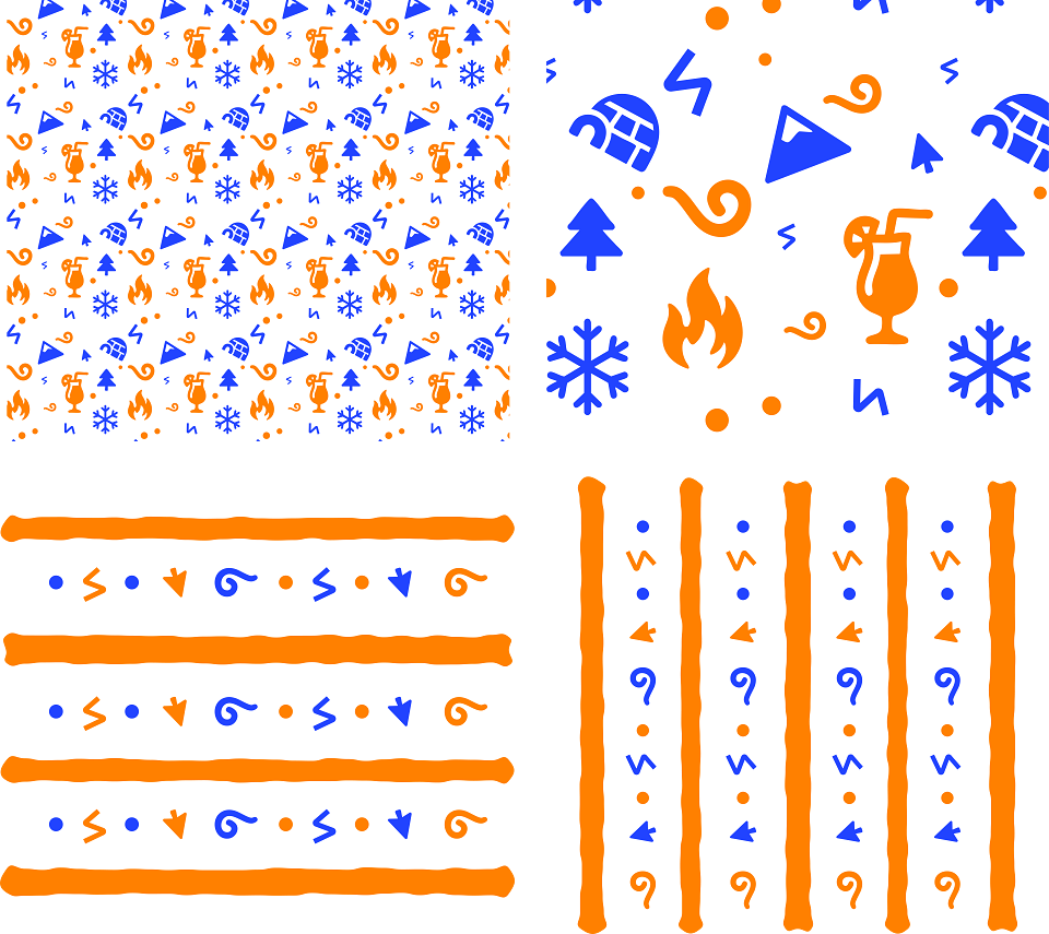
Icon Development
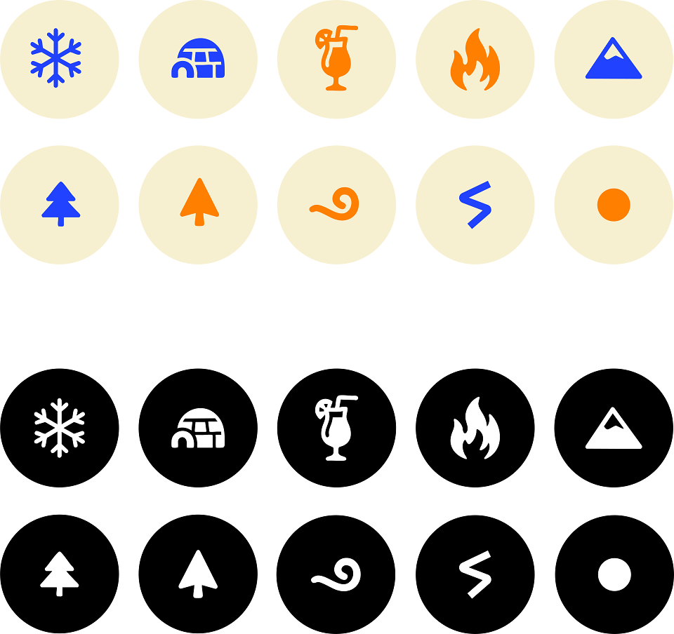
To support the new brand identity, a revised icon system was developed to provide clear and engaging visual communication across all touchpoints. The set includes ten unique icons rendered in a clean, geometric/organic style that aligns with the modern aesthetic of the primary logo. The system is built around key brand themes, with icons representing the "Arctic" concept (snowflake, igloo, mountain), the core product (a cocktail glass), and flavor or energy (a flame, a swirl). Designed for versatility, these icons can be used on both light and dark backgrounds, making them ideal for menu systems, website navigation, packaging details, and social media graphics to quickly convey ideas and enhance the customer experience.
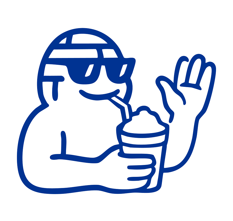
The Mascot
To give the brand a friendly and personable face, a mascot named "The Chill Ambassador" was updated to embody its fun-loving spirit. The character's design cleverly incorporates the same "igloo brick" texture from the primary logo onto its head, creating a seamless and intelligent link between the mascot and the core brand icon. With a laid-back smile, cool sunglasses, and a friendly wave, the mascot personifies the "chill" and welcoming nature of the brand. By showing the character actively enjoying one of the signature frozen drinks, it acts as a relatable product advocate. "The Chill Ambassador" serves as a memorable and approachable brand hero designed to connect with the audience on a more personal level.
Pattern Development
To further extend the brand's visual language, a new versatile system of custom patterns were developed. These patterns utilize the brand's unique icon set and vibrant primary color palette to create a recognizable and ownable texture that reinforces the new identity. The system includes multiple styles, from energetic, scattered compositions to more structured striped arrangements. This versatility allows the patterns to be applied across a wide range of collateral, including dynamic packaging, website backgrounds, social media graphics, and merchandise, adding a layer of energy and personality that makes the brand more engaging at every customer touchpoint.
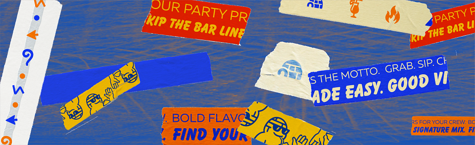
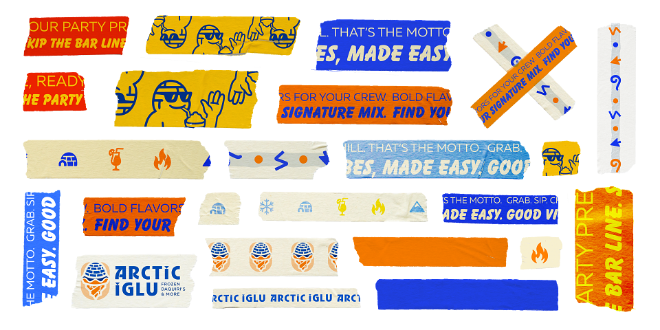
Custom-Designed Tape Print/Digital Graphics
A cornerstone of the brand's application strategy is the new and improved dynamic system of custom-designed tape, which serves as the primary visual asset for most brand applications. This innovative solution was created to empower individual franchisees with a flexible, low-cost, and creative tool for branding. The tape incorporates the "Arctic Iglu" logo, the custom icon set, vibrant brand colors, and key marketing messages like "SKIP THE BAR LINE" and "BOLD FLAVORS FOR YOUR CREW". With its authentic, torn-edge aesthetic, the tape can be used to seal cups, customize packaging, and decorate store environments, allowing for local personality while maintaining national brand cohesion. This approach transforms everyday packaging into a high-impact marketing tool that infuses every customer touchpoint with the brand's energetic and social personality.
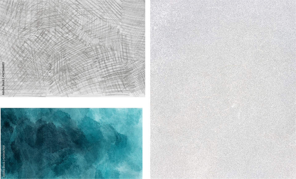
Textures and Grain for Photos and Backgrounds
To add depth, authenticity, and a tactile quality to brand communications, a library of custom textures was chosen for use in photo treatments and backgrounds. This includes a raw pencil sketch texture to evoke a handcrafted, energetic feel; a subtle grain overlay to give photography a nostalgic, film-like quality; and an abstract painterly texture in brand colors to represent the cool, fluid nature of the frozen drinks. This curated system ensures that all visual assets, from digital posts to print materials, share a consistent and rich character that elevates the brand beyond a simple flat design.
Logo Animation
To bring the brand to life in digital applications, a short logo animation was created. The animation features the final "iglu-snowcone" icon on a dark, textured background. Instead of a traditional smooth entrance, the logo utilizes a high-energy "glitch" or "stutter" effect, synchronized with an upbeat, modern electronic sound cue. This stylistic choice was made to reflect the brand's fun and energetic personality, grab attention quickly in digital feeds, and align with the aesthetic of the target audience. The animation effectively infuses the static mark with a sense of motion and excitement.
Brand Applications
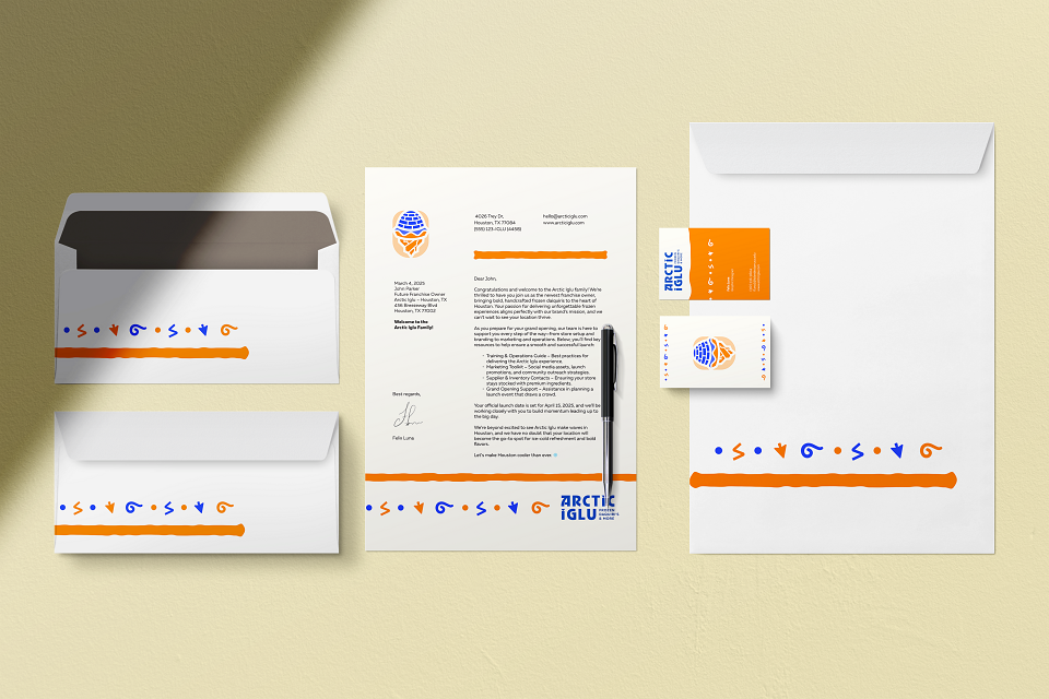
New Franchisee Welcome Kit
To support the brand's goal of national expansion and attract new investors, a professional stationery suite was designed to serve as a "New Franchisee Welcome Kit". This kit, which includes a letterhead, business cards, and envelopes, is often the first tangible brand touchpoint for a new business partner. The design showcases the brand identity system in a polished and cohesive application, featuring the final logo, the vibrant orange and blue color palette, and a decorative border created from the custom icon set. This welcome kit immediately establishes a tone of professionalism and legitimacy, providing new franchisees with a high-quality example of the cohesive brand they are investing in and setting the stage for a successful partnership.
T-Shirt Designs
To foster a deeper connection with the community and transform customers into brand advocates, a line of branded t-shirts was designed. The collection moves beyond simple logo placement, instead featuring the friendly, illustrated brand mascot, officially titled "THE CHILL AMBASSADOR." The designs leverage the full visual system—incorporating vibrant brand colors, custom typography, icon patterns, and the signature tape aesthetic to create fashionable, streetwear-inspired apparel. Offering a variety of styles, from bold character graphics to more subtle typographic treatments, the merchandise provides fans with a tangible piece of the brand's culture, empowering them to celebrate and share the fun, social, and "chill" lifestyle that Arctic Iglu embodies.
Cup/Gallon Designs
The branding system was designed to be fully scalable, extending seamlessly from individual cups to large-format gallon jugs intended for parties and group events. The gallon container utilizes the same dynamic "branded tape" aesthetic, applied as a large-scale decal that wraps the container. This approach demonstrates the versatility and cost-effectiveness of the identity system, allowing for a powerful and cohesive brand presence on all product sizes. This ensures that whether a customer is buying a single drink or a gallon for a party, the energetic and social personality of the Arctic Iglu brand is the centerpiece of the experience
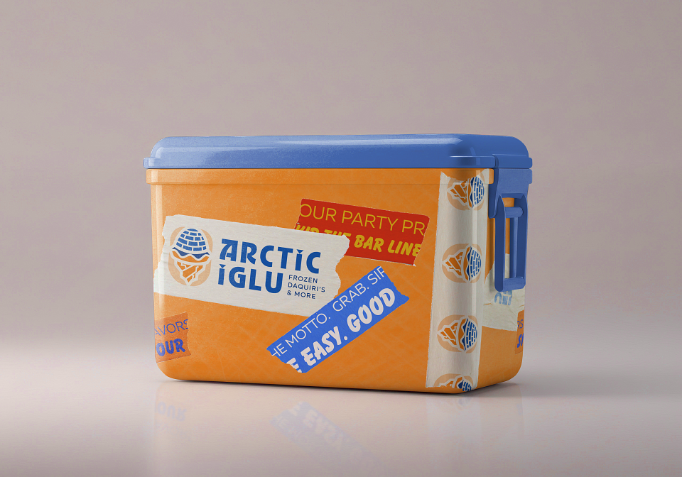
Merchandise
To further integrate the brand into the customer's lifestyle, the merchandise line includes functional products like a branded cooler. The design uses the brand's primary orange and blue colors and features large-scale decals that replicate the signature layered "tape" and "sticker" aesthetic. Key marketing slogans and the primary logo are displayed prominently, making the cooler an instantly recognizable brand asset. This product is a perfect strategic fit, as it directly relates to the use case of taking party-sized drinks to beaches, tailgates, and other social gatherings. It makes the Arctic Iglu brand a functional part of its customers' favorite social events, turning them into highly visible brand ambassadors in a perfectly relevant context.
Social Media Post
The social media strategy is designed to build an engaged community, as demonstrated by a cohesive Instagram launch campaign for a new location. The posts utilize a mix of dynamic lifestyle photos and clean product shots, all unified by the brand's distinct visual system. The signature "tape" aesthetic is used as a primary graphic overlay to deliver bold, energetic headlines and clear calls to action, such as "CHECK OUT OUR NEW TEXTURED CUPS" and "GRAB SOME GEAR FOR THE NEXT HOUSE PARTY". This approach creates a visually compelling and consistent feed that feels native to the platform, effectively communicating key marketing messages in a way that is designed to capture attention and build a loyal following.
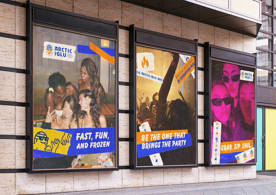
The Poster Series
To build brand awareness and connect with the target audience, a dynamic out-of-home poster series was designed. The campaign features lifestyle photography that reflects the brand's personas, capturing authentic moments of friendship and fun that mirror the social settings where the product is enjoyed. The posters serve as a powerful example of the entire brand system working in harmony: the custom branded tape is used as a primary graphic element to deliver bold headlines like "FAST, FUN, AND FROZEN" and "BE THE ONE THAT BRINGS THE PARTY". The subtle grain texture is applied across the series to create a cohesive and authentic feel, while the logo and brand icons are integrated seamlessly. This approach effectively translates the brand's core message of social connection and fun into a compelling visual narrative.
The Store Front
The brand's energetic identity was translated into a physical storefront design engineered to create powerful curb appeal and an immersive customer experience. The window display utilizes dynamic layering, combining large-scale graphics with a textured background to create visual depth. The branded tape system is used as a primary architectural element, framing the space and delivering bold, inviting messages like "STEP ON IN". This application also introduces a friendly, illustrated brand mascot who acts as a welcoming ambassador for the fun-loving brand. The entrance clearly features the final logo and integrates smaller promotional posters, showcasing the scalability of the design system. Overall, the storefront successfully translates the brand's layered, tactile, and energetic personality into a physical space that engages customers before they even walk through the door.
Project Evaluation & ImpactThe final "Arctic Iglu" brand identity is a successful and cohesive solution that directly addresses the core strategic goals outlined at the project's outset. It effectively transforms a dated, regional brand into a modern, culturally considerate, and nationally scalable identity poised to connect with a 2025 audience. The system's strength lies in its ability to be both consistent and flexible, balancing a professional foundation with a fun, authentic personality.A Successful and Meaningful LogoThe final logo successfully merges the key concepts explored during the ideation phase into a single, memorable mark. The "iglu-snowcone" form is unique and ownable, while the sharp, geometric iceberg base provides a sense of stability. This final design is a vast improvement over more generic concepts, telling a story that is both fun and directly tied to the brand's name and product.A Flexible and Cohesive System in ActionThe true success of the rebrand is demonstrated in the application of the identity across various touchpoints. The cornerstone of this is the "branded tape" aesthetic, which provides a consistent yet dynamic visual language.PackagingOn cups and large-format gallon jugs, the tape system creates a vibrant, layered look that turns a simple container into a walking advertisement.MerchandiseThe identity translates seamlessly to apparel and lifestyle products. T-shirts feature the "Chill Ambassador" mascot , while coolers are decorated with the same sticker and tape decals seen on packaging, integrating the brand into the customer's social life.EnvironmentalStorefronts use the tape system and brand mascot to create an inviting and energetic curb appeal, while posters use the same elements to build a cohesive and recognizable campaign.Digital PresenceThe brand's visual system is perfectly adapted for social media, using the tape overlays and textures to create engaging, platform-native content that promotes products, merchandise, and new locations.Final ConclusionOverall, the "Arctic Iglu" rebrand is a comprehensive success. It addresses the initial problems of a dated identity and cultural insensitivity with a clever, thoughtful, and visually compelling solution. The flexible design system empowers franchisees and creates a rich, layered brand world that is perfectly tailored to its target audience, positioning Arctic Iglu for significant future growth.
ReferencesAuguste Escoffier School of Culinary Arts. (2024, April 1). 2024 alcohol and beverage trends that are shaking things up. Escoffier Blog. https://www.escoffier.edu/blog/world-food-drink/alcohol-and-beverage-trends/Barba, J. (2023, October 19). Study reveals Texas’ favorite frozen cocktail and it’s not what you think. KLAQ. https://klaq.com/texas-favorite-frozen-cocktail/Kiely, M. (2024, May 2). Will frozen cocktails be the drink of the summer?. The Spirits Business. https://www.thespiritsbusiness.com/2024/05/will-frozen-cocktails-be-the-drink-of-the-summer/MarketScale. (2024, April 29). Is America’s demand for frozen food thawing?. https://marketscale.com/industries/food-and-beverage/demand-for-frozen-food/National Restaurant Association. (2022). On the menu: 2023 What's Hot Culinary Forecast. https://go.restaurant.org/rs/078-ZLA-461/images/National-Restaurant-Association-Alcohol-Trends.pdfPark Street. (n.d.). Texas alcohol laws & regulations: A guide to navigating the market. Retrieved May 31, 2025, from https://www.parkstreet.com/states/texas/Sunset Advisory Commission. (2018, August). Texas Alcoholic Beverage Commission:Self-evaluation report. https://www.sunset.texas.gov/public/uploads/files/reports/Texas%20Alcoholic%20Beverage%20Commission%20Self-Evaluation%20Report.pdfVelikova, N., Dodd, T. H., & Hrnciar, W. R. K. (2021, July). Texas wine marketing research institute: Economic impact of the Texas wine and wine grape industries 2019. Texas Wine Marketing Research Institute, Texas Tech University. https://www.depts.ttu.edu/hs/texaswine/FINAL_REPORT_TX_WINE_TTU_2021.pdf
MADEIT CREDITS
-

Felix LunaGraphic Designer