Fabia Goff
Surface Pattern & Graphic Designer
ABOUT
Brief:
Here's what we're looking for:
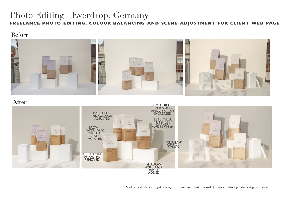
- Most important of all, the colour of the background needs to be consistent with the example image (See attachment)
- The editing and colour correction should look as natural as possible, we use a pastel colour-pallet, so no oversaturated colours and no highlight/shadow tint or filters.
- All photos should look like they've been taken in broad daylight. If you can, adding realistic shadows and highlights to the products (as in the example image) would be great, if that is too complicated, a +0.50 exposure gradient filter coming from the top left-hand corner should be a viable alternative
-Colours of the Packaging and bottles need to be consistent with the photos on our website.
-Logos should be easily readable, without being oversharpened
-Retouching of blemishes in the background and the floor
-Retouching of the packaging (like in the example image)
Approach:
1 - Edited test image to standards requested
2 - Reviewed test image over zoom with client
3 - Completed images in sets of 5 and requested feedback and adjustments with client
4 - Allowed for small adjustments at the end and sent screenshots of progress
Outcome:
Happy client and consistent imagery for their website