EVOKE
Brighton
ABOUT
DASH
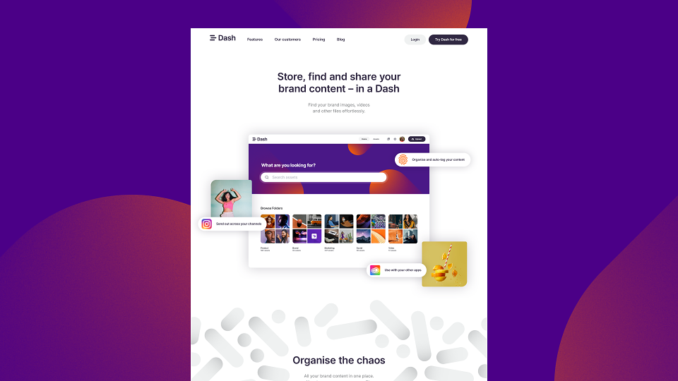
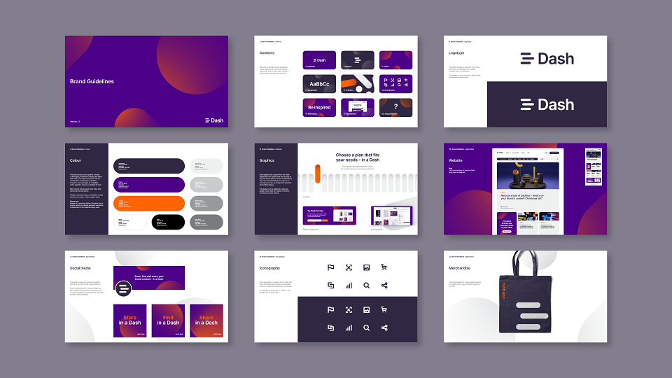
A refreshed brand identity and website for Dash, a product from Brighton based software company Bright. Dash is the centralised home for all your brand’s digital assets, enabling you to organise them, find what you need quickly, share and deploy effortlessly, in a Dash.
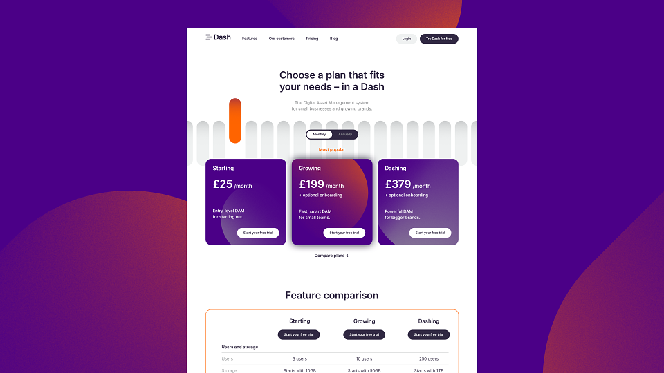
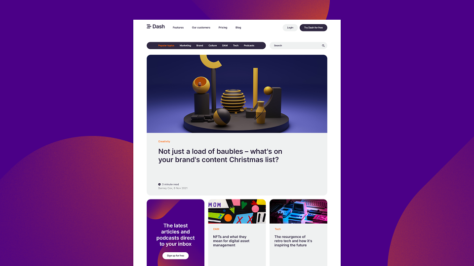
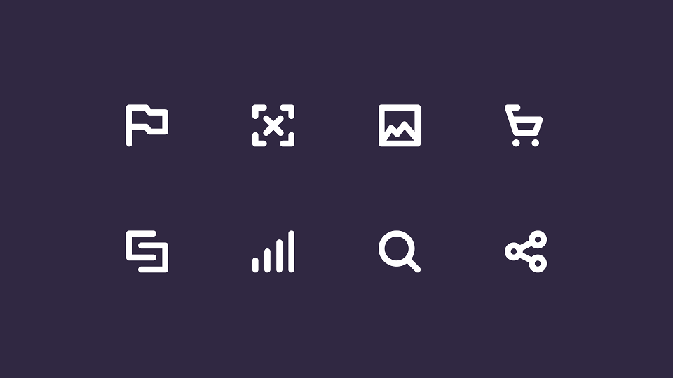
The identity needed to have continuity within the Bright family of brands but with a fresh new look and feel that aligns with their growth strategy. The new identity required adaptable graphic elements that could be deployed across the brand along with iconography and a modular system for the website which makes it easily adaptable for future needs.
The idea of ‘speed’ is a key theme and selling point for the product – enabling Marketers anywhere to create content and deploy it efficiently. The new brand identity is designed to reflect this and be simple and clear at the same time – like the product itself. The solution is built around the visual cues of a dash symbol which are used to create an engaging graphic language that’s reflected across the brand, website and social to communicate the benefits of the product.
TESTIMONIAL
“We wanted a brand identity and website for Dash that reflected the quality and vibrancy of the solution itself. Tom understood this immediately and worked with us iteratively and collaboratively to produce a brand identity and website visuals that really do Dash justice. We are all extremely proud of our new website, and a big part of that is down to Tom’s experience and talent.”
MARTIN WILSON
Director, Bright