Erica Cain
n/a
ABOUT
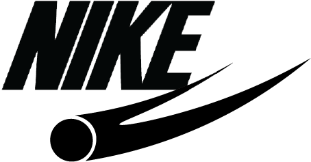
NIKE is a brand that everyone knows. Their signature “Swoosh” logo has not changed since 1971, and has become the most recognised logo in sports apparel. So, I tasked myself with trying to re-brand the company with a new logo. To be transferable onto a shoe and different materials, it was essential to keep the logo clean, simple and monotone. the Athlete in Motion logo was created using the origins of Nike’s name, their mission statement, and they’re “Swoosh” logo as inspiration.
Nike’s mission statement is : “Bring inspiration and innovation to every athlete in the world.” Followed by a quote from co-founder Bill Bowerman stating that “If you have a body, you are an athlete.”
The motion and dynamic-ism of athletes was part of my inspiration for the design, however I also researched the name itself and its origins of the Greek winged goddess of victory.
The design is inspired the “Swoosh” and its motion, but is also very different and can have multiple meanings depending on the viewer’s imagination; some may see a diving athlete, some could see a wing, others a sports ball in motion.
This simplicity allows this design longevity just like the current logo, and to be easily printed, stitched or molded on many different types of equipment and materials, with the advantage of being able to be changed in colour.
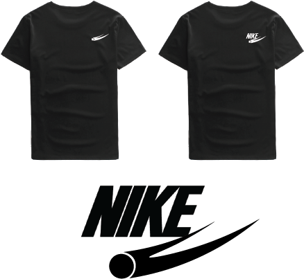
Creating the new logo was just the first step. After I had decided on the Athlete in Motion design it was time to decide on a font and colours. I decided not to change the font for the text as it is already dynamic and has motion. For colour, it was decided that black whould be used for lighter materials and equipment, while white would be on darker pieces, for visual impact. However any bright colour could be used, such as red or orange.
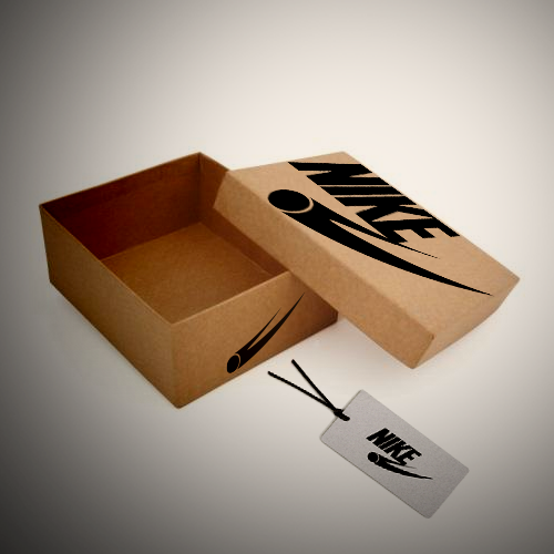
I then mocked up some manipulated photography style images using stock photos of a shoe box and tag, to create a final presentation piece.