Episode Two
Bristol
ABOUT
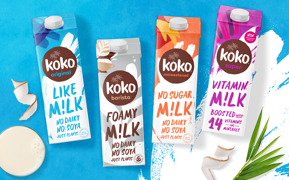
Thirteen years ago, Koko launched as the first UK company to make a coconut-based alternative to dairy. Today, the dairy free category is a very different place, with a new milk alternative hitting the shelves almost daily.
Koko knew they needed a packaging refresh to really shake things up, but - as with any established brand - couldn't risk completely losing their brand styling. With a loyal customer base, affectionately known as the ‘Koko Nuts’, regular buyers still need to recognise their product on shelf.
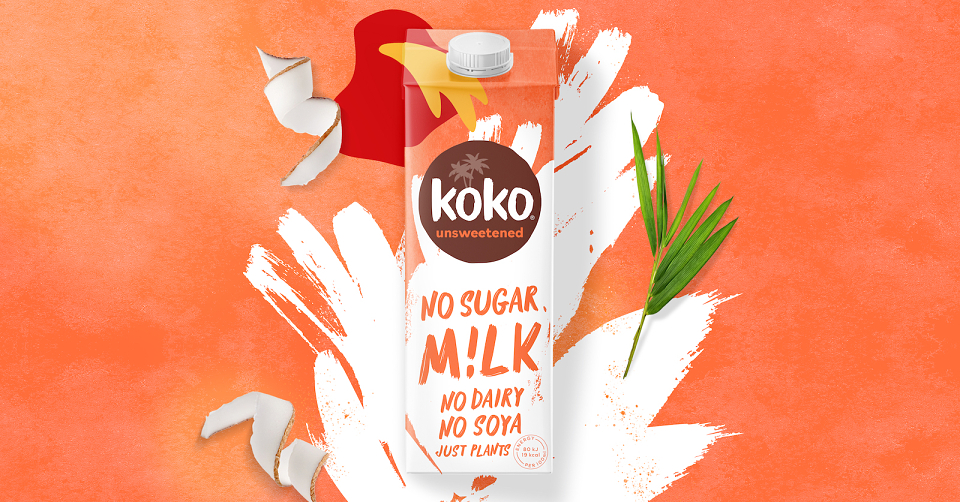
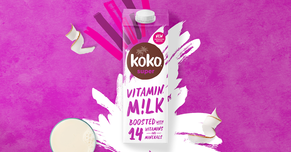
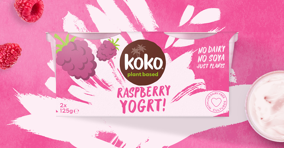
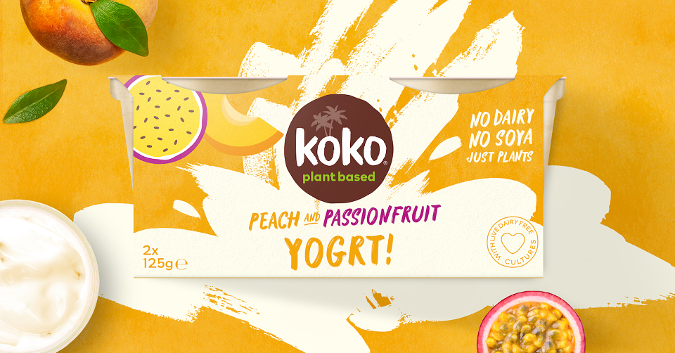
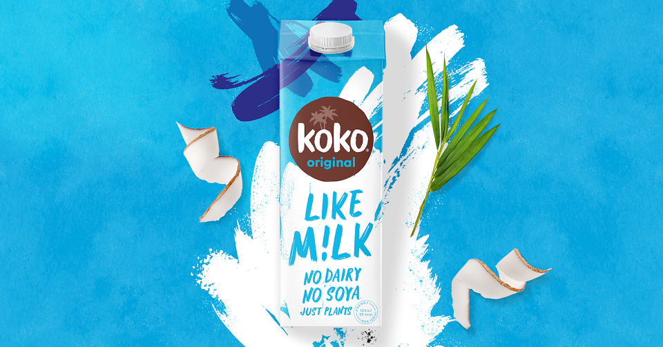
Our start point was to tone back the tropical feel, so that we could remove confusion amongst new consumers. These are not coconut 'flavoured' milks, but they do harness all the goodness of the coconut as an ingredient. The packaging needs to convey that the product is a delicious dairy alternative - not a tropical milk and not a cooking product.
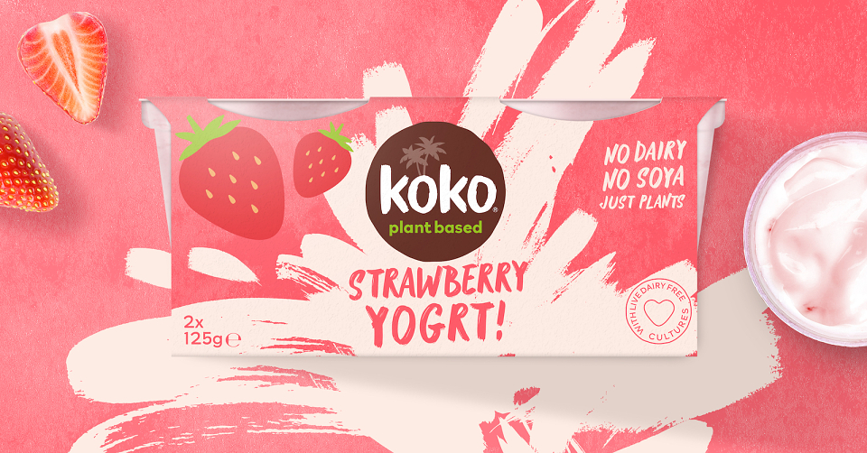
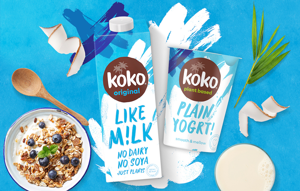
The new colours and graphic elements deliberately reflect the product usage. The new pack looks like a fresh milk carton and the bold design change has a younger, modern feel to better align with the needs of Koko’s core consumer base.
New naming of M!lk and Yogrt! takes on a playful and cheeky tone to reflect the friendly and fun brand personality. With the full range of products being relaunched, the new packaging also ensures clear brand consistency across the ranges. Creating a much stronger, recognisable brand presence on shelf.
"With an ambitious brief, that needed to be turned around within a tight timeframe, we knew we needed a creative agency who could dive straight in - and that’s exactly what Episode Two did. They immediately understood what we were trying to do and have really captured the essence of what we want Koko to be. We absolutely love the new look and know our Koko Nuts will too!" Victoria Eadon, Marketing Manager