Emma Howells
Senior Graphic Designer
ABOUT
This project was developed in response to a creative brief for a summer experience at Bluestone. The aim was to create a vibrant festival-inspired visual identity that would bring a sense of energy, playfulness and celebration to the resort throughout the summer season.
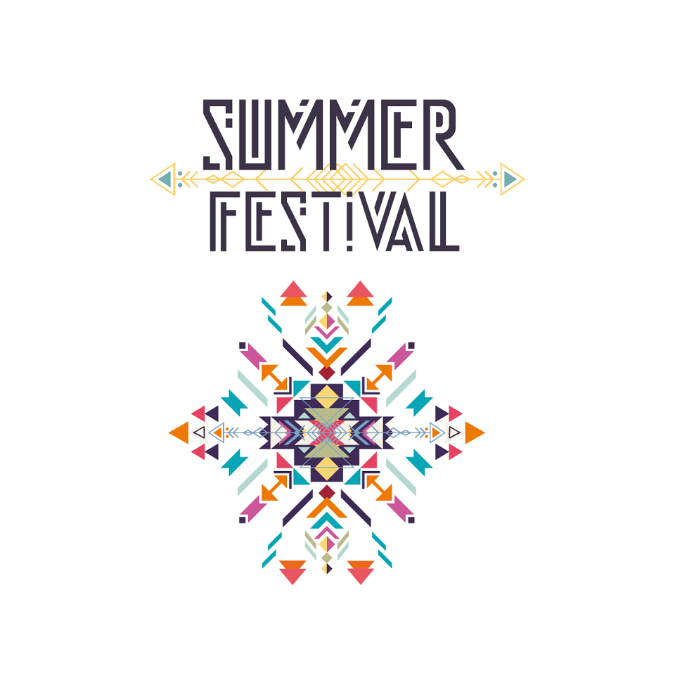
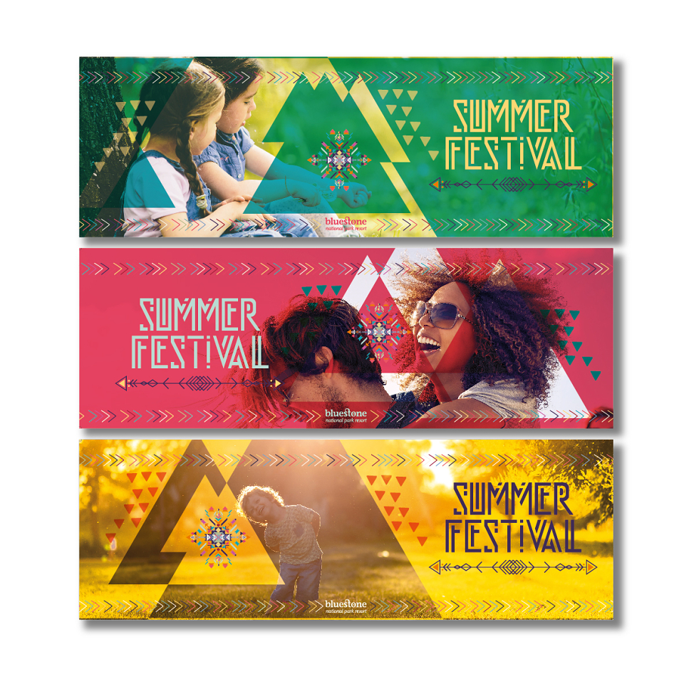
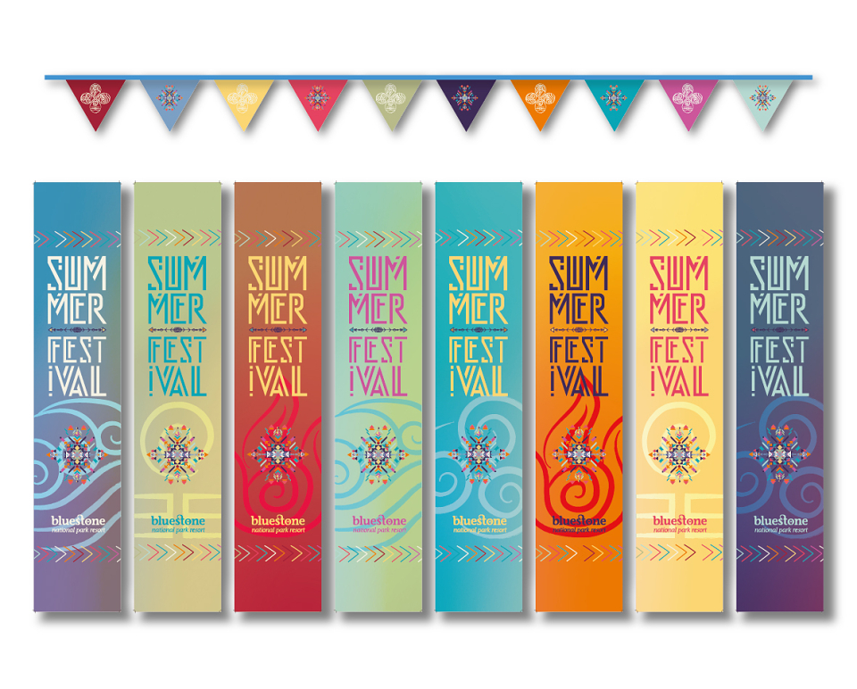
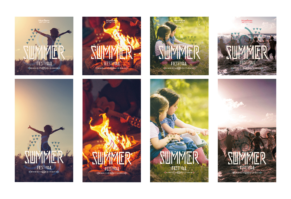
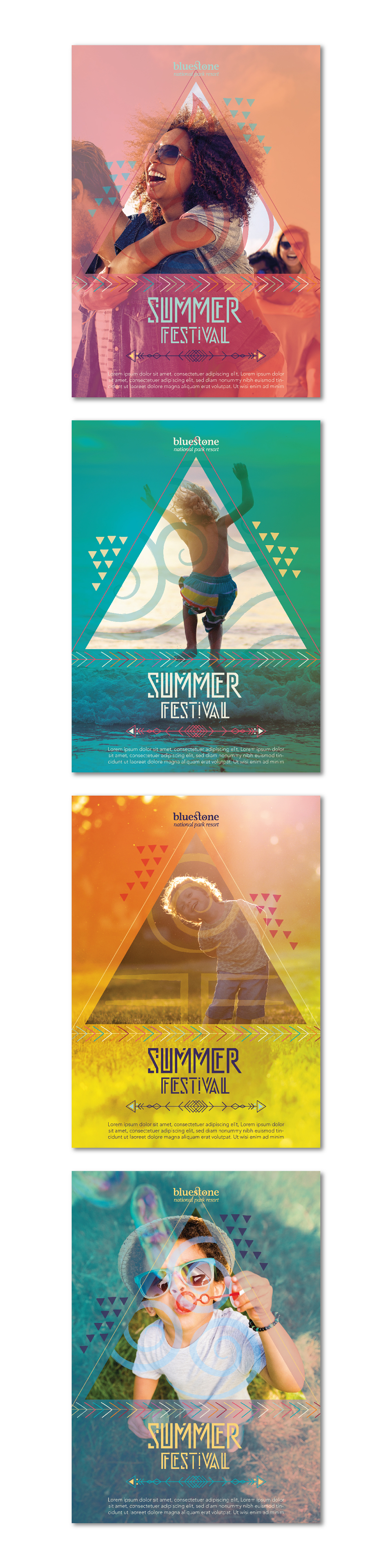
The concept was built around the four elements (fire, water, air and earth) using each as a visual starting point for colour, imagery, texture and atmosphere. Bright, sun-soaked palettes were combined with bold geometric forms, layered photography and expressive graphic details to create a look that felt energetic, contemporary and distinctly summery, while still working within a premium resort environment.
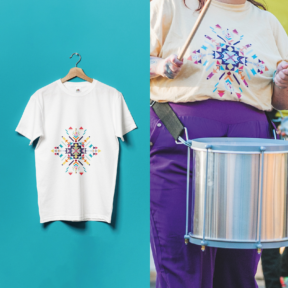
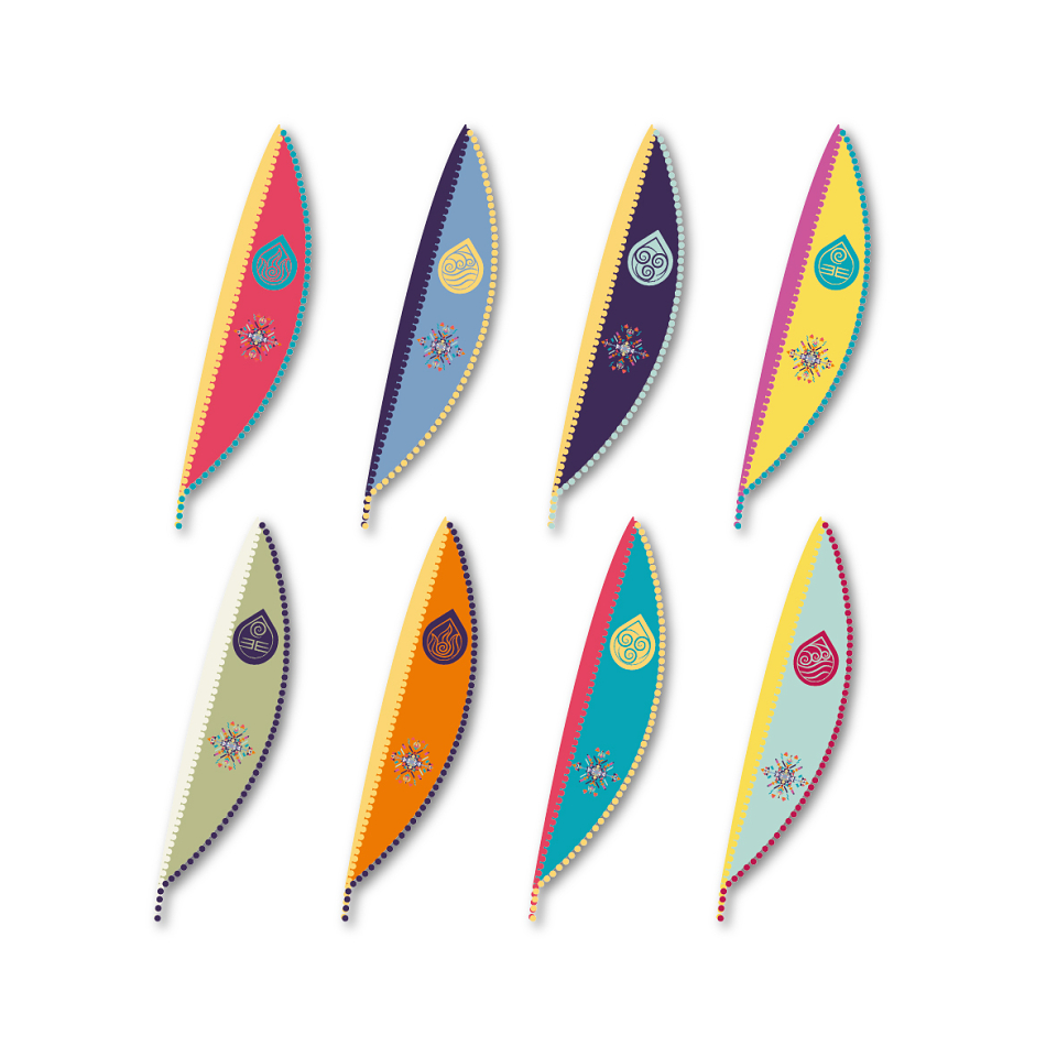
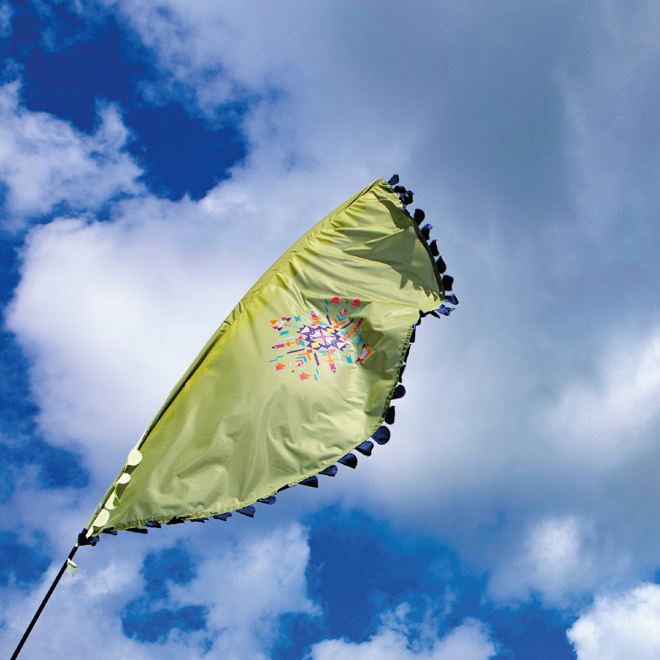
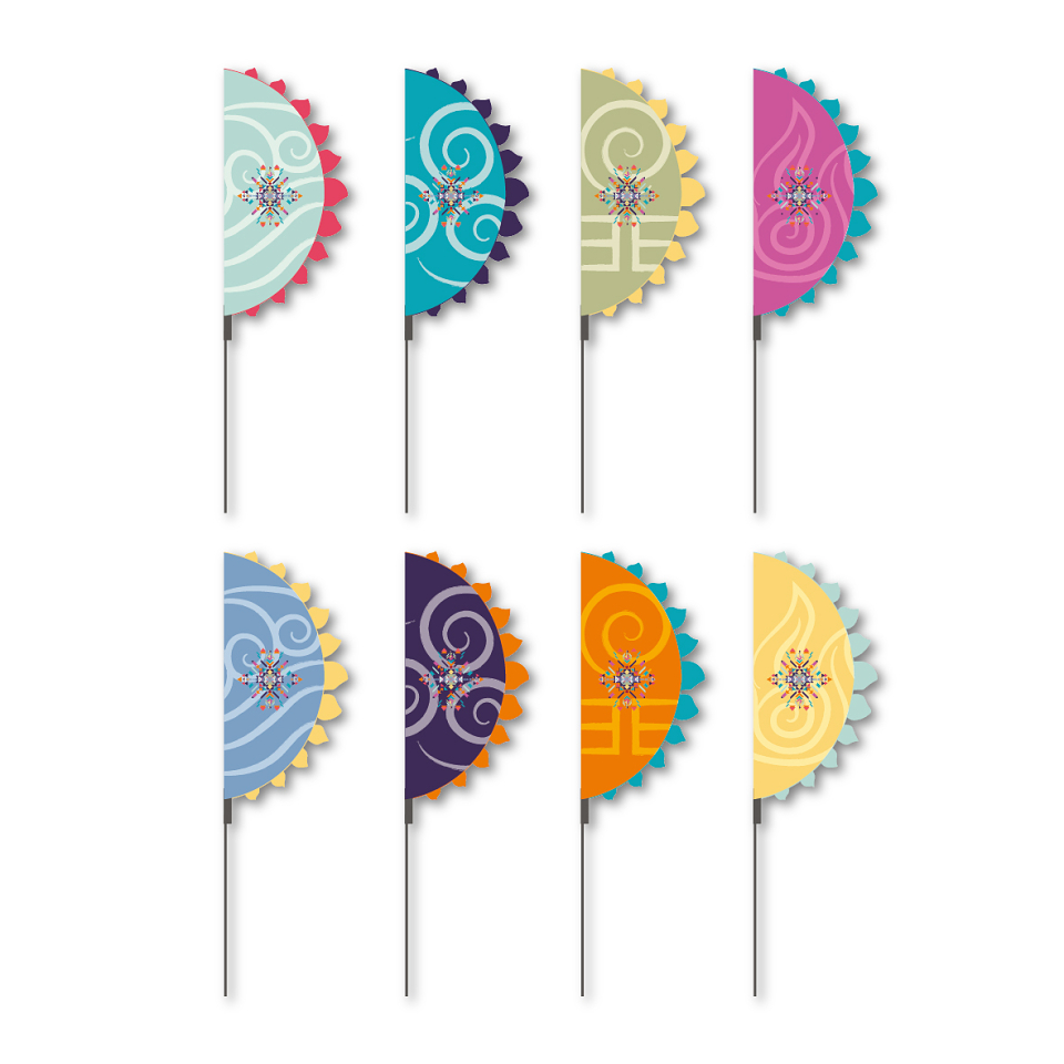
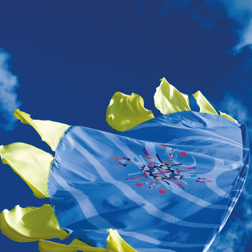
The identity was designed as a flexible system that could translate across the physical and digital guest experience. Final concepts included resort flags and banners, promotional posters and social media assets, creating a cohesive visual language across on-site decoration and marketing communications.
The result is a colourful, immersive festival aesthetic designed to make the summer programme feel like an experience in itself, transforming the resort environment into a lively celebration of summer, nature and connection.
MADEIT CREDITS
-

Bluestone National Park ResortClient
-

Emma HowellsSenior Graphic Designer