ABOUT
For the first time ever, women in America are able to purchase a birth control pill over the counter without a prescription, marking a landmark moment in US history. As the first product of its kind in a newly competitive landscape, Perrigo enlisted our help to create and bring the visual identity for Opill® to life. We knew our design had to translate the ground-breaking nature of the product as a powerful and monumental moment in history for women and people’s health.
Against a backdrop where one-third of American women report barriers in accessing contraception, Opill® is reshaping the parameters of women and people’s health. Opill® required a powerful identity and visual brand language that rewrote the rules of what design in reproductive health means in order to translate the transformational nature of the product on and off-pack.
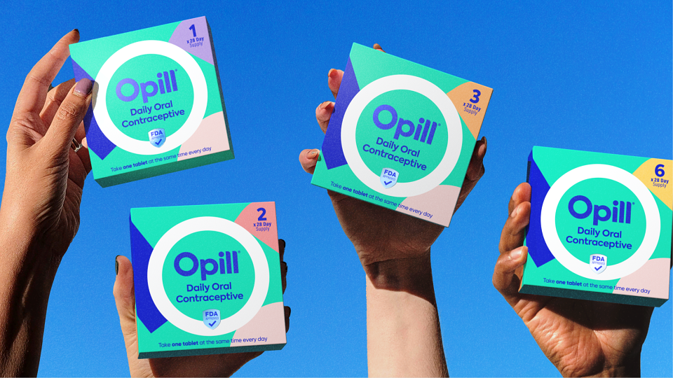
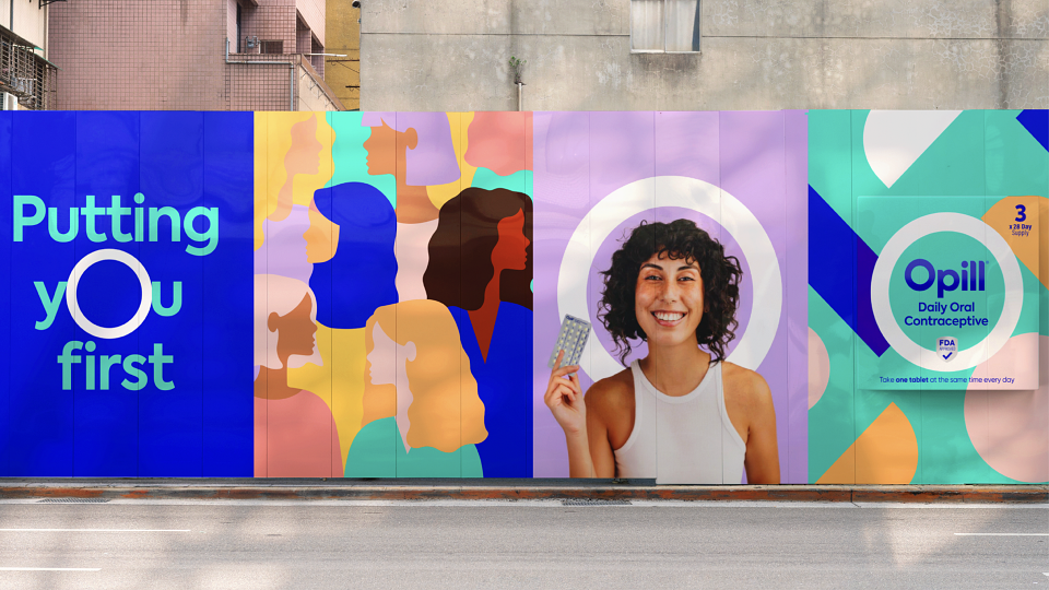
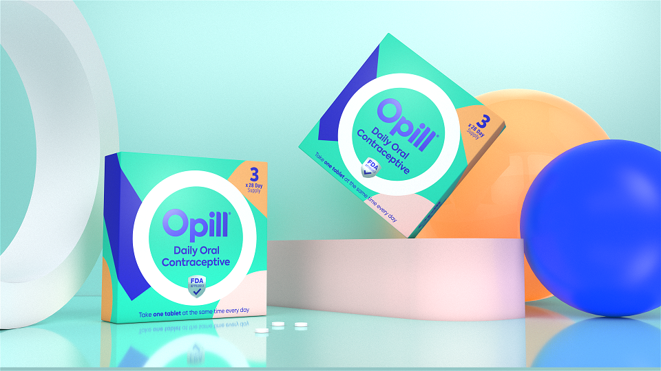
We wanted to capture Opill®’s role in reshaping the roadblocks to reproductive health via a meaningful brand language that breaks free from the norms of traditional healthcare design. Opill®’s visual identity revolves around its O-shaped brandmark, becoming a beacon for protection: a motif that speaks to Opill®’s simplicity, convenience, and ease of use. Reinventing traditional industry standards, the colour palette features a background of modern teal alongside pops of coral, lilac, orange, blush and yellow that appear in free-form shapes. Paired with a dark blue typeface that references classic Rx language, it was crucial to underpin Opill®’s efficacy as a daily contraceptive. Together, the effect is a visual metaphor for the arcs of the world around us and Opill®’s steady presence within that. Opill®’s font was selected due to its open and round typeface; building the sense of a brand that is warm and approachable. We wanted Opill®’s identity to convey the product’s sense of freedom, offering millions of Americans access to effective contraception on their terms and without having to navigate additional barriers. Opill®’s visual and verbal language echoes its capacity to hand people control and convenience over their birth control choices and rewrites the standards of accessible product branding in reproductive self-care.