Ellie Holder
Graphic Designer
ABOUT
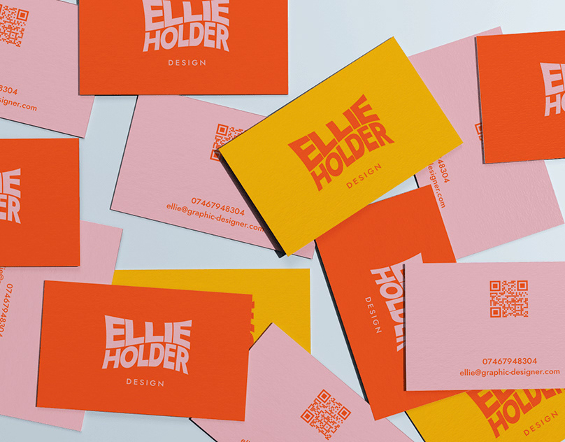
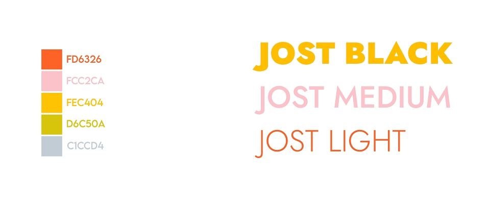
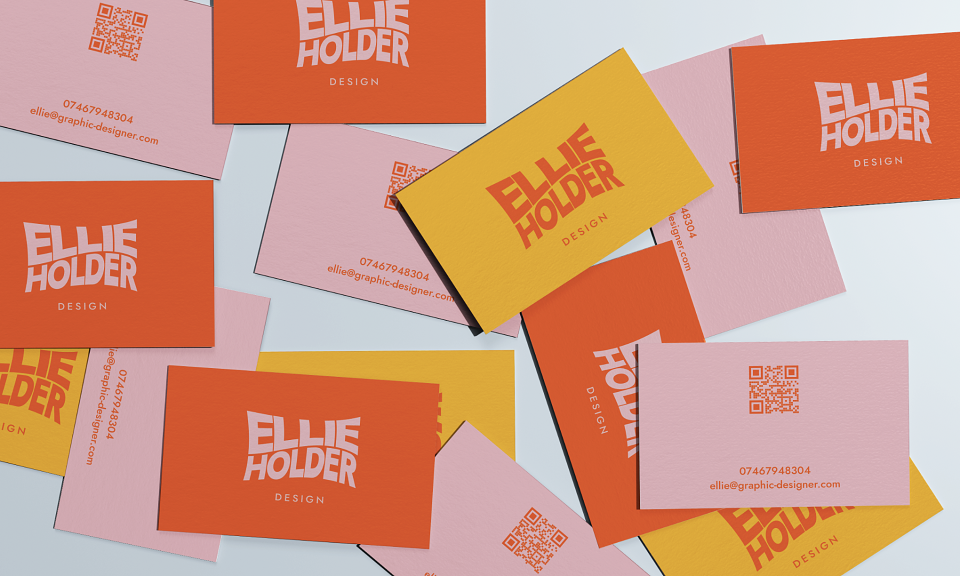
For my logo, I chose a warped text version of my name. Based on feedback I received from my peers, this was the most engaging logo out of all my ideas. The warped text is bold and fun, and along with the bright, friendly colour scheme I picked, makes my brand feel interesting and approachable. The font family I chose for all my text is Jost. It is very geometric - the round parts are very circular, and the shapes are clean and even. It is available for free with a huge range of weights and styles so can be used consistently throughout my branding.
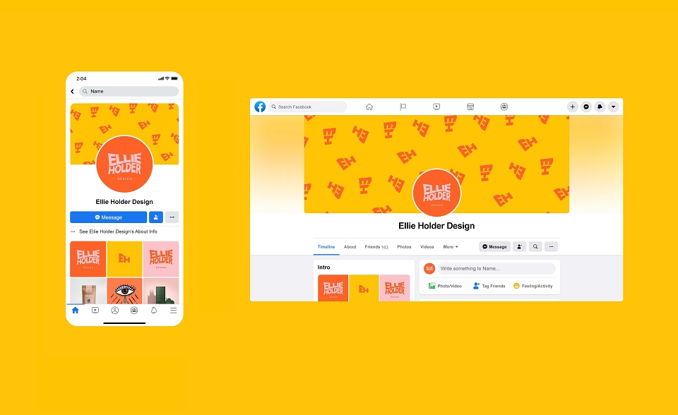
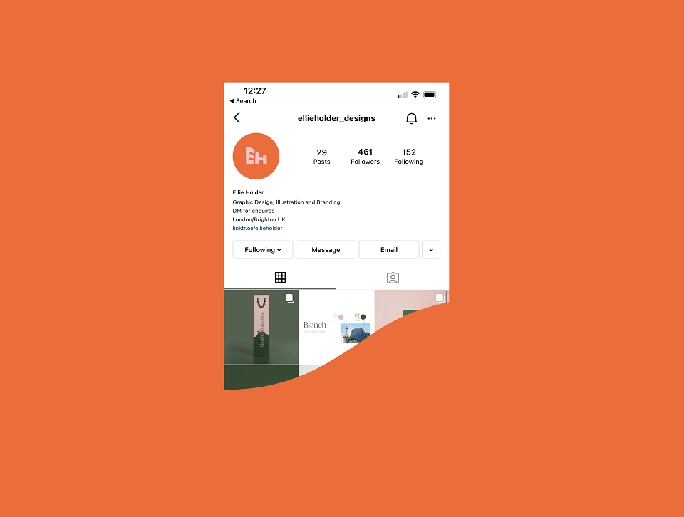
I chose a few alternative colour schemes, as my flat designs only use two colours each, I wanted some scope for variety later on when I design my website. The three colours I have used alternately are a bright orange, yellow, and pastel pink. I chose a grey/blue and a pastel green for accent colours. I designed two logos, one with just my initials for thumbnails, and one with my full name for bigger media.
MADEIT CREDITS
-

Ellie HolderGraphic Designer